REPORT ON MANTLEPIECES
As a first test of your powers of observation, try the following:-
Write down in order from left to right, all the objects on your mantlepiece, mentioning what is in the middle.
Then make lists for mantlepieces in other people’s houses, giving in each case a few details about the people concerned, whether they are old, middle-aged or young, whether they are well off or otherwise, What class (roughly) they belong to. Send these lists in.
If possible, also take photographs of mantlepieces.
Directive to New Observers – Mass Observation c.1937
Reading Picturing Ourselves (p 93, Wells), I remembered the note I made of the Directive to New Observers at the Mass Observation exhibition at the Photographers’ Gallery (Aug-Sep, 2013) at much the same time as I found myself identifying with Humphrey Spender’s description of himself on page 94, as an outsider exploiting others while picturing them. This exercise – create a still life and at the same time create a network of points – seemed a good way to combine that identification with an attempt to start characterising who the me who takes photographs is. Also, the amount of stuff from holidays, work trips etc etc that had silted up on the mantlepiece needed dusting and thinning out. I decided to clear everything off and start again, building up a still life from some of the things that were there as I went.
-
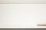
- 1:Bare Mantlepiece
-

- 2: Vase
-
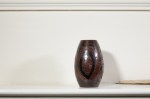
- 3: Vase (Repositioned)
-
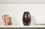
- 4: Greek Jug
-
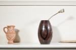
- 5: Poppy Seed Pod
-

- 6: Daffodil
-
- 7: Hydrangea
-

- 8: Lump of Coral
-

- 9: Candle
-

- 10: Coral Removed
-
- 11: Urchin
-
- 12: Thoth, God of Wisdom
All photographs: Nikon D50; Micro-nikkor 55mm 1:3.5. ISO 200, 2 seconds at f32.
Lighting: 2 x Neewer CN-160 LED lights positioned at 45° on either side of the camera, 30° above the line of sight. The light on the right of the camera was less bright than the key light on the left.
What follows are my notes on progression of the compostion.
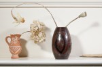
- (fig 2 & 3) How centrally should the brown vase be placed? Initially I put it down too close to the edge of the frame – such a big object (besides possibly being too big to be a point) tended to overbalance whatever I put down next – and it was only after it was moved to a slightly more central position that I could place the Greek jug successfully.
- (fig 4) If the piece of driftwood that enters the frame from the right was not there, I would say that the jug is too close to the edge of the frame (or of course that the initial placement of the vase was correct). The curve of its shadow (increasing its size as a point) works nicely with the curves of the brown vase, but there’s not really much here yet.
- (fig 5) The seed pod adds much needed height, and adds in a diagonal line slanting down across the thirds. The jug feels a bit on its own though.
- (fig 6) The daffodil adds much, through the curve of its stalk (again not a very pointy thing) but also with its head curving back in from the left with its lower line mirroring the top of the jug and casting a shadow where the next thing will go. Looking at it now though, I’d have moved the jug slightly right so it is closer to being under the daffodil head.
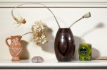
- (fig 7) The hydrangea becomes the centre of the whole composition, moving it’s balance firmly to the left, and leaving the far right, beyond the vase, slightly redundant.
- Which makes me wonder why my next move was to place a piece of coral under the hydrangea (fig 8), rather than just going straight to placing the candle to the right of the vase (fig 9). At this point it seemed the right thing to do to remove the coral (fig 10).
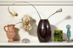
- But something needed to go into that space below the hydrangea and the urchin (more of a contrast in colour to the background and smaller than the coral) works, I think (fig 11). The resulting kite-shape formed by the jug, daffodil, hydrangea and urchin, matches the triangle formed by the vase, seed pod and the candle (or the kite made with the addition of the seed pod’s shadow, out to the right).
- If I do a remake (one shot, of the final composition) I think I’d stop at this point, readjusting slightly some of the relationships between the points and shifting the whole frame slightly to the left. However, this wisdom was only reached by placing Thoth off to the right of the candle (fig 12). A step too far perhaps, but to paraphrase William Blake, wisdom is only achieved through the practice of excess…
I enjoyed this exercise: working out which thing to add, working out where to place it in relation to the earlier elements, taking the picture and then thinking again all combined to make a pleasant evening. Looking at the pictures now, I think I could do a reshoot that would improve the whole thing: little bits of placement are ‘off’; and I kept slightly moving the camera on the tripod when I reset the remote setting each time it went to sleep and as a result, I’ve had to slightly crop the later pictures which mean Thoth, for example, is too close to the edge of the frame; also the lights gradually ate their batteries, so the exposure faded, gradually enough for me not to notice til too late, meaning that the early pictures’ highlights are starker – and, I’d say now, less pleasing – than in the later pictures.
I think I may do a remake of the final set-up, and will make the softer lighting of the later, dying battery, shots a feature.
References:
The Photographer’s Eye – Michael Freeman (Ilex, 2007)
Photography A Critical Introduction, 4th Edition ed. Liz Wells (Routledge, 2008)
Proverbs of Hell – William Blake

Fascinating, and what an interesting project Mass Observation provided.
I’m kicking myself for not taking a picture before I dismantled the existing set up (and used it as a banner for the post) in just the same way I kick myself for not taking a photograph of the garden before we tackled the brambles. And of course, once I’ve done the remake, I must do the written bit of the MO task as well…
Pingback: elements of design # 7 – real and implied triangles | Simon Chirgwin's Learning (B)Log