Choose a community that you’re already a part of. It could be your child’s nursery or you regular gym class, but it should be something that takes up a substantial amount of your interest and time.
Create a photographic response to how this group informs who you are as a person. What aspects of this group or community reflect on you? What do you share? How does it function as a mirror reflection of who you are?
– IaP coursebook – p.71
‘Something that takes up a substantial amount of your interest and time’ fits in neatly to Maria Short (in Context and Narrative) and David Hurn and Peter Jay (in On Being a Photographer) suggesting that you start by making a list of potential Subjects (Short) or Projects (Hurn and Jay) that interest you. I took the list of traits I’d compiled as part of my response to Exercise 3.2 and came up with three areas for investigation here.
- Food and Drink – I’ve been taking photographs in restaurants, of the staff, the food and the place for almost as long as I have been travelling a lot for work. Also, I spend a great deal of time doing most of the cooking for my family. I have a half finished post (still in note form) putting together my thoughts about Masterchef (BBC) and its extremely satisfying story-arc…
- Travel – A lot of my archive (I have been looking back at my output a lot for this course, I think I am much more aware of what it is that I take pictures of and how it has changed over time) consists of pictures taken when I have been away from home, often on my own and usually for work, although holidays feature quite strongly too.
- Change – I am aware of how a large portion of the interest of photographs can come with the addition of time as the thing pictured changes or vanishes entirely. The area of London where I live is gentrifying rapidly while other things – failing shops, my garden in winter – decay and become shabbier before they in their turn are transformed into something new…
In the generally downbeat feedback for my previous assignment, a glimmerof hope was offered by the comment:
‘Your approach of searching and collecting images on a journey or holiday is important.
That’s something you can take from this, the fact that your perception to visual sights
is heightened when you’re not in a customary environment. But this searching and
collecting needs refinement.’
To it, I would add that I have long been aware of the need to be able to apply the same approach to my everyday life and surroundings. I have recently changed job and this has reduced dramatically my opportunities for travel (outside the UK at least). If I’m going to progress as a photographer, I will have to apply myself nearer to home…
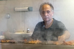
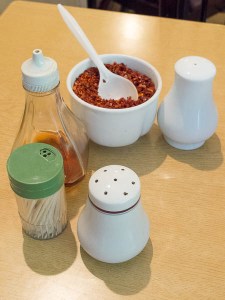
My first idea (September – early December) had its roots in food and my neighbourhood. Ever since I moved into my flat nine years ago, I have been eating in (and taking food away from) the Turkish restaurant at the bottom of my road. I used to live on Green Lanes in Harringay (which is well known for its large Turkish community and their food)and have had plenty of opportunity to work out what I like. This restaurant – Bodhrum – is a very good one indeed. I get on well with the family who run it and thought I could possibly do a Life-style photo essay on a day at the restaurant, getting behind the scenes and covering the stuff that happened down stairs in the prep kitchen, the food and the grilling of meat and its service in the restaurant itself.
-
-
Bodhrum 1 – the ocakbaşı (grill)
-
-
Bodhrum 2 – condiments
I got as far as asking the owner if I could come in for a few evenings and take pictures, and he was happy for me to do so, but somehow it never quite happened (the pictures above were taken a few years ago, when I was trying out a new camera while waiting for my takeaway to be prepared one Friday). Perhaps my enthusiasm was dampened somewhat by not really wanting to do something a ‘straight’ as my original idea, and possibly i wasn’t feeling up to the amount of interaction with people that would be involved, once you factored in customers (who I do not know) as well as the restaurant staff. I toyed with doing quite formal, lit portraits of all the people who work there to combine with images of the food and of them in action (missing out the customers entirely), but I’d lost momentum somehow.
And also burbling away in the background, I was trying to move house and this began to occupy more and more of my thoughts. So, my second idea (December 2016 – January 2018) began to form. Having lived in the same place for a while, I know my immediate neighbours quite well and other people who live a bit further away to a varying degree. Perhaps I could do something around this, to form a commemoration of my time here?
If the pictures were captioned somehow with how long people had lived in their flats and where they had come from, some idea of how the community was changing would be able to be established. The longest-resident person was my downstairs neighbour Bill who – incredibly – had been living in his maisonette since 1960, bringing up two children there with his wife, who had died long before I moved in upstairs. We share a garden and I’d taken photographs of him before, but never quite got it right. I was playing around with redscale (reversing the film in the camera, so its red backing acts as a filter to the pictures) when I took this one of him. As is usually the case when I experiment with ‘alternative film processes’, I rather wish I hadn’t; this project would give me the chance to have another go.

Bill downstairs. Moved from Hackney in 1960. Retired.
I began talking to my other neighbours – no one objected in principle, but I failed to get dates in anyone’s diary – and started working out what lighting tests I’d need to make, to allow me to light portraits quickly using portable off-camera flash. Perhaps I could widen it to include the various small shops nearby where I buy the paper, buy milk, buy vegetables, buy meat; perhaps the Bodhrum idea could be incorporated too…
The project and its idea widened, grew more diffuse, and collapsed in on itself; I was going to have to organise and schedule a large number of individual shoots. In the end, I never really got started. The sale of my flat temporarily fell through because of issues with the chain but now it’s back on again (I hope) and while I’d like to follow through on the idea and take the pictures for this, I realised I needed something I could work on without needing to take more time that I don’t really have from my day-to-day life.
I needed a project where I could just start making pictures.
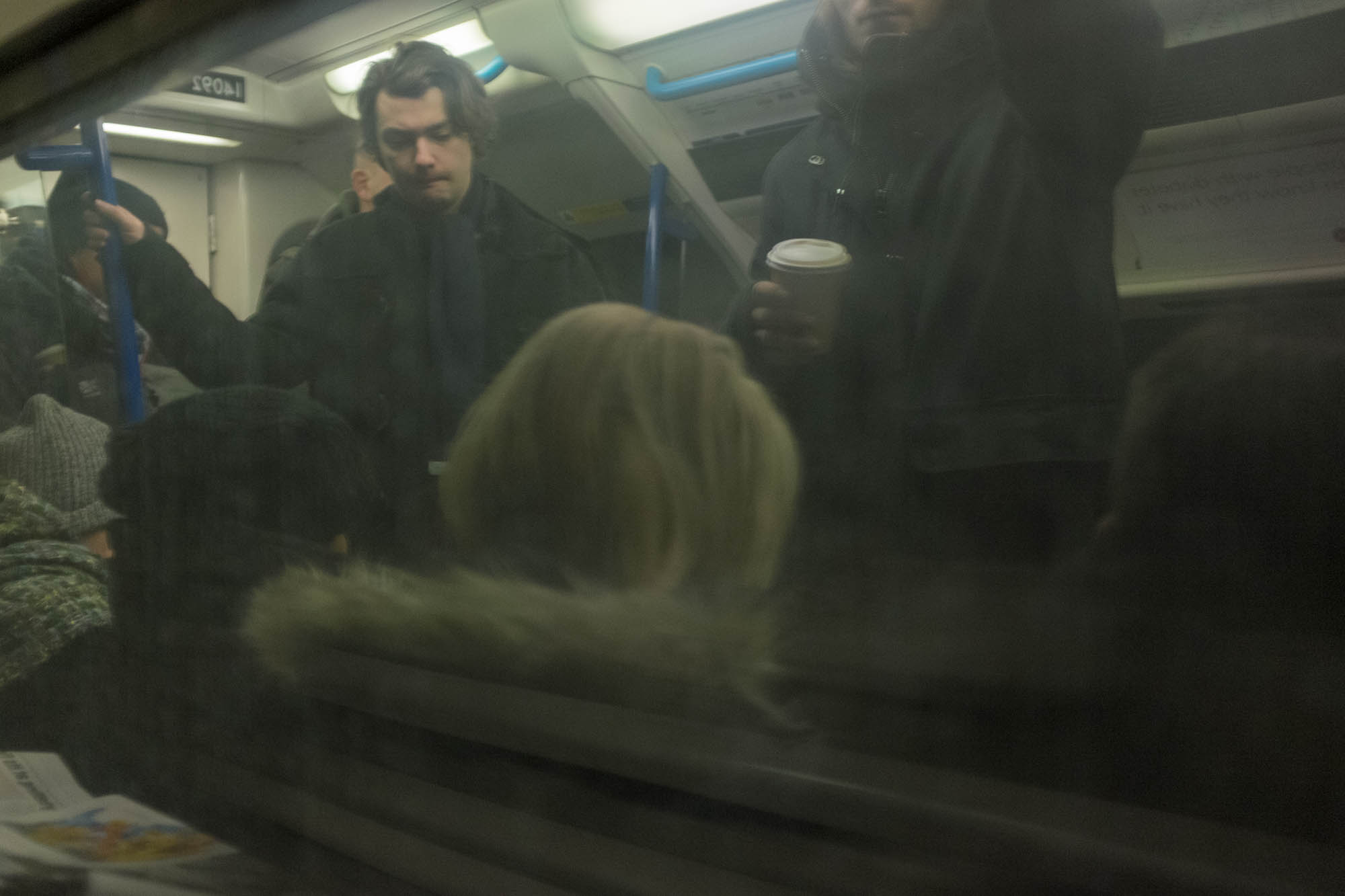
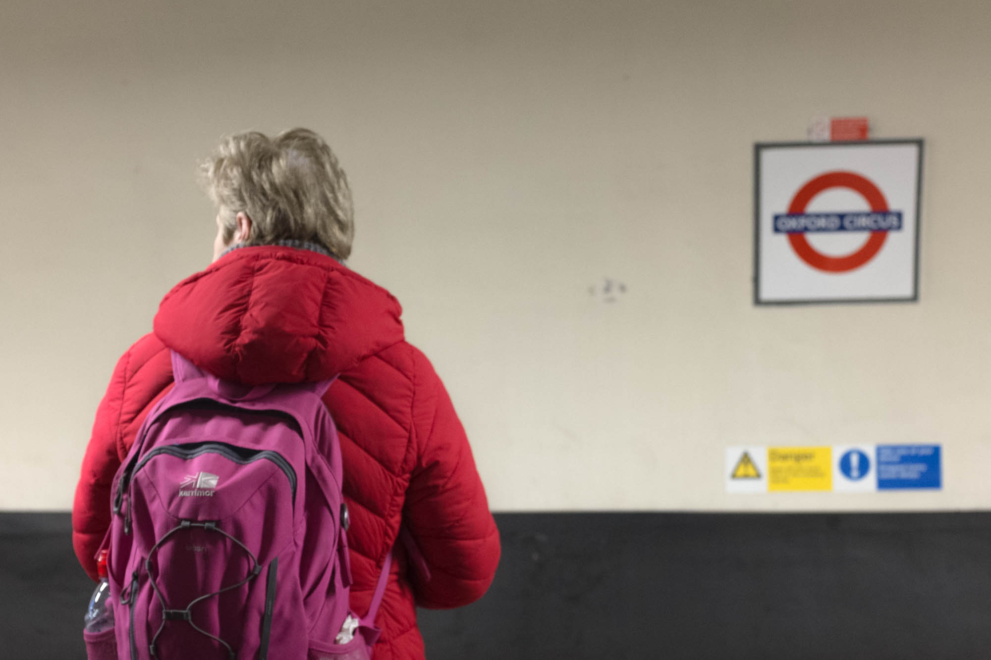
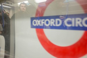
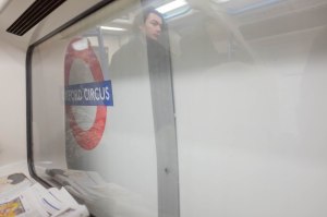
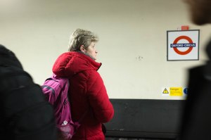
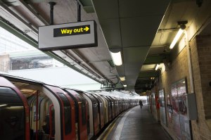
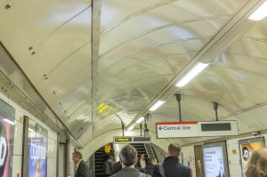
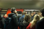
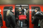
Back in June, I had changed my job (but not my employer). Apart from the effect this had on my available intellectual energy as I absorbed what I needed to do my new work, the main practical difference was that my daily commute doubled in length. Instead of simply taking the Victoria Line to Oxford Circus, I now changed there and continued to White City on the Central Line. With a day a week spent working at home, I was now spending upwards of six hours a week in the underground system.
My journey to work was taking up a surprisingly large part of my time – criterion one of the brief had been met (and I also had one of Hurn and Jay’s key factors in determining the viability of a project – I had regular access to it). It fell into the travel category of my list of subjects while also occupying a place in the unexceptional part of my life (my criterion – work made nearer to home).
For a month or two, it also had taken up a reasonably large part of my conscious thought while I was doing it (criterion two of the brief, and meeting Hurn and Jay’s need for you to know a lot about your subject) as I had expended a considerable amount of thought on working out how to streamline my journey: which carriage should I get into at Walthamstow Central to so as to be in the right place to change at Oxford Circus? did this change if I was travelling in later in the day? – yes! – where should I stand on the central line platform to be next to the doors that would let me get off next to the stairs out of White City station? I needed to work out how could I spend the least amount of time on my extended journey possible.
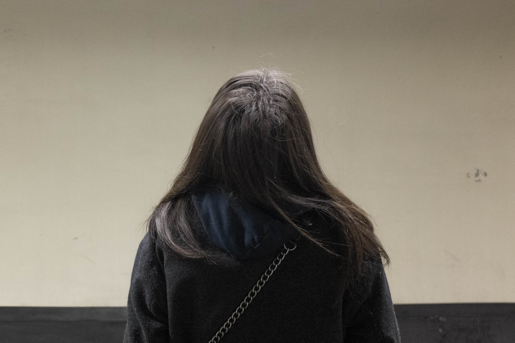
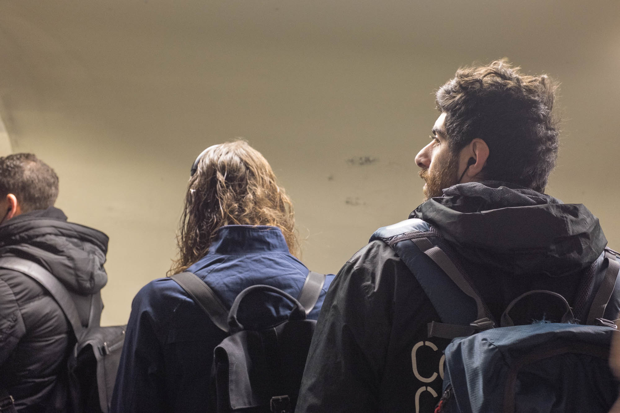
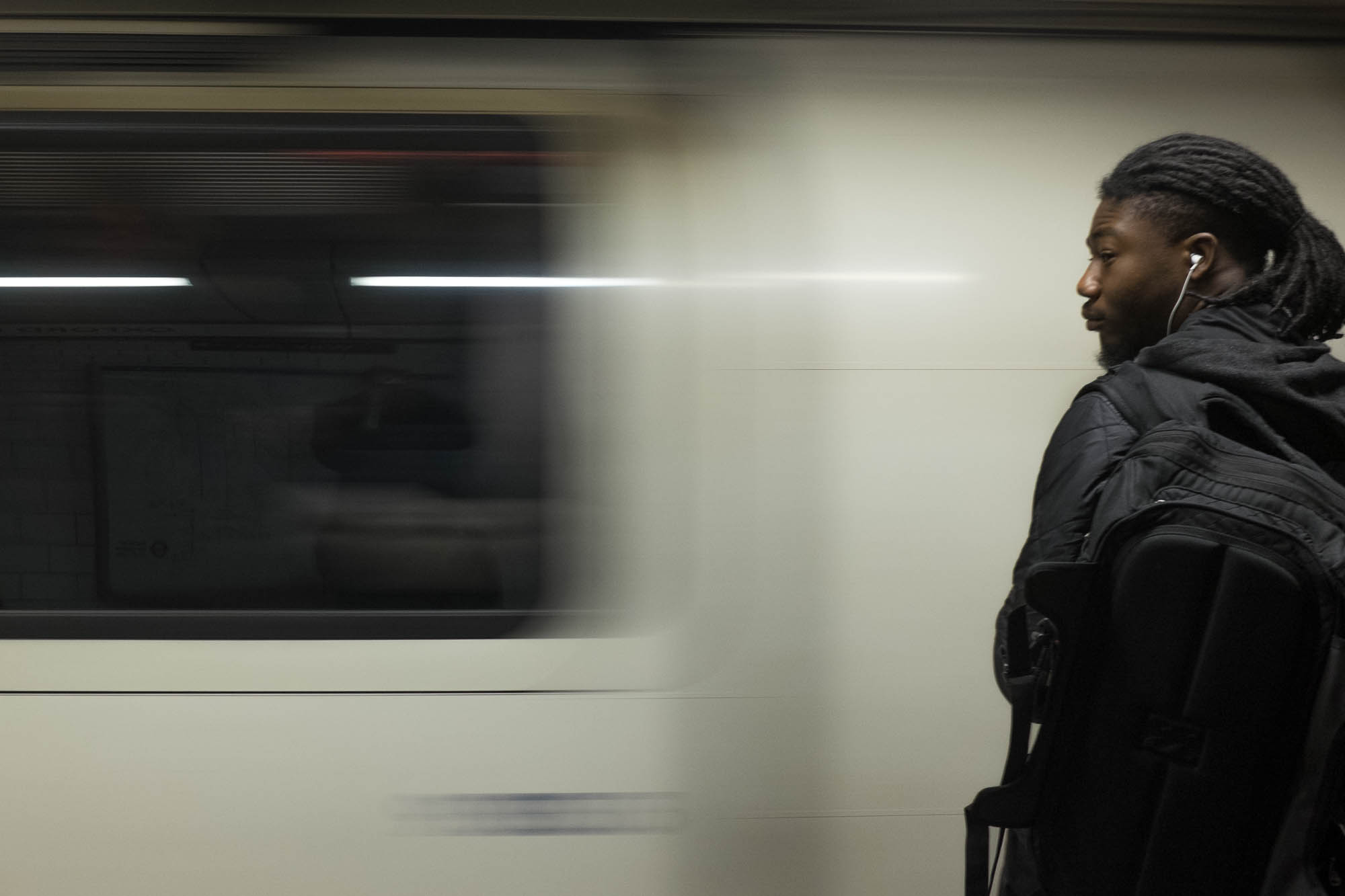
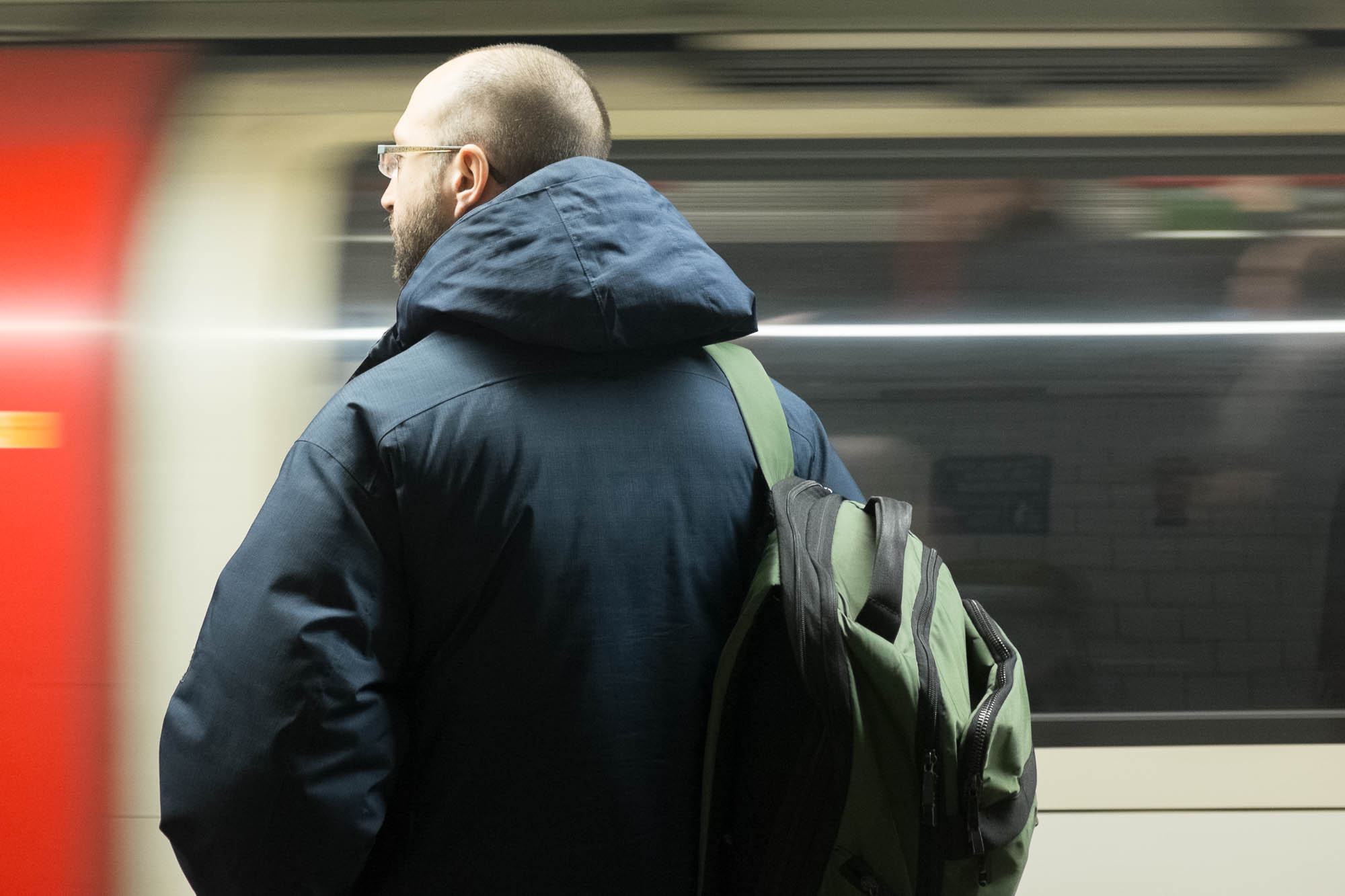
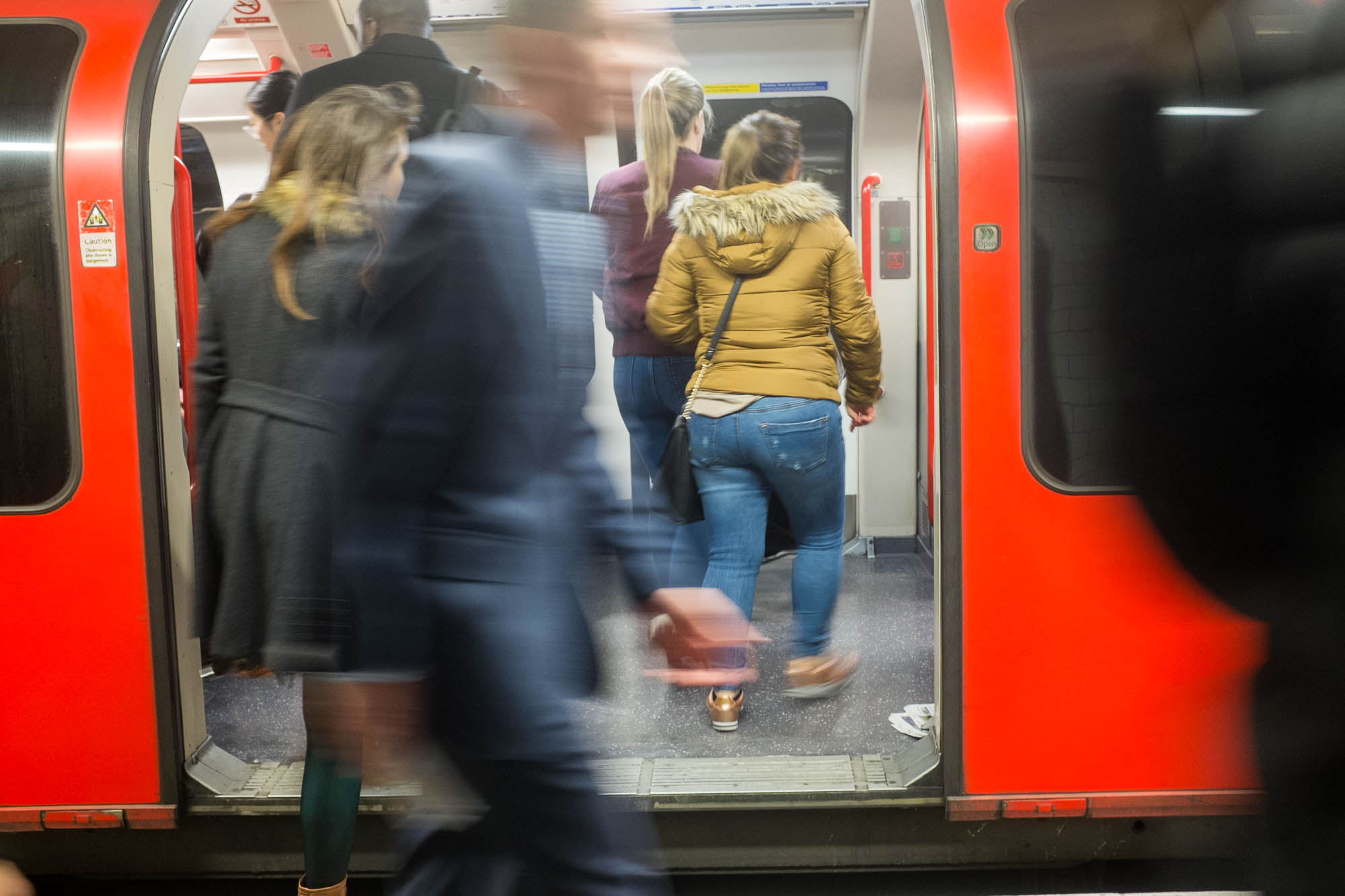
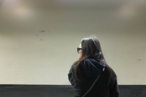
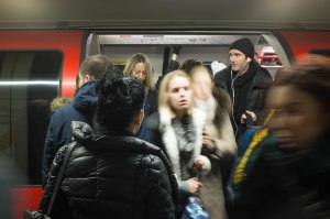
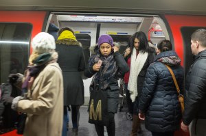
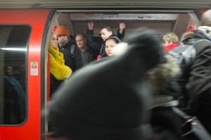
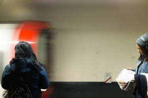
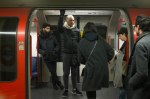
And of course, there are other people who do exactly the same thing, every day. Some of them even can be spotted on consecutive days if you get properly in sync. Could I find people to act as my proxy as I recorded my journey? Could people generally be used to motivate the sequence of final pictures internally by the direction they were looking, illustrating my/our journey? That would give you my community – city dwellers, barely acknowledging each other, but using public transport to get to the same place each day.
I worked out (Hurn and Jay again) that I would need around fifteen pictures: 3 at Walthamstow Station – three covering the journey to Oxford Circus – three for changing lines once I’d got there – three for the onward journey to White City – and a final three as I exit the underground at White City. I realised the number would inevitably rise for some of the stages of my journey, but it shouldn’t rise much beyond twenty.
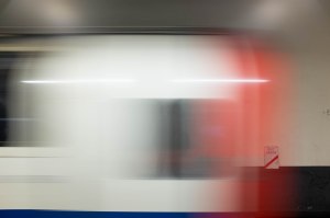
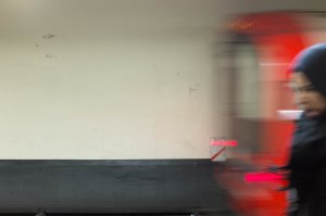
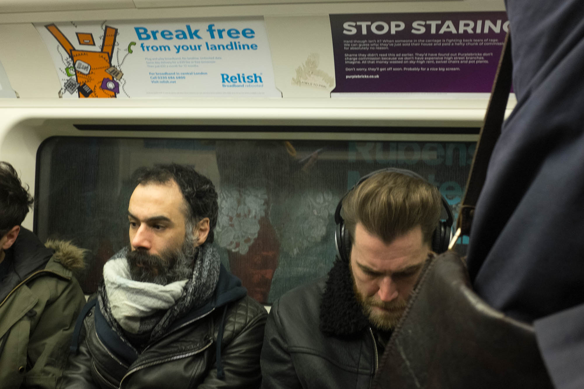
Technically, my options were limited. You cannot use a tripod or artificial lighting on the underground system. I did not want to use an ostentatiously large camera with an ostentatiously large lens. Possibly I could make a couple of passes with an SLR to catch details like signs and clocks and direction indicators with a longer lens, or wider general views with a very wide one, once I had worked out which ones I needed to move my narrative, but for now I would use my nicely unobtrusive Fujifilm x100, with its fixed 35mm (equivalent) lens.

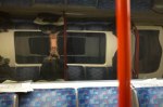
The first picture (Victoria Line)
I made a series of test pictures one morning, establishing that – in the steady light of the underground, I could get the right combination of depth of field (f2.8 in the darker tunnels and f4 or even f5.6 on the trains or the brighter parts of white tiled stations) and speed of shutter (1/30th or 1/60th with the option of dropping down to 1/15th if I wanted obvious motion) by working at an ISO of 1250-1600.
So, my technical constraints had been established and the only thing left to do was to just get shooting!
So I did:
-
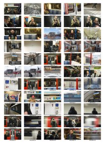
-
fig.1 – a3 contacts
-

-
fig.2 – a3 contacts (cont)
This is a selection of the pictures I took during journeys to work between the eighth of February and the first week of March. As I continued to acquire images, I was creating sequences with them and using the next day’s journey to fill in gaps and replace pictures that didn’t quite work, either because of timing, or for technical reasons like poor focus.
Over this time I also made three trips to Boots to get quick 6×4 prints of good, final set candidate pictures made. By the 3rd of March, I had pretty much all the pictures I felt I needed, bluetacked in sequence order to the plain walls of my living room…
Reference:
- Short, M (2011) Context and Narrative. Lausanne, AVA Publishing SA
- Hurn, D and Jay, P (2008) On Being a Photographer, 3rd Edition. Anacortes, Washington; LensWorks Publishing