It was another dispiriting tutorial. I’d been quite happy with the pictures; Robert, my tutor, was not:
“I think what you’re trying to do with regards to the vice versa brief sounds interesting but
is ultimately intractable and over-complicated. […] Your photographs seem to be holiday photos, and so a different project. […] Actually it isn’t that clear how the concept of vice versa fits with your pictures, but they do seem like candid holiday shots that loosely cover the unaware and the aware categories in Part 2 of the course. […] They’re very diverse pictures and somewhat ill-fitting as a series.”
I had, in his opinion (and, to be fair, in mine, too), over-thought things without managing to translate enough of the thoughts into something you could see in the pictures…
He did like two of them though (James and Alice in my sister’s kitchen – they’ll be in the assessment set) but not the other three; he thought – as with part one – that some of the pictures from the exercises were quite good.

fig.1 – Alice at her Auntie Laura’s, August 2018
Perhaps – he thought – I should create a set of varied portraits of James drawn from the mass of unedited pictures of our holiday to replace this set before assessment? Whatever it was that I was trying to say, it did not come across in the pictures. Hmmm…
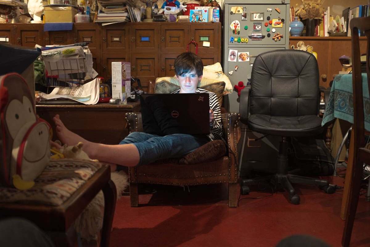
fig.2 – James at his Auntie Laura’s, August 2017
I think (that word again!) that I was trying to take posed, setup pictures outside and to make un-posed pictures inside. I was also hoping – impressed by the sheer size of the photographs of Charles Snelling’s family album, as shown on Julian Germain’s site, in installation shots of For every minute you are angry you lose sixty seconds of happiness at the Baltic Centre in Gateshead – to do something similar in terms of taking family album shots and, through size ( and context, turning them something, not greater exactly, but different. Of making the personal, public and giving viewers something to identify with, without their needing to know exactly who the people and places depicted were. What Robert had seen was just my holiday snaps.
There is no denying that that is what they had started off as; but how could I make them somehow bigger in a way someone else could recognise? How could I transform them into something that other people could identify with, perhaps even into something approaching art?
At this point I went to see two exhibitions that made a big impression on me: Thomas Ruff at the Whitechapel Gallery (with four of his big portraits on display at the NPG by way of a teaser) and the show of Wim Wenders’ polaroids at the Photographer’s Gallery.
In my post about the NPG mini-exhibition (linked above), i included 3 Ruff-inspired portraits of James and intimated that I might include them in a remake of this asignment, at least in part to add more variety to a set of nothing but Jameses. For assessment, I think I’ll use the one of the back of his head, not least because (like surrealists’ photos of people with their eyes shut) this is an impossible viewpoint for anyone to see themselves from in real life, given that (even with mirrors) it is tricky to get anything approaching this clear a view of yourself from behind.

fig.3 – Obverse, James; London; 2018
At the Whitechapel Gallery, at the start of his big retrospective, there were two series’ of appropriated and doctored Installation views from long-taken down exhibitions, one (presumably done specially for the retrospective) at the Whitechapel Gallery itself. Since I would not be able to get James’ Ruff-inspired portraits printed as big as Ruff’s originals (the assessment print will be A4 orpossibly A3) , if I wanted to see what it would look like on a truly grand scale I could do worse than re-working my photograph of the three big portraits at the NPG.
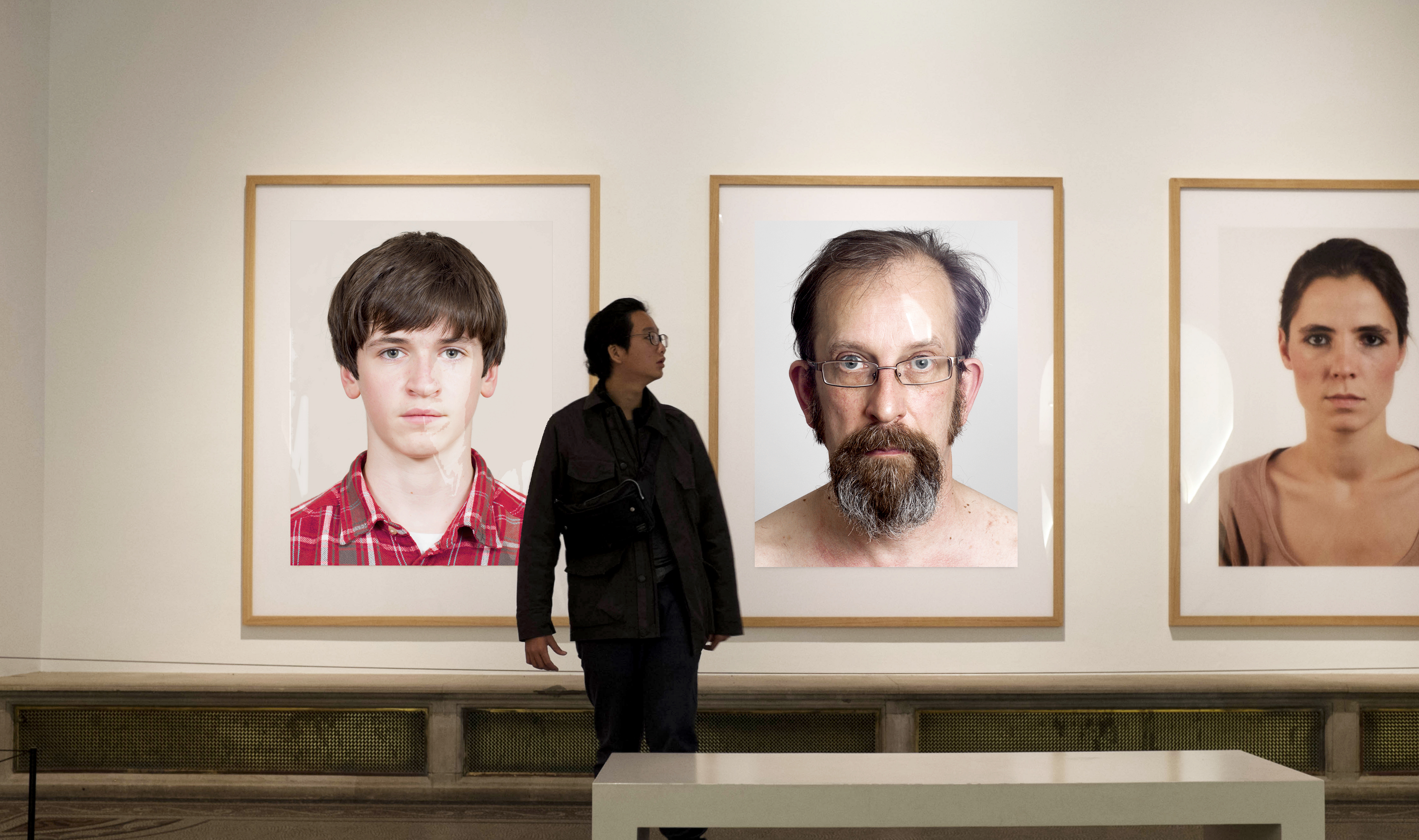
fig.2 – Portraits: J. Gow and S. Chirgwin (with A. Giese); Installation View, The National Portrait Gallery, London, 2017
For good measure I have included one of my base self-portraits for Assignment 3 of Context and Narrative. The most difficult part of this was replicating the reflections in the glass of the pictures, making them feel that they were really there.
Wim Wenders’ pictures at the Photographers’ Gallery were at the opposite end of the scale from Ruff’s – original polaroids, given added dignity by a mask and a frame. You could walk around, listening on headphones to streamed recordings of Wenders reading the relevant section of the text of the book of the pictures. The text turned what could have been mostly seen as insignificant adjuncts to Wenders’ film-making into marvelous chunks of deadpan autobiography. You leant in and peered at the tiny pictures; you smiled and listened to Wenders’ slow delivery of his words. They stopped being a crate of forgotten pictures and became little filmic sequences. Wenders talked about his work having personal relevance for him, but never revealed what was private. This seems to matter too.
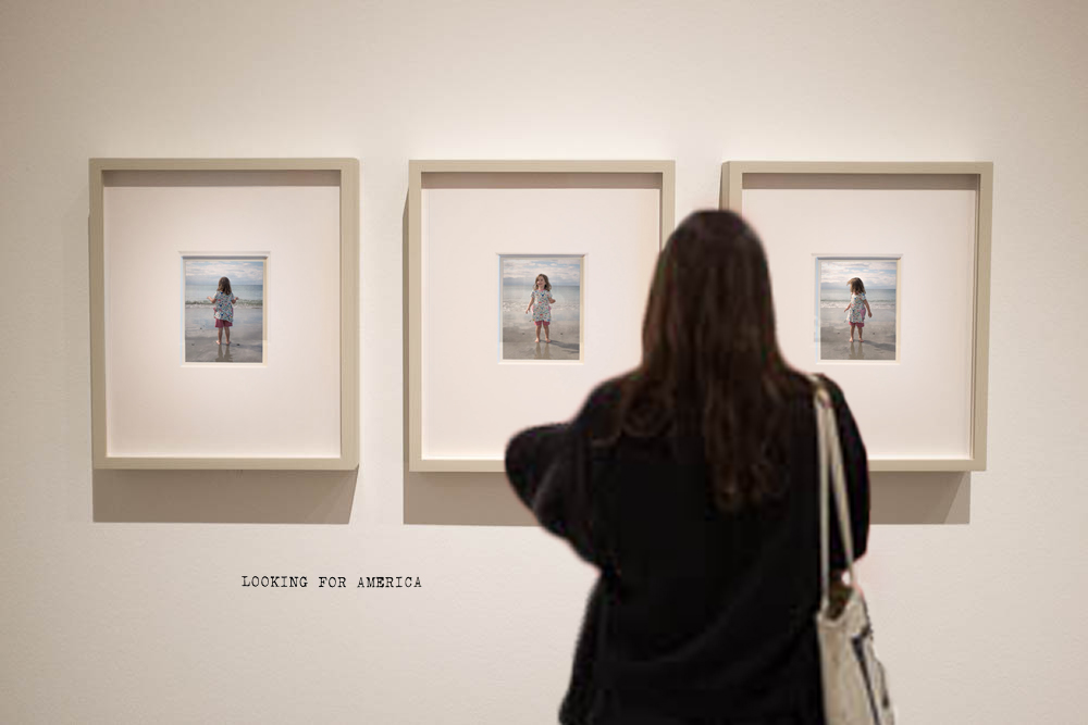
fig.1 – Alice, Skaill Beach 2018; Installation View, The Photographers’ Gallery, London, 2018
There’s nothing in between Skaill bay on the west coast of Orkney and America (Newfoundland, actually); looking out, as a kid I wondered if you might just be able to see it if you really, really screwed up your eyes and concentrated…
So, when I saw that one of Wenders’ sequences was titled LOOKING FOR AMERICA, it seemed obvious that that was the one I should appropriate for the three pictures of Alice at Skaill, one of a number of sequences of three related pictures that I had been unable to include in the original assignment set. The woman looking at them was really looking at Gursky at the Hayward.
I think this covers the opposed ideas of ‘street’ and ‘studio’ quite well. You have unposed, candid pictures taken at Laura’s, a carefully lit and posed picture of James and – taking studio to also mean pictures that are consciously put together – two composites, creating an elevated context for my pictures of my children.
I’ll redo my composite pictures before getting them printed – I was working with relatively small jpegs and they won’t enlarge particularly well. Also, since I did a Gursky pastiche for an exercise during part one of C&N, I have been enjoying the process of putting pictures together from different bits and seem to be improving every time I give it a go. I am aware that there are clumsy things that can easily be improved on (the expansion of the mattes from square to rectangular in the Photographers’ Gallery composite for example) and In another few months (assessment in November, I’m thinking) I should be able to do an even better job, I hope.
But enough for now – I can procrastinate no more! Time to move on to Assignment 3…

That’s a very creative approach and positive too given that you felt dispirited to begin with.
Thanks Catherine. I just wish it had taken me a shorter time to haul myself out of the course-hole I fell into. Here’s hoping…
I am on the FIP course (as a very mature student,) and follow your blog because I learn so much from it. This post is no different. It can feel bruising at first to receive critique but I find it always gives me the ‘shot in the arm’ that I need to move to the next stage of development. Good to know it is the same for you. I like the detail in ‘obverse of James’ especially. Thanks for sharing.
Thank you Sarah! That’s really kind of you. But while recognising the “shot in the arminess” of it all, I wish I’d managed to dwell on it less, and had managed to get over it sooner. But still…
I could give you references about adult learning! There is evidence about how we dwell…. but onwards and upwards! I wish you well, and look forward to your posts. Sutherland is where my mother came from. We live in Kent but trek 730 miles due north west as often as possible.
Pingback: assignment 3; mirrors and windows – ideas | Simon Chirgwin's Learning Log