Category Archives: Coursework

exercise 5.3 – a journey

Note the journeys you go on regularly and reflect upon them.

Now photograph them. Remember to aim for consistency in your pictures […] This will help keep your project honed to the subject matter rather than you, the photographer.

IaP Coursebook, p.112

1: Some everyday journeys:

From the bedroom, down to the kitchen to make tea (and while my mug is brewing on to the downstairs bathroom to empty my bladder) and then up to my study in the attic to write up posts.

From the house to school with Alice – three options: on her seat at the back of my bike (although she’s almost too big for this); on her bike; on her scooter. The route for the days when Alice has her own transport is: down to Boundary Road, up St Barnabas Road, turning left half-way up and going straight on into Thomas Gamuel Park, round the corner by the play park and the exercise gear and straight on up the back of Reina’s and into the school play ground at the top. This journey is done in the morning with the light coming from the east.

This is of course totally different from (but with the same endpoint as) the journey with Alice to school from the old house.

The journey home again in the evening, either from Reina’s (Monday and Tuesday) or the school itself (Wednesday and Thursday). There may be a stop off at the playpark if the weather is right. Evening light – from the west. Mostly, I pick up on Tuesdays and Wednesdays, when Fiona is on shift, but every four weeks, I do Thursday and Friday. On Friday Alice has a dance class in the village, so we head there instead, rather than home.

And after dropping Alice off at school, the trudge (route 1) or cycle (route2) to the station.

Saturdays to Sainsbury’s and George Monoux (pronounced Monucks, in the same way locals call the town Worfamstow) Academy for Alice’s gym class.

To Stansted. To Heathrow. Sometimes to Luton. On to Glasgow. Or Elsewhere (I did quite a bit of work on this set of journeys as background for part three of Context and Narrative)

The journey to work (cf assignment 3) or indeed assignment 5

The journey in to my workplace – through the barriers, up in the lift, go to the place I regularly hotdesk (fig. 3.3, here) plug in my laptop and then – while it’s booting – off to make coffee and to eat the samosa I bought at the station newsagents as I left the tube from this man:

When the coffee (‘real’ not instant, in a cafetiere cup) has brewed and the samosa has been eaten, I’ll go back to my desk, log on and begin my day.

From the station to home. Via the pub. Via Sainsbury’s. Via the Post Office to pick up a parcel.

If I were to pick one journey to tackle for this exercise from the list above, it would be the new journey to school with Alice. However, as mentioned above, I have already done a number of journeys in a number of treatments for various parts of my OCA courses to date, so I’ll revisit one of them and try to do something that ties in to the work on Still Life from earlier in this section of the course,


A flight into Russia

It’s not ground-breaking to take pictures of airline food; it probably was not ground breaking ten years ago. However, a large part of my time travelling by plane is taken up with eating and drinking. The last time I flew to Moscow, I flew with Aeroflot to Sheremetyevo airport to the north of the city. For my dinner, I had the meat option, not the fish; this sequence –  made in a style I have used many times before – shows my progress from receiving my meal tray through eating my main to being replete. I at the chewy bar on the airport express that took me into the city.

On the way home, i probably had the lamb again (I know not to have the fish) but this time, I slipped the paper cup that my glass of wine came in into my cabin bag. Back home – and months later –  i subjected it to the same treatment as I did to some of the objects on my mantelpiece.


fig.4

Removing an object from its context, interests me at the moment; I have a second airline cup – Loganair; Kirkwall to Glasgow in August 2018 – sat next to me as I type. Once I have got the workroom in my new house set up, I’ll take a matching picture of it. I will gather more detritus from journeys as time goes on and photograph them once I have returned home. This will give me another way to picture my travels and present them to others…

exercise 5.2 – exhausting a place

I thought the premise of this exercise was so interesting – ‘Choose a viewpoint, perhaps looking out of your window or from a café in the central square, and write down everything you can see. No matter how boring it seems or how detailed, just write it down. Spend at least an hour on this exercise’ – that I never quite got round to doing it, as I was so interested in working out where  – the threatened open space beside Walthamstow Central? staring out of the window of The Chequers as the market packs up for the evening? somewhere in Orkney? somewhere in Glasgow? somewhere in Salford? – however, I did manage to publish my jotted notes from a train journey.

This does not mean it won’t be something I try to do in the future and I may even try and insert it into a suitable place in a later course. The subtitle of Christian Licoppe’s 2015 paper on exhausting an augmented place – Georges Perec, observer-writer of urban life, as a mobile locative media user – could fit with Digital Image and Culture; using the exercise as a starting point for an examination of space could be applied to any number of landscape, documentary or ‘self and other’ situations. Indeed a quote jumped out at me this morning from an article found by fellow student Nuala Mahon and linked on the OCA Photography facebook group page:

“Whenever Frank went into a new town,” Greenough said, “he tried to find one or two objects or scenes that for him symbolized that place.” That doesn’t mean he was cozying up to the diner counter and getting to know the locals. “You don’t get the sense that he’s really talking with people,” Greenough added—but rather drifting in the background, shooting in hotel lobbies and bars, at funerals and political rallies and outside auto factories”

– Scott Indrisek: Why Robert Frank’s ‘The Americans’ Matters Today


As for photographic treatments of places that might complement Perec’s short book, I found myself pondering three different approaches:

1 – Stephen Shore: In Uncommon Places (known to me from the expanded version published by Thames and Hudson in 2014) Stephen Shore collects pictures taken with a large format camera on a series of road trips he made across America in the 1970s. They are very different to the photographs he took on an earlier series of trips out of New York that are collected as American Surfaces. These pictures are much more carefully composed and framed; obviously they took much more time to envisage and set up. The idea of taking a ‘screenshot’ of what was in front of him (as Shore describes himself doing in the introduction to American Surfaces) is gone; these pictures are not spontaneous snapshots; something vernacular has been superseded by something more coolly calculated.

While you certainly feel as if you are able to get to know his viewpoint and subject, there is little sense of Shore’s exhausting a location in  Perec’s sense. They are static scenes, isolated in time. This doesn’t mean that I dislike them (or that I will not try to emulate them) but that they do not really fit the brief here.

2 – Chris Dorley-Brown: I used to live about ten minutes up the Dalston High Street from the Rio Cinema, so when I saw its unmistakable facade taking up most of a double spread in the Observer, I was naturally going to read the whole article and then to buy the book it came from. Unlike Shore’s single, large format pictures, Dorley-Brown’s are composites, designed to resemble LF photography, but made up from many individual photographs: ‘a simultaneous snapshot of events that happened over an hour’ (Bromwich).  The pictures are assembled seamlessly, in the manner of Andreas Gursky’s massive panoramas. The effect is strange – a number of people cross the farm in each picture, but none of them seems to be aware of the others (obviously – they were not occupying the same point in the space-time continuum when they were photographed) while the perspective has the same strangely precise linearity that estate agents’ perspective corrected cramped interiors have. There is something up with them, but – without having the trick explained to you, you might not quite be able to put your finger on it, 

3 – David Hockney: At the huge retrospective of Hockney’s work at Tate Britain last year, one of his photographic collages  – Pearblossom Hwy. 11–18th April 1986, #1 (1986) offered a model for a picture which would not try to ape a single photograph. Where Dorley-Brown’s pictures are taken from a single point of view, Hockney moved in and out of the scene before him. He describes the process of making the 850 exposures thus:  ‘[each] was taken close to the surface of every element. I was up a ladder photographing the road sign or the cactus. We always took a big ladder, because I knew I needed the ladder – otherwise you have a standard, lens perspective of the object. The markings on the road were done from a ladder, you had to be up above them looking straight down. How do you look at it otherwise?’ (Tate) The effect is an obviously authored view of a space and would be a tremendously complicated (and expensive – 850 prints, even if struck from files made with a digital camera, would cost in the region of 250 pounds) thing to do; you could try it in photoshop for much less money, but I suspect it would drive you mad! A nice thing to try though, if possibly on a smaller scale and budget.


Reference:

  • Perec, G (1975) An Attempt at Exhausting a Place in Paris
  • Indrisek, S (Sept 2018)  Why Robert Frank’s ‘The Americans’ Matters Today Published Online by Artsy.Net (accessed 16/9/18)
  • Licoppe, C (2015) An Attempt at Exhausting an Augmented Place in Paris; Department of Social Science, Telecom Paristech, Paris. (accessed online – 15/9/18)
  • Shore, S (2014) Uncommon Places; Thames and Hudson, London
  • Dorley-Brown, C (2018) The Corners; Hoxton Mini Press, London
  • Bromwich, K (20/05/18)  The Big Picture – Chris Dorley-Brown’s surreal street corner photography (The Observer, accessed online, https://bit.ly/2wYEDJ5 – 30/09/18)
  • Gayford, M. (2017) Hockney’s World of Pictures in Tate Etc. issue 39: Spring 2017 – accessed 30/9/18)

reflection point – on looking out of train windows

How often do you see people walking and reading their texts or on the train and reading their tablet rather than enjoying the view? What are we missing when we do that?

– IaP Coursebook, p.106

In its final chapter – The City and its Discontents –  of Sudjic (2017), the idea is floated that – by burying themselves in a screen – pedestrian city-dwellers lose their ability to navigate their streets deftly, becoming instead less of a citizen and – like (bloody) tourists – more of an obstacle to people who know where they’re going. Certainly, you become less aware of the space you are passing through. Like listening to music on headphones, you become less present, more abstracted. You have ceased to be in the here and now.

When it comes to journeys, I value the sense of time-out  far too much to try and remain engaged with the quotidian of my regular life. I certainly never try to work, unless I absolutely have to. I may read, or I may play with photography from a train’s window, or just to lose myself in the movement and of being in motion through somewhere. Travel takes place in a corridor as  – in the case of railway, literally – you follow a line through the geography of the country, rarely seeing much beyond a few hundred yards on either side of the track.

So, on a journey to Manchester for work, I put down my newspaper and switched off my laptop, forgetting to take a picture for the series I was making for exercise 5.1; Instead I started to stare out of the window, and – in the spirit of Georges Perec – began making notes of what I saw.

25-vi-18 Stuff seen from the Manchester train, looking east.

  • A cluster of 6 or so wind turbines
  • A remarkable banked tilt as we approached (and then went under) a motorway – vehicles, sheets of metal standing like gravestones and – I think – some real beehives
  • Colwich Memorial Garden
  • A park of OpenReach, Thames Water and (orange) RAC vans
  • A blue portaloo at the far corner of a field, after a caravan with a factory (concrete?) in the background
  • Pink-wrapped hay bales dotted over a field
  • Sheep dotted over a field
  • Industry – modern steel shell and victorian brick
  • Farms
  • Pylons, overhead electricity – POWER!
  • People on Platforms, waiting for trains
  • Graffiti
  • Was that a castle on a hill? With a village?
  • Some sort of huge comms mast on the horizon; contrails overhead (photo)
  • -> Arriving in Macclesfield
  • Steel Fences to keep people off the track
  • Stairs so people can get down to the track if they’ve got keys for the gate
  • A pregnant woman in a red and white striped top at Macclesfield; a man in lycra with a bike; a man with an interesting tube/container thing

fig.1 macclesfield

  • Facing forward, I see what’s coming
  • 5 brown cows on a hillside, straddling a path between some trees. How now.
  • Green (grass, trees) – Blue (sky) – Grey (gravel, stone, concrete)
  • Steps up to a green painted footbridge over the railway
  • Stations we don’t stop at; the signs blur past, too fast to be read
  • ‘Polish flag’ signs at bridges
  • Back gardens glimpsed through trees
  • An old(ish) woman in a shocking pink skirt and bikini top in the sun taking down the washing in the back garden of her cubic postwar house
  • Brown brick; grey slate
  • A train whizzing past, going the way I’ve just come
  • Greened up copper on a roof
  • NCP car parks
  • Tethered bikes and golden dried grass like a horse’s mane poking out of gravel at Stockport
  • Chimneys
  • The tradesman’s entrance to cities
  • Regent House Travelodge (blue); Redrock Stockport (red, funnily enough)
  • A rusty metal footbridge – Ardwick – with the Etihad (?) stadium in the background
  • Cranes, construction all around as we near Piccadilly

There are many precedents for taking photographs from trains, and Dyer in The Ongoing Moment makes a strong case for train travel leading to a different, more serendipitous perspective upon a country than the road trips across the USA made by photographers such as Robert Frank or Gary Winogrand in the sixties. He cites Walker Evans’ in some of his pieces for Fortune Magazine or Paul Fusco’s pictures of people lining the tracks, taken from the train carrying the coffin of Bobby Kennedy from New York to Arlington almost exactly 50 years ago.

Beyond photography, I immediately found myself thinking of Phillip Larkin’s poem, The Whitsun Weddings, where the view from a stopping train leads to a reverie on marriage and what it means and on Larkin’s being single when so many people are not. And how Larkin took photographs (and was good at it, too).

fig.2 – from an earlier journey,  heading home from Nottingham

It’s quite hard, maintaining concentration as you watch the country and the towns slip past and make notes; you do end up making connections and thinking about things, based on what  you have seen and how you relate to it. On your phone (more so than reading a book or the paper – I don’t know) you are abstracted from you surroundings, you are somewhere else rather than in the here and now.

Reference:

  • Sudjic, Deyan (2017) The Language of Cities. London, Penguin
  • Larkin, Phillip (1964) The Whitsun Weddings (in the collection The Whitsun Weddings, Faber and Faber, London)
  • Dyer, Geoff (2006) The Ongoing Moment Abacus, London.


exercise 5.1: still life

fig.1 – a pair of converse; a couple of summers

Create a set of still-life pictures showing traces of life without using people.

You could do this with your camera phone to reflect the vernacular and transient nature of these moments or you could choose to use high-quality imagery to give these moments gravitas, like Nigel Shafran. Your technical decisions should back up your ideas, so write a short reflective commentary detailing these decisions and the reasons for them.

– IaP coursebook p.105

1: Moving House:

For most of the time I’ve been working my way through this module, I’ve have also been in the process of selling my house and buying another with my partner. Last month, after various false starts, all the process turned into reality and we actually moved. I had lived there for nearly ten years and it had been home to Fiona and our daughter Alice for the last five. It’s amazing how much crap you can amass in that time…

I didn’t want to move a load of junk from one house to another, but I didn’t want just to bin it before the move either. I set up a simple plain backdrop (a roll of paper) and lit it with a diffused strobe in my attic workroom. I used this to take photographs of a lot of the things that had been put aside for one reason or another and then even managed to bin some of them. The pair of shoes at the top of this post are one example.

Then,while a lot of the stuff that had built up in corners or on top of wardrobes or in the attic had no real structure to it, other areas had been put together in a considered way. There was the shelf at the top of the stairs up from the front door, the pin board covered in local announcements and post cards sent by friends, the magnets commemorating journeys stuck to the fridge, the galleries of pictures on Alice’s bedroom walls and there was the living room mantelpiece. I wanted to record these carefully, as they had a lot of potential to describe who we were and what we had done while we lived in the house. The living room mantelpiece had the best mix of all of us, so it is the one I include here.

fig.2 – fiona, alice and simon (after mass observation)

This is the mark two (or maybe even three) mantelpiece – I had cleared it before using it as a stage upon which to construct a still life for an early Art of Photography Exercise four years ago and since then the objects on it have shifted and grown in number. I’d tied in the exercise to Mass Observation’s 1937 directive to new observers: REPORT ON MANTLEPIECES which used the objects found on mantelpieces (the idea was you would do your own and then repeat the task with other people’s) as a way to describe the people who lived in a house – picking up on the surrealists’ interest in objets trouve and tying in intriguingly with the idea examined in my previous post of using objects as metaphor. It ended with an exhortion to ‘If possible, also take photographs of mantlepieces.’ So I did.

I wanted the resulting photograph to be detailed and able to be printed pretty much life size. I put my DSLR on a tripod, aligned for a portrait. I fitted my shift lens (which – as well as allowing in camera perspective correction when you’re photographing buildings – allows the lens to be moved to make stitched together panoramas without moving the camera itself. I set up a pair of speed-lights on either side of the mantlepiece, angled fairly flatly along the chimney breast and firing through umbrellas to diffuse the light a bit. I stopped well down to increase the depth of focus and upped the stobes’ output accordingly.

The final, landscape panorama was stitched together from three images in lightroom – one with the lens centred and one each with the lens shifted to the left and the right. You can clearly make out objects and associate them with one or two or all of us. Our new house has no mantlepiece; perhaps this picture could be printed and hung on the wall where one once would have been. Perhaps though, we may just let  a new set of expressions of who we are build up and keep this (and the other photos from Hibbert Road) as a record of what was.

2: Wherever I Lay My Laptop

My main place of work is a ‘hot desk environment’ – when you go home at the end of the day. you are supposed to leave the desk you worked at cleared of all evidence of your having been there, ready for someone else to sit there tomorrow (or later in the day, if people work shifts). I  spend a day a week working at home and when I am visiting my son in Glasgow, that home may not be mine. Sometimes I visit other parts of the UK and work at our offices there; I try to work on trains, or in hotel rooms. As well as my laptop, there is other stuff that is constant: I drink a lot of tea and coffee; there are notebooks containing relevant (and irrelevant) information; if I am not in a  conventional office, I need the single-use code generator that lives with my keys to connect to central servers over the internet. Where these sit in relation to the laptop changes from place to place as I build my working environment each day…

I could do more of these – there is not a picture made at the new house yet, and there are other premises, in other cities where I sometimes find myself working – but this selection gives an idea of something – my laptop and my view of it – remaining constant while the things around it change. It might be too grand to describe my daily construction of somewhere to work as making a daily sculpture, but there is certain degree of ritual to it and – if someone – an observer – looked at what I was doing, there could be seen to be an element of performance in this. These photographs,  taken with my ‘notebook’ camera – a fujifilm X100s, which lives in my work bag – form a partial record of these daily performances and begin to become a part of it. Continuing to take these over a period of time, a viewer could tell a lot about me; other people who have no fixed location for their work could identify with the viewpoint these pictures are taken from; day by day they would grow into a body of work…


And now, is this a still life?

fig.4 – isolated mantelpiece object #7 

I think it may be.

At the same time I was packing stuff away before moving, I set up a diffused stobe and a paper backdrop to act as a small ‘stage’ for taking photographs of individual objects, stripped of their context. This creature can be seen along to the right in the picture of the mantelpiece. Where fig.2 could be placed towards the documentary end of a spectrum running from found to constructed, this lies at the other extreme, tending towards the status of an advertising pack shot. Similarly fig.1 is devoid of context but perhaps alludes to such ideas as ‘walking a mile in someone else’s shoes’ and life as a journey. There is scope for the viewer to inject some of their own sense of self into my photograph, or possibly just to identify something of me and the things I may have done while wearing my battered Converse.

In the chapter on Still Life in Bate (2012) there is discussion of how the blank background of this sort of commercial photography can be seen as representing  death or eternity while the object pictured stands between the viewer and their inevitable demise. I like this as an underlying concept, with its beginning of an idea of what certain strands of my photography may be ‘for’. I think I shall try and develop this further, but probably not during the time remaining to me during this module…


Reference:

Bate, D. (2012) Photography – The Key Concepts Bloomsbury, London

Part 5: Research Point 1 – Metaphor and Photography

We are asked to read Chapter 4 ‘Something and Nothing’ of Charlotte Cotton’s  The Photograph as Contemporary Art and then to consider the following:

To what extent do you think the strategy of using objects or environments as metaphor is a useful tool in photography? When might it fall down?

– IaP Coursebook p.99

There is not a single mention of Metaphor  in Chapter 4 of Cotton, so I decided to do a bit of clarifying research. I found this online:

‘A metaphor is a figure of speech that describes an object or action in a way that isn’t literally true, but helps explain an idea or make a comparison.

Here are the basics:

metaphor states that one thing is another thing

It equates those two things not because they actually are the same, but for the sake of comparison or symbolism

If you take a metaphor literally, it will probably sound very strange (are there actually any sheep, black or otherwise, in your family?)

Metaphors are used in poetry, literature, and anytime someone wants to add some color to their language’

– Alice E.M. Underwood, Grammarly Blog


While I’m not really sure whether a classical rhetorical figure that is primarily concerned with written or spoken language can be applied directly to photographs without some bending and twisting,  to return to Magritte and that pipe that is not a pipe, and the first of Underwood’s statements (‘a metaphor states that one thing is another thing’) every photograph could be seen as a metaphor. What you see is a photograph, not the object portrayed. This just takes us back to discussions of indexicality (the seeming ability of the object photographed to have made its own image) and ontology (what photographs are); but it does not move us any further forward than that.

Then, with a bit more thought, you could take most of the work considered in Cotton’s chapter as the photographer taking a thing (a collection of objects found complete or assembled over the course of the photographer’s day or some action carried out by them) and saying simply ‘This is art!’ or even better ‘This is my art!’ The metaphorical content answers the standard question ‘Why did you photograph that?’ or ‘What is that a photograph of?’

As such, any photograph that is not presented as a documentary record  (another metaphor of course) could be acting out the post-Duchampian  dialogue described by Grayson Perry in Playing to the gallery (2014) – ‘this is art, because I – as an artist – say it is’. Each photograph becomes Post-Modernism in action. Bam! Ka-Pow! (as Roy Lichtenstein might have said).


Traditionally, figures of speech are primarily concerned with the rhetorical use of language, with the creation of specific meaning for an audience. The most obvious way to perform this sort of linguistic task with a photograph is through the titling. The contrast between the words and what is depicted can be used in a way that is productive of a meaning.

As a title,  ‘Quiet Afternoon’ does nothing to tell you what  is literally depicted  (a courgette a carrot and a grater balanced  on a green tablecloth. against a green background) in Fischli and Weiss’ photograph depicted on page 115 of Cotton’s book; it does describe the circumstances that led to its production. As such you can easily imagine the scene – two men, bored, passing the time by making ‘a sculpture’ from things that are to hand. The photograph is a record of their activity during this ‘Quiet Afternoon.’

(Many years ago, during our long summer vacations, my friends and I would sit in the back bar of the Queen’s Hotel in Kirkwall, making towers of our empty beer glasses. A photograph of the tower, could be titled ‘An evening with friends (1983).’ As such, it could be far more evocative than any photograph we actually did take at the time. Other people would be able to extrapolate from it what had been going on and what was depicted. I wish I had taken the time to make that picture, then. Now, in the unlikely event of finding myself in similar circumstances, I hope I would.)

The title ‘Untitled’ takes this one stage further, inviting the viewer to provide their own title and association for what it is they are looking at.  The empty bed depicted in Felix Gonzales-Torres’ 1991 untitled billboard invites your own metaphorical meaning – it becomes a picture of absence, of someone who is no longer in the bed, of the effect AIDS had on beds all over the world. Or there is the ‘Untitled’ of William Eggleston’s Memphis (and elsewhere) prompting the viewer to help in the creation of his semi-fictional 1960s American south…


This is all quite dry and cerebral – I could be over thinking things again – so, by way of an example: in May this year, I was over in Belfast for a couple of days’ work and had the evening to myself. As is my wont, I went for a walk with my camera. I passed an Orange Lodge and a park named after a Presbyterian minister. A number of gable ends had loyalist murals painted on them.

I photographed the murals in passing but knew I would probably never do anything with the pictures. They would form another layer of digital silt (a metaphor, by the way) on one of my hard drives. From time to time, I might see them in passing and then move on to something that would hold my attention for longer. If I am honest, I take a lot of photographs like that.

Then the way the light was falling on some litter in a carpark caught my eye.

There was some tangerine peel. And it was orange!

fig.1: majority – belfast

A bottle, caught by the low light, was very green standing out against the neutral grey of the compacted gravel!

fig.2: minority – belfast

I changed my angle to put them together within a single frame  getting an awkwardly balanced composition!

fig.3: power sharing – belfast

And then of course, as I add the pictures to my blog, here, I give the pictures apposite titles. I don’t anchor the text, instead I try to create a relay. Let the viewer find the links. And there you are!

I have succeeded (I think) in capturing and presenting a train of thought. Which is of course, yet another metaphor. There is also the tension between what is actually depicted – rubbish, waste, redundant packaging that has been discarded – and the still all too current (undiscarded) associations of ‘green’ and ‘orange’ in Belfast. It’s not the best thing I’ve ever done, but nor is it the worst.

You can do quite a lot with three images and some words, if only you can find some way of activating their possibilities. Rhetoric and figures of speech can be a way of doing this.


The potential weakness with all this lies in the way that any metaphor’s meaning is both historically and culturally determined. They seldom achieve either universality or constancy over time. If the metaphor’s comparison is outside the viewer’s frame of reference it may go unnoticed or possibly simply be misunderstood. I’m sure there are things in Daido Moriyama’s photographs that I do not pick up on, because I simply don’t know enough about Japanese culture at the time they were produced. Also, metaphors – like radioactive elements – tend to have a form of half-life as they decay and lose their impact with the strangeness that is an important part of their impact dissipating into cliche.

In 1991, Gonzales-Torres’ billboards may have chimed with an atmosphere of AIDS-awareness messages; now, twenty seven years later, that isn’t necessarily the first thing you think of (and Cotton, half-way between then and now already needed to make this association explicit in her book). Meanings change over time; so do associations.


In the end, a metaphor is just another possible punctum consciously placed there for the viewer to find. It may work for individuals, but is unlikely to grab and hold everyone. Over time it may lose it’s impact, becoming a dead metaphor (black sheep of the family is a nice example of this). A metaphor’s strength sis derived from its strangeness. Over time clashing ideas may cease to chime in a viewer’s head; in the end the vivid rhetorical image may lose its tang. After the passage of enough time, you might end up with the photograph just being a photograph…


Sylvia:

‘Colin – your muscles are like bands of steel!’

Colin:

Your similes will get you nowhere, Sylvia – it’s metaphors or nothing with me…

Sylvia (Later, after some research):

 Colin – your muscles are bands of steel!

Colin:

‘My Darling…’


Part of  a lesson on figures of speech given by George Rendall to class 1E at Kirkwall Grammar School, c. 1977. From memory.

If I remember aright, Colin was Colin Liddle and Sylvia, Sylvia Aim.


Reference:

  • Cotton, C. (2014) The Photograph as Contemporary Art (3rd edition) London: Thames & Hudson
  • Underwood, A E.M (2015) Metaphor. Post On Grammarly Blog (https://www.grammarly.com/blog/metaphor/) accessed 26/7/18

part 5 – project one: absence and signs of life

This section of the course opens on a quote by John Szarkowski from his introduction to William Eggleston’s Guide:

The real location, found objects and characters, combined with technology and the photographer’s eye, come together to create a new world, one balanced loosely between recognition and art.‘ (my emphasis)

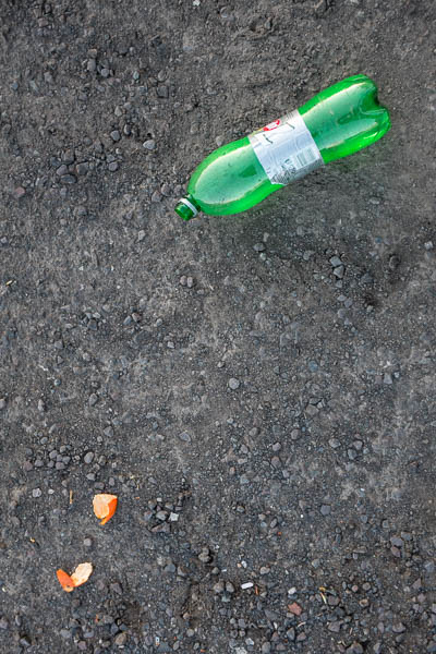
On the cover of the book is (the famous) picture of a tricycle, with some anonymous bungalows and a big American car viewed across the street in the background. One morning, as I walked up Theydon Street to the bus stop, I saw a tricycle parked outside one of the houses. I have known about Eggleston for years and although I had not yet started upon this course of study, I recognised this as an opportunity to make some (referential) art, of entering into the Eggleston’s world and of transplanting a tiny bit of his Memphis into my Walthamstow. I reached into my jacket pocket for the Olympus XA which lived there…

fig.1 – walthamstow c.2013

…and click. Like Eggleston, I took a single frame. It’s not quite right. I couldn’t get far enough away from the trike to centre it in the image (and in the space). The tip of the handlebars is annoyingly cut off. Perhaps I should have put the camera on the ground and abandoned looking through the viewfinder. So, I’ve never done anything with the picture til now, but I always think of it when I see Eggleston’s original.


But I digress. After reading the quote from Szarkowsky, we are asked to reflect upon:

  •  Where does that leave the photographer? As a storyteller or a history writer?

A story teller uses narrative to make sense of the society where they live, as they see it. There may be a level of serious intent to their story telling or they may simply hope to entertain. People like stories. We’ve been being told stories since we were kids. When someone asks us, ‘How was today’ or ‘What happened’ we will generally reply by telling a story of some sort.

A historian is just a specialised type of story teller, telling stories that attempt to give a single path through the chaos of events. ‘History’ tends to exist at some point in the past (when I was at school, it became ‘Modern Studies’ after a hard cut off in 1945; now my son is studying the subject it includes events which I remember happening as news). ‘History’ is an academic subject with rules that historians are supposed to follow; it has sub-genres such as ‘family history,’ ‘local history’ ‘social history’ etc. When ‘history’ becomes about an individual it becomes ‘biography’; when history is about people known to the historian or the historian him- or herself, it becomes an ‘autobiography’ or a ‘memoir’.

‘History’ is expected to be made up from a consideration of ‘facts’ stored as such in archives (public, private or personal). These facts – often contradictory; often subjective; always positioned politically in their own time – are then sifted and sorted and hammered into a – supposedly – definitive ‘truth’. This ‘definitive truth’ is in turn able to be examined as – secondary – source material for later attempts to come up with another even more definitive ‘truth.’

This need for history to be written with a degree of hindsight seems to rule out any idea of the photographer working as a historian; possibly a photographer could view their work as parallel to that of a journalist – writing the ‘first draft of history’ – but I suspect that, for me at least, there is a less noble impulse at work than that. I think I take pictures of things that catch my eye and which interest me with a view to putting them together into more meaningful collections later.

We are not historians, but perhaps we are trying to second guess history and to capture things that later, after they have acquired the patina that time can bestow, will become its building blocks. We lay up images as if they were wines, or cheese, in the hope that the mundane facts that surround us will become objects of fascination later on. Some – holiday snaps, news pictures, fashion photography perhaps – like yoghurt or cottage cheese, can be served almost as soon as they are done (although they may of course become more interesting in time) while others will need to age for longer, like parmesan or stilton, in order to acquire the patina of history.

  • Do you tend towards fact or fiction?

Since every photograph I take is of a thing (or a number of things) that have existed in front of my camera – that old question of indexicality popping up again – the basic building blocks of my practice as a photographer can be seen as somehow factual.  But the real magic happens when I put these building blocks together, when I decide that this 30th of a second, belongs next to that 125th.

Since every photograph I make is the product of a string of my decisions – I should stand here, I should cut off the frame there, I should open the shutter… NOW! – these individual facts are formed of – at best –  subjective truths. I exclude much more of my experience than I include. Where I stand in relation to the subject – to use the famous example, when I photograph a demonstration, am I standing with the protesters confronted by ‘the pigs’ or am I standing behind the policemen, looking at ‘the mob’ – will determine the nature of the fact that I present.

The french word histoire has fewer connotations of an academic pursuit than it does in its modern English form. Henry Fielding’s most famous novel has the full title, The History of Tom Jones, A Foundling; it is of course a fiction. It is also intended to be read as a story, with the reader aware that  – while all the things that happen in the book have probably happened somewhere, sometime – they are intended to draw lessons from it about life and society.

‘A fiction’ is not necessarily to be equated with ‘a lie’; but it does include an awareness of the extent to which it has been constructed from its elements. Eggleston painted a picture of a place that was very like the Memphis he lived in, but managed to distance himself (and the viewer) from any attempt to portray an all-encompassing portrait of the city. He is operating at some distance from W. Eugene Smith’s obsessive and doomed attempt to encapsulate all Pittsburgh. Eggleston tells his story (or possibly more accurately, recites his poem) about a place that is a bit like the real city of Memphis. I have seen him speak (at the National Portrait Gallery two Julys ago now) and when he does – even when he’s being probed by Sean O’Hagan – he’s giving nothing away…

  • How could you blend your approach?

I thinking blending could come from softening (or removing entirely) the relation between the subject matter and its original context. You can picture something in situ or you can take it away for photographic attention  later. If it is too large to move, you could picture it in some way that limits the clues about it circumstances from around it. The less there is to help ground something, the more easily it floats free in time and space. As such it becomes both more and less itself and less rooted in the specificity of where you found it.

The absence of people in Eggleston’s picture of the trike means there are none of the clues that we can read from people’s appearance. The title is vague – Untitled, Memphis c.1969-70. The (koda)colour palate of the film and the styling of the car glimpsed through the space under the trike’s frame help place the frame in time, but no more accurately than the title. The house in the background seems suburban, American. The tricycle, looming huge and abandoned, maybe says something about a type of childhood. Maybe the photographer’s, or maybe yours, the viewer’s.

Then you could take it one stage further and remove the tricycle from the scene entirely, putting it in front of a neutral backdrop. It would cease being something from the place that William Eggleston is guiding you through and become closer to occupying the space of an item from a catalogue of childhood.

  • Where is your departure from wanting/needing to depict reality?

Some things need to stick as close as they can to an objective reality; some things simply matter enormously in the here and now. These things probably will form part of histories yet to be written. Robert Capa’s Loyalist Militiaman at the Moment of Death, Cerro Muriano, September 5, 1936, still would be a striking photograph if it were a set-up, but once you start wondering about its provenance you have much less space in your head to consider what it means for people to be being killed, in Spain, on that hill at that time. This weakens its propagandistic value considerably. The title makes a huge claim for the photograph; if it is ‘a lie’ how can we trust the photographer? How can we trust the people who publish the picture? How can we trust the people who use the picture to gain our sympathy?

‘The camera never lies’ but if in fact it does (or rather the person wielding it lies about the photograph) how can we ever believe anything? We certainly can believe a little less in the cause of the Spanish republic and – if we were suffering this crisis in the nineteen thirties – become less likely to join the International Brigades or to donate money or to lobby our MPs to intervene.

To go back to Grenfell Tower and my previous assignment, it was important not to fabricate anything and to make sure that the pictures taken in the surroundings of the tower were not misdescribed by the words: the Avondale picture was taken from the Avondale Conservation Area; the Ladbroke picture was taken looking out from the heart of the Ladbroke Conservation Area. The blackened tower block with its empty windows needed no trickery in order to be recognisable as itself, even when partially hidden by trees of buildings. The words themselves are real sentences taken from the real planning documents, which are still available online. I have checked. I have been scrupulous.

I don’t think I would ask a militiaman to pretend he’s just been shot, but the way I presented my – verified, fact checked – words in the Grenfell assignment has no correlative in the objective world. I made those pictures from words printed in a ‘typed’ typeface scanned and then layered them onto a photograph of a record card; I rearranged the words from Gary Younge’s article in the Guardian so that they fitted the aspect ratio of my images, and missed out the other words that surrounded them. I tried my best (and I think I have succeeded) to hide my efforts to fabricate these ‘documents’ and, at their heart, the words – ‘real’ words, from ‘real’ records – are really true. The key thing here is that the viewer is not distracted from what the diptychs ‘mean’, by the facts of their construction.

In Barthes’ essay The Rhetoric of the Image, one of the things achieved by anchoring text is a reduction in the myriad number of possible meanings (the polysemous nature of the photograph) that an be drawn from a single image. It is this process of limiting meanings that allows pictures to be used as evidentiary ‘fact’

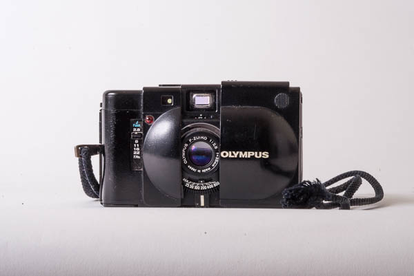
fig.2 – this is not my olympus xa

Most of the time it doesn’t matter a bit whether there is something made up about my photographs, any more than it does about the made up bits in novels which take place in the past and contain real events and real people – War and Peace, say or Pat Barker’s novels set  during the first world war that feature her imaginings of ‘Siegfried Sassoon’ and ‘Wilfred Owen.’ Where it does matter is when there are real (and notice I haven’t used inverted commas here) consequences to what the fiction means. There may well be corporate manslaughter charges as a result of the Grenfell inquiry; people have died; people may go to prison.

More trivially, a passport photograph has to look enough like the person holding the passport to allow a border official to identify them. While I would never cross a border without my glasses, I have to take off my glasses for a passport photo. I could  have recently grown a beard which will be shaved off years before my shiny new, ten-year passport expires. My passport picture both looks like me and it does not.

History is supposed to be objective; my experience of things that may form part of history is highly subjective, and rendered even more so by the set of decisions I make (consciously or subconsciously) as I take a photograph. All my pictures exist somewhere on a spectrum running from relatively uninflected to really rather constructed. If they seem to warrant a factual treatment, I’ll try to limit the range of available meanings to those that match my own take on the events; at other times, I’m happy to leave a much wider range of meaning for the viewer to piece together their own sense of what the picture is ‘about’ but even then, I try to limit the meanings to ones that fit ones that I’m comfortable with.

It’s all in the telling, I suppose.


When I look at my tricycle picture now, I still see Eggleston’s original, floating behind it (or maybe in front of it) but I also see a constellation of circles – the three wheels of the tricycle of course, three wheels on the cars over the street and the wheel at the side of the wheelie bin. And I really like the way the trike’s seat sits on the wheel of the black car. I don’t mind that it is an imperfect appropriation of Eggleston’s original. It is something else and that is just fine.

fig.3 – walthamstow c.2018

And, of course,  I still find myself thinking of William Eggleston from time to time, when I’m out with my camera.


Reference:

  • Eggleston, W – photographs –  & Szarkowski, J – introduction (1976) William Eggleston’s Guide Museum of Modern Art, New York.

exercise 4.2 – words and pictures

oxford circus as a gallery space

Choose a day that you can spend out and about looking with no particular agenda. Be conscious of how images and texts are presented to you in the real world – on billboards, in magazines and newspapers, and online, for example. Make notes in your learning log on some specific examples and reflect upon what impact the text has on how you read the overall message.

– IaP Coursebook p.79

Pictures on display –

fig.1 – an absense of beaches

The first pictures I see each morning usually are these, hanging outside the bathroom door. They are photo collages, assembled on a photocopier by German artist Ursula Keller  and purchased from the accountant I shared with her (or possibly the owner of the gallery in Glasgow that represented her) at the time they were exhibited there (around 1995).  The common title of the series – ‘Given the obvious lack of beaches’ – is based on a hopeful quote by Glasgow’s provost, Pat Lally, along the lines that ‘Given the obvious lack of beaches in the city, we need to give our visitors some alternatives.’ Keller had provided some beaches (and palm trees, and sunsets) from elsewhere and added them to Glasgow landmarks like the Barrowlands Ballroom and the University tower.  The title opens them up, preventing them from being merely an interesting visual jape and locating them in a place where they can comment on the shift of Glasgow from being ‘about’ heavy industry and razor gangs to being somewhere that was ‘Miles Better’ – a cultural rather than an industrial destination for people who did not live there.

fig 2 – polaroids

Another grouping of pictures in my house consists of four polaroids taken by me of shadows moving around the house’s rooms.

While Keller’s titles are complementary, these have simple date/time titles orientating the viewer to the point in time when these unique traces were plucked from the sun’s progression around the house.

They’re pretty abstract photographs – you need something to anchor them, if only to let you know that you’re looking at moments in time, and the patterns are made by that .


fig.3 – on the way to the tube

Images in the Street – 

As I cycle to the station, I see advertisements – on buses, on hoardings and on buildings. I go into Tesco to pick up the paper. The building itself is covered in pictures (to the left of fig.3 there’s a bowl of curry, labeled EASY) and surrounded by words. The text that jumps out here is the one they want you to notice (whether you are going to buy anything or not) – FRESH; it relates easily to the massive bowl of green salad. But it’s not quite as fresh as all that – like most of the food in an ‘express’ (or ‘local’) grocer’s the salad is preprepared, something covered by the small print – “Salad you won’t have to wait for” – this is a fuel stop, not an artisanal bakery or greengrocer. It’s opposite the station so you can pick up something for supper on your way home. But it’s the word FRESH that hooks you and sticks in your mind so you know that it’s an alternative, next time you need it.

fig.4 – you could be this person too (or if not, that one on the other side)

And then, when you enter the shop, you’re flanked by a pair of larger than life people offering you food (they are literally ‘putting food on the table’). One is male, one female. both are captioned with a very personal description of the food they have just made (from FRESH ingredients; from closer to scratch than popping a ready meal into the microwave) – these are ‘Jane’s Fishcakes for two, or one’ – you are invited to identify with these cooks; they are like you, they care about food, they smile invitingly, proud of their efforts. They even have their own signature dish…


They are also at odds with the reality of the inside of the shop of course, but never mind, you can aspire to the sort of life they seem to embody (even if it is possible to infer from that caption that Jane is currently single, and eating double portions to compensate) and maybe even go to a full-on supermarket (a ‘big’ Tesco) at the weekend, and do some proper cooking then.

I buy my paper and cross the road to the station…


On Public Transport –

On the tube (in the tube?) the sort of adverts and the amount and type of information varies according to how you will encounter them. London Underground is a complex machine for processing people and moving them from one place to another. There are places where people are expected to stand (on Platforms) and places where you really don’t want somebody to even break their step (in the concourses) and places that are somewhere in between (escalators, where people will stand – on the right – and move past the walls at a predictable speed). And then on the trains you will be static (sat, or strap hanging) for long enough to read text and even jot down a URL or phone number (or take your own picture with your phone).

I’m not sure whether it is men or women who are supposed to be drawn by the Heist tights’ ad: I quite like a shapely bum, but I’m not going to bet my bottom that my tights are better than theirs. Am I supposed to buy a pair for Fiona? Or do women look at other women’s pirouetting arses and want to emulate them? It has associated the word Heist in my mind with tights; with nice tights that do nice things to women’s bottoms; perhaps this is all it needs to do.

Versace Jeans are hardly evident in the pictures that line one of the station’s halls, but the pictures  – black and white, moodily lit, medium sized and in frames- combine with the cumulative display to create the idea of an exhibition in a gallery. Versace jeans are ‘art’ they are a cut above more vernacular jeans. But I’m still not likely to exit the station onto Oxford Street and buy a pair. But, again, the brand has stuck in my head with a set of associations. Boo Hoo (also plastered all over the station) clothing is a bit flash, a bit flirty, a bit young, a bit common; Versace is for people a bit older, with a bit more taste.

The London Transport adverts (posters) encouraging approved behaviours in us, the passengers, are obviously drawing on Gillian Wearing’s series from 1992-93 showing people with placards, but without the tension between the words on the placards (which in TFL pictures are printed, so official, rather than the handwritten interior statements in Wearing’s) and the appearance of the person depicted. Again there is a reference to art, but its effect here is to comfort: the people holding the placards smile; if we all did as the words say, the tube would be a nicer place.

(Interestingly at Euston, the same pictures have been modified – presumably by station staff – with the addition of glued on, handwritten statements, like “Welcome to Euston”; these instantly seem less corporate and more personal; I wondered if the particular TFL staff members in the altered pictures worked at that particular station)

Heading home from Oxford Street, who wouldn’t fancy a holiday, somewhere warm with a pool?  Heading home from Oxford Street after a had day’s shopping, feeling a bit skint, who wouldn’t fancy a chance to save some money  on that holiday? Don’t the kids look happy? don’t they seem free (as well as ‘free’)? Doesn’t the water look cool? Wouldn’t you like to be anywhere else but waiting for your train home?

And then, sitting on the train, you have time to look at the pictures arrayed above the heads of your fellow passengers. Often they have exemplary people, ready for you to identify with them and to find out more by reading before signing up to realise your dreams through education or through buying clothes or through  guaranteeing your family’s prosperity by insuring yourself before you die and leave them in penury or through investing in some sure-fire winner.

One of the things that is odd about the ‘Beach Body Ready?’ ad discussed on the OCA Blog  is that it is confrontational rather than aspirational. The Rodchenko-esque (another borrow from art) man looks off, like the woman who has realised her bold dream, into some future-tense middle-distance; the woman in the bikini looks at you daring you to eat her protein-rich whey powder and get into shape for the summer.

And I do wonder whether all the borrowings from art are to make the advertising people feel better about themselves and whether they are dropping in a bit of Rodchenko here, a bit of Gillian Wearing there as a way of nodding to the people who know like me (or you of course most likely if you’re reading this) that they’re capable of more somehow, like an actor saying ‘I don’t have to do this rubbish you know – Larry thought most highly of my Laertes…’


In the Newspapers –

I’ll be writing more about news pictures and their relation to their captions and headlines in a later exercise, but I’ll say something here about layout on the page and the cumulative effect of groups of photographs.

While i’ve been collecting newspaper pictures, there have been two stories that have been illustrated by galleries of faces – London knifings (in the Sun) and the Guardian’s investigation which kick-started the reexamination of how the home office treats immigrants. In both cases you are presented with a typology you don’t want to be a part of. In the first you have the victims of knife crime and in the other, the members of the Windrush generation, caught out by their lack of the necessary documentation and so threatened with deportation.

The knife victims’ pictures are obviously not taken by a professional – everything about them screams ‘cameraphone’; they are dead; the pictures have been provided by relatives or combed from social media sites. The pictures remind the viewer of other galleries – of the world trade centre dead or British armed forces’ personnel killed in Iraq, or last years victims of knife crime in London. You read the headline to find out about the specifics of the story, but you already know its outline.

The Windrush pictures on the other hand have been taken by a professional. Their arrangement still says ‘victim’, but there is still the chance of the shared situation they find themself in improving. After all, they’ve a newspaper and a professional photographer on their side. You read the text to find out who they are and what has been done to them. You hope that something will be done.


Specific, Technical Pictures –

We are in the middle of the process of selling my house and buying another one. We have now reached a point where we are poring over the survey of the house we are buying. It has a number of directly illustrative photographs, showing details of points that are described  in the text:

‘a previous masonry paint finish has been removed in recent years and defective bricks have been sensitively cut out and replaced (see fig. 10 which shows such a repair)’

…and that is exactly what you see when you look at the photo. Taken on their own they would seem a strange set of seemingly randomly chosen details; with the text the are of one thing and of that thing only. Later in the survey, it comments that another described detail is visible on Google Street view which is offered as evidence that a a specific crack has not got worse since the street view pictures were taken in 2008 and so appears to be long-standing and not anything to worry about.

In the survey the pictures are of things you – the emptor – should consider carefully as part of your caveating. There, look – we’ve told you; we don’t think it’s serious, but – if it turns out to be – don’t say you weren’t warned…

You can contrast these tightly composed pictures with the expansive wide shots of my flat (or indeed the house that we are buying) from the estate agents’ sales brochures. There the pictures are about conjuring up as much space as possible and drawing you in to imagine living in such a place with ‘high ceilings’ and a ‘large kitchen diner’ opening onto a ’50 foot garden’… Yes please!


Most of the pictures I see in my day-to-day life are presented to me as hooks, designed to get my attention and draw me into reading some text. That text tends to tell me what it is I’m looking at, particularly if there is any potential ambiguity in what the image ‘is of’.

research point – barthes’ ‘the rhetoric of the image’

Read ‘Rhetoric of the Image’ and write a reflection in your learning log.
• How does Barthes define anchorage and relay?
• What is the difference between them?
• Can you come up with some examples of each?
• How might this help your own creative approaches to working with text and image?

– IaP coursebook – p.79

My final assignment for Context and Narrative drew heavily on Barthes’ essay by using it to provide a model for a ‘made up’ image in the form of the pasta advertisement, juxtaposed with a poem. In planning the image I engaged quite closely with the text, but I shall try to recap here. It is certainly a text that warrants careful re-reading.

Anchor and Relay:

Both are terms relating to text associated with images, a practice so widespread that it is difficult to find ‘pure’ uncaptioned images anywhere. Images are viewed as ‘polysemous’ with a huge range of possible interpretations and meanings. Text can dominate this plurality of meanings when the image ‘duplicate[s] certain of the text by a phenomenon of redundancy’ (anchorage) or else the text can be used to ‘add fresh information’ to that contained within the picture (relay).

So:

  • Anchorage – Text answers the question ‘What am I looking at?’, narrowing down a number of possibilities to that expressed in the associated text. The image becomes a single thing, with an approved reading supplied by the words. In other words the text dominates the process of producing meaning for the viewer. This is the most common way that text is used with images (in newspaper captions, advertisements etc) and represents a reduction of the possibilities of the image.
  • Relay – new, extra information is provided by text (or speech in the case of comic books or films) which augments and moves on the content available in the image itself. Instead of dominating the image, text works in a complementary way to the content of the image.  Image and Text play equal parts in a narration, organised as a series of syntagms (ie in a sequential, progressive way).

Anchors lend themselves to certainty, shutting down options and seem directly related to an indexical reading of the photograph as a direct objective trace of a real object; they specify which set of connotations are sanctioned for the use of the viewer. Relays offer more scope for interpretation and work on the part of the viewer, expanding the possibilities for both connotation and more complex narratives. Relays also  – at least tacitly – acknowledge the possibility of the existance of a narrator, telling the story, while anchors present a story as existing, a latent presence within the image.

Some Anchors – Labels on pictures of food in menus or above the service area in take aways; newspaper captions; labels in family albums; simple descriptive titles.

Some Relays -Dialogue in films (or caption cards in silent films for that matter); Allusive titles relying on knowledge not contained in the image (classical painting based on Greek or Roman myths, say); captions where the information relayed is not present in the image.


I could use this, immediately, in revisiting my (superceded) early idea for assignment three. I had hoped to be able to show my thought processes as I chose where to be at set points in my journey to work in order to be able to make the simplest transition to the next stage.

Starting at Walthamstow Central, sitting in the 3rd coach from the rear of the train allows me to step straight into the way out at Oxford Circus, where – after I go up one level on the escalator – I can then get the easiest, least congested path to the Westbound Central Line Platform. Then if I wait by the waste bin, opposite the peeling paint, I can get on the next train after arriving at White City, disembark and go straight up the stairs.

There was way too much information to get across here, to leave it entirely to the pictures. There is a lot of discussion online about the limitations of the philosophy of ‘show – don’t tell’ in visual story telling; indeed Barthes questioned the idea that we are becoming a more visual/less verbal culture in the original essay in 1964. If I could have added text in some way – sometimes anchoring by reducing the chaos of what you were looking at to a manageable chunk of information; in others adding relays such as recordings of (or the script for) announcements about the next station – I maybe could have got it to work.

I think I will try this, using a mixture of new pictures and audio recordings to augment the slideshow version of that assignment for exercise 4.5…

Reference:

  • Barthes, R (1964) Rhetoric of the Image from trans. Heath, S. (1977) Image Music Text (Fontana Press, London

I have spent a fair amount of time working through the search results produced by using the search string  – Barthes Anchor Relay – on google. It is interesting how everyone seems quite certain of what an anchor is; thinking on relay – mostly still centred around Barthes’ identification of it as a feature of cinematic or comic strip narrative –  is much more diffuse.

exercise 4.1 – looking at advertisements

OCA tutor Dawn Woolley writes a regular blog  called ‘Looking at Advertisements’. Read one of Dawn’s articles and write a blog post or make a comment on the site in response.

– IaP Coursebook – p.75

I looked at two of Dawn’s posts: the Protein World “Beach Body” post and then followed up by having a look at the related post looking at an earlier Protein World advertisement.


I had picked the first post to read because I remembered seeing the advert on the tube when it’s campaign was active in 2015. I remembered noticing the advert for two main reasons: when I first saw it, I was struck by how confrontational the image of the woman was; then a few days later I noticed it had been overwritten in marker pen with a phrase I hadn’t seen deployed in public since the late 80’s – “This Offends!”

The original advert – I saw it as one of the array of advertisement cards above the windows of a tube train, angled down at me – was above my eyeline, compounding the way that the centre of the image is firmly set around her navel. it is her body (or rather her flat, evenly tanned stomach) not her face that is ready for the beach. This is less apparent on a screen, although one of the blog illustrations does show it in its original setting on the tube.

The discussion of the photography in Dawn’s blog (and in the comments that follow)  is mostly concerned with the passivity of the woman in the image with her eyes shut, or in shadow. I (the viewer of the advert)  am looking at her; she is not looking at anyone. I am active; she is passive. Indeed, looking at the image and the way the shadow falls on the yellow background, it is not clear whether she is lying down, on a yellow beach, sun bathing, while I am positioned to stare down at her. There was concern that – unlike the earlier advert featuring a man – the photograph could not be traced back to an “art photography” context, but not that this would in some way validate the objectification.

It appears to fit in nicely with Berger’s critique of the treatment of women as subjects of a male gaze in fine art (in Ways of Seeing).  I followed the link of the 2015 post back to the post about the previous year’s ad:

Here the discussion was much more around the appropriation of the style of Alexander Rodchenko’s photographs, taken in the aftermath of the Russian revolution, which often featured pictures of heroic individuals, rendered strange by the angel they were viewed from. Unlike the woman, with her closed, shadowed eyes, the man’s chin juts out and his eyeline is set on some distant horizon where the promise of the ‘Protein Revolution’ – another, link back to Rodchenko, verbal this time – is realised in all its glory. His right arm is frozen as it swings over the camera. It doesn’t matter that you can’t see his pace properly because this is  synecdoche (the figure of speech where a part stands in for the whole) – it doesn’t matter that you can’t make out the face, you’re looking at the six pack.

Figures of speech of course are drawn from classical rhetoric. Similarly – as much as the allusions to Rodchenko and revolutionary Russian, this draws on half-remembered ideas about classical statuary. The man in image two is standing, frozen, towering above you like a collossus; the woman could be a caryatid. And photographs of people in poses drawn from classical statuary have been used to legitimise the sexualised gaze pretty much since photography began.

Just as the “beach body” picture could be seen to fit into the category of the ‘cheesecake’ pinup, the male torso depicted here is a fairly standard ‘beefcake’ shot, objectifying a paradoxically feminised image of the hairless but honed male body with the repeated muscular V-s pointing down below the (eyelevel) waist-band of his trousers. This is homo-eroticism, but not so overtly that a militantly straight body-builder would be put off buying the product,

I am not the target audience for this. I feel no envy (or a wish to be like the man pictured). I do not desire the man himself. I am certainly not going to pick up a tub of whey protein and take it back home to Fiona so she can get herself beach-body ready in time for summer.

However, I do think of Clive James’ description of Arnold Schwarzenegger looking like “a brown condom stuffed with walnuts” and this in turn leads me on to Steve Bell describing David Cameron as looking like a condom stuffed with ham. Neither comparison is flattering. Both are funny. Both are powerfully visual. The fact that this is what I think of locates me as someone who sees themself as above all this bodybuilding stuff, as a mind rather than a body. I also think of the pilot in Airplane asking the boy who is visiting the airliner’s cockpit, ‘Son – do you like Gladiator movies? … Have you ever seen a grown man naked?’. I find it all slightly ridiculous while hoping I don’t come across as appearing superior (not a flattering look).

Returning to the adverts though, it’s interesting how poor the text is at closing off these unauthorised readings of them. I assume that – as a man – I should wish to have a six-pack and am prepared to do something about it; how I am supposed to regard the woman, I don’t know; I have even less idea of how I would be supposed to view her if I was – the assumed target of the second ad – a woman. Maybe I’m supposed to make women envious simply by going, ‘mmm –  nice’ but she seems too fierce (or as I said at the begiining of this post, confrontational) for that. Both pictures seem to be too open (and to remain so, despite the text) to prevent unintended readings at odds with their text. They are strong images, and they provoke; if they were less strong, I assume that – as someone who is not part of their intended audience – I would not remember them. If the beach body ad was less strong, it would not have been defaced by angry women. Similarly, a weaker image in the first ad would not have led me to distance myself from it through humour. Both adverts provoke, but not necessarily in the way that their makers intended.