Monthly Archives: July 2014

the frame # 9 – cropping and extending

MIA Bus Station, Florida, USA

Again – like swapping the camera blithely through ninety degrees – I think I have been cropping photographs fairly consistently during this part of the course, making a banner header for most of the exercise posts. I definitely like panoramas, on screen at least – I don’t think I often get any thing printed that isn’t fairly close to either square or a standard 3:2 frame…

Generally, any hesitations I have over changing the frame from what was shot,  come from reducing my ability to view (either as prints or on screen) large versions of the resulting pictures. The reason can be seen in the Miami Airport Bus Station picture, which was taken from a scan made by Snappy Snaps at the same time as they made me a set of 6″ x 4″ prints.

Looking closely at the original or not that closely at the crops, shows how low the resolution was for this. Also, while I don’t seem to mind isolating a small section of a negative, I am definitely reluctant to alter the aspect ratio. I’m not sure why, but I suspect that it has something to do with liking the regular conformity of a series of pictures, as much as anything. That said, there seems something horribly random about composing a picture through a viewfinder and then changing its shape radically later.

This probably ties in with a reluctance to desaturate digital pictures to make black and white images and the fact that I own one panoramic camera with a swing lens and quite a few medium format cameras that take square pictures. I also suspect that this is something I need to confront and get over.

Anyway, here are a couple of cropped pictures with comments inline with them when viewed as a slideshow:

1 – Miami Airport Bus Station, April 2014


2 – Alice – Turbine Hall, Tate Modern, May 2014

 3: All Souls’ Church from Oxford Circus, June 2014

All Souls' Church - Regent Street London. June 2014

All Souls’ Church – Regent Street London. June 2014

The idea of extending pictures is one that interests me. This (shot at the same time as I was doing Exercise # 5) is an attempt to get a decent, large, clean view of All Souls’. With a bit more work to neaten up the joins (not really visible here, but definitely present if you look at a larger version) it would be quite a good picture, I think, albeit a narrow one. It was manufactured from 3 portrait shot, meaning the overlaps were quite near the edges. More shots, or possibly more shots in landscape might have meant that the bits that matched were closer to the centre of the frame, with less likelihood of distortion.

I like the idea of creating long, thin (or short, wide) pictures of two parades of shops on the Lea Bridge Road, at the bottom of my street. I would like to make them from a large number of stitched together pictures, taken moving crab-wise along the edge of the opposite pavement. I have had one go already at the first of these (wonderful shops painted yellow, green, orange, pink, red and green etc) but realised as vans came along and parked obscuring the shops, that i needed to choose a quieter time to do this.

Once I have managed to get the series of shots (taken I think with the camera in portrait and with the shots overlapping by at least a third) I expect to need to do some perspective correction and then to spend ages stitching the pictures together manually. It should be worth the effort, even if its just to record what the shops were like at a set moment in time. Even better would be to come back and repeat the exercise in a few years, giving a sense of how the area has changed. Once I’ve got the first sets taken, I’ll  post here, and then leave them, and the shops, to mature like a good wine…

the frame # 8 – vertical and horizontal frames

landscape & portrait

landscape & portrait

I’ve been taking pictures in both landscape and portrait throughout this section of the course (and # 4 is entirely portrait) and while I haven’t specifically gone out and done a 20 pictures both ways shoot, I think I’ve thought about which format suits a picture for pretty much each exercise I have done.

Also, looking back through the latest hundred and ten pictures I’ve posted to flickr, I see that about two thirds are landscape, a sixth are portrait and a sixth square.

I think the four to one ratio of landscape to portrait is as much down to the slight clumsiness of using a camera rotated through 90 degrees, rather than any inherent dislike of tall thin pictures, as I seem to remember that any time I’ve used a half-frame 35mm camera (which take two portrait ratio pictures on each frame) the majority have been portrait rather than landscape. A lot of it comes down I think – like an unwillingness to change prime lenses, particularly with screw thread fittings rather than bayonet, or to get out my tripod – to my laziness, something I am trying consciously to overcome over the course of AoP. But then, another thought on this  – and I’ve just spent 5 minutes playing with a camera, trying both eyes and rotating the camera each way – that it is possible that the awkwardness of using a camera rotated through 90 degrees may be greater for right-eyed, right-handed people, while I’m left-eyed and left-handed – certainly, the keyboard shortcuts for rotating an image generally are more faffy for doing so the way I generally have to (anti-clockwise, I think) leading me to think that most people twist the camera the other way, which certainly feels much less natural than the way I do. Which is some compensation at least for not being able to do the ‘keeping your left eye open, looking for the next shot while your right eye looks through the viewfinder sited towards the left-hand-side of a Leica’ thing, that Joel Meyorowitz does in The Genius of Photography

The 1/3  that are square ones – and I should say here while we’re on questions of format, that I rather like square pictures and feel there are loads of things that suit the huge range of symmetries that are available to you –  are all medium format, from  6×6 negatives and positives, and simply show that I’ve been playing with a variety of mf cameras recently, rather than that I’m cropping stuff down from rectangles into squares, but anyway, cropping’s a different post entirely…

the frame # 7 – positioning the horizon

Hackney Mashes - Sunday 29th of June, Morning

Hackney Marshes – Sunday 29th of June, Morning

A reshoot, as the first time I didn’t have my tripod with me and really, I should have. I also tried shooting over the Marshes and the Lea towards Clapton, but it the results were less good than these, taken just over the red bridge at the start of the Hackney Marshes football fields looking down towards the orbit and the olympic park.

  1. The emphasis is on the foreground, and the gorizon seems a long way away, with a great deal of space to cover before you would get there. Something – anything – happening in the foreground would have justified the emphasis on the space more though, here it’s just an – admittedly nicely curvey-bordered – expanse of grey.
  2. Better, but still too much empty tarmac. I had tried to get some painted writing, giving directions to some cycling or running event, that was closer and to the right into the shot, but my tripod was in the way of the joggers and cyclists and  the overall view of the grass as it stretched away to the horizon was less pleasing.
  3. Quite nice. The 50:50 balance between sky and earth is offset by the runner who links across the horizon into both.
  4. The sky and the distance starts being what the picture is about. You become aware of the cricketers and the runner is no longer crucial to giving some focus to the picture.
  5. The sky now dominates while the goals to the left and the cricketers both give a sense of scale to the picture while anchoring it to the earth somehow.
  6. But here, the sky is about to break free of the earth and the picture is almost flat again. Possibly just works because of the variety of buildings on the horizon. It might still work if the top was cropped slightly so the edge of the frame was at the top of the cloud on the left.

All pictures taken with a Nikkor AF-D 35mm 1:2 lens on a Nikon D50. ISO 200; f8; 1/640th – 1/1250, depending on how much sky was in the picture.

the frame # 6 – balance

I’m going to park this one for now, as I’m struggling with the ‘relative weight of things’ v ‘how far they are from the edge of the frame-ness’ of all this. I am fine with ideas like the the golden section or the rule of thirds, but turning it all into little weights on a balance diagrams is something I find really hard (even though I think the pictures I’m looking at are balanced). Rather than get stuck here, I think I’ll come back to this after doing some more reading on Gestalt, Golden Sections and that, if I have time…

But here are some the pictures (all taken around the taking of photos for the other exercises) that I was going to use:

I have particular difficulty with doing this exercise with portrait format images by the way (even though I don’t have a problem with swapping the camera through 90 degrees) – not sure why…

assignment 1 – personal review

Demonstration of Technical and Visual Skills

  • Materials: as a totally online assignment, this only really applies to the way the pictures are laid out on the blog. I think the way i’ve laid things out on the virtual page demonstrates the beginnings of being able to control the way wordpress works, but I suspect that without the ability to work directly with the style sheet, I won’t be able to take this much further.
  • Techniques: the first part of the course has dealt pretty exclusively with the effect of different lens focal lengths, framing (both at the time of shooting and altering this as part of post-production) and the placing of objects within the frame;  I have consciously chosen the way I have applied this to the pictures – there aren’t any “happy accidents” – and things like fairly constant use of stopped down lenses to keep as much in focus as possible is deliberate; I applied techniques to the pictures I had decided to take, and generally they have turned out as expected.
  • Observational Skills: it was enjoyable to spend large parts of my day with a part of my head ticking away, translating things that were around me into usable representations of the abstract concepts that made up the pairs.
  • Visual Awareness: and likewise, I think I managed to isolate things in a way that allows the quality that made me notice them in the first place to be apparent, even if it is only in the context of the pair at times, rather than in a standalone picture.
  • Design and Compositional Skills: I don’t think any of the pictures jar as compositions, although the bit of the section I have probably most need to do more thinking about is the more formal stuff around balance and theories about the division of frames; the pictures feel right, but I don’t know if I could demonstrate why to my satisfaction yet.

Quality of Outcome

  • Content: some of the qualities depicted come across more strongly than others – I am unsure for example whether ‘smooth’ contains too many unsmooth elements, while ‘many’ feels nicely like a jostling throng of signs; generally though, I think all 17 photographs are worth looking at and engage the viewer on a level where they are not simply ‘a church spire’, ‘a man in long grass’, ‘a closed venetian blind’ etc
  • Application of Knowledge: the main knowledge required here was the ability to use my camera and to process the resulting images in a competent way; I  think I have achieved this.
  • Presentation of Work in a Coherent Manner: the commonalities between the pairs (one portrait, one landscape; the phonetic titles; the subdued colour) combine to tie the pictures together as a group, rather than leaving them feeling like a number of photographs that just happened to end up together; this is more obvious in the blog post, than in viewing the full-size pictures one after the other, but some of this sense of a conscious set still comes across, I think.
  • Discernment*: I think some of the subjects a unusual and tangential enough to qualify as showing discernment…
  • Conceptualisation of Thoughts & Communication of Ideas: as stated above, I think the pictures generally express what I want them to express; some do this better than others.

Demonstration of Creativity

  • Imagination: my approach to this assignment has been more observational than imaginative; I have seen pictures and then taken them rather than plucking an idea from my head and then making it flesh (or rather ones and nothings); I had some more obviously imaginative ideas for some of the pairs – an upturned glass which was half-full of ice and the same glass surrounded by a puddle of water for solid/liquid, say or using the same subject for each of the opposed pictures, finding the contrast in the same object – but these tended to clash with my dual-location scheme, and also would have slowed me down as, mostly, they involved a much greater degree of fabrication.
  • Experimentation: I have used equipment more consciously in pursuit of an affect than I have generally done in the past; the part one exercises were genuinely enjoyable to plan and shoot, at least in part because they involved actually putting theory (which generally i was aware of but had not actually worked through systematically) into practice.
  • Invention: as with Imagination, above, I think  I have approached this in a way that is more observational than inventive.
  • Development of a Personal Voice: The pictures have all featured subjects that are part of my day-to-day life, so in some way reflect who I am; however, I think I have more of a sense of fun, or humour, than these pictures suggest; over the remainder of the course, I must strive not to come across as so po-faced…

Context

  • Reflection: to comment on the qualities of my reflection in this “reflection” piece seems dangerously close to crossing the line into navel gazing; I quite like my belly button and am glad it’s not an outie, but don’t feel I can comment here further…
  • Research: I think I worked out a clear approach to the assignment and then set out and followed it, expanding my list of subjects as I went.
  • Critical thinking (learning log): I am happy with the way my log is developing as a record of my journey through the course, with the proviso that i need to speed up my writing up both exercises and the work I am doing – reading and looking – around the practical stuff. I realise that I need to get back into the way of just writing and getting it down rather than agonising over every phrase…

* I realised while writing this that my idea of what discernment actually is was a bit hazy.  So I looked it up:

‘As a virtue, a discerning individual is considered to possess wisdom, and be of good judgement; especially so with regard to subject matter often overlooked by others’ – Wikipedia (my emphasis)

assignment 1 – contrasts

1: The Pictures

Black and White

walthamstow, black

1: blak (adj) – of the very darkest colour owing to the absence of or complete absorption of light; the opposite of white

wʌɪt - Of the colour of milk or fresh snow, due to the reflection of all visible rays of light; the opposite of black

wʌɪt (adj) – Of the colour of milk or fresh snow, due to the reflection of all visible rays of light; the opposite of black

Many and Few

signs - walthamstow

3: ˈmɛni (adj) – a large number of

wʌɪt - Of the colour of milk or fresh snow, due to the reflection of all visible rays of light; the opposite of black

4: fju (adj) – a small number of

 Smooth and Rough

walthamstow, black

5: smuːð (adj) – having an even and regular surface; free from perceptible projections, lumps, or indentations

wʌɪt - Of the colour of milk or fresh snow, due to the reflection of all visible rays of light; the opposite of black

6: rʌf (adj) – having an uneven or irregular surface; not smooth or level

Still and Moving

7: stɪl (adj) – not moving or making a sound

signs - walthamstow

8: ˈmuːvɪŋ (adj) – in motion

High and Low

9: hʌɪ (adj) – far above ground, sea level, or another point of reference

10: ləʊ (adj) – located at or near the bottom of something

Broad and Narrow

11: brɔːd (adj) – having a distance larger than usual from side to side; wide

12: ˈnarəʊ (adj) – of small width in relation to length

Diagonal and Round

13: dʌɪˈag(ə)n(ə)l (adj) – (of a line) straight and at an angle; slanting

14: raʊnd (adj) – having a curved shape like part of the circumference of a circle

Continuous and Intermittent

15: kənˈtɪnjʊəs (adj) – forming an unbroken whole; without interruption

16: ɪntəˈmɪt(ə)nt (adj) – occurring at irregular intervals; not continuous or steady

Light and Dark

17: lʌɪt & dɑːk (both adj) - with little or no light

17: lʌɪt (noun) – the natural agent that stimulates sight and makes things visible – & dɑːk (adj) – with little or no light

2: Notes on the Pictures

Black and White – Something totally white or totally black would simply have been absenses, rectangles of #000000 or #FFFFFF respectively.  Against the white of the online ‘page’, ‘White’ is merely very pale grey. The main difficulty in taking these was getting the exposure to the point where white was ‘white’ rather than mid grey without blowing the highlights and for black to be ‘black’ while retaining some sort of variation…

Many and Few – Good examples of the need to seize the moment and take the photograph rather than storing ideas away for another day. I spotted a perfect ‘Few’ on my way to work one morning but didn’t have time to take the picture; the next day a second agent had been engaged and the shot was no longer there. I ended up finding a different single sign, and made the picture posted here of it. Likewise, the day after I took ‘Many’ one of the signs, and with it the single cluster of signs was gone; a few days later there were only four.

Like ‘Black’ and ‘White’ I suspect ‘Few’ makes less sense on its own than it does twinned with ‘Many’.

Smooth and Rough – I took a few tryouts (I dind’t have a tripod with me, but wanted to see what it would look like with different lenses) for ‘smooth’ at a point when I intended to use the black and yellow tape for intermittent. As soon as I had it downloaded onto my laptop, I realised that the way the light bounced off the metal floor made it made a better candidate for smooth. Now I see how pitted the surface is in places and how the edges of the plates don’t quite sit level where they join in a conscious division of the frame, and I wonder if maybe it isn’t that smooth after all. Although of course, in the most part, it is…

Rough had been going to be a stretch of lumpy, uneven pavement gridded diagonally by the shadows of some railings. Then, one evening on the way home, the road round the corner was closed because of a burst water main. The pipe had been fixed, but the road-surface had not yet been made good. I was five minutes later home than I’d intended.

I like the was the yellow of the tape and the orange of the barriers stand out in the individual pictures as well as adding a further level of clash between the two images.

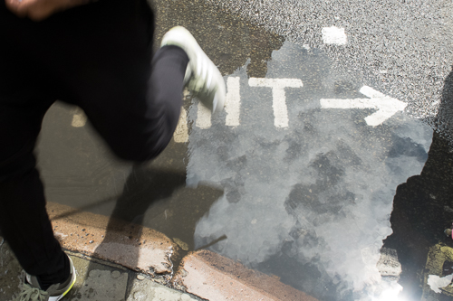
Still and Moving – ‘Moving’ is the only photograph in the assignment that wasn’t taken ‘for’ it; rather I was taking photographs of people’s reflections in the (rather unusual) puddle and the LOOK RIGHT sign on the road when people started moving through the frame. The effect worked, and I started thinking about a suitable ‘Still’ to pair with it.

‘Still’ is the only image that has been cropped heavily from a landscape formatted photograph. The portrait formatted version had too much foreground and didn’t have and of the cloudy sky; I didn’t like it, but didn’t remember that ‘Moving’ was already set as landscape and, anyway, I thought I was going to use one of the pictures of the couple seated on a bench with a barbecue for ‘still’ (see the contact sheet). This therefore is the only picture I would automatically replace with another if the assignment was going to be printed – there just aren’t enough pixels there to allow a print much larger than 8 inches on its longer side.

High and Low – ‘High’  took 3 goes to get right: the first had loads of reflections on the glass, so I gave up and remembered to bring my circular polariser the next day; then I didn’t have enough time to hang about waiting for someone to pause in the right position at the bottom of the converging lines and the glass awning, far enough from the edge of the frame, then the third day I got it. A good example of taking too many digital photographs, before arriving at one that works. ‘Low’ was relatively easy, once I’d worked out that framing the spire through the trees’ branches gave as good an idea of it being ‘up’ and ‘beyond’.

Also, of course, ‘High’ could be ‘Low’ and ‘Low’ could be ‘High’, but I decided to go with them titled this way round as it then became a reference to the camera’s (or rather my) viewpoint and – as such – could possibly do something to puncture shift puncture the purely literal, realist meaning of the pair of pictures, shifting them from the iconic to the indexical…

Broad and Narrow – I tried a variety of narrow lanes off Oxford Street before deciding that the one used here worked best. To make the space between the two buildings less, I used a 16mm lens, the widest lens used in any of these. Then, realising that ‘Broad; needed some context in the form of something that would express itswideness, I first tried lying under a pylon and shooting up, but it just felt enclosed; then I tried the side-on shot here and liked the way that wires stretch out in a balanced and symmetrical way form the central pylon, puncturing the edges of the frame and giving the idea of the picture being wider than it actually is.

Diagonal and Round – I’d seen the spire in the gap between a cafe’s two spans of awning and thought it would make a good picture. It then took at least 4 goes to get it right. Problems were caused by the way that if sunlight did not directly strike the cloth of the awning, either they were a mucky brown or the sky was completely overexposed; the sun only fell in the right place for an hour or so around lunchtime, and it wasn’t alway sunny at that time – a dull sky still was horribly overexposed. Then, once that was sorted, I discovered that you only got enough spire if you moved back from gap and compressed the image with a long lens. Eventually it was sunny, and I had my 70-300mm zoom with me. It would have been good to have added a tripod into the mix, but that’ll have to be notched up to experience…

It took so many goes to get ‘Diagonal’ right, that when I noticed yesterday that it should have been paired with ‘Round’ rather than ‘Curved’ that my heart sank, but I determined to find a definition of ‘Round’ which would fit Curved. Sorry. Next time RTQ! Also, I like ‘Curved’ – a pleasant and quick break from the stress of the sequence of composition shoot and like the inverted triangle of rhyming blue sky echoing the steeple of All Souls.

Continuous and Intermittent – On the way back to work after lunch one day, I noticed how the ‘give way’ lines at the end of Riding House Street were a lot less regular than most. ‘Intermittent’, I thought and also rather liked the way people looked, crossing the road. After a false start with a pedestrian crossing further down Regent St (on the contact sheet) I settled down and framed up the shot that’s used here and then had a bit of a wait for a single person to walk into the empty space at the left of the frame. I’d intended to do ‘Continuous’ with a bicycle skirting along double yellow lines, but then noticed how nicely continuous the cycle lane edging was where the road ran down hill to the bridge of the Lea that takes you to Clapton. I shot uphill and downhill, and decided that the downhill run worked better with its long inverted V almost as far as the vanishing point, even though it meant that instead of having a cyclist going away meant they were travelling in the same direction as the pedestrian in ‘Intermittent’.

Light&Dark – just the one exposure, properly exposed for both the light and the shaded parts of the image and with a nice variety of shapes created by the battered slats of the venetian blind.

3: Technical

All pictures were taken with a Nikon D50 using a variety of lenses with focal lengths ranging from 16mm to 300mm apart from ‘8: Moving’ which was taken with a FujiFilm x-20. ‘8 Moving’ was cropped to the same 3:2 aspect ratio as the other landscape format pictures. Post processing was carried out in Adobe Photoshop Elements 6 (mainly removing spots caused by my dirty sensor)  and Adobe Lightroom 5.

4: References

All definitions and pronunciations from Oxford Dictionaries

contrasts # 2 – ideas & approach

rejected internal contrast - large and small

rejected internal contrast – large and small

At the start-of-course chat with my tutor, Dave, we talked about putting additional constraints on this exercise, which seemed like a good idea. Thinking later, I also thought it would might also help if I established some extra contrasts between the two pictures of a pair and one way of doing this would be to choose two locations where all the pictures would be taken.

So, one picture of each contrasting pair has been taken in the area around Oxford Circus, representing the area I move in when I am at work and one has been taken in Walthamstow, the area where I live and am not at work. I don’t think it’s made the contrasts any more contrasty, but it did impose a discipline on the exercise and will have had an effect on the subject matter.

Further to this, each pair has one picture taken in landscape format and one in portrait (cropped down to a ratio of 5×4, following the advice on page 15 of The Photographer’s Eye (Freeman, Ilex Press, 2007) that vertically, 3:2 can seem “a bit extreme” due to a tendency to ground the subject nearer the bottom of a frame, regardless of orientation; also, I reckoned that there would be less of an onscreen clash of picture size moving from one image in the pair to the other). This meant that for at least the first picture of each pair, I had to take one in portrait and one landscape.

Lastly, I had hoped to get some sort of further technical contrast between pictures such as one taken with a wide lens and the other with a long lens or one stopped down and the other with the lens open. I didn’t manage to stick to this one for many of the pairs but I didn’t worry too much about it.

Then, to help come up with ideas for the pairs, I made took a library card for each contrast and jotted down ideas for either or both concept, as I thought of them, or saw things which might fit. I tried to use things that already existed rather than needed some degree of setting up, spotting things that illustrated the state I was looking for rather than making something for the effect. Some of the pairs, I rejected outright as I couldn’t get beyond some very obvious idea into something more interesting (sweet and sour was one of these); others went through several iterations of an idea before one came up that stuck and was photographable (many and few started as a busy tube carriage and an almost empty one before I spotted the cluster of 6 “For Sale” signs on my way to the tube; then it took a bit longer to find a single sign somewhere in town) and others moved from one pair to another (the yellow and black hazard tape on the metal floor was originally “intermittent” and only become “smooth” after I’d taken some test shots and seen how the metal reflected the light in a way that suggested a high degree of polish).

Once I had 3 or so of the ideas in place I began taking photographs, getting them onto my laptop and then – usually – doing one or more re-shoots. Very few of the pictures submitted were right first time, or even first shoot, although I think I got a better hit rate as the Assignment progressed and the deadline got closer.

As I went on, I got better at planning shots and having the right equipment with me for the first go – the early pairs (High and Low, Diagonal and Curved)  went through numerous iterations as I took in a different lens, or a tripod, or a polariser on the next day and the next; for the later ones (Rough and Smooth, Intermittent and Continuous) each picture was taken on shoot one after I had worked out what I needed to fit into my bag before I went out that day. If I can carry this on to the rest of the course I will have gone a long way towards eliminating the  (ultimately) non-productive hours I have spent on this part of the course, easily exceeding the 80 estimated in the introduction…