Tag Archives: portrait

assignment 2 – reflection

living-room wall, during the editing process for assignment 2 – walthamstow, september 2017

1: Demonstration of technical and visual skills

This assignment exists in two forms: online in the post that precedes this one and physically as five A4 prints + a printed sheet with the artist’s statement from the post. While most people reading this won’t ever see these prints, I consider them to be the primary endpoint of the assignment with the log version acting more as supporting material.

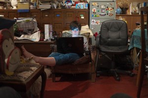
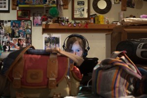
I am happy with the all five of the final pictures (and indeed there are others that I like as well, but that did not make the final cut). The composition works for me and the relationship between my subjects and the camera seems appropriate for the situation. Colour, contrast and overall balance of lighting likewise seems right. The light from James’ laptop and Alice’s iPad in the two interior pictures is possibly a bit too blue, too bright, but will pass (or be fairly easily rebalanced for assessment).

I have got to the point where I am acceptably comfortable working in Lightroom. I use it both as my main editor and, probably more importantly, as an organisational tool. For more complex retouching and for compositing, I use Photoshop (Elements – I’m a tightwad), but haven’t really had to here. The final piece of the workflow jigsaw has been getting the printing module to output files that come back from Loxley successfully translated into C-type prints (ie as old-fashioned photographic prints, rather than inkjet).

The prints that should now be with my tutor (and let’s wait til he comments, before I make any definitive pronouncements on them, myself) seem to have worked well. In the past, colour has generally worked as exected, but I’ve had issues with the way with the overall lightness of my prints – they tend to be much darker than the images appear on screen. This time both the small prints I make with the machines in Boots (see the header for this post) and the final submission prints seem consistent with what I’m seeing on screen. One of the differences between professional, restaurant food and the food you eat at your (or someone else’s) home is supposed to be that if you have the same meal several times at a restaurant, it will be the same each time; a home cook will not maintain that level of consistency…

I have been musing about the way the size of a print (or the size a picture displays on screen) affects the way that it is read) a lot recently, too. The bigger something is printed, the less likely it is to come across as a vernacular snapshot.  Part of the job of moving the assignment pictures away from being viewed as ‘holiday snaps’ has been achieved simply through printing them on a bigger scale than would easily fit into an album; a comment on one of my earlier posts by my fellow-student Holly Woodward commenting that she wondered how they would look as A3 also set me thinking. For the assessment maybe?

As well as making them seem more considered and worthy of serious consideration, size also of course, exposes technical imperfections like noise and poor focus. The prints seem generally fine technically; I’m less sure about them once they have gone through WordPress’ compression and resizing engines. Another reason for preferring the physical version of the assignment.


2: Quality of outcome

In the posts leading up to this assignment, I have focused a lot on the creation of images that can be read by people who do not know the circumstances of their making. So, how well have do I think I managed this?

The pictures on the ferry north, are sufficiently ‘boaty’ with the tilted horizon and windblown look of the people  combining to provide a simple and clear portrayal of people in a particular space. Also, everyone looks happy enough (with me, with each other, with the general blusteriness) for a general ‘off on holiday mood’ to be conjured up. However, I realise that my personal reactions to the site-specific backgrounds (the inside of Laura’s and Dave’s kitchen;  the beach at the third barrier, with Fiona and the sand castles) will not come across to others. So, do they succeed in signifying enough to work? The answer (obviously to such a rhetorical question) is that I think they do.

The pictures of James and Alice looking at screens clearly come across as people who are not fully present in the environment where they are pictured. Their relationship is with somewhere far away on the other side of their screen. Certainly there are not in the same space as I am, although I am physically present in both of the pictures: my camera bag is one of the two foreground objects in the picture of Alice; more subtly, my unlit knees are just apparent in the bottom corners of the picture of James. Also, they are still among all the busy-ness of the room around them. They are on holiday from being on holiday but there is a lot that can be read off the walls to give a sense of my relatives who are sharing their house with us.

And finally, as Fiona sits on the beach, she definitely exudes a sense of relaxation and away from it all, from all the child-friendly activity like building sand castles, from other people, from the city. She has managed to achieve solitude, and in a nice looking location.

The statement accompanying the pictures (I hope) expands their possible meaning rather than simply explaining it (in Barthes’ terms the paragraphs should act as ‘relays’ rather than ‘anchors’). I wonder whether it should be split into chunks and interspersed with the pictures, rather than presented in a single – separate – ‘thing’. Before I find out what my tutor thinks, I feel that a useful approach to reworking the assignment might be to play around with the sequencing of text and image, but that may all change!


3: Demonstration of creativity

As I worked through the edit for this I was quite surprised at how much overlap there was with parts of the course introduction. There is a distinct (and unplanned) connection back to both my Square Mile Exercise and to the work that is beginning to done with examining/interrogating my (family’s) photographic archive.

I suppose this is inevitable when I have made a lot of use of my family to make pictures in circumstances – on holiday – where people traditionally make the bulk of their pictures and at a location where I have a load of history to work with (Orkney). As such this assignment can be viewed as a snapshot of a larger body of work made within a much greater time frame.

I can see glimmerings of a lot of things that might move all this further on, both here and in later courses. This, I suspect is part of the cumulative ‘developing a voice’ aspect of the courses. Stuff to put away for a bit to let it develop further in the dark recesses of my head.


4: Context:

Through this section of the course, I have experimented with the way I have presented my pictures in the posts on my blog. For TAoP and C&N, I mainly used WordPress’ gallery and slideshow options with the pictures shown medium size (about 300px on the longest edge, or about half the normal WP column width) and centred, which is fine but a bit limiting. Here I used both smaller and larger sides and tried to integrate them into the writing more. I have also begun to play with the HTML markup for the blog a bit rather than just accepting what the WYSIWYG editor gives me.

I have barely scratched the surface of this aspect of presenting my work and my studies, and will probably not take it significantly further during this module. When I move onto level two at the end of IaP, I’ll start a new blog. This would be the time to investigate moving to a premium (and so not free) version of WordPress, which hopefully will allow more tinkering with layout and appearance.

Most people (though not of course the OCA’s assessors) only see my work online; many professional photographers’ sites (including some of the people we are pointed to by the courses) have terrible, clunky websites; it would be good to develop something that can act as a proper installation or even just an adequate representation of work completed.

I think the exercises for this part of the course as presented here on my log still work well though. I am less sure that working on them at the same time as I was taking the pictures that make up the assignment was necessarily the best way to go about this, though. However, while a more sequential – research to exercise to assignment – approach might have been better, the time-bound nature of doing much of the work over the course of a holiday when I had ready access to people who could act of subjects ruled this out.

I have used this method once before – for part three of TAoP where I created a great mass of colour-related pictures and only later sorted out ‘the good ones’ for the assignment and used the others to illustrate the exercise posts. The effect then was to slow my progress down and to allow me to continually look for something ‘better’. Here I was not able to go on adding more and more pictures to the pot and so, I think, that as a working method it worked better here.

Part three will, I hope, be treated to a more linear approach…


assignment 2 – the edit

I had cut down the number of pictures I took during my holiday in Orkney from around four hundred to a more manageable thirty six.

I now needed to think  – again – about the assignment brief:

  • There need to be five photographs in the final submission
  • It needs to build on the exercises (and so should include elements of ‘aware’ and ‘unaware’)
  • It is called ‘Vice Versa’
  • There needs to be an interchange between elements of ‘street’ and ‘studio’

To go through them one by one:

Five photographs is an awkward number which removes the simple option of using contrasting pairs of shots to build up an easy narrative. It also means you can’t feature too many different people.

So, I need to determine who is going to remain ‘in’. There are six people in the pictures that made the short list (Fiona, James, Alice, my sister and my brother-in-law,  and Fiona’s sister, who was up from Newcastle for part of the time). Six is a lot, and it could all become a bit confusing. I toyed with the idea of doing it all with pairs, with one person linking into the next picture with a new subject-partner who would then carry on to the following picture (a bit like Schnitzler’s play ‘la Ronde‘, but without the criticism of sexual mores), but rejected it as too complex and also because I didn’t have enough pictures featuring pairs of people.

So despite really liking the picture of Alice with her uncle (3rd from the left in the top row of the contact sheet) I’ll limit myself to pictures of Alice, Fiona and James. Down to 26…

Then – as well as moving between the ‘unaware’ and the ‘aware’ – the exercises had involved a lot of placing someone within a readable space (or in front of a readable back ground). I rejected any pictures that could have been taken anywhere or which don’t have enough background detail to locate the pictures somewhere isolated. The close ups of Fiona on the boat and of James on the train to Aberdeen went. Down to 20.

Vice versa. I need to have something that can be introduced with a reversible opposition like ‘Orcadians in London and vice versa’ (Londoners in Orkney). From the coursework I began working towards ‘Documentary-style pictures in controllable conditions and studio-type pictures in the wild’  or maybe ‘Captured indoors and staged outside.’ This would also give me the rhetorical contrast between street and studio.

The process moved from one of exclusion to a more postitive one of definite inclusion.

There weren’t that many interior shots in the remaining twenty and of them two had stood out from the moment they were taken: individual pictures of Alice and James, lost in the worlds transmitted to them by wireless devices.

While firmly located within the particularity of my sister’s kitchen, neither of them are totally ‘there’ which is interesting too.

So, to balance these, I needed two staged exteriors. Again, two pictures had been present in my thinking about this exercise from the moment I took them (in two sessions on the boat north from Aberdeen as the day faded).

These two were also just about the best results from my experiments with fill flash in fading light outdoors.Timing of taking the photograph against the rise and fall of the boat is also critical in finalising the framing here – another dialogue between ‘staged’ and ‘captured’. And somewhere far behind us on the boat, on a beach on the other side of the North Sea, Rineke Dijkstra can maybe just be glimpsed, setting up her view camera and lights, waiting…


This leaves one picture to choose, from the remaining sixteen. A lot of the pictures seem to fall naturally into threes like these of Alice:

…or these, of Fiona:

…and any one of the three of Alice could easily be used as a stand alone and would fit in with the ‘constructed-outdoors’ half of the assignment, but really, I think they work better together (ideally not displayed level, as they are here, but rather with the horizon lined up, giving a descending line from left to right). And also, in terms of balance for the set, James and Alice both appear in two of the pictures already settled upon; Fiona is only in one. So really the final picture needs to be of her.

The first of the stone skimming pictures could do the job, but it is much more ‘observed’ rather than constructed. And if it could match the other two exterior pictures by being in a portrait ratio, that would be good too. So, I will go for this one, which stretches the idea of ‘a portrait’ about as far as it will go in terms of the relative size of the subject to the location.

Fiona’s pose is easily readable as ‘relaxed’ and ‘away from the everyday’; the location also suggest isolation and holidays; there is a degree of stillness and peace. Fiona has – consciously or unconsciously, I don’t know – adopted a pose; the sandcastles in the foreground are as constructed as any studio set. Their arrangement in the foreground draws the eye upwards, where is is stopped from simply passing over the figure by the line of the dunes and the sky.

So, five portraits: two are very much posed, two taken unawares and the final one falls somewhere in between. If I was constructing an album, instead of submitting an assignment, I would include more pictures, grouped and arranged carefully in relation to one another over a series of pages. I may well do that – and include pictures from previous years – but for now I will settle on this five. I will make a final pass of the pictures in Lightroom and photoshop, adjusting the crop and the exposure etc. I will write a brief introduction (500 words) and post the pictures here. I will have the pictures printed (slightly smaller than A4, with a border for handling) and send them to my tutor. I will write down my reflections on the assignment.

To go back again one last time to Walker Evans, many are called…

on the portrait chapter in Bate – a resusable reference

I have read this chapter again and again. I have referred to it on numerous occasions here and in my log for Context and Narrative. A summary of what is in it will be of benefit, I think…

After starting off with a potted history of the development of portrait photography in the nineteenth century, Bate gets onto the two topics I’m going to discuss here: What are the elements of a portrait photograph and how do we read them? and What is it that we do when we look at pictures of people and why do we like to do it? Continue reading

NFTU #6 – close-ups and printing size

An article in today’s Guardian by poet Lydia Towsey opens: ‘Botticelli’s painting of the Birth of Venus was the first female nude painted and exhibited life size.’

james; waulkmill, 2017

The rest of the article – about body image and eating disorders and the way being the subject of portraiture can help recovery from them – has a lot more in it to consider, but it was the phrase ‘life size’ that captured my immediate attention. Continue reading

assignment 1: the non-familiar – reflection + tutorial feedback

nearing the end of the edit for my typology

1: Demonstration of technical and visual skills

During the video tutorial for this assignment, neither Robert, my tutor, nor I were able to dredge up much enthusiasm for the pictures I had submitted of other people who had attended the same MSP re-registration course as I had back in March. While they showed a “professional approach”and there was “an attempt at visual consistency” (my emphasis) where I had “balanced the figures with the background well,” I think both our responses were better summed up by my jotted note, “Meh!” Continue reading

assignment 1: the non-familiar – the pictures

MSP® is part a UK government managed portfolio of Best Management Practices. It has no practical element. 2 levels of Certification are available – Foundation and Practitioner. The higher level certificate (practitioner) expires after five years and so everyone is expected to sit a re-registration exam. Most people do this at the end of a short course to refresh their knowledge of the methodology.

On the 16th and 17th of March 2017, eight people attended a Managing Successful Programmes (MSP®) re-registration course in a commercial building near Liverpool Street Station in London. I was one of them. I had never met  my fellow students before the course and I will probably never meet any of them again. We all work for large organisations, working on projects and programmes that will have significant impact on the way our colleagues work.

While one of my fellow students did not wish to have their photograph taken, six (and the trainer) allowed me to take a photograph of them during breaks from studying. Here are five of the resulting portraits.

Exercise 1.2: Background as Context

sean in the three judges, glasgow – may ’17

“Make a portrait of someone you know, paying very close attention to what is happening in the background of the shot. Be very particular about how you pose the subject and what you choose to include in the photograph. Ideally, the background should tell the viewer something about the subject being photographed.”
IaP Coursebook, p.26

I have mentioned Sean in my learning log twice before: he was one of the people who helped me generate my self-portrait in part three of  Context and Narrative and he made a cameo appearance as a ‘colleague’ in my discussion of Robert Adams’ Why People Photograph during The Art of Photography.

We both come from Orkney; our sons are in the same class at school; we shared a flat for a while. I have played in bands with him, played in the same Glasgow chess club. He is a rather good photographer and writes proper computer code for a living.  Continue reading

Exercise 1.1: Jean-Baptiste Frénet – Madame Frénet et fillettes, c.1855.

Madame Frénet et fillettes, c.1855. (Image Copyright, Wilson Centre for Photography)

I went twice to see Tate Britain’s 2015 exhibition Salt and Silver. This picture hung in the final room, Portraits and Presence. Certainly, it was the presence of a woman who must have been dead for nearly a century and a half by the time I was standing in front of her portrait that drew me back to this particular photograph again and again.
Continue reading

the frame # 8 – vertical and horizontal frames

landscape & portrait

landscape & portrait

I’ve been taking pictures in both landscape and portrait throughout this section of the course (and # 4 is entirely portrait) and while I haven’t specifically gone out and done a 20 pictures both ways shoot, I think I’ve thought about which format suits a picture for pretty much each exercise I have done.

Also, looking back through the latest hundred and ten pictures I’ve posted to flickr, I see that about two thirds are landscape, a sixth are portrait and a sixth square.

I think the four to one ratio of landscape to portrait is as much down to the slight clumsiness of using a camera rotated through 90 degrees, rather than any inherent dislike of tall thin pictures, as I seem to remember that any time I’ve used a half-frame 35mm camera (which take two portrait ratio pictures on each frame) the majority have been portrait rather than landscape. A lot of it comes down I think – like an unwillingness to change prime lenses, particularly with screw thread fittings rather than bayonet, or to get out my tripod – to my laziness, something I am trying consciously to overcome over the course of AoP. But then, another thought on this  – and I’ve just spent 5 minutes playing with a camera, trying both eyes and rotating the camera each way – that it is possible that the awkwardness of using a camera rotated through 90 degrees may be greater for right-eyed, right-handed people, while I’m left-eyed and left-handed – certainly, the keyboard shortcuts for rotating an image generally are more faffy for doing so the way I generally have to (anti-clockwise, I think) leading me to think that most people twist the camera the other way, which certainly feels much less natural than the way I do. Which is some compensation at least for not being able to do the ‘keeping your left eye open, looking for the next shot while your right eye looks through the viewfinder sited towards the left-hand-side of a Leica’ thing, that Joel Meyorowitz does in The Genius of Photography

The 1/3  that are square ones – and I should say here while we’re on questions of format, that I rather like square pictures and feel there are loads of things that suit the huge range of symmetries that are available to you –  are all medium format, from  6×6 negatives and positives, and simply show that I’ve been playing with a variety of mf cameras recently, rather than that I’m cropping stuff down from rectangles into squares, but anyway, cropping’s a different post entirely…

Panel Discussion: Photography Today – National Portrait Gallery, 05-vi-14

From my photography day-book...

From my photography day-book…

Mark Durden, author of Phaidon’s Photography Today (2014), a survey of photography as art from the 1960s to the present, is joined by the Guardian’s photography writer Sean O’Hagan* and photographer Sarah Jones to discuss themes of the self, the face and the body in photographic works by modern masters such as Diane Arbus, William Eggleston, Nan Goldin and James Nachtwey. In association with Phaidon. Continue reading