Tag Archives: AoP

assignment # 3 – tutor’s comments & re-edited set

I got the feedback for Assignment 3 in time for Christmas. Dave, my tutor commented: “The log is coming along well. I’d like to see a little more content generally but there is plenty of time for this over the next two chapters.” The fact that that I’m only posting this now, 3 months later shows that there’s still a fair bit of work to do on this front. I have done the exercises for both part 3 and part 4, but have been appalling at writing them up. I have no real excuse for this and can only say that my intention is to rattle them off in parallel with doing the narrative exercises over the next few weeks.

But now onto the main part of Dave’s feedback, relating to the pictures submitted for Assignment 3. The slideshow below is a revised set of pictures, incorporating the areas he identified as needing work. I’ll get them reprinted before I submit them for assessment. The original treatment of the pictures can be seen here.

This slideshow requires JavaScript.

Overall, the feedback was generally very positive – “Firstly I should say that the colour relationships were mainly all clear and well spotted so well done –this assignment is particularly difficult to do when out of the studio so you have done well. Your diagrams show that you are seeing the different relationships well and composing the frame accordingly, which is the primary objective of the assignment.”

Where it wasn’t positive, it was, I’d say, fair and tended to chime with what I’d thought myself as I was completing the assignment:

  • “There was one image that stood out as not really up to the quality of the others -AoP-A3-06. The sign and shop front are all a little soft from camera shake.” – Premier Halal Butchers is on my way home from the tube; I reshot the picture on a night when it was rainy enough for the neon to reflect back from the paving (Fig 6 in the slideshow above).
  • “The only overall concern I had was that you seem to have had a slightly heavy hand with the saturation controls –presumably in an effort to really make the colour relationships stand out. I would advise against this, you are better off keeping the colours a little more natural. […] The assignment is all about seeing the colour relationships when you are framing, not about creating or highlighting them in post-production.” – I had come to the same conclusion myself when I realised that some of the “accentuated colour” versions of the assignment pictures weren’t all that more accentuated than the “normal” ones; I had spent a fair bit of time isolating the colours I wanted to stress in most of the pictures, reducing the saturation and shifting the hue of things that reduced the clarity of the main colour relationship in the picture; some of the results were downright garish. Ugh! I have now restored the pictures to something much closer to what came out of the camera.
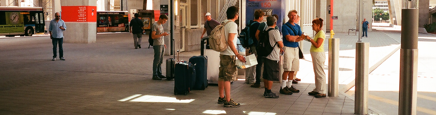
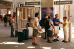
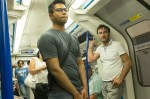
  • “I would like to begin to see is some effort to link the images in later assignments together thematically or narratively.” To an extent, I felt – and still feel – that these pictures all link together in the sense that they were taken on my way to or from work, and my original intention as I started to compile the set was to come up with each of the four categories containing one picture from each four sub-groups – Walthamstow, Public Transport, Glasgow and Oxford Circus with one night shot in each subgroup – but this quickly became more of a hindrance than a help in getting the assignment completed.
  • Finally, one of the pictures was picked out as having a rather tenuous colour-relationship, Fig 9: Red and Blue – London. Again, guilty as charged, I think. It’s probably only there as a throwback to the 4 public transport pictures idea. I shall go through the rejected pictures from the other shoots and see if I can find something that more clearly shows Colour Contrast through Contrasting Colours.

Throughout Part 3, I had been reading and thinking around the work of the New Topographics photographers; following on from this, Dave suggested I look at the work of a number of more contemporary (and more British) photographers, to develop further my thoughts on depicting landscape. I have worked through the list and have particularly enjoyed work by Jem Southern and Fay Godwin. One of the posts I need to write here over the remainder of the course is one that goes into all this more, as I try to make my thoughts on town and country, America and Europe, wilderness and “man-altered”, home and away, past and present etc etc coalesce into something I build on. Watch this space…

elements of design # 6 – implied lines

There’s nothing to add to what I’ve seen in other people’s logs about the two pictures (the bullfighter and the circling horses) at the start of the exercise (Part 1), so straight on to three examples of my own (Part 2):

Continue reading

reading – during part 1 of the course

I have read (and re-read) the first two chapters of both Photography: a Critical Introduction (ed Wells; Routledge, 4th Edition 2009) and The Photograph (Clarke; OUP, 1997) as I have gone back and forth, to and from work, while I have been working through Part 1 of The Art of Photography. Both books cover similar things here – photography itself and how it developed over the first 150 or so years of its existance, the relationship between pictures and the things they depict, what makes a photograph a photograph and what difference do all these things make to the way we think while looking at pictures.

Alongside this, I have also read bits of Understanding a Photograph (John Berger; Penguin, 2013) and The Nature of Photographs (Stephen Shore; Phaidon, 2010); the combination of all these has, I think combined to change the ways I view other people’s photographs, although I don’t think it has fed into my own work in any tangible way yet…

…or so I wrote in the middle of July, while I was waiting for the feedback on my first assignment. I intended to come back and expand on this, but I didn’t.

Foolish, forgetful Simon! Continue reading

the frame # 9 – cropping and extending

MIA Bus Station, Florida, USA

Again – like swapping the camera blithely through ninety degrees – I think I have been cropping photographs fairly consistently during this part of the course, making a banner header for most of the exercise posts. I definitely like panoramas, on screen at least – I don’t think I often get any thing printed that isn’t fairly close to either square or a standard 3:2 frame…

Generally, any hesitations I have over changing the frame from what was shot,  come from reducing my ability to view (either as prints or on screen) large versions of the resulting pictures. The reason can be seen in the Miami Airport Bus Station picture, which was taken from a scan made by Snappy Snaps at the same time as they made me a set of 6″ x 4″ prints.

Looking closely at the original or not that closely at the crops, shows how low the resolution was for this. Also, while I don’t seem to mind isolating a small section of a negative, I am definitely reluctant to alter the aspect ratio. I’m not sure why, but I suspect that it has something to do with liking the regular conformity of a series of pictures, as much as anything. That said, there seems something horribly random about composing a picture through a viewfinder and then changing its shape radically later.

This probably ties in with a reluctance to desaturate digital pictures to make black and white images and the fact that I own one panoramic camera with a swing lens and quite a few medium format cameras that take square pictures. I also suspect that this is something I need to confront and get over.

Anyway, here are a couple of cropped pictures with comments inline with them when viewed as a slideshow:

1 – Miami Airport Bus Station, April 2014


2 – Alice – Turbine Hall, Tate Modern, May 2014

 3: All Souls’ Church from Oxford Circus, June 2014

All Souls' Church - Regent Street London. June 2014

All Souls’ Church – Regent Street London. June 2014

The idea of extending pictures is one that interests me. This (shot at the same time as I was doing Exercise # 5) is an attempt to get a decent, large, clean view of All Souls’. With a bit more work to neaten up the joins (not really visible here, but definitely present if you look at a larger version) it would be quite a good picture, I think, albeit a narrow one. It was manufactured from 3 portrait shot, meaning the overlaps were quite near the edges. More shots, or possibly more shots in landscape might have meant that the bits that matched were closer to the centre of the frame, with less likelihood of distortion.

I like the idea of creating long, thin (or short, wide) pictures of two parades of shops on the Lea Bridge Road, at the bottom of my street. I would like to make them from a large number of stitched together pictures, taken moving crab-wise along the edge of the opposite pavement. I have had one go already at the first of these (wonderful shops painted yellow, green, orange, pink, red and green etc) but realised as vans came along and parked obscuring the shops, that i needed to choose a quieter time to do this.

Once I have managed to get the series of shots (taken I think with the camera in portrait and with the shots overlapping by at least a third) I expect to need to do some perspective correction and then to spend ages stitching the pictures together manually. It should be worth the effort, even if its just to record what the shops were like at a set moment in time. Even better would be to come back and repeat the exercise in a few years, giving a sense of how the area has changed. Once I’ve got the first sets taken, I’ll  post here, and then leave them, and the shops, to mature like a good wine…

the frame # 8 – vertical and horizontal frames

landscape & portrait

landscape & portrait

I’ve been taking pictures in both landscape and portrait throughout this section of the course (and # 4 is entirely portrait) and while I haven’t specifically gone out and done a 20 pictures both ways shoot, I think I’ve thought about which format suits a picture for pretty much each exercise I have done.

Also, looking back through the latest hundred and ten pictures I’ve posted to flickr, I see that about two thirds are landscape, a sixth are portrait and a sixth square.

I think the four to one ratio of landscape to portrait is as much down to the slight clumsiness of using a camera rotated through 90 degrees, rather than any inherent dislike of tall thin pictures, as I seem to remember that any time I’ve used a half-frame 35mm camera (which take two portrait ratio pictures on each frame) the majority have been portrait rather than landscape. A lot of it comes down I think – like an unwillingness to change prime lenses, particularly with screw thread fittings rather than bayonet, or to get out my tripod – to my laziness, something I am trying consciously to overcome over the course of AoP. But then, another thought on this  – and I’ve just spent 5 minutes playing with a camera, trying both eyes and rotating the camera each way – that it is possible that the awkwardness of using a camera rotated through 90 degrees may be greater for right-eyed, right-handed people, while I’m left-eyed and left-handed – certainly, the keyboard shortcuts for rotating an image generally are more faffy for doing so the way I generally have to (anti-clockwise, I think) leading me to think that most people twist the camera the other way, which certainly feels much less natural than the way I do. Which is some compensation at least for not being able to do the ‘keeping your left eye open, looking for the next shot while your right eye looks through the viewfinder sited towards the left-hand-side of a Leica’ thing, that Joel Meyorowitz does in The Genius of Photography

The 1/3  that are square ones – and I should say here while we’re on questions of format, that I rather like square pictures and feel there are loads of things that suit the huge range of symmetries that are available to you –  are all medium format, from  6×6 negatives and positives, and simply show that I’ve been playing with a variety of mf cameras recently, rather than that I’m cropping stuff down from rectangles into squares, but anyway, cropping’s a different post entirely…

the frame # 7 – positioning the horizon

Hackney Mashes - Sunday 29th of June, Morning

Hackney Marshes – Sunday 29th of June, Morning

A reshoot, as the first time I didn’t have my tripod with me and really, I should have. I also tried shooting over the Marshes and the Lea towards Clapton, but it the results were less good than these, taken just over the red bridge at the start of the Hackney Marshes football fields looking down towards the orbit and the olympic park.

  1. The emphasis is on the foreground, and the gorizon seems a long way away, with a great deal of space to cover before you would get there. Something – anything – happening in the foreground would have justified the emphasis on the space more though, here it’s just an – admittedly nicely curvey-bordered – expanse of grey.
  2. Better, but still too much empty tarmac. I had tried to get some painted writing, giving directions to some cycling or running event, that was closer and to the right into the shot, but my tripod was in the way of the joggers and cyclists and  the overall view of the grass as it stretched away to the horizon was less pleasing.
  3. Quite nice. The 50:50 balance between sky and earth is offset by the runner who links across the horizon into both.
  4. The sky and the distance starts being what the picture is about. You become aware of the cricketers and the runner is no longer crucial to giving some focus to the picture.
  5. The sky now dominates while the goals to the left and the cricketers both give a sense of scale to the picture while anchoring it to the earth somehow.
  6. But here, the sky is about to break free of the earth and the picture is almost flat again. Possibly just works because of the variety of buildings on the horizon. It might still work if the top was cropped slightly so the edge of the frame was at the top of the cloud on the left.

All pictures taken with a Nikkor AF-D 35mm 1:2 lens on a Nikon D50. ISO 200; f8; 1/640th – 1/1250, depending on how much sky was in the picture.

the frame # 6 – balance

I’m going to park this one for now, as I’m struggling with the ‘relative weight of things’ v ‘how far they are from the edge of the frame-ness’ of all this. I am fine with ideas like the the golden section or the rule of thirds, but turning it all into little weights on a balance diagrams is something I find really hard (even though I think the pictures I’m looking at are balanced). Rather than get stuck here, I think I’ll come back to this after doing some more reading on Gestalt, Golden Sections and that, if I have time…

But here are some the pictures (all taken around the taking of photos for the other exercises) that I was going to use:

I have particular difficulty with doing this exercise with portrait format images by the way (even though I don’t have a problem with swapping the camera through 90 degrees) – not sure why…

assignment 1 – personal review

Demonstration of Technical and Visual Skills

  • Materials: as a totally online assignment, this only really applies to the way the pictures are laid out on the blog. I think the way i’ve laid things out on the virtual page demonstrates the beginnings of being able to control the way wordpress works, but I suspect that without the ability to work directly with the style sheet, I won’t be able to take this much further.
  • Techniques: the first part of the course has dealt pretty exclusively with the effect of different lens focal lengths, framing (both at the time of shooting and altering this as part of post-production) and the placing of objects within the frame;  I have consciously chosen the way I have applied this to the pictures – there aren’t any “happy accidents” – and things like fairly constant use of stopped down lenses to keep as much in focus as possible is deliberate; I applied techniques to the pictures I had decided to take, and generally they have turned out as expected.
  • Observational Skills: it was enjoyable to spend large parts of my day with a part of my head ticking away, translating things that were around me into usable representations of the abstract concepts that made up the pairs.
  • Visual Awareness: and likewise, I think I managed to isolate things in a way that allows the quality that made me notice them in the first place to be apparent, even if it is only in the context of the pair at times, rather than in a standalone picture.
  • Design and Compositional Skills: I don’t think any of the pictures jar as compositions, although the bit of the section I have probably most need to do more thinking about is the more formal stuff around balance and theories about the division of frames; the pictures feel right, but I don’t know if I could demonstrate why to my satisfaction yet.

Quality of Outcome

  • Content: some of the qualities depicted come across more strongly than others – I am unsure for example whether ‘smooth’ contains too many unsmooth elements, while ‘many’ feels nicely like a jostling throng of signs; generally though, I think all 17 photographs are worth looking at and engage the viewer on a level where they are not simply ‘a church spire’, ‘a man in long grass’, ‘a closed venetian blind’ etc
  • Application of Knowledge: the main knowledge required here was the ability to use my camera and to process the resulting images in a competent way; I  think I have achieved this.
  • Presentation of Work in a Coherent Manner: the commonalities between the pairs (one portrait, one landscape; the phonetic titles; the subdued colour) combine to tie the pictures together as a group, rather than leaving them feeling like a number of photographs that just happened to end up together; this is more obvious in the blog post, than in viewing the full-size pictures one after the other, but some of this sense of a conscious set still comes across, I think.
  • Discernment*: I think some of the subjects a unusual and tangential enough to qualify as showing discernment…
  • Conceptualisation of Thoughts & Communication of Ideas: as stated above, I think the pictures generally express what I want them to express; some do this better than others.

Demonstration of Creativity

  • Imagination: my approach to this assignment has been more observational than imaginative; I have seen pictures and then taken them rather than plucking an idea from my head and then making it flesh (or rather ones and nothings); I had some more obviously imaginative ideas for some of the pairs – an upturned glass which was half-full of ice and the same glass surrounded by a puddle of water for solid/liquid, say or using the same subject for each of the opposed pictures, finding the contrast in the same object – but these tended to clash with my dual-location scheme, and also would have slowed me down as, mostly, they involved a much greater degree of fabrication.
  • Experimentation: I have used equipment more consciously in pursuit of an affect than I have generally done in the past; the part one exercises were genuinely enjoyable to plan and shoot, at least in part because they involved actually putting theory (which generally i was aware of but had not actually worked through systematically) into practice.
  • Invention: as with Imagination, above, I think  I have approached this in a way that is more observational than inventive.
  • Development of a Personal Voice: The pictures have all featured subjects that are part of my day-to-day life, so in some way reflect who I am; however, I think I have more of a sense of fun, or humour, than these pictures suggest; over the remainder of the course, I must strive not to come across as so po-faced…

Context

  • Reflection: to comment on the qualities of my reflection in this “reflection” piece seems dangerously close to crossing the line into navel gazing; I quite like my belly button and am glad it’s not an outie, but don’t feel I can comment here further…
  • Research: I think I worked out a clear approach to the assignment and then set out and followed it, expanding my list of subjects as I went.
  • Critical thinking (learning log): I am happy with the way my log is developing as a record of my journey through the course, with the proviso that i need to speed up my writing up both exercises and the work I am doing – reading and looking – around the practical stuff. I realise that I need to get back into the way of just writing and getting it down rather than agonising over every phrase…

* I realised while writing this that my idea of what discernment actually is was a bit hazy.  So I looked it up:

‘As a virtue, a discerning individual is considered to possess wisdom, and be of good judgement; especially so with regard to subject matter often overlooked by others’ – Wikipedia (my emphasis)