Category Archives: Assignment 2

assignment 2: vice versa – notes for the assessors

The tutor’s report for the assignment is Here.

All Related Posts for the assignment can be found either Here or by using the link nested beneath the heading Identity and Place in the blog’s top navigation.

File versions of the five A4 prints contained in the physical submission can be found on the assessment G: Drive as can a revised artist’s statement.


Assignment 2 – Revised for Assessment

In its original form, this assignment was not well received by my tutor, who described it as just a selection of my holiday pictures. Which in a way it was.

What I had been trying to do was to take posed, photographs in uncontrolled places (beaches, on the windy upper deck of the ferry north) at times when the lighting seemed suitable, and to take unposed observational pictures in more controllable conditions indoors. As Robert pointed out, I was probably over-thinking things.

fig.1 – looking for america (alice on skaill beach)

However, the phrase ‘holiday photos’ started me thinking about the differences between vernacular uses of photography and the more rarefied designation of some photographs as ‘art’. Rather than submitting a set of varied portraits of James for assessment – a suggestion made during the online tutorial – I have instead taken Grayson Perry’s definition of art being anything that an artist says it is from Playing to the Gallery and run with it!

The physical submission for this assignment consists of two observational photographs from the original submission for the assignment, one portrait of my son taken after visiting the Ruff retrospective at the Whitechapel Gallery and two constructed ‘installation views’ featuring my pictures, elevated to art status on the walls of the National Portrait Gallery (replacing two of the Ruffs) and – at the top of this post – the Photographer’s Gallery (in the frames for three of Wim Wenders’ polaroids).

In the end, I think this assignment examines my twin identities as a parent with a camera and (vice versa!) as a photographer (an artist, even?) who is also a parent…


Assignment 2 – Tutorial + Remake

It was another dispiriting tutorial. I’d been quite happy with the pictures; Robert, my tutor, was not:

“I think what you’re trying to do with regards to the vice versa brief sounds interesting but
is ultimately intractable and over-complicated. […] Your photographs seem to be holiday photos, and so a different project. […]  Actually it isn’t that clear how the concept of vice versa fits with your pictures, but they do seem like candid holiday shots that loosely cover the unaware and the aware categories in Part 2 of the course. […]  They’re very diverse pictures and somewhat ill-fitting as a series.”

I had, in his opinion (and, to be fair, in mine, too), over-thought things without managing to translate enough of the thoughts into something you could see in the pictures…

He did like two of them though (James and Alice in my sister’s kitchen – they’ll be in the assessment set)  but not the other three; he thought  – as with part one – that some of the pictures from the exercises were quite good.

fig.1 –  Alice at her Auntie Laura’s, August 2018

Perhaps  – he thought – I should create a set of varied portraits of James drawn from the mass of unedited pictures of our holiday to replace this set before assessment? Whatever it was that I was trying to say, it did not come across in the pictures. Hmmm…

fig.2 – James at his Auntie Laura’s, August 2017

I think (that word again!) that I was trying to take posed, setup pictures outside and to make un-posed pictures inside. I was also hoping – impressed by the sheer size of the photographs of Charles Snelling’s family album, as shown on Julian Germain’s site, in installation shots of For every minute you are angry you lose sixty seconds of happiness at the Baltic Centre in Gateshead – to do something similar in terms of taking family album shots and, through size ( and context, turning them something, not greater exactly, but different. Of  making the personal, public and giving viewers something to identify with, without their needing to know exactly who the people and places depicted were. What Robert had seen was just my holiday snaps.

There is no denying  that that is what they had started off as; but how could I make them somehow bigger in a way someone else could recognise? How could I transform them into something that other people could identify with, perhaps even into something approaching art?


At this point I went to see two exhibitions that made a big impression on me: Thomas Ruff at the Whitechapel Gallery (with four of his big portraits on display at the NPG by way of a teaser) and the show of Wim Wenders’ polaroids at the Photographer’s Gallery.

In my post about the NPG mini-exhibition (linked above), i included 3 Ruff-inspired portraits of James and intimated that I might include them in a remake of this asignment, at least in part to add more variety to a set of nothing but Jameses. For assessment, I think I’ll use the one of the back of his head, not least because (like surrealists’ photos of people with their eyes shut) this is an impossible viewpoint for anyone to see themselves from in real life, given that (even with mirrors) it is tricky to get anything approaching this clear a view of yourself from behind.

fig.3 – Obverse, James; London; 2018

At the Whitechapel Gallery, at the start of his big retrospective, there were two series’ of appropriated and doctored Installation views from long-taken down exhibitions, one (presumably done specially for the retrospective) at the Whitechapel Gallery itself. Since I would not be able to get James’ Ruff-inspired portraits printed as big as Ruff’s originals (the assessment print will be A4 orpossibly A3) , if I wanted to see what it would look like on a truly grand scale I could do worse than re-working my photograph of the three big portraits at the NPG.

fig.2 – Portraits: J. Gow and S. Chirgwin (with A. Giese); Installation View, The National Portrait Gallery, London, 2017

For good measure I have included one of my base self-portraits for Assignment 3 of Context and Narrative. The most difficult part of this was replicating the reflections in the glass of the pictures, making them feel that they were really there.


Wim Wenders’ pictures at the Photographers’ Gallery were at the opposite end of the scale from Ruff’s – original polaroids, given added dignity by a mask and a frame. You could walk around, listening on headphones to streamed recordings of Wenders reading the relevant section of the text of the book of the pictures. The text turned what could have been mostly seen as insignificant adjuncts to Wenders’ film-making into marvelous chunks of deadpan autobiography. You leant in and peered at the tiny pictures; you smiled and listened to Wenders’ slow delivery of his words. They stopped being a crate of forgotten pictures and became little filmic sequences. Wenders talked about his work having personal relevance for him, but never revealed what was private. This seems to matter too.

fig.1 – Alice, Skaill Beach 2018; Installation View, The Photographers’ Gallery, London, 2018

There’s nothing in between Skaill bay on the west coast of Orkney and America (Newfoundland, actually); looking out, as a kid I wondered if you might just be able to see it if you really, really screwed up your eyes and concentrated…

So, when I saw that one of Wenders’ sequences was titled LOOKING FOR AMERICA, it seemed obvious that that was the one I should appropriate for the three pictures of Alice at Skaill, one of a number of sequences of three related pictures that I had been unable to include in the original assignment set. The woman looking at them was really looking at Gursky at the Hayward.


I think this covers the opposed ideas of ‘street’ and ‘studio’ quite well. You have unposed, candid pictures taken at Laura’s, a carefully lit and posed picture of James and – taking studio to also mean pictures that are consciously put together – two composites, creating an elevated context for my pictures of my children.

I’ll redo my composite pictures before getting them printed – I was working with relatively small jpegs and they won’t enlarge particularly well. Also, since I did a Gursky pastiche for an exercise during part one of C&N, I have been enjoying the process of putting pictures together from different bits and seem to be improving every time I give it a go. I am aware that there are clumsy things that can easily be improved on (the expansion of the mattes from square to rectangular in the Photographers’ Gallery composite for example)  and In another few months (assessment in November, I’m thinking) I should be able to do an even better job, I hope.

But enough for now – I can procrastinate no more! Time to move on to Assignment 3…


assignment 2 – reflection

living-room wall, during the editing process for assignment 2 – walthamstow, september 2017

1: Demonstration of technical and visual skills

This assignment exists in two forms: online in the post that precedes this one and physically as five A4 prints + a printed sheet with the artist’s statement from the post. While most people reading this won’t ever see these prints, I consider them to be the primary endpoint of the assignment with the log version acting more as supporting material.

I am happy with the all five of the final pictures (and indeed there are others that I like as well, but that did not make the final cut). The composition works for me and the relationship between my subjects and the camera seems appropriate for the situation. Colour, contrast and overall balance of lighting likewise seems right. The light from James’ laptop and Alice’s iPad in the two interior pictures is possibly a bit too blue, too bright, but will pass (or be fairly easily rebalanced for assessment).

I have got to the point where I am acceptably comfortable working in Lightroom. I use it both as my main editor and, probably more importantly, as an organisational tool. For more complex retouching and for compositing, I use Photoshop (Elements – I’m a tightwad), but haven’t really had to here. The final piece of the workflow jigsaw has been getting the printing module to output files that come back from Loxley successfully translated into C-type prints (ie as old-fashioned photographic prints, rather than inkjet).

The prints that should now be with my tutor (and let’s wait til he comments, before I make any definitive pronouncements on them, myself) seem to have worked well. In the past, colour has generally worked as exected, but I’ve had issues with the way with the overall lightness of my prints – they tend to be much darker than the images appear on screen. This time both the small prints I make with the machines in Boots (see the header for this post) and the final submission prints seem consistent with what I’m seeing on screen. One of the differences between professional, restaurant food and the food you eat at your (or someone else’s) home is supposed to be that if you have the same meal several times at a restaurant, it will be the same each time; a home cook will not maintain that level of consistency…

I have been musing about the way the size of a print (or the size a picture displays on screen) affects the way that it is read) a lot recently, too. The bigger something is printed, the less likely it is to come across as a vernacular snapshot.  Part of the job of moving the assignment pictures away from being viewed as ‘holiday snaps’ has been achieved simply through printing them on a bigger scale than would easily fit into an album; a comment on one of my earlier posts by my fellow-student Holly Woodward commenting that she wondered how they would look as A3 also set me thinking. For the assessment maybe?

As well as making them seem more considered and worthy of serious consideration, size also of course, exposes technical imperfections like noise and poor focus. The prints seem generally fine technically; I’m less sure about them once they have gone through WordPress’ compression and resizing engines. Another reason for preferring the physical version of the assignment.


2: Quality of outcome

In the posts leading up to this assignment, I have focused a lot on the creation of images that can be read by people who do not know the circumstances of their making. So, how well have do I think I managed this?

The pictures on the ferry north, are sufficiently ‘boaty’ with the tilted horizon and windblown look of the people  combining to provide a simple and clear portrayal of people in a particular space. Also, everyone looks happy enough (with me, with each other, with the general blusteriness) for a general ‘off on holiday mood’ to be conjured up. However, I realise that my personal reactions to the site-specific backgrounds (the inside of Laura’s and Dave’s kitchen;  the beach at the third barrier, with Fiona and the sand castles) will not come across to others. So, do they succeed in signifying enough to work? The answer (obviously to such a rhetorical question) is that I think they do.

The pictures of James and Alice looking at screens clearly come across as people who are not fully present in the environment where they are pictured. Their relationship is with somewhere far away on the other side of their screen. Certainly there are not in the same space as I am, although I am physically present in both of the pictures: my camera bag is one of the two foreground objects in the picture of Alice; more subtly, my unlit knees are just apparent in the bottom corners of the picture of James. Also, they are still among all the busy-ness of the room around them. They are on holiday from being on holiday but there is a lot that can be read off the walls to give a sense of my relatives who are sharing their house with us.

And finally, as Fiona sits on the beach, she definitely exudes a sense of relaxation and away from it all, from all the child-friendly activity like building sand castles, from other people, from the city. She has managed to achieve solitude, and in a nice looking location.

The statement accompanying the pictures (I hope) expands their possible meaning rather than simply explaining it (in Barthes’ terms the paragraphs should act as ‘relays’ rather than ‘anchors’). I wonder whether it should be split into chunks and interspersed with the pictures, rather than presented in a single – separate – ‘thing’. Before I find out what my tutor thinks, I feel that a useful approach to reworking the assignment might be to play around with the sequencing of text and image, but that may all change!


3: Demonstration of creativity

As I worked through the edit for this I was quite surprised at how much overlap there was with parts of the course introduction. There is a distinct (and unplanned) connection back to both my Square Mile Exercise and to the work that is beginning to done with examining/interrogating my (family’s) photographic archive.

I suppose this is inevitable when I have made a lot of use of my family to make pictures in circumstances – on holiday – where people traditionally make the bulk of their pictures and at a location where I have a load of history to work with (Orkney). As such this assignment can be viewed as a snapshot of a larger body of work made within a much greater time frame.

I can see glimmerings of a lot of things that might move all this further on, both here and in later courses. This, I suspect is part of the cumulative ‘developing a voice’ aspect of the courses. Stuff to put away for a bit to let it develop further in the dark recesses of my head.


4: Context:

Through this section of the course, I have experimented with the way I have presented my pictures in the posts on my blog. For TAoP and C&N, I mainly used WordPress’ gallery and slideshow options with the pictures shown medium size (about 300px on the longest edge, or about half the normal WP column width) and centred, which is fine but a bit limiting. Here I used both smaller and larger sides and tried to integrate them into the writing more. I have also begun to play with the HTML markup for the blog a bit rather than just accepting what the WYSIWYG editor gives me.

I have barely scratched the surface of this aspect of presenting my work and my studies, and will probably not take it significantly further during this module. When I move onto level two at the end of IaP, I’ll start a new blog. This would be the time to investigate moving to a premium (and so not free) version of WordPress, which hopefully will allow more tinkering with layout and appearance.

Most people (though not of course the OCA’s assessors) only see my work online; many professional photographers’ sites (including some of the people we are pointed to by the courses) have terrible, clunky websites; it would be good to develop something that can act as a proper installation or even just an adequate representation of work completed.

I think the exercises for this part of the course as presented here on my log still work well though. I am less sure that working on them at the same time as I was taking the pictures that make up the assignment was necessarily the best way to go about this, though. However, while a more sequential – research to exercise to assignment – approach might have been better, the time-bound nature of doing much of the work over the course of a holiday when I had ready access to people who could act of subjects ruled this out.

I have used this method once before – for part three of TAoP where I created a great mass of colour-related pictures and only later sorted out ‘the good ones’ for the assignment and used the others to illustrate the exercise posts. The effect then was to slow my progress down and to allow me to continually look for something ‘better’. Here I was not able to go on adding more and more pictures to the pot and so, I think, that as a working method it worked better here.

Part three will, I hope, be treated to a more linear approach…


assignment 2 – vice versa


Definition:

vice versa

/vʌɪs ˈvəːsə,vʌɪsə ˈvəːsə/

adverb

with the main items in the preceding statement the other way round.

street pictures in the studio and vice versa

synonyms

conversely, inversely, the other way round, contrariwise, oppositely, in reverse, reciprocally

unposed pictures in controllable conditions and vice versa

– entry adapted from an online dictionary


Pictures

fig.1 – alice and fiona outdoors; aware

fig.2 – james outdoors; aware

fig.3 – james indoors; unaware

fig.4 – alice indoors; unaware

fig.5 – fiona alone, unaware, but posed


Statement

Every year, towards the end of July, I head north with my family to Orkney, where I was born and grew up. We stay for two weeks or so with my sister and brother-in-law in their house in Kirkwall. I am returning to somewhere; my partner and children are going somewhere strange, somewhere that they do not really know.

When we visit Fiona’s family I am viewed through the prism of Fiona’s relationship with me; in Orkney she becomes more of an adjunct to me and less a fully-dimensioned person. There are fewer people who share histories with her here. There are fewer prospects that live on in her mind when she is no longer among them, in the islands.

Our relationships to one another shift somehow when we are in Orkney. Mine, probably most dramatically. I am no longer simply Fiona’s partner or James and Alice’s father or that bloke at work; I step back into being a younger brother again, an uncle (because my niece lives in Orkney too), Frances and Graham’s son, or a person who went to school with someone.

When people hear that I grew up in Orkney, they often say that it must have been amazing; they ask me what it was like. I tell them that it was just like growing up; I say that growing up in a city must have been amazing. In truth, by the time I was fourteen (James’ age now) I already longed to get away.

I have never lived in my sister’s house: she bought it after our parents had died and after I had gone south to university. It is not my home – indeed, my home is now in London –  and sometimes, when we are all packed into it, it can seem quite crowded. It is difficult to find a space for yourself, somewhere where you can be on your own.

It’s hard work being on holiday. It’s tiring. Whether you’re four or fifty. Wherever it is that you have gone to get away from it all. And if you are a parent, with a young child, it is hard to find some time when you are ‘off’, recharging your batteries in preparation for your return to the normal and your everyday life. Beaches can help.

I get away from it all by taking photographs, I suppose. By withdrawing  physically and squinting through a viewfinder, I can step outside. I am on holiday.

assignment 2 – the edit

I had cut down the number of pictures I took during my holiday in Orkney from around four hundred to a more manageable thirty six.

I now needed to think  – again – about the assignment brief:

  • There need to be five photographs in the final submission
  • It needs to build on the exercises (and so should include elements of ‘aware’ and ‘unaware’)
  • It is called ‘Vice Versa’
  • There needs to be an interchange between elements of ‘street’ and ‘studio’

To go through them one by one:

Five photographs is an awkward number which removes the simple option of using contrasting pairs of shots to build up an easy narrative. It also means you can’t feature too many different people.

So, I need to determine who is going to remain ‘in’. There are six people in the pictures that made the short list (Fiona, James, Alice, my sister and my brother-in-law,  and Fiona’s sister, who was up from Newcastle for part of the time). Six is a lot, and it could all become a bit confusing. I toyed with the idea of doing it all with pairs, with one person linking into the next picture with a new subject-partner who would then carry on to the following picture (a bit like Schnitzler’s play ‘la Ronde‘, but without the criticism of sexual mores), but rejected it as too complex and also because I didn’t have enough pictures featuring pairs of people.

So despite really liking the picture of Alice with her uncle (3rd from the left in the top row of the contact sheet) I’ll limit myself to pictures of Alice, Fiona and James. Down to 26…

Then – as well as moving between the ‘unaware’ and the ‘aware’ – the exercises had involved a lot of placing someone within a readable space (or in front of a readable back ground). I rejected any pictures that could have been taken anywhere or which don’t have enough background detail to locate the pictures somewhere isolated. The close ups of Fiona on the boat and of James on the train to Aberdeen went. Down to 20.

Vice versa. I need to have something that can be introduced with a reversible opposition like ‘Orcadians in London and vice versa’ (Londoners in Orkney). From the coursework I began working towards ‘Documentary-style pictures in controllable conditions and studio-type pictures in the wild’  or maybe ‘Captured indoors and staged outside.’ This would also give me the rhetorical contrast between street and studio.

The process moved from one of exclusion to a more postitive one of definite inclusion.

There weren’t that many interior shots in the remaining twenty and of them two had stood out from the moment they were taken: individual pictures of Alice and James, lost in the worlds transmitted to them by wireless devices.

While firmly located within the particularity of my sister’s kitchen, neither of them are totally ‘there’ which is interesting too.

So, to balance these, I needed two staged exteriors. Again, two pictures had been present in my thinking about this exercise from the moment I took them (in two sessions on the boat north from Aberdeen as the day faded).

These two were also just about the best results from my experiments with fill flash in fading light outdoors.Timing of taking the photograph against the rise and fall of the boat is also critical in finalising the framing here – another dialogue between ‘staged’ and ‘captured’. And somewhere far behind us on the boat, on a beach on the other side of the North Sea, Rineke Dijkstra can maybe just be glimpsed, setting up her view camera and lights, waiting…


This leaves one picture to choose, from the remaining sixteen. A lot of the pictures seem to fall naturally into threes like these of Alice:

…or these, of Fiona:

…and any one of the three of Alice could easily be used as a stand alone and would fit in with the ‘constructed-outdoors’ half of the assignment, but really, I think they work better together (ideally not displayed level, as they are here, but rather with the horizon lined up, giving a descending line from left to right). And also, in terms of balance for the set, James and Alice both appear in two of the pictures already settled upon; Fiona is only in one. So really the final picture needs to be of her.

The first of the stone skimming pictures could do the job, but it is much more ‘observed’ rather than constructed. And if it could match the other two exterior pictures by being in a portrait ratio, that would be good too. So, I will go for this one, which stretches the idea of ‘a portrait’ about as far as it will go in terms of the relative size of the subject to the location.

Fiona’s pose is easily readable as ‘relaxed’ and ‘away from the everyday’; the location also suggest isolation and holidays; there is a degree of stillness and peace. Fiona has – consciously or unconsciously, I don’t know – adopted a pose; the sandcastles in the foreground are as constructed as any studio set. Their arrangement in the foreground draws the eye upwards, where is is stopped from simply passing over the figure by the line of the dunes and the sky.

So, five portraits: two are very much posed, two taken unawares and the final one falls somewhere in between. If I was constructing an album, instead of submitting an assignment, I would include more pictures, grouped and arranged carefully in relation to one another over a series of pages. I may well do that – and include pictures from previous years – but for now I will settle on this five. I will make a final pass of the pictures in Lightroom and photoshop, adjusting the crop and the exposure etc. I will write a brief introduction (500 words) and post the pictures here. I will have the pictures printed (slightly smaller than A4, with a border for handling) and send them to my tutor. I will write down my reflections on the assignment.

To go back again one last time to Walker Evans, many are called…

assignment 2 – making the photographs

The objective of this assignment is to provide you with an opportunity to explore the themes covered in Part Two with regard to the use of both studio and location for the creation of portraits.

This assignment is about taking what has worked from the above exercises and then trying to develop this further in terms of interchanging the use of portraits taken on location (street) with portraits taken inside (studio). You need to develop a series of five final images to present to the viewer as a themed body of work. Pay close attention to the look and feel of each image and think how they will work together as a series. The theme is up to you to choose; you could take a series of images of a single subject or a series of subjects in a themed environment. There is no right answer, so experiment.

 – IaP Coursebook (p.55)

For a themed environment, I had worked out that I was going to take the photographs for this assignment while I was on holiday in Orkney at the beginning of August. At the time we – my partner, our daughter and me- set out from London on our way north (my son from an earlier relationship would meet us in Edinburgh) I had only completed the unaware exercise for Project 1. So, the pictures I would take on holiday would need to complete the exercise material as well as provide a basis for this assignment.

As well as the ‘themes’ I identified around lighting, rendering the natural unnatural (and vice versa), seeding pictures with signifiers to allow them to be read, defeating the pose and around the balance between location and person pictured (described more fully in the previous post) I had a rough idea that I could take pictures of people using wireless devices to connect back to their normal, ‘citified’ lives, surrounded by glorious countryside, their faces lit – like the girl in the Kyiv metro (fig.3 in my Project 1 post) – by the light of their screens.

In the end, no one was really trying to use a device outside for anything more involved than sending a quick text, and I wasn’t going to set it up, however pictorial the result. But where people did switch off and log on was back at the house in the evening.


I started off though, taking ‘unaware’ type pictures on the journey. Perhaps this would provide a strand for the assignment. If I could draw on some of the categories of subject used by Kuzma (‘pointers’ et al) so much the better.


Also on the journey north, I began to experiment with trying to catch people at the time of day when my camera’s flash would begin to make a difference to the way the pictures looked. The result was one of fill (and helped eradicate the cast from the yellow helicopter target on the deck, when the subject was close enough), rather than fully blown lighting in the style of Dicorcia or Macleod, but the effect was pleasing nonetheless.

Also the sheer blusteriness on the boat distracted my subjects, making them less conscious of taking part in a photograph. To an extent, the surroundings helped me in my attempts to take pictures of people posing, but not posing…


One of the things looked at in Bate (p.79) is the way cinema alternates between close-up (concentrating on the face) and wide shot (locating the character within space). In the two exercises dealing with subjects and backgrounds (and also the introductory exercise to the section, which I also shot while in Orkney) I had been conscious of pulling back from the person pictured in order to get in enough of their surroundings for them to be readable (at least in general terms). I started to play with close and far, thinking in terms of possible sequences of photographs for some of the assignment.

And I also began to think in terms of using a form of  ‘field – reverse’ juxtaposition  (the editing cinematic mechanism of cutting from a picture of someone looking to a second picture of what they are ‘looking at’) to make links between things which are not necessarily proximate.

(The picture of me was taken by my daughter; not bad for a four year-old!)

This would potentially allow big close ups with not enough background information to place them in space to be used, coupled with their reverse, possibly as a series of diptychs. However, this probably fits better, later in the course, so I did not develop it further here.


The clothespeople are wearing (or not wearing) and the way the weather conditions either amplify or contrast with them also can help create an idea of what type of experience the subjects of the photographs are having. Blue skies and contrasty light can work with tee-shirts and swimming costumes to give one sort of holiday experience; layers, huddled postures under grey skies with little or no contrast gives another. Conditions change quickly in Orkney.

Blue water can look inviting or it can be read as cold and icy. The effect can be comic or affecting. Props can enhance the effect.


Over the two weeks we were away from home, I amassed a large number of pictures. Some of them have been fed into the exercises, but by the time I was back in London I had a good number of pictures from which to choose the final five. The next post will look at the process of editing them down from a short list of around twenty to the final submission.


Full digital contact sheets of the 2017 holiday pictures considered now follow:

Outings #1 – James and me alone (source for the same-person-different-background exercise)

Outings #2 – everyone out in the West Mainland

same-background-different-subject pictures and others

journeying north + early holiday

evenings in at my sister’s house (unaware)

assignment 2 – consolidating the exercises

What follows are some of the ways the research strands I have been following for the past couple of months have fed into my submission for assignment 2, Vice Versa.

Family Photography, Now (Book)

Sophie Howarth’s introductory essay – Is my family normal? (pp 6-13) looks firstly at what has usually comprised most people’s family photograph albums ( ‘the domestic photograph is still, largely, a tool for promotion’; ‘we organise our albums […] to tell the story we want to believe about our lives’; ‘the more unusual your family circumstances, the more important it seems  to be to show yourself as “normal”‘) and backs it up with a photograph of Bashir al Assad (the Syrian president) and his wife and children from instagram and an apt quote from Martin Parr: ‘Most family albums are a form of propaganda, where the family looks perfect and everyone is smiling.’ This ties in neatly to the part of the course introduction which dealt with social media profile pictures (and albums of ‘day-to-day’ pictures) where most people seem desperate to show themselves in the best, and happiest, light.

She then goes on to offer an alternative to this, not  ‘unhappy families’ but rather pictures which stretch the paradigm of what we show to others of our ‘private’ lives. These pictures, rather than replicating the pictures that everyone else takes, instead try to produce photographs that deal with the specifics of their own situation, highlighting how their family situation differs from everyone else’s. This work – which makes up the first half of the book, This is my life (photographers documenting their own families) – seems to be saying ‘My family is not normal and we’re ok with that.’

You have a single parent photographing his son until his son said stop (Robin Cracknell); Elena Brotherus trying to have an not get a family in Annonciation; Timothy Archibald working with his son to try to visualise autism; Cecilia Reynoso recording family gatherings in all their messiness; Colin Gray’s hugely constructed pictures his parents as they age; and more. All seem to involve the picture’s subjects and to depict something of the photographer’s subjective relationship to them.

The other thing that seems to unite all these depictions of family is that they have developed over time – 35 years in Gray’s case – allowing them to address changes in both individuals and in the relationships between them. This open-ended way of working (shared with Evan’s three years of covert photography on the NY subway or Germain’s eight years of picturing Charlie) is not something you can apply directly to a course with a set timeframe like this one.

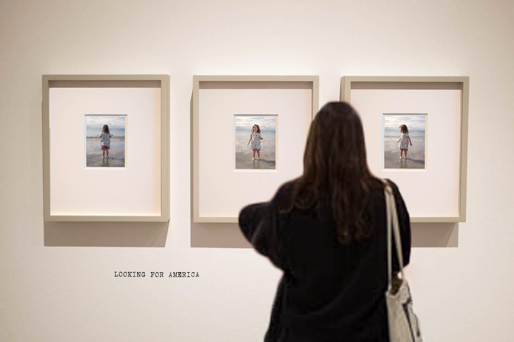
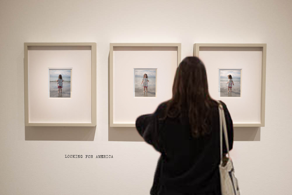
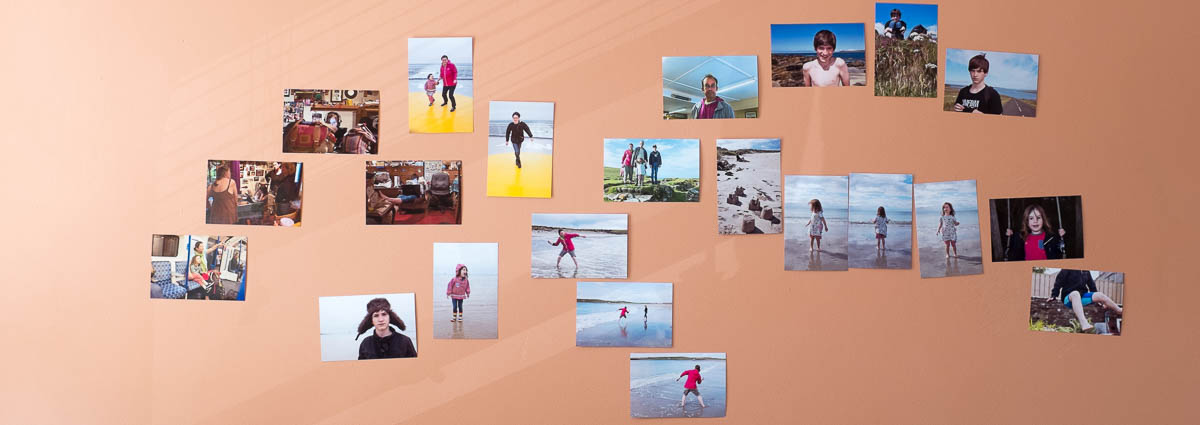
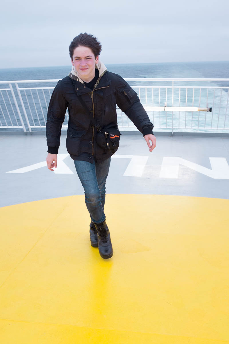
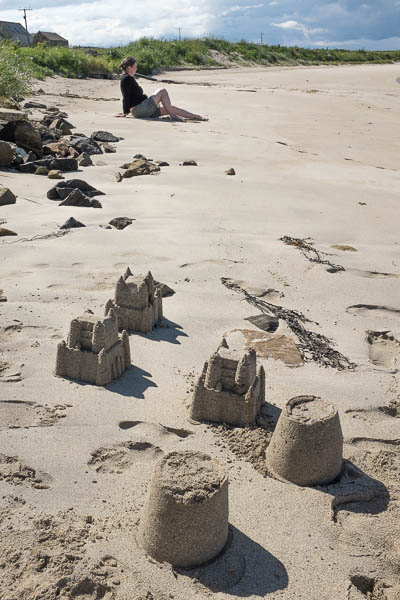
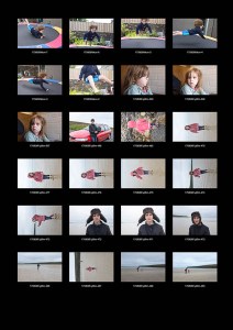
For this assignment (and the aware project that led up to it) I have used photographs of my family taken during our annual holiday in Orkney. These pictures relate to those taken in previous years – locations and activities repeat; people get older; relationships shift – but for this assignment the pictures need to stand alone and to have been taken for it.

I hope I have been able to take the temperature of where we are – some family photographs, now. The assignment will add another growth ring to the photographic tree that is forming around holidays in Orkney, without being the whole tree…


Street & Studio and other Oppositions:

“Documents are documents because there’s this concept of the picture, and vice-a-versa…”

– Steve Edwards

In the opening lecture of the Street & Studio study day organised by Tate Modern, Steve Edwards describes a group of opposed concepts about ‘art’ and ‘not art’ that photographic theory has oscillated between during the nearly two hundred years the medium has been in existence. He starts the talk by quoting Jeff Wall  saying there are two myths in photography – that photographs tell the truth and conversely that they do not – and ends with a second quote from Alan Sekula which suggests that the myth that photography does not tell the truth has replaced the myth that they do. Both quotes were apparently made around the same time (in the eighties); the talk was given a decade ago.

The definition of art needs ‘not art’ in order to make sense. ‘Not art’ implies the absense of a maker; it is literal, straightforward, a copy and not an original; it is therefore transparent. ‘Art’ results in pictures; ‘not art’ produces documents, traces of reality.  In its early Fox-Talbot form, photography was not thought to be art. ‘Not art’ is not idealised (and so art is in pursuit of the ideal);’Not art’ is not made, it has no maker. ‘Art operates within a ‘high aesthetic mode’; ‘not art’ doesn’t operate, it just is…

Since its invention photography has oscillated between rejoicing in its status as ‘not art’ (‘the pencil of nature’, the emphasis on photojournalism in the 1930s, 40s and 50s) and disguising it through pursuit of pictures (in the 19th century, pictorialism; more recently through the constructed tableux of Crewdson and the other neo-Pictorialists). And somewhere between there is work which combines the picturing of ‘the real’ from the point of view of an artist (Walker Evan’s ‘documentary style’ or Jeff Wall’s pictures constructed to better ‘capture’ events than a straight street shot might).

The difference could in part be between ‘capturing’ and ‘making’ your pictures (or indeed, your photographs).


The pose and how to break it:

There is an essay (Eskilden; pp171-177) by Susanne Holschbach titled The Pose: It’s Troubles and Pleasures. It examines the way the idea of the ‘Pose’ is as different from the more neutral term ‘posture’  as ‘picture’ is from ‘document’ (or ‘fiction’ from ‘truth’ or indeed ‘studio’ from ‘street’).

Negatively – the pose’s artificiality allows someone to hide what is the truth about them (and this is what gives power to the paparatzi’s seeming ability to catch the famous with their mask off). Conversely, it can allow the photographer to impose their view of someone up them: the very action of taking a mugshot in a police station could be seen as defining the person pictured as criminal.

Positively – the pose allows people to project who they are and what they are striving to become; the pose and the objects and props associated with it allows people to define themselves (‘adapt[ing] their behaviour to resemble the image with which they identify themselves’) rather than having some one else impose an image upon them.

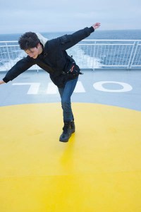
Holschbach also looks at the way photographers can try to undermine people’s tendencies to pose by distracting them from what they are actually doing – for example, in Phillip Halsman’s 1950s series of famous people, jumping – ‘having their photograph taken’ is displaced by ‘jumping in the air’.  Their mask slips enough for us to get an idea of the person behind it. In theory at any rate.


Two Photographers:

1: Phillip-Lorca Dicorcia (b. 1951) – makes work that occupies a position straddling the divide between street and studio; Heads (2000) used hidden flash and a very long lens on the street to pick out individuals as they walked past; Hustlers ((1990-92 exhibited in Boston as Strangers in 1993) dropped sex-workers into prepared locations and photographed them with a large-format camera, creating a tension between what is ‘real’ (the model’s name, where they were approached to be photographed, how much they were paid) and what is constructed; the results of his work are not quite documentary and not quite posed, although they are definitely constructed.

2: Murdo McLeod (b. 1963) – Scottish editorial photographer working for the Guardian and the Observer; unlike most photographers working in newspapers, he has a distinctive style; this style involves non-naturalistic lighting and the use of props and goes well beyond what is ‘normal’ in newspaper photography; lighting often uses flash to increase the contrast between the subject and the outdoor background as night is falling; will work with subjects to get beyond their ‘photography face’ (Bobby Charlton in 2009 blowing out his cheeks and popping his eyes as if he might burst is a good example); makes you look and carry on looking.

Both DiCorcia and Macleod have created much of the ‘look’ of some of their pictures by using articifcial light in the form of strobes, operated outside. I do not possess powerful enough strobes to do this (and even if I did, I probably would not be able to justify lugging them up to the north of Scotland). However, there were possible ways to at least approximate the effect, making my subjects stand out against their background.


Lighting:

There is one of Harry Callahans’s Eleanor and Barbara photographs where they stand, side by side and facing the camera, lit by a diagonal shaft of bright light with a canyon of darkness forming triangles of black above to the left and below to the right. they are as ‘lit’ as if they were on a Hollywood sound stage. They are in the street, but the effect is definitely ‘studio’.  The print had obviously been worked on to heighten the way the lighting had worked, but it had definitely been spotted, before Callahan put down his tripod, ‘There…’

project 2.1

exercise 2.2

There is lighting all around us. Sometimes we carry it with us; sometimes it is natural. It can be enhanced or altered with a judicious use of flash. It can sculpt someone’s face, or separate them from a background. If you put your subject into this ‘good’ light when you spot it or notice that someone or something is in a place where they are ‘lit’, it is a good tool to use when you want to move your pictures along the route from snap to portrait.

project 2.2

And the better you know a place, the more likely you are to know when this might to happen…


Constructing a picture to be read.

In my post on the portrait chapter of Bate’s Photography – The Key Concepts I have looked at both the 4 elements that comprise the readable content of a photographic portrait  (face, pose, clothing, location) and the various psychological processes that are in play when we look at pictures of people.

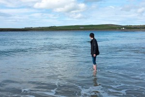
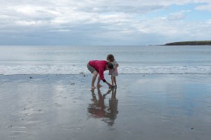
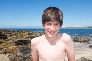
Awareness of all this allows you to attempt a greater degree of control of how people may read your pictures. It may be impossible to translate everything that you feel about a scene or a person into something transmittable to others – there are associations I have with a lot of of the locations of my pictures that simply do not come across; the open door behind my sister in exercise 2.1 has a completely different meaning for her than for me – but if you can spot things that will ‘catch’ with others – the way a child stands on a beach can open up a path to identification of the picture’s subject with the viewer’s past self, say – you are more likely to make work that will arrest someone’s attention for longer than an unconsidered snapshot would.

If you can disguise this effort of construction in something that still retains some of the qualities of a snapshot, so much the better.


Reference:

  • ed. Eskilden, U. (2008) Street & Studio – An Urban History of Photography London. Tate Publishing
  • Edwards, S. (2008) Documents & Pictures. Session 1 of the event held at Tate Modern to examine the background to the exhibition Street & Studio (05/07/08)
    Available online at: http://bit.ly/2xFuDAQ (accessed 02/09/17)
  • Howarth, S. & McLaren, S (2016) Family Photography Now. London. Thames and Hudson.
  • Macleod, M. (2010) Gnùis – Photographs by Murdo Macleod Stornoway, An Lanntair