Category Archives: Assignment 5

assignment 5 – notes for the assessors

The tutor’s report for the assignment is Here.

All Related Posts for the assignment can be found either Here or by using the link nested beneath the heading Identity and Place in the blog’s top navigation.

File versions of the twelve A4 prints contained in the physical submission can be found on the assessment G: Drive.

***

There has been too little time between the tutorial and the deadline for assessment submission for any real revision to be carried out, but I have tweaked the statement that accompanies the pictures.

As I did not send prints to Robert for this assignment, I have gone over the finished picture files and struck proofs before sending them off for printing along with the other assignments’ pictures.

I have also tried to make sure that the intended text will always be associated with the pictures as the seeming absence of titles was one of the areas of discussion at the tutorial.


assignment 5 – tutorial and formative feedback

We had a short and quite relaxed online, voice-only tutorial which divided pretty evenly between the assignment itself and my plans for level two.

I had received Robert’s initial notes the day before and had time to think about them before the tutorial itself. This way of working – we did the same for Assignment 4 in April – seems to work well as the tutorial is not spent establishing what your tutor thinks about the work in general, while you deal with your reaction to the criticism regardless of whether it is good or bad. Here it was mostly good: Robert was glad I had returned to a typology which hung ‘together well, especially in the grid format’ with ‘no room for confusion about the subject, as [I had] singled it out and repeated it so consistently.’

The rest of the notes concerned a lack of a discernible motive behind the making of the pictures or tools to extract further meaning from them, beyond simple pictures of feet. This was a bit disconcerting but I was able to argue my case – that it is as hard to tell who someone is from their footwear alone as it is from their unadorned face –  during the tutorial, as well as discussing various things about meaning – of feet, of hands, of tattoos, of shoes –  and appearance.

Gradually, it became apparent that I had only captioned the pictures (ie ‘woman, 20’s; relaxed after being cramped by people standing in aisle’) on the post that ran through them as a slideshow on my blog, and Robert – apart from viewing the layout image on the main blog post with the artist’s statement – had been looking at them as the full-size files that I had made available on my g:drive which had only identifying file names (ie metrosynecdoche-06.jpg).

So, the main thing I take from this assignment is that I should never assume that anyone will look at all the versions that I make available of an assignment; greater consistency in the surrounding, meta-photographic information (particularly if it is something like a title that is intended to act in the manner a relay) is something to aim for when submitting the pictures for assessment. That said, it is a fairly light piece of work (particularly when juxtaposed with my assignment 4) and does as such not bear too much analysis.


We then – as this is the last assignment for the module – went on to talk about my progress over the course of this module which Robert felt had been gathering momentum from assignment 3 onwards after a very uncertain start, leading to consistent, self-confident and self-assured work – and to look forward to level two.

I intend to move onto Digital Image and Culture next – we talked about the need for me to carry on taking the sort of pictures I have been producing during IaP alongside the more theory-focussed work of DIaC. I shall do – it’s become a habit to have a camera with me and to photograph things that catch my eye – but also want to examine further the ‘still life with context removed’ pictures that I have started experimenting with during this section of Identity and Place.

As my second level two course, Robert has strongly recommended that I try Self and Other as this strikes him to be a logical continuation of the work I have been doing here and the slightly detached point of view I have been working from. This is an interesting idea as up until now, I have always intended to do the landscape course as part of level two and have come to a point where I’d like to try and apply the learnings of DIaC to the depiction of place, rather than identity (inasmuch as the two can be separated).

I have eighteen months or so to make up my mind as to which way to go. A lot can change in that time so we shall see…


assignment 5 – reflection

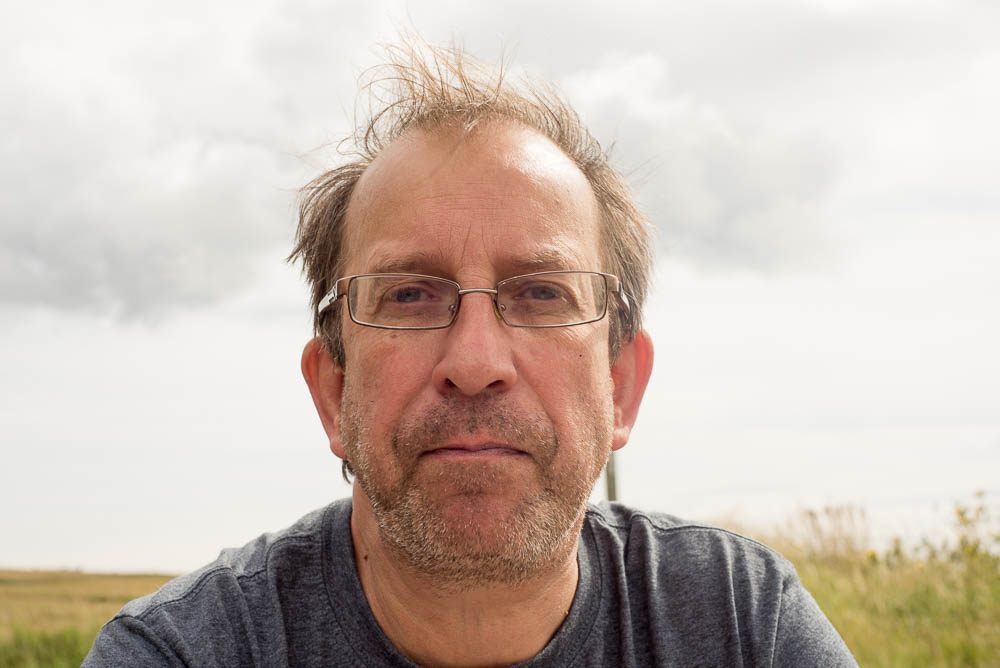
portrait of the artist in London, in battered, red converse (august 2018)

1: Demonstration of technical and visual skills

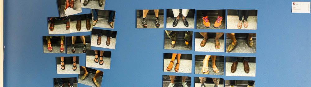
Compositionally my submission for this final assignment consists of  a  set of images that are consistent both compositionally and in terms of subject matter.  These are competent, engaging pictures that work well as a set while displaying a good variety of individual subjects.

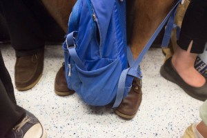
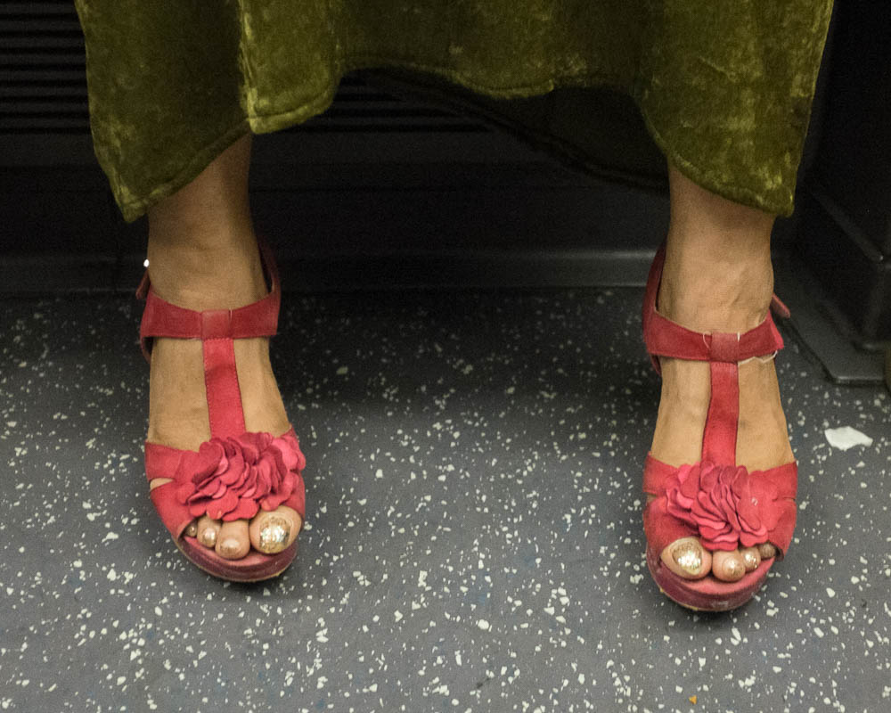
Running through my work for this module, there is a strand of pictures taken in low, irregularly coloured light, usually without the option of using flash to balance things out; these represent my best response to these difficult conditions to date, I think. I have been able to maintain a constant colour palette for each of the two underground lines’ trains; the pictures are sharp and display control of focus to concentrate on the picture’s subject matter.

I find that the pictures hold my attention (and that of others) – I am drawn in and think about what it is that I’m looking at. It is not an overly-serious body of work, but I find I can look at the individual pictures and wonder about what the rest of the person looks like for longer than I thought I would as I was taking the pictures and editing them down to a final set.


2: Quality of outcome

The assignment brief ends: ‘The only stipulation is that the final outcome must represent a notion of identity and place that you are personally inspired by. Make sure that your work is visually consistent, relevant to the subject matter you choose and holds together well as a set, both visually and conceptually‘ (IaP coursebook, p.115). I think I have achieved this.

Before Christmas last year, tutor Clive White said the first of two things about typologies that I found helpful enough to bookmark. It dealt with some of the technical work involved in making typologies:

‘…it helps if the images have the accuracy of a technical drawing; each with the same aspect ratio and size and perspective corrected. It emphasises that they’re all intended to belong to a class, the class of radiator‘ [the discussion was prompted by six grid-presented pictures of iron radiators by fellow student Stefan J Schaffeld]. ‘You can make those corrections in Photoshop

…which is pretty much what I did when it came to this work. As I took the pictures, I had a firm image of what the finished images would look like and I was able to achieve this using the tools at my disposal, although I used Photoshop’s younger cousin, Lightroom, for corrections rather than Photoshop itself.


3: Demonstration of creativity

The second bookmarked quote came from a discussion thread in April this year (Formalism and the Bechers)  and was to do with the mindset behind making typologies:

‘The Becher’s focussed on typologies; like collecting cigarette and tea cards back in the day or football stickers these days.’

I collected Brooke Bond tea cards (and sent off for the albums to keep them in) when I was a boy; I am currently collecting the Lego cards that are being given away at Sainsbury’s. This seems to be something deeply embedded in my make-up.

There was a period when I was travelling to and from Moscow quite often, early this century. Waiting for the flight out from London (or for the flight home), I became aware that the people who lived in the Russian Federation almost all had square-toed shoes, while the fashion in shoes in the UK was for rounded. What you had on your feet could be used to locate you. At the same time, I was often slightly startled by the way people in shops or restaurants would greet me in English without my having given myself away with my heavily accented Russian. I assumed it was something to do with one of the things Bate categorises – the face, the pose, the clothes; maybe it was my round-toed shoes…

This is a project I can repeat, making variations on a theme. I still travel a fair bit, and many of the places I travel to have an underground (or a metro or a subway). I try to use public transport rather than taxis wherever I am. The next time I’m in Paris (possible), Berlin (scheduled for October) Kyiv (likely at some point)  Sao Paulo (much less likely)  or Glasgow (inevitable), I could spend some time photographing my fellow traveller’s feet, producing further partial portraits of particular places, at particular moments in time. I could also take further sets of pictures in London as the seasons change. The difficulty would be to keep it fresh rather than taking the pictures becoming just another thing that I do when I arrive somewhere with an underground railway.

What this assignment continues is my habit of taking photographs on the move as I go about my day-to-day life. I hope they also demonstrate curiosity.


4: Context

The shoe project draws from all the sections of this course module: the bit of work from part one that stood out for my tutor was my typology of smokers; much of my reading for part two was concentrated on photographs taken on metros and subways and the London underground; my third assignment featured a tube journey and began the examination of myself as a city-dwelling public-transport user that continues here; the captioning of the individual pictures ties in with part four even if it does not draw on the fourth assignment itself.

It is harder to see how it relates to the final section on Removing the Figure, although there are no faces to be seen. I have however found a lot to think about and use in future projects during this section of the course; I think still lifes will play a significant part in my work for my next course. My original idea for this last assignment (dropped for boringly practical reasons) was to identify playground furniture with childhood and park benches with being a parent and would probably have been a better fit, but since we are instructed to draw on all parts of the module, I think this is alright!

Where it does draw on part five is its use of a figure of speech – synecdoche, rather than metaphor, as in research point 1 – as a structuring principle. The danger with synecdoche is that – in reducing a whole person to a specific part or function – there is always a danger of objectification. ‘Farm hands’ are likely to seem less rounded as a person than the farmer who hire; a woman described as ‘a nice piece of ass’ is not going to be asked about her views on Wittgenstein by the person doing the describing.

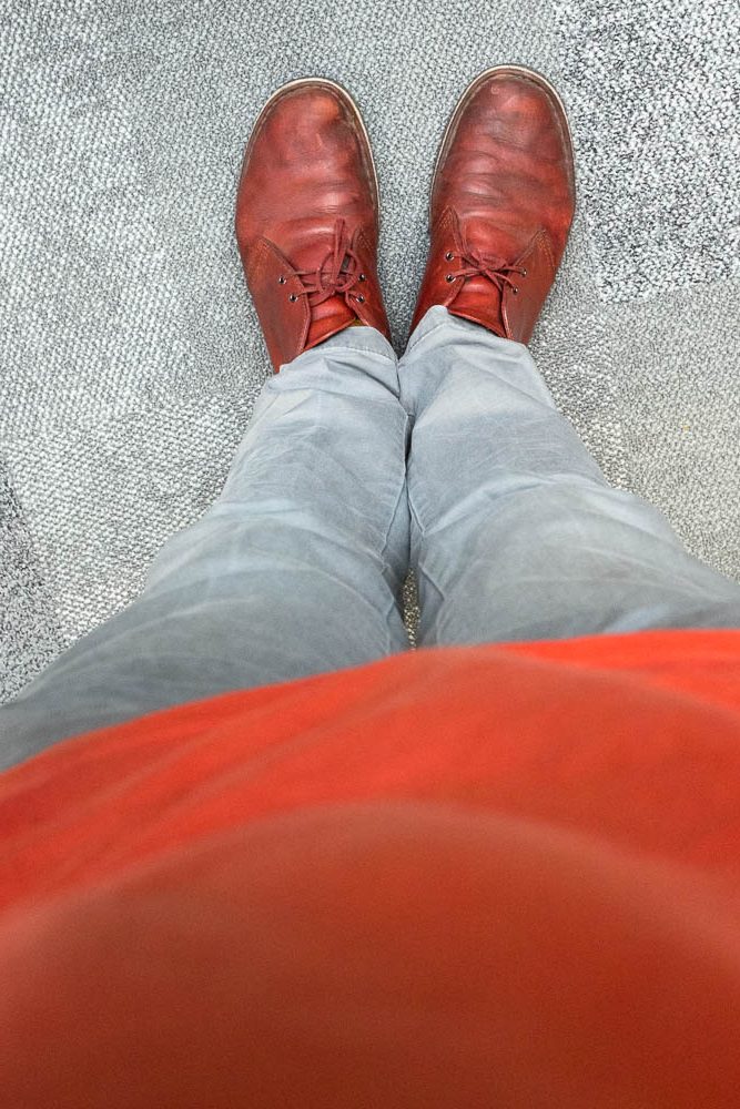
I did not intend the people who’s feet I had taken pictures of to be reduced by the process or to be seen as ‘other’. I firmly fit into the same category or class – commuters – as they do. Perhaps I should have included a picture taken after asking someone sitting opposite me to take a picture my feet as well and included it in the set but I couldn’t summon up the courage to commission someone to do so in the course of my daily trips to and from work. By way of partial recompense for this, I include a self portrait at the top of this post. The feet point the other way, but they still show me, there on the tube with all the others…


Reference:

towards assignment 5: synecdoche and metonymy

On the morning of the anniversary of the Grenfell fire, as I walked to work, I saw a man walking in the opposite direction. He was wearing a t-shirt with ‘Grenfell = Auschwitz’ written on it. (Annoyingly I didn’t have my camera out at the time, so I don’t have a photo to use here)  While the statement may have been intended as a metaphor, its impact on me is better described by another figure of speech – hyperbole: an exaggerated claim or statement that is not meant to be taken literally. Grenfell Tower was neither built nor maintained in order to exterminate its residents and the fire was nothing to do with genocide. However, the statement was strong enough for me to remember it now and to have thought about it off and on since the man’s t-shirt caught my eye that morning.

It also has acted as a spur for me to start thinking about other rhetorical figures that might be used to underpin my work: in particular metonymy (where a thing or a concept is referred to by the name of something closely associated with that thing or concept) and synecdoche (where a specific part of something is used to refer to the whole).

It is, incidentally an example of metonymy to use Auschwitz as a stand in for The Holocaust. More pertinently, the photographs I intended to make for this this assignment, taken in playparks and using the slides and climbing frames found there to stand in  as signifiers of childhood and parenthood are likewise using Metonymy to make their point. And if they had been used to make a statement along the lines of ‘life is a playgound’ they would have been metaphors. And then if I had used the swings and roundabouts so that that they signified as part of their wider context (the playground), they would have been examples of synecdoche.

Synecdoche – generally seen as a subset of Metonymy – is the one I’m going to concentrate on here as it is the figure of speech at the heart of my fifth assignment for Identity and Place…


At the beginning of part 3, I wrote about using St Basil’s Cathedral as a lazy shorthand for ‘Moscow’; now, here is another cliché of a photo:

untitled, 2017

If I give this untitled photograph the title ‘The Eiffel Tower’ it could possibly be read as a metaphor (and if I title it ‘Ce n’est pas la tour Eiffel‘ I am arguably drawing attention to this in a knowing, slightly smart-arse way).  But if I title it ‘Paris‘ , then the title acts as a synecdoche, where a component part (the tower) stands for a larger whole (the city it is in).

By using pictures of pairs of feet to stand (no pun – another figure of speech – intended) in for whole commuters, I am doing something similar to people referring to workers as ‘hands.’

Simplifying a complex whole  – the whole person who turns up to do work in your factory – into the part that is of use to you can easily be seen as demeaning. Their hands are going to do the work and generate value for you; you are not interested in their hopes, aspirations or anyhting else related to their lives outside their work. Indeed classical rhetoric ties directly into the concept of oratory which tends to be done from a position of power, associated with right wing/conservative types such as Boris Johnston. Perhaps the left (a synecdoche taken from the seating arrangements in the French revolutionary assembly, and now I think of it, so is ‘the right’) tends more to the forms of non-conformist preaching in the UK or its Southern Baptist equivalent in the US(?)

But I digress. In calling my assignment Metrosynecdoche, I was not trying to reduce my fellow commuters to just their feet. Their feet and their footwear are intended to stand in for their complete selves. Perhaps I should have included a photograph of my own feet, or better still, got someone sitting opposite me to do so. Certainly I am no different to the other people on the tube. I live in the city and need to get around to get to work and to go and experience things outside my job. Perhaps I should have called it Metrometonymy instead, with the commuters (or the commute) standing in for the related concept of ‘London’.

fig.1 – portrait of the artist as a commuter


Reference:

I have looked at a lot of pages of the Wikipedia, getting my head around the – quite complex – concept of figures of speech. Here are a couple of them:

There are many more. You could do worse than to click on some of the cross referencing links in the pieces identified above.


Assignment 5 – Metrosynecdoche

metrosynecdoche – installation layout (july 2018)

In Mike Nichol’s 1989 film Working Girl, Melanie Griffiths wears a pair of almost luminously white, box-fresh trainers as she catches the subway in from the ‘burbs to her work as a receptionist in New York; only when she is sat at her desk does she force her feet into the pair of formal, heeled shoes demanded by her station. The rest of the film (as I remember it from a single viewing, more than thirty years ago) revolves around the differences encoded in her public/private working/off-duty footwear and her socially-hobbled and her mobile selves.


Already, only a month or so after these pictures were taken, they start to offer up information about the great heatwave of July 2018 and how people behaved during it. As more time passes, other details will surface and become important: that pair of trainers was only available for three months in Spring 2018; the lino on the central line stopped being dark grey when new carriages were introduced in 2021; I had that exact colour of nail varnish; we thought the summer was so hot back then, before global warming really kicked in…

Men and women wear different types of shoes, although this – like so many other things – has become less starkly binary over the course of my life. There are social codes – which may be falling into abeyance – around shoes: ‘no brown in town’ for workers in the city; ‘no stilettos’ or ‘no trainers’ in nightclubs; some stubborn people may still wear socks with sandals, even if I didn’t spot any.

Then: how comfortable is someone with the limited space they have to occupy? Have they taken care of their feet? Adorned them even? Which normally-hidden tattoos will surface now that it is summer? Can you tell what is being piped into their ears by their phone by looking at their feet?


You can tell a lot about people from looking their feet. Or at any rate that’s the theory. I once got a place on a training scheme because my docs were sticking out at the bottom of my Oxfam suit trousers while I answered the three-person panel’s questions with my feet stretched out in front of me.

I was told later that my success at the interview in part was down to those black Doctor Martens’ Airwear boots signalling that I wasn’t the sort of person who normally wore a suit and that they had liked that subtly conveyed message. I hope I confessed (now it was too late to offer my place to someone else) that I only was wearing a pair of hastily shined-up boots because the heel had come off my good shoes that morning. Knowing me, I probably did.


Encoding and decoding meaning based on someone’s dress can be fraught with all sorts of danger, as both Harrison Ford and Melanie Griffith found out in 1989 and we can still find out, every time we get dressed and go outside into the world. I turned out not to be the sort of person who wore Docs with suits; perhaps someone who was that person would have made more of the opportunity that I was being offered…


larger versions of the individual pictures can be found here


assignment 5 – editing the pictures

fig.1 – a new wall in a new space

While shooting my pictures of feet, I wrote (and then as things went on, revised) a short set of Roy Stryker-esque rules to keep me on track:

  • All photographs must be taken between the 16th July and 26th of July
  • Take a photograph of the shoes worn by each person who sits opposite you on the tube
  • Try to get a mix of men and women.
  • However, you are not allowed to move your seat to be opposite someone with better shoes.
  • Do not behave in a way that could be viewed as creepy: if there is only one person in a section with twelve seats, do not sit opposite them.
  • If challenged, explain what it is that you’re doing; if someone objects, delete the picture.
  • If there is someone standing in the aisle and obscuring (or partially obscuring) your view of a pair of feet, wait until they have moved.
  • The finished pictures must show a clear shot of a single pair of feet.
  • No rucksacks!

Early on, I gave up on trying to get a serendipitous spectrum (black/red to violet/white) as there were too many brown shoes while no one wearing yellow shoes sat down opposite me and in the end I had between around forty pairs of feet to choose from, with up to four ‘goes’ at getting the picture I wanted.

One of my tutor’s comments on the pictures for assignment 3 (also taken in the tube) had been that I needed to set my camera  to use a higher ISO to improve the overall focus of my pictures. I had done this and have noted that  – having got rid of my 10 year old D50 – probably don’t need to be so conservative with my sensor sensitivity setting; general tests seem to confirm that both my D610 and Fujifilm X100-s (the camera used for these pictures) are much less noisy at a high ISO setting than my earlier DSLR which only went up to 1600 and wasn’t very happy when you did. Despite this, the tube is not a perfect environment for photography – the movement of the train combined with low lighting, particularly at floor level makes sharp deep focus a tricky thing to achieve. I was able to do a simple, technical first edit to reject anything that was not crisp at the toe-point of at least one shoe and preferably both.

Further early pictures were rejected on the basis of the ‘no rucksacks’ rule; a pity because there were some smashing colour combinations and pairs of shoes worn by people who wedged their rucksacks between their feet. However, the cut off at the top of the frame would not work well in terms of isolating one person’s feet.

All three rucksack pictures have quite interesting arrangements of feet within their un-cropped frame. The fixed lens on the X100 doesn’t isolate a single pair of feet in the frame, so pretty much all of the pictures had other people’s feet to the sides. This was not something I wanted for my eventual typology, however attractive the effect. I began to work with the pictures that remained.

fig.5: E. bound Central Line; Woman 30s/40s

I needed to work out a workable crop. To start with I tried a 5×4 ratio to reference Sanders’ and the Bechers’ use of a view camera to make their pictures.

fig.6: crop 1; 5×4

Unfortunately, this only worked with people whose feet were relatively close together – already here the woman’s feet are beginning to push towards the edges of the frame. I went for the as-shot, 6×4 ratio of the camera I was using, to allow the pictures to breathe a bit more:

fig.7: crop 2; 6×4

This resulted in a more comfortable crop, but I thought I would try one more thing before applying it to all the remaining candidate shots: I went for a portrait format version in both 6×4 and 5×4; the 5×4 looked better:

fig.8: crop 3b; 4×5

Again though, it seemed a bit cramped and, because all the pictures had been taken in a conventional landscape format didn’t leave a lot of room for adjusting the vertical position of the feet in the cropped pictures (the 4×6 was even worse in this respect – you had to include the whole height of the image to get in even a relatively narrow spread of feet)

fig.9: N. bound Victoria Line; Man, 30s; 4×5

I quite like the effect of this, but for the purposes of the assignment,  6×4 landscape format it was. I also straightened up the horizontal perspective using the junction between the bench seat and the floor of the carriage as the standard.


David Bate – in the chapter on portraits in Photography: the key concepts –  has written about how we read pictures of people, using expression, posture, clothing etc. to try to identify (or identify with) the person pictured, almost without thinking about it. This can be applied to partial portraits showing details of someone’s person, as well as to a head shot or a full-length picture.

Looking at the pictures each evening, I had tried to work out how different people would take different things from the pictures: someone interested in footwear would be able to draw one set of conclusions from the style and colour of the shoes – much as Stephen Shore talks of the paints used on the cars in Uncommon Places becoming more and more evocative of the time depicted –  while another might read different things about how relaxed people were feeling that morning or evening (and are the people going home, more relaxed than the people commuting at the start of their day?); a historian of the tube would know which line was which by the colour of the flooring and on and on. I took this difference between the dark Central Line and the much lighter, Victoria Line flooring and decided to use it as a further organising device: an even number of dark and light backgrounds could be used to give a chequer-board effect to the overall display of pictures. The Central Line is much dimmer than the Victoria (somewhere between one and two stops) so some of the pictures from the second part of my journey were taken with a longer exposure time , making it harder to get them sharp, unless I waited until we were stationary in a station.

I could have further increased the sensitivity of the sensor, of course, but I didn’t – I’m only beginning to really process Martin Parr’s pronouncement on digital photography: (‘The thing people do not realise with digital is that what you should be constantly adjusting is the iso’) and need to do more systematic tests of how both my main cameras perform. The result of this was that I had a smaller set of Central Line pictures to work with, so an easier task of getting them down to a final candidate list.


At this point, I went to Boots and made 6×4 prints of about 28 pictures (eleven Central line and seventeen Victoria). I tried to arrange them into a grid and realised that the final organising principle (to go with even numbers of men and women and alternating dark and light flooring) could easily be a continuous line running through the set, provided by the junction between the bench seat and the floor – a single silver bar on the Victoria Line and a double gunmetal one on the Central giving a skirting-board effect; I would use the lower of the two central bars to provide a unifying constant, running through all the pictures. Neatening up the position of the line (a third down from the top of the frame) proved impossible to reconcile with the other framing rules. More pictures were eliminated, leaving me eighteen or so to play with.

Another difference between the Central line and the Victoria is that the central block of seats has a two-seat wide recess by the pole at the centre of the carriage. It took me a while to realise that sitting in one of the recessed seats changed the angle so much that pictures taken there didn’t really work with the ones taken over the standard-width aisle elsewhere. Reduced further the number of useable Central Line pictures.

Which meant all I needed to do then was prune down the Victoria Line shots (a subjective process that I have not fully unpacked) to include the ones that I liked while balancing out the genders and to write up the Artist’s Statement.

Done!


Reference:


assignment 5 – a false start, a new idea and taking the pictures

Towards the end of my assignment four tutorial, I outlined what I thought I would do next: a typology of play-park furniture (slides, swings, climbing frames, things like that) taking Bernd and Hilla Becher’s industrial forms idea and applying it as a way of commenting on my identity as both a parent and a photographer. I would take the pictures (as far as possible) using a medium format film camera; they would be in colour; light conditions would be low-contrast; there would be no foreground figures. I even went so far as to start taking the pictures.

fig.2 – slide; gotherington

fig.1 – climbing frame; glasgow


I like both of these, but it wasn’t really working out. To get pictures without kids climbing over the equipment, I’d need to be able to get to the various play parks either early in the morning (for pictures that would work while looking west) or the evening (while looking east); finding the time to zoom off on my bike before or after work wasn’t really practical while I was trying to pack up stuff before moving house. To get the low-contrast pictures I wanted called for days when the weather wasn’t bright and sunny and this summer hasn’t been very good for that.

fig.3 – slide; southend

Reluctantly, I put the idea (and its related sub-set of benches in play parks where I’d wearily sit while Alice or James ran around climbing or sliding or swinging) to one side and cast around for something that would be suitable for the assignment but did not require me to find lumps of non-existent time to complete it.


Then, one day I paused and looked down towards the ground. This is what I saw (or at any rate  a photo of a reconstruction of what I saw).

fig.4 – portrait of the artist in red desert boots

Which did not necessarily conjure up the image of a middle-aged bloke that stares back at me when I catch a glimpse of myself reflected in a shop window or in a picture of me taken by someone else.

fig.5 – picture of me taken by my son

I began thinking about shoes and the messages about their wearers encoded in them.

Earlier this year, I attended an event where one of the speakers – as an aside – said that you could tell an awful lot about people from looking at their shoes. It was easily the most interesting thing anyone said that day and I began to think about approaching a range of people at work and seeing if they’d let me take pictures of their empty shoes, lit and presented as still lives. The resulting pictures would then be presented as a set,  identified with their job titles and the associated salary band. Again, an interesting project, but one that I haven’t got round to doing anything with yet.

Then, one day shortly after I’d moved house, and shortly after I’d stood staring at my feet, I was sitting on the tube fiddling with the settings of my camera (possibly thinking of Walker Evans or Martin Parr in Japan) when I looked across the aisle and saw this:

fig.6 –  south-bound victoria line; man, 20s-30s

I thought of the old joke about the extrovert engineer who stared at your shoes while he (and it always is a he in this joke) talks to you. And then after I had changed at Oxford Circus (the action described in assignment three), I took a second photograph:

fig.7 – east-bound central line; woman, 20s

And on my way home that evening, I took another couple of pictures;  I was off and running. The pictures built up quite quickly.

For the next fortnight (the two weeks running up to our break in Orkney) I took pictures of the shoes worn by everyone who sat opposite me on my journeys to and from work. If I wanted to compile a decent typography, I needed  either twelve (three rows of four) or fifteen (five rows of three) subjects to make up a nice grid of variations. I was doing rough edits of the pictures each evening to determine what worked and what I still needed to picture each evening and this fed into the next day’s shooting.

On the 26th of July, I got home from work and emptied my memory card for the final time. Two and a bit weeks later, I got back to Walthamstow from my holiday and began to edit in earnest.


Reference: