Category Archives: Part 4

reflection point – on looking out of train windows

How often do you see people walking and reading their texts or on the train and reading their tablet rather than enjoying the view? What are we missing when we do that?

– IaP Coursebook, p.106

In its final chapter – The City and its Discontents –  of Sudjic (2017), the idea is floated that – by burying themselves in a screen – pedestrian city-dwellers lose their ability to navigate their streets deftly, becoming instead less of a citizen and – like (bloody) tourists – more of an obstacle to people who know where they’re going. Certainly, you become less aware of the space you are passing through. Like listening to music on headphones, you become less present, more abstracted. You have ceased to be in the here and now.

When it comes to journeys, I value the sense of time-out  far too much to try and remain engaged with the quotidian of my regular life. I certainly never try to work, unless I absolutely have to. I may read, or I may play with photography from a train’s window, or just to lose myself in the movement and of being in motion through somewhere. Travel takes place in a corridor as  – in the case of railway, literally – you follow a line through the geography of the country, rarely seeing much beyond a few hundred yards on either side of the track.

So, on a journey to Manchester for work, I put down my newspaper and switched off my laptop, forgetting to take a picture for the series I was making for exercise 5.1; Instead I started to stare out of the window, and – in the spirit of Georges Perec – began making notes of what I saw.

25-vi-18 Stuff seen from the Manchester train, looking east.

  • A cluster of 6 or so wind turbines
  • A remarkable banked tilt as we approached (and then went under) a motorway – vehicles, sheets of metal standing like gravestones and – I think – some real beehives
  • Colwich Memorial Garden
  • A park of OpenReach, Thames Water and (orange) RAC vans
  • A blue portaloo at the far corner of a field, after a caravan with a factory (concrete?) in the background
  • Pink-wrapped hay bales dotted over a field
  • Sheep dotted over a field
  • Industry – modern steel shell and victorian brick
  • Farms
  • Pylons, overhead electricity – POWER!
  • People on Platforms, waiting for trains
  • Graffiti
  • Was that a castle on a hill? With a village?
  • Some sort of huge comms mast on the horizon; contrails overhead (photo)
  • -> Arriving in Macclesfield
  • Steel Fences to keep people off the track
  • Stairs so people can get down to the track if they’ve got keys for the gate
  • A pregnant woman in a red and white striped top at Macclesfield; a man in lycra with a bike; a man with an interesting tube/container thing

fig.1 macclesfield

  • Facing forward, I see what’s coming
  • 5 brown cows on a hillside, straddling a path between some trees. How now.
  • Green (grass, trees) – Blue (sky) – Grey (gravel, stone, concrete)
  • Steps up to a green painted footbridge over the railway
  • Stations we don’t stop at; the signs blur past, too fast to be read
  • ‘Polish flag’ signs at bridges
  • Back gardens glimpsed through trees
  • An old(ish) woman in a shocking pink skirt and bikini top in the sun taking down the washing in the back garden of her cubic postwar house
  • Brown brick; grey slate
  • A train whizzing past, going the way I’ve just come
  • Greened up copper on a roof
  • NCP car parks
  • Tethered bikes and golden dried grass like a horse’s mane poking out of gravel at Stockport
  • Chimneys
  • The tradesman’s entrance to cities
  • Regent House Travelodge (blue); Redrock Stockport (red, funnily enough)
  • A rusty metal footbridge – Ardwick – with the Etihad (?) stadium in the background
  • Cranes, construction all around as we near Piccadilly

There are many precedents for taking photographs from trains, and Dyer in The Ongoing Moment makes a strong case for train travel leading to a different, more serendipitous perspective upon a country than the road trips across the USA made by photographers such as Robert Frank or Gary Winogrand in the sixties. He cites Walker Evans’ in some of his pieces for Fortune Magazine or Paul Fusco’s pictures of people lining the tracks, taken from the train carrying the coffin of Bobby Kennedy from New York to Arlington almost exactly 50 years ago.

Beyond photography, I immediately found myself thinking of Phillip Larkin’s poem, The Whitsun Weddings, where the view from a stopping train leads to a reverie on marriage and what it means and on Larkin’s being single when so many people are not. And how Larkin took photographs (and was good at it, too).

fig.2 – from an earlier journey,  heading home from Nottingham

It’s quite hard, maintaining concentration as you watch the country and the towns slip past and make notes; you do end up making connections and thinking about things, based on what  you have seen and how you relate to it. On your phone (more so than reading a book or the paper – I don’t know) you are abstracted from you surroundings, you are somewhere else rather than in the here and now.

Reference:

  • Sudjic, Deyan (2017) The Language of Cities. London, Penguin
  • Larkin, Phillip (1964) The Whitsun Weddings (in the collection The Whitsun Weddings, Faber and Faber, London)
  • Dyer, Geoff (2006) The Ongoing Moment Abacus, London.


exercise 4.2 – words and pictures

oxford circus as a gallery space

Choose a day that you can spend out and about looking with no particular agenda. Be conscious of how images and texts are presented to you in the real world – on billboards, in magazines and newspapers, and online, for example. Make notes in your learning log on some specific examples and reflect upon what impact the text has on how you read the overall message.

– IaP Coursebook p.79

Pictures on display –

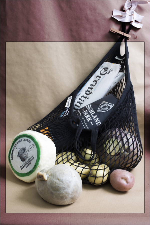
fig.1 – an absense of beaches

The first pictures I see each morning usually are these, hanging outside the bathroom door. They are photo collages, assembled on a photocopier by German artist Ursula Keller  and purchased from the accountant I shared with her (or possibly the owner of the gallery in Glasgow that represented her) at the time they were exhibited there (around 1995).  The common title of the series – ‘Given the obvious lack of beaches’ – is based on a hopeful quote by Glasgow’s provost, Pat Lally, along the lines that ‘Given the obvious lack of beaches in the city, we need to give our visitors some alternatives.’ Keller had provided some beaches (and palm trees, and sunsets) from elsewhere and added them to Glasgow landmarks like the Barrowlands Ballroom and the University tower.  The title opens them up, preventing them from being merely an interesting visual jape and locating them in a place where they can comment on the shift of Glasgow from being ‘about’ heavy industry and razor gangs to being somewhere that was ‘Miles Better’ – a cultural rather than an industrial destination for people who did not live there.
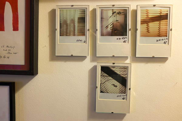
fig 2 – polaroids

Another grouping of pictures in my house consists of four polaroids taken by me of shadows moving around the house’s rooms.

While Keller’s titles are complementary, these have simple date/time titles orientating the viewer to the point in time when these unique traces were plucked from the sun’s progression around the house.

They’re pretty abstract photographs – you need something to anchor them, if only to let you know that you’re looking at moments in time, and the patterns are made by that .


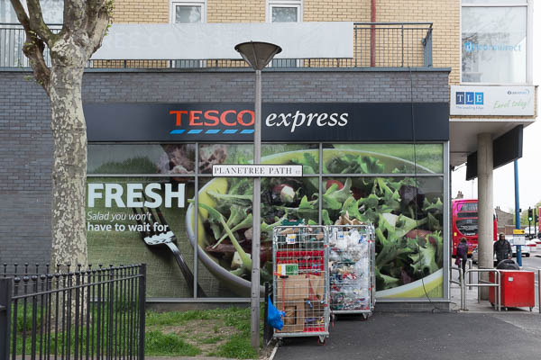
fig.3 – on the way to the tube

Images in the Street – 

As I cycle to the station, I see advertisements – on buses, on hoardings and on buildings. I go into Tesco to pick up the paper. The building itself is covered in pictures (to the left of fig.3 there’s a bowl of curry, labeled EASY) and surrounded by words. The text that jumps out here is the one they want you to notice (whether you are going to buy anything or not) – FRESH; it relates easily to the massive bowl of green salad. But it’s not quite as fresh as all that – like most of the food in an ‘express’ (or ‘local’) grocer’s the salad is preprepared, something covered by the small print – “Salad you won’t have to wait for” – this is a fuel stop, not an artisanal bakery or greengrocer. It’s opposite the station so you can pick up something for supper on your way home. But it’s the word FRESH that hooks you and sticks in your mind so you know that it’s an alternative, next time you need it.

fig.4 – you could be this person too (or if not, that one on the other side)

And then, when you enter the shop, you’re flanked by a pair of larger than life people offering you food (they are literally ‘putting food on the table’). One is male, one female. both are captioned with a very personal description of the food they have just made (from FRESH ingredients; from closer to scratch than popping a ready meal into the microwave) – these are ‘Jane’s Fishcakes for two, or one’ – you are invited to identify with these cooks; they are like you, they care about food, they smile invitingly, proud of their efforts. They even have their own signature dish…


They are also at odds with the reality of the inside of the shop of course, but never mind, you can aspire to the sort of life they seem to embody (even if it is possible to infer from that caption that Jane is currently single, and eating double portions to compensate) and maybe even go to a full-on supermarket (a ‘big’ Tesco) at the weekend, and do some proper cooking then.

I buy my paper and cross the road to the station…


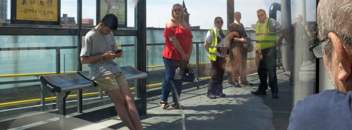
On Public Transport –

On the tube (in the tube?) the sort of adverts and the amount and type of information varies according to how you will encounter them. London Underground is a complex machine for processing people and moving them from one place to another. There are places where people are expected to stand (on Platforms) and places where you really don’t want somebody to even break their step (in the concourses) and places that are somewhere in between (escalators, where people will stand – on the right – and move past the walls at a predictable speed). And then on the trains you will be static (sat, or strap hanging) for long enough to read text and even jot down a URL or phone number (or take your own picture with your phone).

I’m not sure whether it is men or women who are supposed to be drawn by the Heist tights’ ad: I quite like a shapely bum, but I’m not going to bet my bottom that my tights are better than theirs. Am I supposed to buy a pair for Fiona? Or do women look at other women’s pirouetting arses and want to emulate them? It has associated the word Heist in my mind with tights; with nice tights that do nice things to women’s bottoms; perhaps this is all it needs to do.

Versace Jeans are hardly evident in the pictures that line one of the station’s halls, but the pictures  – black and white, moodily lit, medium sized and in frames- combine with the cumulative display to create the idea of an exhibition in a gallery. Versace jeans are ‘art’ they are a cut above more vernacular jeans. But I’m still not likely to exit the station onto Oxford Street and buy a pair. But, again, the brand has stuck in my head with a set of associations. Boo Hoo (also plastered all over the station) clothing is a bit flash, a bit flirty, a bit young, a bit common; Versace is for people a bit older, with a bit more taste.

The London Transport adverts (posters) encouraging approved behaviours in us, the passengers, are obviously drawing on Gillian Wearing’s series from 1992-93 showing people with placards, but without the tension between the words on the placards (which in TFL pictures are printed, so official, rather than the handwritten interior statements in Wearing’s) and the appearance of the person depicted. Again there is a reference to art, but its effect here is to comfort: the people holding the placards smile; if we all did as the words say, the tube would be a nicer place.

(Interestingly at Euston, the same pictures have been modified – presumably by station staff – with the addition of glued on, handwritten statements, like “Welcome to Euston”; these instantly seem less corporate and more personal; I wondered if the particular TFL staff members in the altered pictures worked at that particular station)

Heading home from Oxford Street, who wouldn’t fancy a holiday, somewhere warm with a pool?  Heading home from Oxford Street after a had day’s shopping, feeling a bit skint, who wouldn’t fancy a chance to save some money  on that holiday? Don’t the kids look happy? don’t they seem free (as well as ‘free’)? Doesn’t the water look cool? Wouldn’t you like to be anywhere else but waiting for your train home?

And then, sitting on the train, you have time to look at the pictures arrayed above the heads of your fellow passengers. Often they have exemplary people, ready for you to identify with them and to find out more by reading before signing up to realise your dreams through education or through buying clothes or through  guaranteeing your family’s prosperity by insuring yourself before you die and leave them in penury or through investing in some sure-fire winner.

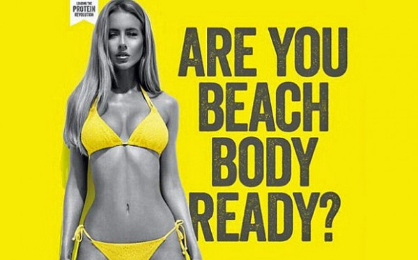
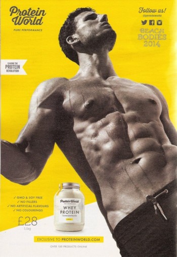
One of the things that is odd about the ‘Beach Body Ready?’ ad discussed on the OCA Blog  is that it is confrontational rather than aspirational. The Rodchenko-esque (another borrow from art) man looks off, like the woman who has realised her bold dream, into some future-tense middle-distance; the woman in the bikini looks at you daring you to eat her protein-rich whey powder and get into shape for the summer.

And I do wonder whether all the borrowings from art are to make the advertising people feel better about themselves and whether they are dropping in a bit of Rodchenko here, a bit of Gillian Wearing there as a way of nodding to the people who know like me (or you of course most likely if you’re reading this) that they’re capable of more somehow, like an actor saying ‘I don’t have to do this rubbish you know – Larry thought most highly of my Laertes…’


In the Newspapers –

I’ll be writing more about news pictures and their relation to their captions and headlines in a later exercise, but I’ll say something here about layout on the page and the cumulative effect of groups of photographs.

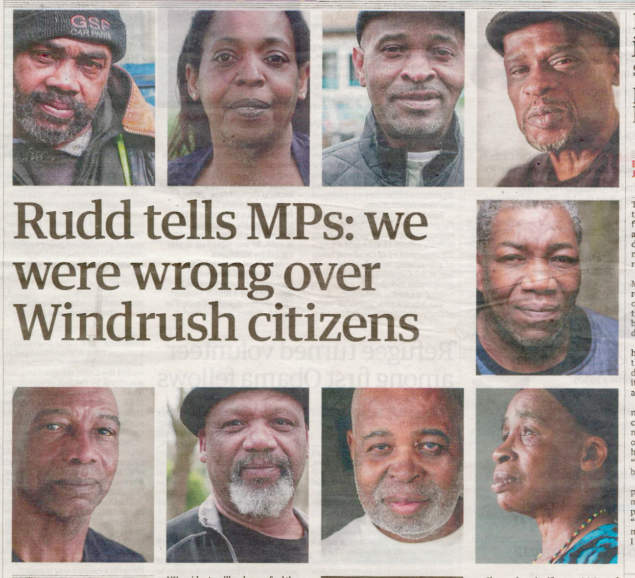
While i’ve been collecting newspaper pictures, there have been two stories that have been illustrated by galleries of faces – London knifings (in the Sun) and the Guardian’s investigation which kick-started the reexamination of how the home office treats immigrants. In both cases you are presented with a typology you don’t want to be a part of. In the first you have the victims of knife crime and in the other, the members of the Windrush generation, caught out by their lack of the necessary documentation and so threatened with deportation.

The knife victims’ pictures are obviously not taken by a professional – everything about them screams ‘cameraphone’; they are dead; the pictures have been provided by relatives or combed from social media sites. The pictures remind the viewer of other galleries – of the world trade centre dead or British armed forces’ personnel killed in Iraq, or last years victims of knife crime in London. You read the headline to find out about the specifics of the story, but you already know its outline.

The Windrush pictures on the other hand have been taken by a professional. Their arrangement still says ‘victim’, but there is still the chance of the shared situation they find themself in improving. After all, they’ve a newspaper and a professional photographer on their side. You read the text to find out who they are and what has been done to them. You hope that something will be done.


Specific, Technical Pictures –

We are in the middle of the process of selling my house and buying another one. We have now reached a point where we are poring over the survey of the house we are buying. It has a number of directly illustrative photographs, showing details of points that are described  in the text:

‘a previous masonry paint finish has been removed in recent years and defective bricks have been sensitively cut out and replaced (see fig. 10 which shows such a repair)’

…and that is exactly what you see when you look at the photo. Taken on their own they would seem a strange set of seemingly randomly chosen details; with the text the are of one thing and of that thing only. Later in the survey, it comments that another described detail is visible on Google Street view which is offered as evidence that a a specific crack has not got worse since the street view pictures were taken in 2008 and so appears to be long-standing and not anything to worry about.

In the survey the pictures are of things you – the emptor – should consider carefully as part of your caveating. There, look – we’ve told you; we don’t think it’s serious, but – if it turns out to be – don’t say you weren’t warned…

You can contrast these tightly composed pictures with the expansive wide shots of my flat (or indeed the house that we are buying) from the estate agents’ sales brochures. There the pictures are about conjuring up as much space as possible and drawing you in to imagine living in such a place with ‘high ceilings’ and a ‘large kitchen diner’ opening onto a ’50 foot garden’… Yes please!


Most of the pictures I see in my day-to-day life are presented to me as hooks, designed to get my attention and draw me into reading some text. That text tends to tell me what it is I’m looking at, particularly if there is any potential ambiguity in what the image ‘is of’.

research point – barthes’ ‘the rhetoric of the image’

Read ‘Rhetoric of the Image’ and write a reflection in your learning log.
• How does Barthes define anchorage and relay?
• What is the difference between them?
• Can you come up with some examples of each?
• How might this help your own creative approaches to working with text and image?

– IaP coursebook – p.79

My final assignment for Context and Narrative drew heavily on Barthes’ essay by using it to provide a model for a ‘made up’ image in the form of the pasta advertisement, juxtaposed with a poem. In planning the image I engaged quite closely with the text, but I shall try to recap here. It is certainly a text that warrants careful re-reading.

Anchor and Relay:

Both are terms relating to text associated with images, a practice so widespread that it is difficult to find ‘pure’ uncaptioned images anywhere. Images are viewed as ‘polysemous’ with a huge range of possible interpretations and meanings. Text can dominate this plurality of meanings when the image ‘duplicate[s] certain of the text by a phenomenon of redundancy’ (anchorage) or else the text can be used to ‘add fresh information’ to that contained within the picture (relay).

So:

  • Anchorage – Text answers the question ‘What am I looking at?’, narrowing down a number of possibilities to that expressed in the associated text. The image becomes a single thing, with an approved reading supplied by the words. In other words the text dominates the process of producing meaning for the viewer. This is the most common way that text is used with images (in newspaper captions, advertisements etc) and represents a reduction of the possibilities of the image.
  • Relay – new, extra information is provided by text (or speech in the case of comic books or films) which augments and moves on the content available in the image itself. Instead of dominating the image, text works in a complementary way to the content of the image.  Image and Text play equal parts in a narration, organised as a series of syntagms (ie in a sequential, progressive way).

Anchors lend themselves to certainty, shutting down options and seem directly related to an indexical reading of the photograph as a direct objective trace of a real object; they specify which set of connotations are sanctioned for the use of the viewer. Relays offer more scope for interpretation and work on the part of the viewer, expanding the possibilities for both connotation and more complex narratives. Relays also  – at least tacitly – acknowledge the possibility of the existance of a narrator, telling the story, while anchors present a story as existing, a latent presence within the image.

Some Anchors – Labels on pictures of food in menus or above the service area in take aways; newspaper captions; labels in family albums; simple descriptive titles.

Some Relays -Dialogue in films (or caption cards in silent films for that matter); Allusive titles relying on knowledge not contained in the image (classical painting based on Greek or Roman myths, say); captions where the information relayed is not present in the image.


I could use this, immediately, in revisiting my (superceded) early idea for assignment three. I had hoped to be able to show my thought processes as I chose where to be at set points in my journey to work in order to be able to make the simplest transition to the next stage.

Starting at Walthamstow Central, sitting in the 3rd coach from the rear of the train allows me to step straight into the way out at Oxford Circus, where – after I go up one level on the escalator – I can then get the easiest, least congested path to the Westbound Central Line Platform. Then if I wait by the waste bin, opposite the peeling paint, I can get on the next train after arriving at White City, disembark and go straight up the stairs.

There was way too much information to get across here, to leave it entirely to the pictures. There is a lot of discussion online about the limitations of the philosophy of ‘show – don’t tell’ in visual story telling; indeed Barthes questioned the idea that we are becoming a more visual/less verbal culture in the original essay in 1964. If I could have added text in some way – sometimes anchoring by reducing the chaos of what you were looking at to a manageable chunk of information; in others adding relays such as recordings of (or the script for) announcements about the next station – I maybe could have got it to work.

I think I will try this, using a mixture of new pictures and audio recordings to augment the slideshow version of that assignment for exercise 4.5…

Reference:

  • Barthes, R (1964) Rhetoric of the Image from trans. Heath, S. (1977) Image Music Text (Fontana Press, London

I have spent a fair amount of time working through the search results produced by using the search string  – Barthes Anchor Relay – on google. It is interesting how everyone seems quite certain of what an anchor is; thinking on relay – mostly still centred around Barthes’ identification of it as a feature of cinematic or comic strip narrative –  is much more diffuse.

exercise 4.1 – looking at advertisements

OCA tutor Dawn Woolley writes a regular blog  called ‘Looking at Advertisements’. Read one of Dawn’s articles and write a blog post or make a comment on the site in response.

– IaP Coursebook – p.75

I looked at two of Dawn’s posts: the Protein World “Beach Body” post and then followed up by having a look at the related post looking at an earlier Protein World advertisement.


I had picked the first post to read because I remembered seeing the advert on the tube when it’s campaign was active in 2015. I remembered noticing the advert for two main reasons: when I first saw it, I was struck by how confrontational the image of the woman was; then a few days later I noticed it had been overwritten in marker pen with a phrase I hadn’t seen deployed in public since the late 80’s – “This Offends!”

The original advert – I saw it as one of the array of advertisement cards above the windows of a tube train, angled down at me – was above my eyeline, compounding the way that the centre of the image is firmly set around her navel. it is her body (or rather her flat, evenly tanned stomach) not her face that is ready for the beach. This is less apparent on a screen, although one of the blog illustrations does show it in its original setting on the tube.

The discussion of the photography in Dawn’s blog (and in the comments that follow)  is mostly concerned with the passivity of the woman in the image with her eyes shut, or in shadow. I (the viewer of the advert)  am looking at her; she is not looking at anyone. I am active; she is passive. Indeed, looking at the image and the way the shadow falls on the yellow background, it is not clear whether she is lying down, on a yellow beach, sun bathing, while I am positioned to stare down at her. There was concern that – unlike the earlier advert featuring a man – the photograph could not be traced back to an “art photography” context, but not that this would in some way validate the objectification.

It appears to fit in nicely with Berger’s critique of the treatment of women as subjects of a male gaze in fine art (in Ways of Seeing).  I followed the link of the 2015 post back to the post about the previous year’s ad:

Here the discussion was much more around the appropriation of the style of Alexander Rodchenko’s photographs, taken in the aftermath of the Russian revolution, which often featured pictures of heroic individuals, rendered strange by the angel they were viewed from. Unlike the woman, with her closed, shadowed eyes, the man’s chin juts out and his eyeline is set on some distant horizon where the promise of the ‘Protein Revolution’ – another, link back to Rodchenko, verbal this time – is realised in all its glory. His right arm is frozen as it swings over the camera. It doesn’t matter that you can’t see his pace properly because this is  synecdoche (the figure of speech where a part stands in for the whole) – it doesn’t matter that you can’t make out the face, you’re looking at the six pack.

Figures of speech of course are drawn from classical rhetoric. Similarly – as much as the allusions to Rodchenko and revolutionary Russian, this draws on half-remembered ideas about classical statuary. The man in image two is standing, frozen, towering above you like a collossus; the woman could be a caryatid. And photographs of people in poses drawn from classical statuary have been used to legitimise the sexualised gaze pretty much since photography began.

Just as the “beach body” picture could be seen to fit into the category of the ‘cheesecake’ pinup, the male torso depicted here is a fairly standard ‘beefcake’ shot, objectifying a paradoxically feminised image of the hairless but honed male body with the repeated muscular V-s pointing down below the (eyelevel) waist-band of his trousers. This is homo-eroticism, but not so overtly that a militantly straight body-builder would be put off buying the product,

I am not the target audience for this. I feel no envy (or a wish to be like the man pictured). I do not desire the man himself. I am certainly not going to pick up a tub of whey protein and take it back home to Fiona so she can get herself beach-body ready in time for summer.

However, I do think of Clive James’ description of Arnold Schwarzenegger looking like “a brown condom stuffed with walnuts” and this in turn leads me on to Steve Bell describing David Cameron as looking like a condom stuffed with ham. Neither comparison is flattering. Both are funny. Both are powerfully visual. The fact that this is what I think of locates me as someone who sees themself as above all this bodybuilding stuff, as a mind rather than a body. I also think of the pilot in Airplane asking the boy who is visiting the airliner’s cockpit, ‘Son – do you like Gladiator movies? … Have you ever seen a grown man naked?’. I find it all slightly ridiculous while hoping I don’t come across as appearing superior (not a flattering look).

Returning to the adverts though, it’s interesting how poor the text is at closing off these unauthorised readings of them. I assume that – as a man – I should wish to have a six-pack and am prepared to do something about it; how I am supposed to regard the woman, I don’t know; I have even less idea of how I would be supposed to view her if I was – the assumed target of the second ad – a woman. Maybe I’m supposed to make women envious simply by going, ‘mmm –  nice’ but she seems too fierce (or as I said at the begiining of this post, confrontational) for that. Both pictures seem to be too open (and to remain so, despite the text) to prevent unintended readings at odds with their text. They are strong images, and they provoke; if they were less strong, I assume that – as someone who is not part of their intended audience – I would not remember them. If the beach body ad was less strong, it would not have been defaced by angry women. Similarly, a weaker image in the first ad would not have led me to distance myself from it through humour. Both adverts provoke, but not necessarily in the way that their makers intended.