Tag Archives: orkney

assignment 2 – reflection

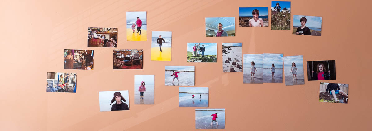
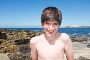
living-room wall, during the editing process for assignment 2 – walthamstow, september 2017

1: Demonstration of technical and visual skills

This assignment exists in two forms: online in the post that precedes this one and physically as five A4 prints + a printed sheet with the artist’s statement from the post. While most people reading this won’t ever see these prints, I consider them to be the primary endpoint of the assignment with the log version acting more as supporting material.

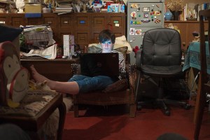
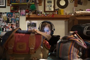
I am happy with the all five of the final pictures (and indeed there are others that I like as well, but that did not make the final cut). The composition works for me and the relationship between my subjects and the camera seems appropriate for the situation. Colour, contrast and overall balance of lighting likewise seems right. The light from James’ laptop and Alice’s iPad in the two interior pictures is possibly a bit too blue, too bright, but will pass (or be fairly easily rebalanced for assessment).

I have got to the point where I am acceptably comfortable working in Lightroom. I use it both as my main editor and, probably more importantly, as an organisational tool. For more complex retouching and for compositing, I use Photoshop (Elements – I’m a tightwad), but haven’t really had to here. The final piece of the workflow jigsaw has been getting the printing module to output files that come back from Loxley successfully translated into C-type prints (ie as old-fashioned photographic prints, rather than inkjet).

The prints that should now be with my tutor (and let’s wait til he comments, before I make any definitive pronouncements on them, myself) seem to have worked well. In the past, colour has generally worked as exected, but I’ve had issues with the way with the overall lightness of my prints – they tend to be much darker than the images appear on screen. This time both the small prints I make with the machines in Boots (see the header for this post) and the final submission prints seem consistent with what I’m seeing on screen. One of the differences between professional, restaurant food and the food you eat at your (or someone else’s) home is supposed to be that if you have the same meal several times at a restaurant, it will be the same each time; a home cook will not maintain that level of consistency…

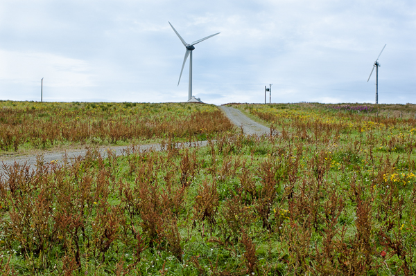
I have been musing about the way the size of a print (or the size a picture displays on screen) affects the way that it is read) a lot recently, too. The bigger something is printed, the less likely it is to come across as a vernacular snapshot.  Part of the job of moving the assignment pictures away from being viewed as ‘holiday snaps’ has been achieved simply through printing them on a bigger scale than would easily fit into an album; a comment on one of my earlier posts by my fellow-student Holly Woodward commenting that she wondered how they would look as A3 also set me thinking. For the assessment maybe?

As well as making them seem more considered and worthy of serious consideration, size also of course, exposes technical imperfections like noise and poor focus. The prints seem generally fine technically; I’m less sure about them once they have gone through WordPress’ compression and resizing engines. Another reason for preferring the physical version of the assignment.


2: Quality of outcome

In the posts leading up to this assignment, I have focused a lot on the creation of images that can be read by people who do not know the circumstances of their making. So, how well have do I think I managed this?

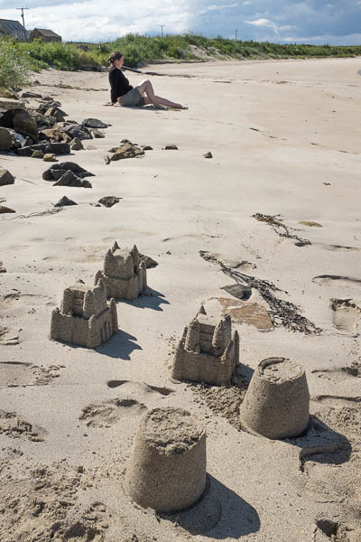
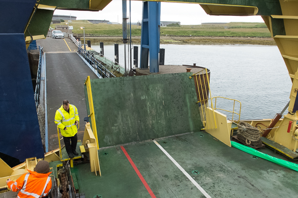
The pictures on the ferry north, are sufficiently ‘boaty’ with the tilted horizon and windblown look of the people  combining to provide a simple and clear portrayal of people in a particular space. Also, everyone looks happy enough (with me, with each other, with the general blusteriness) for a general ‘off on holiday mood’ to be conjured up. However, I realise that my personal reactions to the site-specific backgrounds (the inside of Laura’s and Dave’s kitchen;  the beach at the third barrier, with Fiona and the sand castles) will not come across to others. So, do they succeed in signifying enough to work? The answer (obviously to such a rhetorical question) is that I think they do.

The pictures of James and Alice looking at screens clearly come across as people who are not fully present in the environment where they are pictured. Their relationship is with somewhere far away on the other side of their screen. Certainly there are not in the same space as I am, although I am physically present in both of the pictures: my camera bag is one of the two foreground objects in the picture of Alice; more subtly, my unlit knees are just apparent in the bottom corners of the picture of James. Also, they are still among all the busy-ness of the room around them. They are on holiday from being on holiday but there is a lot that can be read off the walls to give a sense of my relatives who are sharing their house with us.

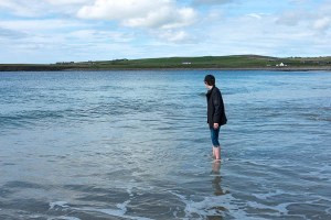
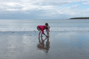
And finally, as Fiona sits on the beach, she definitely exudes a sense of relaxation and away from it all, from all the child-friendly activity like building sand castles, from other people, from the city. She has managed to achieve solitude, and in a nice looking location.

The statement accompanying the pictures (I hope) expands their possible meaning rather than simply explaining it (in Barthes’ terms the paragraphs should act as ‘relays’ rather than ‘anchors’). I wonder whether it should be split into chunks and interspersed with the pictures, rather than presented in a single – separate – ‘thing’. Before I find out what my tutor thinks, I feel that a useful approach to reworking the assignment might be to play around with the sequencing of text and image, but that may all change!


3: Demonstration of creativity

As I worked through the edit for this I was quite surprised at how much overlap there was with parts of the course introduction. There is a distinct (and unplanned) connection back to both my Square Mile Exercise and to the work that is beginning to done with examining/interrogating my (family’s) photographic archive.

I suppose this is inevitable when I have made a lot of use of my family to make pictures in circumstances – on holiday – where people traditionally make the bulk of their pictures and at a location where I have a load of history to work with (Orkney). As such this assignment can be viewed as a snapshot of a larger body of work made within a much greater time frame.

I can see glimmerings of a lot of things that might move all this further on, both here and in later courses. This, I suspect is part of the cumulative ‘developing a voice’ aspect of the courses. Stuff to put away for a bit to let it develop further in the dark recesses of my head.


4: Context:

Through this section of the course, I have experimented with the way I have presented my pictures in the posts on my blog. For TAoP and C&N, I mainly used WordPress’ gallery and slideshow options with the pictures shown medium size (about 300px on the longest edge, or about half the normal WP column width) and centred, which is fine but a bit limiting. Here I used both smaller and larger sides and tried to integrate them into the writing more. I have also begun to play with the HTML markup for the blog a bit rather than just accepting what the WYSIWYG editor gives me.

I have barely scratched the surface of this aspect of presenting my work and my studies, and will probably not take it significantly further during this module. When I move onto level two at the end of IaP, I’ll start a new blog. This would be the time to investigate moving to a premium (and so not free) version of WordPress, which hopefully will allow more tinkering with layout and appearance.

Most people (though not of course the OCA’s assessors) only see my work online; many professional photographers’ sites (including some of the people we are pointed to by the courses) have terrible, clunky websites; it would be good to develop something that can act as a proper installation or even just an adequate representation of work completed.

I think the exercises for this part of the course as presented here on my log still work well though. I am less sure that working on them at the same time as I was taking the pictures that make up the assignment was necessarily the best way to go about this, though. However, while a more sequential – research to exercise to assignment – approach might have been better, the time-bound nature of doing much of the work over the course of a holiday when I had ready access to people who could act of subjects ruled this out.

I have used this method once before – for part three of TAoP where I created a great mass of colour-related pictures and only later sorted out ‘the good ones’ for the assignment and used the others to illustrate the exercise posts. The effect then was to slow my progress down and to allow me to continually look for something ‘better’. Here I was not able to go on adding more and more pictures to the pot and so, I think, that as a working method it worked better here.

Part three will, I hope, be treated to a more linear approach…


assignment 2 – the edit

I had cut down the number of pictures I took during my holiday in Orkney from around four hundred to a more manageable thirty six.

I now needed to think  – again – about the assignment brief:

  • There need to be five photographs in the final submission
  • It needs to build on the exercises (and so should include elements of ‘aware’ and ‘unaware’)
  • It is called ‘Vice Versa’
  • There needs to be an interchange between elements of ‘street’ and ‘studio’

To go through them one by one:

Five photographs is an awkward number which removes the simple option of using contrasting pairs of shots to build up an easy narrative. It also means you can’t feature too many different people.

So, I need to determine who is going to remain ‘in’. There are six people in the pictures that made the short list (Fiona, James, Alice, my sister and my brother-in-law,  and Fiona’s sister, who was up from Newcastle for part of the time). Six is a lot, and it could all become a bit confusing. I toyed with the idea of doing it all with pairs, with one person linking into the next picture with a new subject-partner who would then carry on to the following picture (a bit like Schnitzler’s play ‘la Ronde‘, but without the criticism of sexual mores), but rejected it as too complex and also because I didn’t have enough pictures featuring pairs of people.

So despite really liking the picture of Alice with her uncle (3rd from the left in the top row of the contact sheet) I’ll limit myself to pictures of Alice, Fiona and James. Down to 26…

Then – as well as moving between the ‘unaware’ and the ‘aware’ – the exercises had involved a lot of placing someone within a readable space (or in front of a readable back ground). I rejected any pictures that could have been taken anywhere or which don’t have enough background detail to locate the pictures somewhere isolated. The close ups of Fiona on the boat and of James on the train to Aberdeen went. Down to 20.

Vice versa. I need to have something that can be introduced with a reversible opposition like ‘Orcadians in London and vice versa’ (Londoners in Orkney). From the coursework I began working towards ‘Documentary-style pictures in controllable conditions and studio-type pictures in the wild’  or maybe ‘Captured indoors and staged outside.’ This would also give me the rhetorical contrast between street and studio.

The process moved from one of exclusion to a more postitive one of definite inclusion.

There weren’t that many interior shots in the remaining twenty and of them two had stood out from the moment they were taken: individual pictures of Alice and James, lost in the worlds transmitted to them by wireless devices.

While firmly located within the particularity of my sister’s kitchen, neither of them are totally ‘there’ which is interesting too.

So, to balance these, I needed two staged exteriors. Again, two pictures had been present in my thinking about this exercise from the moment I took them (in two sessions on the boat north from Aberdeen as the day faded).

These two were also just about the best results from my experiments with fill flash in fading light outdoors.Timing of taking the photograph against the rise and fall of the boat is also critical in finalising the framing here – another dialogue between ‘staged’ and ‘captured’. And somewhere far behind us on the boat, on a beach on the other side of the North Sea, Rineke Dijkstra can maybe just be glimpsed, setting up her view camera and lights, waiting…


This leaves one picture to choose, from the remaining sixteen. A lot of the pictures seem to fall naturally into threes like these of Alice:

…or these, of Fiona:

…and any one of the three of Alice could easily be used as a stand alone and would fit in with the ‘constructed-outdoors’ half of the assignment, but really, I think they work better together (ideally not displayed level, as they are here, but rather with the horizon lined up, giving a descending line from left to right). And also, in terms of balance for the set, James and Alice both appear in two of the pictures already settled upon; Fiona is only in one. So really the final picture needs to be of her.

The first of the stone skimming pictures could do the job, but it is much more ‘observed’ rather than constructed. And if it could match the other two exterior pictures by being in a portrait ratio, that would be good too. So, I will go for this one, which stretches the idea of ‘a portrait’ about as far as it will go in terms of the relative size of the subject to the location.

Fiona’s pose is easily readable as ‘relaxed’ and ‘away from the everyday’; the location also suggest isolation and holidays; there is a degree of stillness and peace. Fiona has – consciously or unconsciously, I don’t know – adopted a pose; the sandcastles in the foreground are as constructed as any studio set. Their arrangement in the foreground draws the eye upwards, where is is stopped from simply passing over the figure by the line of the dunes and the sky.

So, five portraits: two are very much posed, two taken unawares and the final one falls somewhere in between. If I was constructing an album, instead of submitting an assignment, I would include more pictures, grouped and arranged carefully in relation to one another over a series of pages. I may well do that – and include pictures from previous years – but for now I will settle on this five. I will make a final pass of the pictures in Lightroom and photoshop, adjusting the crop and the exposure etc. I will write a brief introduction (500 words) and post the pictures here. I will have the pictures printed (slightly smaller than A4, with a border for handling) and send them to my tutor. I will write down my reflections on the assignment.

To go back again one last time to Walker Evans, many are called…

assignment 2 – making the photographs

The objective of this assignment is to provide you with an opportunity to explore the themes covered in Part Two with regard to the use of both studio and location for the creation of portraits.

This assignment is about taking what has worked from the above exercises and then trying to develop this further in terms of interchanging the use of portraits taken on location (street) with portraits taken inside (studio). You need to develop a series of five final images to present to the viewer as a themed body of work. Pay close attention to the look and feel of each image and think how they will work together as a series. The theme is up to you to choose; you could take a series of images of a single subject or a series of subjects in a themed environment. There is no right answer, so experiment.

 – IaP Coursebook (p.55)

For a themed environment, I had worked out that I was going to take the photographs for this assignment while I was on holiday in Orkney at the beginning of August. At the time we – my partner, our daughter and me- set out from London on our way north (my son from an earlier relationship would meet us in Edinburgh) I had only completed the unaware exercise for Project 1. So, the pictures I would take on holiday would need to complete the exercise material as well as provide a basis for this assignment.

As well as the ‘themes’ I identified around lighting, rendering the natural unnatural (and vice versa), seeding pictures with signifiers to allow them to be read, defeating the pose and around the balance between location and person pictured (described more fully in the previous post) I had a rough idea that I could take pictures of people using wireless devices to connect back to their normal, ‘citified’ lives, surrounded by glorious countryside, their faces lit – like the girl in the Kyiv metro (fig.3 in my Project 1 post) – by the light of their screens.

In the end, no one was really trying to use a device outside for anything more involved than sending a quick text, and I wasn’t going to set it up, however pictorial the result. But where people did switch off and log on was back at the house in the evening.


I started off though, taking ‘unaware’ type pictures on the journey. Perhaps this would provide a strand for the assignment. If I could draw on some of the categories of subject used by Kuzma (‘pointers’ et al) so much the better.


Also on the journey north, I began to experiment with trying to catch people at the time of day when my camera’s flash would begin to make a difference to the way the pictures looked. The result was one of fill (and helped eradicate the cast from the yellow helicopter target on the deck, when the subject was close enough), rather than fully blown lighting in the style of Dicorcia or Macleod, but the effect was pleasing nonetheless.

Also the sheer blusteriness on the boat distracted my subjects, making them less conscious of taking part in a photograph. To an extent, the surroundings helped me in my attempts to take pictures of people posing, but not posing…


One of the things looked at in Bate (p.79) is the way cinema alternates between close-up (concentrating on the face) and wide shot (locating the character within space). In the two exercises dealing with subjects and backgrounds (and also the introductory exercise to the section, which I also shot while in Orkney) I had been conscious of pulling back from the person pictured in order to get in enough of their surroundings for them to be readable (at least in general terms). I started to play with close and far, thinking in terms of possible sequences of photographs for some of the assignment.

And I also began to think in terms of using a form of  ‘field – reverse’ juxtaposition  (the editing cinematic mechanism of cutting from a picture of someone looking to a second picture of what they are ‘looking at’) to make links between things which are not necessarily proximate.

(The picture of me was taken by my daughter; not bad for a four year-old!)

This would potentially allow big close ups with not enough background information to place them in space to be used, coupled with their reverse, possibly as a series of diptychs. However, this probably fits better, later in the course, so I did not develop it further here.


The clothespeople are wearing (or not wearing) and the way the weather conditions either amplify or contrast with them also can help create an idea of what type of experience the subjects of the photographs are having. Blue skies and contrasty light can work with tee-shirts and swimming costumes to give one sort of holiday experience; layers, huddled postures under grey skies with little or no contrast gives another. Conditions change quickly in Orkney.

Blue water can look inviting or it can be read as cold and icy. The effect can be comic or affecting. Props can enhance the effect.


Over the two weeks we were away from home, I amassed a large number of pictures. Some of them have been fed into the exercises, but by the time I was back in London I had a good number of pictures from which to choose the final five. The next post will look at the process of editing them down from a short list of around twenty to the final submission.


Full digital contact sheets of the 2017 holiday pictures considered now follow:

Outings #1 – James and me alone (source for the same-person-different-background exercise)

Outings #2 – everyone out in the West Mainland

same-background-different-subject pictures and others

journeying north + early holiday

evenings in at my sister’s house (unaware)

exercise 2.3 – same model, different background

‘Consider the work of both Callahan and Germain, then select a subject for a series of five portraits, varying the locations and backgrounds. The one consistent picture element must be the subject you have chosen, who must appear in all five images. Think carefully about where you choose to photograph them, either using a pose that offers a returned gaze to the camera, or simply captures them going about their daily business. The objective once again is to visually link the images together in some way.

Present your five images as a series and write around 500 words reflecting on the decisions
you made. Include both of these in your learning log or blog.’

– IaP Coursebook p.51

My son, James is nearly fifteen, on the cusp of being an adult. He lives with his mother in Glasgow, while I live in London, but I do manage to get up once a month or so and see James. Every year we go on holiday to Orkney, where I grew up.

This year we managed to make a couple of day trips to some of the smaller islands that fringe Scapa Flow. For this exercise I’ve put together a series of pictures to make a single day from various days of outings.  Continue reading

exercise 2.1 – individual spaces

‘Make three different portraits using three different subjects. Prior to shooting your portraits, engage with your subjects and agree three different specific locations which have some relevance or significance to them individually. This can either be inside or on location, but the key to this portrait is the interaction you’ve had with your subject in identifying a place that has specific meaning for them. Each portrait should be accompanied by a very short piece of text explaining the choice of location or venue. Don’t be tempted to create a work of complete fiction here; it might make life easier for you, but you’d be missing an opportunity to really engage with your subject and collaborate with them in the image-making process’

–  IaP Coursebook – p.40

All three of the people pictured for this exercise live in Kirkwall, Orkney and the pictures were taken during my annual trip north in August 2017. I am related to all three of them, so, to a certain extent, I was able to grasp the reasons why they had chosen the locations they had fairly quickly. None of their reasons seemed odd to me; all of them had chosen places with links to their respective childhood. Interestingly – like the places I’d chosen to represent my square mile – none of the locations turned out to be quite the same as the place that existed in my subject’s memory. Continue reading

assignment # 2 – reflections and tutor’s comments

Rather quickly compared to last time – less than a week -­ I got the feedback report from my tutor; as a result, I hadn’t managed to put finger to keypad to do my own reflection piece on the assignment. So, here I’ll try and combine the two a bit, but mainly go with the stuff David wrote and my responses to it. To start with however, I think some gentle general self­-criticism might be in order.

So: the idea of limiting what I could shoot (and eliminating any idea of a reshoot) by going to a small island for a day worked rather well as a discipline. I had done research in the sense that I both knew what wartime installations in Orkney looked like and had read up on what I would be able to find on Flotta. I hadn’t spent any time on that island, but I knew what Orkney looked like and so wasn’t taking facile, “first look” pictures and knew what to avoid (big flat blown skies and flat landscapes with nothing to stop your eye sliding in one side and straight out the other). In terms of pacing myself I could probably have been a bit more energetic and a bit less dawdly as I started out, as it took me from 9 until lunch at nearly two to reach the furthest point of my walk at Stangar Head. Once there, I hurriedly took 2: two points, 5: distinct shapes # 1 and 14: pattern in a bit of a rush while shoving sandwiches into my mouth and slurping down coffee from a Thermos. At the same time, I managed to calculate how quickly I’d have to move on the way back to catch the ferry. There are 14 pictures in my submission for the assignment and only two were taken after lunch; probably I could have done more, and maybe come up with alternatives for some of the less successful earlier pictures if I hadn’t been rushing along through the rain that had started to fall.

1: garrison cinema - flotta

1: garrison cinema – flotta

2: airstrip - flotta

2: airstrip – flotta


Certainly, I hope I would have noticed the blob of rain on the lens that meant there was a soft spot on several of the pictures I took on the way; I might even have been able to do justice to the airstrip and the garrison theatre.

I like the pictures included in the final selection, particularly the ones of wartime structures, where I think I have come to a conscious understanding of how shooting out from the landward side gives an underlying sense of their purpose of observation and defence which is not there if you position yourself on the shore­side of them looking inland. I’ll play with this some more next time I’m up in Orkney I think. Some of them are weaker than the rest ­ 2: two points is soft (something gone into by Dave in his tutor’s report and which I’ll talk about more fully in a later post about what I think I am doing with equipment during this course -­ once it’s written, I’ll turn this into a link…); 4: several points is a bit lacklustre really; 14: pattern is just a bit too obvious ­ but generally I’m happier with this set than I was with the contrasted pairs of Assignment 1.

Dave’s overall view was very encouraging too ­ “Well done! […] this was an accomplished assignment and you have made some really interesting pictures ­ going on to highlight 5 of the pictures which “work for me because they are visually well composed as well as having a subject matter that begs questions –what is this place, and what happened here? The sea is obviously important and the lighting suits the subjects well” ­ and he also appreciated the fact I’d had prints made.

Where he was less pleased with the pictures, his criticisms made sense: there were a number that he felt were too tightly framed ­ the diagonals of the playpark and the third shapes picture although he was charitable enough to ascribe this to the need to follow the constraints of the exercise, rather than my laziness in not walking half a dozen paces further back and jumping over a fence! I also suspect that part of the reason for overly tight framing could be down to my rarely looking at my pictures any larger than 6 x 4 inches and making a lot of judgements while shooting based on the small viewfinder image and the equally small screen on my D50 ­ a bonus of getting decent sized prints made is possibly that I will start to be less concerned about something not being “there” in the picture as it is too small to stand out. We’ll see…

Dave also felt that the first implied triangle picture didn’t match the other pictures in the set due to the wildly differenct perspective created by both the lens and the way it was angled down at the foreground. I can see this and am happy to replace it with his suggested alternative:

AoP-assignment-2.2-1

“The triangle could be in the posts, the grass or the tarmac and it fits well with the cool, grey aesthetic that runs through the images whilst adding something new to the series” – Dave Wyatt

This isn’t a picture I took as part of the assignment; rather it was a diary-­type shot taken as I got off the ferry, to show where I was. As a result, I never considered it for inclusion here, but realise now that -­ as well as Dave’s comment above -­ it adds a further layer to the view of the economic history of the island contained in the set: other pictures show farming (now pretty much defunct), the fleet base at Scapa Flow, renewable energy elements and ­ – in 13: rhythm -­ a retired couple’s washing, hinting at the ageing resident population; I’d been slightly annoyed that I hadn’t been able to get anything of the oil terminal into the set and this achieves that in a simple and obvious way. I will get a copy printed up at the same time as I get the prints made for assignment 3…

assignment # 2 – elements of design: pictures + commentry

Produce 10-15 photographs, all of a similar subject…

Flotta – Friday 1st August 2014

This slideshow requires JavaScript.


…between them they will show the following effects:

1: single point dominating the compostion

1: A Single Point

1: A Single Point

I thought long and hard about using one of the shots of the wind turbine, with its nacelle as the point, but in the end decided that a: the square view through the window and the doorway of this small brick hut (a sentry hut?) was “pointy” enough and b: that this was a much stronger photo than any of the turbine pictures. I particularly like the way moving your eyes over its surface  generates a strong sense of refocussing (as discussed in part 4 of Shore’s The Nature of Photographs) and the way the various horizontal and vertical lines in the picture reinforce the idea of the frame. The point possibly becomes a punctum, leaving us with a picture about pictures hung on (or here, in) a wall, with the almost central positioning of the point achieving a sense of uneasy stillness which works nicely with the flatness of the view.

2: two points

2: Two Points

2: Two Points

Two water tower supports, out towards Stangar Head. I think these qualify as points because of the way the crumbling concrete contrasts with the softness of the land and the lack of any obvious focal point out towards the horizon. This is probably a bit soft, when viewed at print size, a warning not to use a heavy 35-70mm zoom handheld with a shutter speed of 1/80th sec. The framing of this is key: I spent a reasonable amount of time with the camera, judging how close to the edge the two structures needed to be to achieve some sense of balance; I then carried on this process cropping a bit more off the the sides and bottom of the image in Lightroom. I hope your eyes travel along the horizon from the larger tower to the smaller one, and then back again…


a combination of vertical and horizontal lines

3: Vertical and Horizontal Lines

3: Vertical and Horizontal Lines

A natural triptych which – like 1 – creates a very strong sense of planes. Taken inside a searchlight emplacement (the light would have split into 3 strong beams as it passed through the vertical slits) I used the camera’s flash throttled back to minimum intensity to get some sense of texture on the inside wall helped by the black staining, which is presumably carbon deposited by the arc-ing rods that made the beam of the searchlight. It was hard getting the colour temperature right here, something that wasn’t made easier by the chromatic aberration visible down the verticals of the slits, that I only noticed when I got the second version of the print back. I’ve corrected it on the file uploaded here, and will get a new print made when I get the prints made for assignment 3.

several points in a deliberate shape

4: Several Points in a Deliberate Shape

4: Several Points in a Deliberate Shape

Two triangles combine to make a quadrilateral tilted away from the viewer like a ceiling over the ludicrously busy field. Your eye either moves round the edge of the shape, or zigzags up from the pole on the right, to the windmill, down to the power post and back up to the other smaller windmill. The slight a-symmetry of the distances off to the left and right edges of the shape make it more interesting than if I had moved off to the left, when I would have lost the way that the field above the road and the sky area locks jigsaw-like into the foreground bit of field with its run-to-seed docks and yellow flowers.

distinct, even if irregular, shapes

I took advantage of the 10-15 picture scope for this assignment to add all three of these – a building of unknown purpose at Stangar head, the inside of the buried nissen hut that acted as the magazine for Buchanan Battery and a recycled nissen hut spotted on my way back to catch the ferry. I think compositionally the three work as a sequence, with the centrally placed doors of 5 and 6 creating a similarity with the curve of the nissen hut in 7 echoing the corrugated ribs in the roof of 6.

5 and 6 are fine (and I like the green object in 6 – a Heineken can? – in the lit part of the spill of earth into the hut, wishing the coke bottle in deep shadow over to the left was equally lit) but I’m particularly happy with 7 where planes merge into one another making shapes out of things that would have simply seemed unrelated if I hadn’t moved left and right, back and fore til they lined up and worked as a 2D arrangement…

curves

8: Curves

8: Curves

Here, I think the viewer’s eyes starts at the top left of the frame and follows the zig and the zag of the road down to the bottom right; the fence post directs the eye up to the cottage and then you track up the gentler curve of the horizon back to the top left. And then you do it again. It would be slightly better if i’d taken half a step to my left, lining up the ruined cottage’s chimney with the fencing stab, I think, but I can live with it as it is. Definitely among my favourites out of the pictures  in the assignment.

diagonals

9: Diagonals

9: Diagonals

I spotted the playpark as I walked through the village and realised it was perfect for doing something that collapsed the many planes formed by the various bits of equipment into something much flatter. It was then huge fun to move left and right, step back and take a half step forward again, squat down, stand up, lean and lean back before taking each of the 3 pictures I took here. This is the one that creates the nicest chaos of diagonals, I think.

The only bit that I feel unhappy with is the very top where I can’t quite work out where the exact point to cut off the confluence of the near poles should be. As a result, it’s an ‘almost’ rather than a ‘definitely’. Getting it right would involve going back though, and I won’t be able to do that until next year now.

at least two kinds of implied triangle

Another group of 3 to take advantage of the 10-15 limit, as 10 manages to get the asked-for two with the obvious vanishing point of the road tailing off towards the horizon, and the inverted triangle formed by the two cottages on either side of the road and the inverted Stop! Children sign painted on the road. 11 was included as the first thing I thought when I noticed the two cottages and the bloke in a red caghoul, fixing a fence was “triangle!” – it proved a lot harder to get the red of the caghoul light enough and red enough (and the landscape light enough for it to show up strongly) than I thought it would. 12 is there because i like the way that the bank opening up to the concrete shelter on the right seems to lack any sense of depth, while pointing the way to a vanishing point somewhere off to the left. Also, it rhymes beautifully with the triangle formed by the washing lines in…

rhythm

13: Rhythm

13: Rhythm

…this one! Here I took several other shots, trying to get a fully left to right waveform from the clothes on the line; this was the one that worked best. Also, the way the gaps in the breezeblock wall and the fencing stabs below the washing move left to right in some sort of counterpoint helps the rhythmic feel here. the way the washing pole seems to bend into the picture helps too.

pattern

14: Pattern

14: Pattern

As I said elsewhere, brick isn’t really a particularly Orcadian building material and is only really found in the wartime buildings that dot the landscape. I wish I’d been able to find a more imaginative pattern somewhere, but I didn’t, so here’s a section of the wall of the Fleet Communications Centre. After 70 odd years, at least the pointing is holding up…


Lastly, I confess that I have deviated from the order these are given in the Assignment Brief, as the images seem to flow better this way: eg the final implied triangle matches the way the washing lines fill the upper half of rhythm; the first four pictures go obviously one, two, three, four; diagonals goes quite naturally to the first implied triangle, and not just because they’re the only ones in portrait format.

At any rate, if I were to hang the prints on a wall, this is the order I would like you to walk past them.

assignment 2 – contact sheets & general notes

1: Orkney is notoriously flat; Flotta is even flatter. (Ha!)
A friend from University whose dad worked for years making documentaries in Scotland told me that cameramen used to refer to an “Orkney Shot”; a shot framed so that something – anything – acted as a stop on one or other sides of the frame, to stop the eye just sliding through and out. This is maybe a bit unfair on Orkney, but once you’re out of the towns, there is an awful lot of sky over quite flat horizons and – if you want to take a picture of some foreground thing, it is likely to have sky behind it. My first thought almost all the time was to make sure that the sky didn’t simply blow out, and in processing the pictures back at my sister’s house, to keep some interest in the overcast sky, while raising the general lightness of the the land and the objects on it. Also, on an overcast day, there isn’t a lot of contrast around as the sky acts as an enormous soft box, spilling diffused light over everything; black and white was not going to work for my Flotta pictures and anyway, the muted range of August colours is quite attractive. All the assignment pictures therefore remain in colour.

2: Generally, I took fewer photographs of each thing than I did during assignment 1. To an extent, I think this was a result of limited time on the island concentrating my mind somewhat, but it also marks less of a tendency to think that tiny little things – marginal reframes, a slight shift of my weight – will result in a profoundly better photograph; rather the pictures where there a many shots were taken because of something I was consciously trying different things with: the windmill shots were repeated to try and vary the timing of the blades in relation to the corners of the frame, and the pictures inside the searchlight emplacement (# 3 in the final selection) were trying different flash settings, trying to get a still dark inside, but not black balance between inside and outside and a couple of different lenses. On the whole, i think I was much more consciously taking pictures, rather than just concentrating on what was in the frame. It also felt more like fun at times. I hope this shows in the pictures.

3: Buildings in Orkney were traditionally made from stone, and now tend to be made from breeze-blocks and then harled. The wartime installations used that most uncharacteristic material brick, with some parts made from reinforced concrete. There were a lot of corrugated iron nissen huts too. Quite a few nissen huts are still in use, and the  brick buildings have lasted well despite wind and rain and neglect. The reinforced concrete is starting to go though (and signs are going up saying, don’t enter the buildings because they’re dangerous) but you can still see that the batteries were designed by people who’d recently qualified as architects and were throwing their dreams of Bauhaus into the war effort.

4: It’s remarkably easy to lose track of time when you’re walking and taking pictures, and thinking and looking. It’s easy to see fro the contacts that the amount of time spent getting to Buchanan Battery far outweighed the time I had to get back to the ferry (even if you allow for some of sheet 1’s pictures being taken on the boat back to the mainland). While taking the pictures on sheet 6, I had a late lunch; sheet 7 was all taken as I walked, picking up my pace as time slipped by. I still managing to stop to take some, but not that many pictures, although a close look shows that they’re much more rushed than the earlier ones, and there were glaring things I missed, like the spot of rain on the lens spoiling some farms set among rather nice overhead cable geometry). The two shots of the ferry approaching the slip on sheet 7, show how close I came to missing it. Really, I should know better…


assignment 2 – background

the signal station at the entrance to scapa flow, flotta

the signal station at the entrance to scapa flow, flotta

In the feedback for Assignment 1 Dave, my tutor, suggested that for the next one, I limit myself to an area one kilometre square, to try and establish more thematic continuity between pictures than I had managed in the first assignment. Fairly early on during part two, I had identified that I should be able to get all the elements needed for the pictures in Jubilee Park, Leyton and had even begun to take some pictures as ‘sketches’ for the early point pictures.

Then I went off on holiday to Orkney.

At this point, I had pretty much all the photographs I needed for the first 5 exercises of Elements of Design, and some for the remaining three exercises. During the first week in Orkney, I got quite a few of the others. While I did manage some sorting and editing of pictures, I had also intended to spend some of my time writing up the exercises and the reading I’d been doing in my log, but of course time in the evenings seemed better spent with relatives or drinking beer with friends or just staring into space. Which is as it should be on a holiday, really.

Then the one large chunk of time I was going to get to spend on my own (abandoning children, partner and all for a whole day) came round with a forecast of clear weather. I decided to go to take a ferry to one of the smaller islands and spend the day exploring and taking pictures. The idea that I could take the assignment pictures there began to form in my head. I wrote down the photo requirements for the assignment in my day book, charged batteries and made sandwiches, and set my alarm to allow me to catch an early ferry.

The island I’d decided to visit was Flotta…

The word Flotta means “flat island” in old norse and at its highest point, the island is only 59m above sea level. From the trig point you get a very good idea of Scapa Flow laid out around you:  there’s the two main towns on the mainland – Kirkwall and Stromness – and also have a great view southwest into Longhope bay and of the various even smaller islands scattered to the north and the south.

The mouth of Longhope bay is guarded by two martello towers built to protect convoys before they set out for Canada during the American war of 1812. During the two world wars, you’d have seen the fleet at anchor in Scapa Flow, and also the boom defences (big, heavy steel nets, hung from floats) used to close off the two main ways in and out of the anchorage. There were gun batteries built on the east and south sides of the island and the fleet control centre stood at the south-east tip. There were anti aircraft batteries and searchlights and barrage balloons. It was a busy place during the war, and there was a large (1800 seat) cinema and concert hall, over by the two piers on the west side of the island. Many of these buildings and emplacements are still there, and in a fairly good state.

buchanan battery, looking east towards south ronaldsay

buchanan battery, looking east towards south ronaldsay


Now, the boats anchored in Scapa Flow are likely to be tankers, waiting to be loaded with crude from the Flotta Oil Terminal, whose rows of storage tanks are fed by a pipeline from the Forties field in the North Sea.

These waves of activity – war, war, oil – have fed into Orkney’s economy topping up the islands’ finances way beyond the level that it could have reached relying on agriculture alone. Flotta has been at the centre of all this, as it is at the centre of Scapa Flow. It’s population is low (under 80, I think, and most of them retired), and the primary school closed a couple of years ago when all the children on the island had gone to the secondary school in Kirkwall. Most of the oil workers commute out from the mainland, but the island isn’t completely dead. There’s still a post office; land is farmed; boats come and go.

On Friday 1st August this year, I was heading out from Lyness on one of them, with 7 hours to explore and take pictures before the last boat back in the afternoon.

arriving on flotta, with the oil terminal in the background

arriving on flotta, with the oil terminal in the background


The ferry puts you ashore on a slip in the middle of the western side of the island and I had decided to walk round the southerly loop, only going out along the thin peninsular to the north if I had time before the ferry returned to take me away in the afternoon. On my way, I intended to visit as many of the gun batteries on the east side (overlooking Hoxa Sound towards South Ronaldsay) and the south side (overlooking Switha Sound towards Hoy) as I could. I also wanted to take in the Fleet Direction Centre at Stangar at the south east point of the island. Then I’d follow the coast back round to the slip, passing the airstrip that had been built for the construction of the oil terminal in the 70s and the cinema on my way.

As always, I was wildly optimistic (or easily distracted) and after detours to the wind turbine by the trig point, off to investigate a nissen hut near the village and other bits of general looking at stuff and thinking about things and taking pictures and that, I only really managed to take in the first battery (Buchanan), the signal station (where I had my lunch) and the airstrip. It was enough – just – to get the pictures for the assignment, but another hour or so would have been nice…


elements of design # 3 – horizontal and vertical lines

horizontal and verical lines

inukshuk – yesnaby, orkney

Produce 4 examples of horizontal and 4 of vertical lines. Avoid repeating the way in which a line appears. The most successful will be those in which the line is the first thing a viewer would notice.

– AoP Coursebook

Continue reading