Tag Archives: london

Project 2.1: The Unaware – Evans, Kuzma and Parr in the Underground

While I was doing the research for this project, I made a trip to Kyiv for work. All the photographs illustrating this post were made during this trip, on the city’s soviet-era metro system. I have known about these pictures for a long time now – indeed one of my clearest memories of the 2010 exhibition Exposed at Tate Modern was standing in front of the glass case containing the blackened Contax Rangefinder hidden beneath his coat by Evans to take his subway pictures –  and have often taken photographs of my fellow travellers on public transport wherever I find myself.

fig.1 – on the Kyiv Metro

I have written about Evans’ subway shots before so – as this course is concerned with identity as well as location – will only add a couple of brief notes here. Continue reading

assignment # 3 – colour: pictures and commentry

Take about sixteen photographs:

This slideshow requires JavaScript.

…that illustrate the following colour relationships:

1: Colour Harmony through Complementary Colours
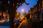
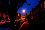
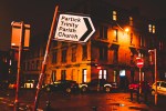
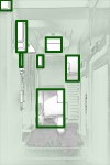
I spotted the building while I was walking from the subway on my way to a meeting at Pacific Quay. On my way back, I had enough time to loiter, waiting for people to walk by in both directions. The pale orange of the brick is matched by the reddish orange of the trim to the gable and the door and contrasts nicely with the pale autumn blue of the sky to the north; I like the tiny bits of colour reflected in the gutter. A very flat image (with flat lighting – it was taken at noon)  with a lot of horizontal lines running through it: the kerb, the line in the middle of the road and the bottom of the building wall; the diagonals of the gable add interest. The eye moves between the two points made by the door and the walking man (who is surprisingly close to the wall, if you look closely).
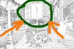
The orange and blue of the sign stands out strongly here and there’s lots more of both colours in the traffic and the pedestrians who occupy the space round it. Your eye moves then to the green and red barriers that enlose the sign, making an inverted vanishing point in the centre bottom of the image, with the red also turning up as highlights in the fragments of distant buses on the road and reflected in the plate glass of the window on the right.

An astonishing corner on the Lea Bridge Road, composed as four quadrilaterals united by the sense of movement provided by the striding man in the jersey that managed to be a gloriously matching blue to the door.  There’s a minor violet and yellow thing going on in the upper right quarter as well. There is an interesting absence of any scale to the various bits of the building too.

Essentially a diagonal band of orange, a diagonal band of blue and a second diagonal band of orange, with your eye drawn to super-bright highlight of the central streetlight, which is casting all the yellowy-orange glare in the street. I’ve been walking on my way home from the tube at dusk a lot these past few weeks, and this is probably the best representation of it that I’ve managed to take.

2: Colour Harmony through Similar Colours
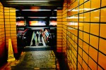
Lots of lines pointing in towards a vanishing point on the platform, held together by the overall warmth of the colours in the station. The lightness of the yellow contrasts to the dark orange-brown of the tiles where the stair dips down to the platform while the brigthness of the orange (sort of) cross formed by the sign, its reflections and the train give a focus and depth to the picture.

Reflections after rain stop this being boring, while a walking man (central and pulling the attention in from the edges of the frame) gives the composition focus and a point of balance. The violets in the this are very cold somehow, with the reds providing no sense of warmth.
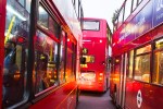
Despite the sense of forward movement into the space between the nearer two buses here nothing was moving (possibly a faster shutter speed might have spoiled this while sorting out the slight sense of softness across the image) and I was safely stood on a crossing in the middle of Walthamstow Bus Station. Again, there is something quite cold about the image, despite the warmth of the colours.

More streetlight, mostly a rather bilious yellow provides an out-of-focus backdrop for the leaning sign. Despite the possible depth off to the left and the right, a rather flat image.

3: Colour Contrast through Contrasting Colours
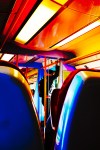
Red and blue fighting one another with the orange relating to both (opposite to blue and comfortably similar to red) and so making it less uncomfortable somehow. compositionally arranged around the triangle betwen the seats occupied by the man and his rucksack.

A striking yellow gable end with the shadow of a perpendicular row of houses cast on it by the late afternoon sun. The blue of the eastern sky contrasts with the yellow strongly.

Nice shapes at the entrance to work. For some reason on the day I took it, I was able to notice the strong contrast between the yellow of the artificial light inside and blue light coming in from the windows to the west. Compositionally a mass of quadrilaterals, capable of further abstraction.
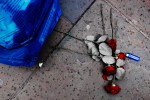
An objet trouve. A strong colour contrast between the red of the flowers and the blue of the rubbish sack and the lighter emphasises the softness of the abandoned roses and the hardness of the plastic; the light green of the leaves’ underside contrasts with the red of the flowers while stopping the blue jarring as much as it might. The lines between paving slabs and the stems of the roses adds a sense of movement through the frame.

4: Colour Accent using any of the above

A very centralised composition with the cyclist frozen within a a central diamond formed by the cars’ slanting windscreens, the roofs and the tree. An obvious orange point amongst the blues and greens of the foliage and the sky’s reflections on the shiny surfaces of the cars.
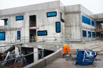
Taken through a 1 inch square mesh, covering a window on the hoarding that surrounds this building site, hence the vignetting at the bottom of the image. I got the lens in a better place for this with a second shot, but the man’s legs were no longer in a perfect inverted ‘V’… The picture is further held together by two triangles (or one quadrilateral) formed by the man and the two orange-red bands above him on the building and the orange net at the bottom left.
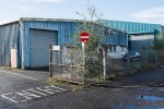
If William Eggleston can do pictures with their composition based on the confederate flag, I can take a picture composed like a saltire. Particularly when I’m in Glasgow. The greenish-blue of the building, the sky and its reflection in the puddles along with the green of the leaves contrast strongly with the red of the no entry sign.

The sight-lines of the woman at the bottom left and the man taking up the whole of the right side of the frame all point in towards the woman in the red coat, with the colour hopefully stopping the tall man in the hat being the sole focus of the picture.

All pictures taken with a Fujifilm X-100s apart from Fig 3 which was taken with my Nikon D50 and a Nikkor 24mm 1:28 lens. All editing on the main images done in Adobe Lightroom 5.

More general thoughts on these pictures and how they relate to my reading will be contained in the next post.

bernt & hilla becher

water towers

water towers

coal bunkers

coal bunkers

gasometers

gasometers

I caught the small exhibition (4 groups of 9 pictures ­ Cooling Towers, Water Towers, Gasometers and Commercial Facades ­ 1 of 15 pictures ­ Coal Bunkers ­ and some larger single images in a room off to one side) at the Spruth Mather gallery in Mayfair. It was good, free, but only ran until Saturday 4th October.

All the groupings were of large prints tightly grouped in plain white frames. The gallery was quiet ­I was the only person there most of the time ­ so you could get close, peer in at the printing and spend enough time with the pictures to start to see more than just the repetitions. So what did I see…

Firstly, I marvelled at the ability of the eye to anthropomorphise – so many of the coal bunkers looked like insects or other small scuttley animals ­- but having got over that, I realised I was enjoying both the printing – so many different greys! ­- and how the way the Bechers used the tilt facility on the large format camera they used for their series to keep verticals vertical rendered everything slightly strange ­- verticals seen from below sometimes seems to converge at the bottom rather than in a “normal” vanishing point at the top ­- but in a much more subtle way than the perspective compensation stuff in Lightroom does. The flat white of the skies would have simply been blown highlights in digital colour, but here it ­- and the way the details in the background behind the industrial subject tends to overexposure ­- foregrounds the shape of the subject. Whether this was a result of the exposure on its own, good printing technique or a combination of the two, the effect was a good one, and one that it would be fun to play with. Individually some of the pictures were beautiful and -­ unlike much art photography -­ I’d happily hang them on the wall of my house; taken in their typed groups they were fascinating, illustrations of how you can build up series over time. I think the ones I liked best were the ones that most chime with my experience ­- the gasometers and the water towers.

Certainly there is stuff I can apply to pictures I make myself. The idea of taking similarly composed pictures of the same type of structure could easily be applied to the modernist coastal defences in Orkney; then there’s the German Atlantic Wall along the French coast; from behind, looking out to sea would be one angle, what would be the other? There are deflated gasometers all around me in the east end of London and to the east of Glasgow as you drive out on the M8 there are water towers, which look nothing like the “shuttlecock” water tower on the way in from Stansted. In the attic I have a Graflex Press Camera that I really should use to overcome my fears of bellows and recipricocity and tilts and shifts and have a proper play with. Maybe I could even start processing film again. Maybe I could work out how to get 5×4 sheets of colour slide film to a lab somewhere that will still do large format transparencies. I just need to find the time.

Meanwhile, I must get a frame for the poster of some of the blast furnaces that had its price massively reduced in the Tate Modern sale and get it up on a wall…

elements of design # 3 – horizontal and vertical lines

horizontal and verical lines

inukshuk – yesnaby, orkney

Produce 4 examples of horizontal and 4 of vertical lines. Avoid repeating the way in which a line appears. The most successful will be those in which the line is the first thing a viewer would notice.

– AoP Coursebook

Continue reading

deutsche börse photography prize 2014

photographers' gallery, london

5th floor, photographers’ gallery, london

Last week I made my second and third visits to the Deutsche Börse Photography Prize showing at the Photographers’ Gallery. I was able to do multiple visits (my first had been the week before) because the gallery is about 10 minutes walk from my work, so a quick lunchtime visit is easily made. This is perfect when the exhibition is free and you can layer impression upon impression over the show’s run, which ended on Sunday.

4 artists were in contention for the prize, 2 on each of the top two floors the gallery.  On the fifth floor were photos by Lorna Simpson and Richard Mosse; on the fourth, photos by Jochen Lempert and Alberto Garcia Alix.

Mosse won overall, so I will start there with him:

Richard Mosse – The Enclave:

Photos taken using infrared stock (the effect of which can be seen on the header, on the left) of landscapes and people on the border between The Democratic Republic of Congo and Rwanda. Various groups have been fighting over this territory since the end of the Rwandan genocide, a brutal fact which contrasts strongly with the strange beauty of the large infrared prints where the green of foliage is shifted into a brilliant magenta and water and the sky are turquoise as lapis luzali. For me, the aestheticisation of the warzone certainly supplied a punctum to add distance between me and what was portrayed, the effect being to render the scenes strange and not of this world, creating a space where I could think about “war” and “africa”; but they also echoed psychedelic and prog rock album sleeves, which at least partially collapsed the political intent. That said, they were lovely to look at – and very large indeed – but I think the looking was primary, with the connotations of war – explicitly stated in the captions – coming a poor second, even in pictures of people in colour-shifted red-brown uniforms with guns; in some ways they seemed as created as last years’ fictional series telling the story of a 1960s Zambian space programme by Christina de Middel. But they were ravishing to look at.

Lorna Simpson – Summer ’57/Summer ’09:

A huge array of 5×5 black and white pictures (to the right in the header), shot, by the look of things, on a twin lens reflex. Some were a publicity portfolio taken in the 50’s and bought by Simpson from ebay; some were Simpson’s recreations of them, with her as a model in similar poses and locations. This was fascinating to look at, trying to work out which were original and which were the copies, although this was made easier (I think) by the differences in finish of the two sets of pictures. I’m not sure how much they comment on issues of race in the USA, but the interest to me centred around how the 50’s model seemed utterly comfortable with the cheesecake poses she was striking while Simpson achieved a degree of separation between who she was and what she was doing; in the sense that the early pictures were natural and so hugely denotive, the recreations managed to call the whole set’s authenticity into question. I probably spent more time looking at these, with my mind whirring, than any of the others apart from:

Alberto Garcia Alix – Selfportrait:

Like Chris Killip’s nominated work for last year’s prize, these pictures of Garcia Alix and his circle taken between the late 70s and a couple of years ago seemed quite old fashioned – black and white, documentary images shot over a period of time in a specific location. Also the subject matter – the photographer and his friends shoot up, get tattoos and get progressively more leathery and drawn over time – doesn’t seem particularly groundbreaking (I was thinking of Nan Goldin and Larry Clark as comparisons) but over the three lunchtimes – during which time I managed to see the whole of the 37 minute film that linked sequences of stills with ghostly black and white video footage of (I think) Beijing – I found I was more and more impressed by the way he seemed to view his move from handsome 22 year-old to Spanish-Keith-Richard-alike with distance and a lack of editing out the unpleasant. Also, like Simpson, he seemed to be dealing with poses from an earlier age – they were insider pictures of the other, but an other that was aware of its antecedents. Another example of photographs plus time equaling an increasing degree of meaning.

Jochen Lempert – Jochen Lempert:

The exhibition leaflet said:

Originally trained as a biologist, Lempert has been using photography since the early 1990s to study humans and the natural world. With an eye for subtle contrasts within subject matter – moss growing over a metal fence; a butterfly and its shadow on the grey concrete of the street – his use of repetition, pattern and abstraction creates connections between otherwise distinct subjects. His approach is scientific and poetic as well as humorous.

But this was the one I didn’t get. I tried. And I tried again. And again. But I did not get it. My fault, not his, I’m sure…

More generally, it was interesting that everyone was using film, albeit in very different ways, making it quite a traditional set of nominees. All four in some way created some distance between subject matter and the pictures themselves (although, for me, Lempert created so much distance, I switched off). Mosse’s pictures won, but – aside for being glad that I saw them blown up to such huge proportions – I think I could have got the idea from reading about them; it was Garcia-Alix and Simpson’s pictures that I found myself going back to, analysing the performances, the distance between the old poses and the later recreations and enjoying the experience. Not sure how I would apply any of this to my work. But I’ll keep on thinking.