5th floor, photographers’ gallery, london
Last week I made my second and third visits to the Deutsche Börse Photography Prize showing at the Photographers’ Gallery. I was able to do multiple visits (my first had been the week before) because the gallery is about 10 minutes walk from my work, so a quick lunchtime visit is easily made. This is perfect when the exhibition is free and you can layer impression upon impression over the show’s run, which ended on Sunday.
4 artists were in contention for the prize, 2 on each of the top two floors the gallery. On the fifth floor were photos by Lorna Simpson and Richard Mosse; on the fourth, photos by Jochen Lempert and Alberto Garcia Alix.
Mosse won overall, so I will start there with him:
Richard Mosse – The Enclave:
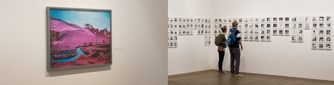
Photos taken using infrared stock (the effect of which can be seen on the header, on the left) of landscapes and people on the border between The Democratic Republic of Congo and Rwanda. Various groups have been fighting over this territory since the end of the Rwandan genocide, a brutal fact which contrasts strongly with the strange beauty of the large infrared prints where the green of foliage is shifted into a brilliant magenta and water and the sky are turquoise as lapis luzali. For me, the aestheticisation of the warzone certainly supplied a punctum to add distance between me and what was portrayed, the effect being to render the scenes strange and not of this world, creating a space where I could think about “war” and “africa”; but they also echoed psychedelic and prog rock album sleeves, which at least partially collapsed the political intent. That said, they were lovely to look at – and very large indeed – but I think the looking was primary, with the connotations of war – explicitly stated in the captions – coming a poor second, even in pictures of people in colour-shifted red-brown uniforms with guns; in some ways they seemed as created as last years’ fictional series telling the story of a 1960s Zambian space programme by Christina de Middel. But they were ravishing to look at.
Lorna Simpson – Summer ’57/Summer ’09:
A huge array of 5×5 black and white pictures (to the right in the header), shot, by the look of things, on a twin lens reflex. Some were a publicity portfolio taken in the 50’s and bought by Simpson from ebay; some were Simpson’s recreations of them, with her as a model in similar poses and locations. This was fascinating to look at, trying to work out which were original and which were the copies, although this was made easier (I think) by the differences in finish of the two sets of pictures. I’m not sure how much they comment on issues of race in the USA, but the interest to me centred around how the 50’s model seemed utterly comfortable with the cheesecake poses she was striking while Simpson achieved a degree of separation between who she was and what she was doing; in the sense that the early pictures were natural and so hugely denotive, the recreations managed to call the whole set’s authenticity into question. I probably spent more time looking at these, with my mind whirring, than any of the others apart from:
Alberto Garcia Alix – Selfportrait:
Like Chris Killip’s nominated work for last year’s prize, these pictures of Garcia Alix and his circle taken between the late 70s and a couple of years ago seemed quite old fashioned – black and white, documentary images shot over a period of time in a specific location. Also the subject matter – the photographer and his friends shoot up, get tattoos and get progressively more leathery and drawn over time – doesn’t seem particularly groundbreaking (I was thinking of Nan Goldin and Larry Clark as comparisons) but over the three lunchtimes – during which time I managed to see the whole of the 37 minute film that linked sequences of stills with ghostly black and white video footage of (I think) Beijing – I found I was more and more impressed by the way he seemed to view his move from handsome 22 year-old to Spanish-Keith-Richard-alike with distance and a lack of editing out the unpleasant. Also, like Simpson, he seemed to be dealing with poses from an earlier age – they were insider pictures of the other, but an other that was aware of its antecedents. Another example of photographs plus time equaling an increasing degree of meaning.
Jochen Lempert – Jochen Lempert:
The exhibition leaflet said:
Originally trained as a biologist, Lempert has been using photography since the early 1990s to study humans and the natural world. With an eye for subtle contrasts within subject matter – moss growing over a metal fence; a butterfly and its shadow on the grey concrete of the street – his use of repetition, pattern and abstraction creates connections between otherwise distinct subjects. His approach is scientific and poetic as well as humorous.
But this was the one I didn’t get. I tried. And I tried again. And again. But I did not get it. My fault, not his, I’m sure…
More generally, it was interesting that everyone was using film, albeit in very different ways, making it quite a traditional set of nominees. All four in some way created some distance between subject matter and the pictures themselves (although, for me, Lempert created so much distance, I switched off). Mosse’s pictures won, but – aside for being glad that I saw them blown up to such huge proportions – I think I could have got the idea from reading about them; it was Garcia-Alix and Simpson’s pictures that I found myself going back to, analysing the performances, the distance between the old poses and the later recreations and enjoying the experience. Not sure how I would apply any of this to my work. But I’ll keep on thinking.