Prologue

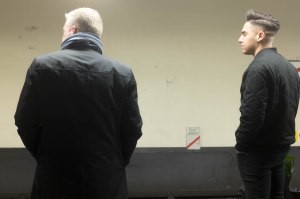
Orientation

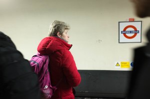
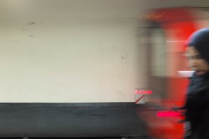
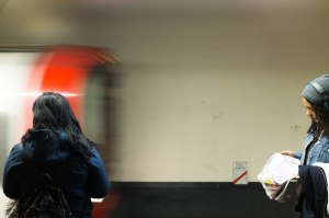
Waiting for the train


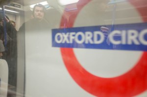
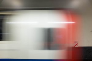
Arrival


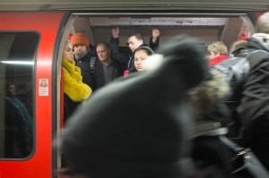
Disembarkation


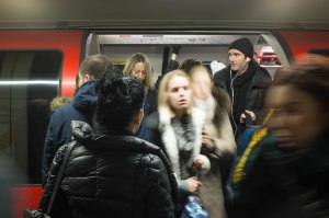

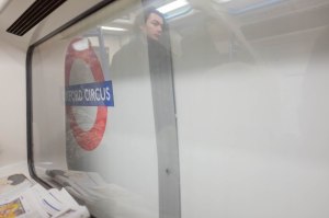
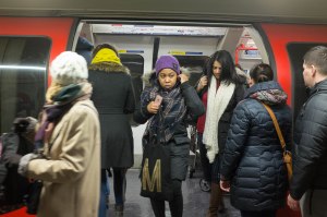
Embarkation


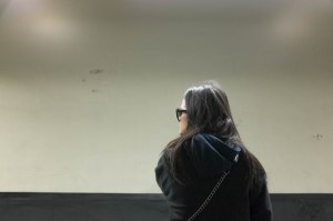
The lady in the red coat gets on board

Departure


Now it was time to go back to the questions posed by the coursebook (on p.71)
• What order should the images be shown in?• Are there too many repetitive images?• Do you need to let go of earlier images because the project has changed?• Are you too close to some of your favourite pictures and they don’t fit the sequence?• Do you need to re-shoot any for technical reasons?• Are there any gaps that need to be filled?
It still needed work, but it was getting there, I thought. The main problem was the number of (repetitive) images in the sections between the arrival and departure of the train. I had already got rid of a lot of images as the project had changed to concentrate on the Oxford Circus part of my morning commute; the fact that I really liked some of the dropped sequences (the ‘on the Central Line’ section – in the previous post – works nicely for all sorts of reasons, I think, but it did not fit into the revised timebox), but I don’t think that held me back from putting them to one side.
Order was straightforward. If I was going to build up a sense of the experience of passing through Oxford Circus Station, changing from the Victoria Line to the Central Line, it needed to combine the various passes I had made through the station in a chronological order.
The people waiting (my proxies or in terms of this module, mirrors) needed to build up, a train needed to come; people needed to spill out and the waiting people get on board; the train needed to leave with them on it. Ideally there would be some sense of this being a repetitive cycle as the next lot of passengers began the wait for the next train.
In order to get this across, I needed to create an idea of a place where the action would occur. The final exercise for this part of the course had worked through the idea of different sorts of gaze. The first type of look I had looked at was the one that came out of consciousness of the photographer’s (my) presence. This tied in both with Stephen Shore’s idea of taking ‘a screenshot of my field of vision’ (discussed in this post) and the ideas around producing a subjective representation of an individual’s experience of – primarily urban – life examined in Christopher Butler’s Modernism – a very short introduction. Modernism may be quite old hat (and there is nothing particularly cutting edge about American Surfaces any more either), but this gives a way of establishing me as a participant in the everyday drama that was unfolding in my series of pictures.

The Critical Bin
All the pictures for the central section of my sequences had been taken using a fixed focal length fixed lens from the same viewpoint – to one side of the bin that I used to locate where the correct doors of the correct carriage of the central line train I would take west would be to allow me to both get on and get off again, by the way out when I got to my destination. (You can see it reflected in the dark windows of the stationary trains in some of the pictures, if you look hard enough.) Standing there, I had tried to keep the camera pointed straight ahead giving me a rectangular stage where the action could unfold.
In order to stop this single frame being both repetitive and flat, I needed the action to move through it on different parallel planes. The trains and people moving along the platform established some of this; I used the direction the people were the people I was focusing on were looking and the sense of their actual movement to help articulate the transition between the individual pictures:
 |
 |
 |
At this point, I also went back to the digital pictures and adjusted the crop of the pictures so to accentuate this sense of movement over the groups of selected pictures. I also realised that the sequence would hang together better if individuals – the woman in the red coat or the tall man with a beard and a rucksack, for example – could be followed from sequence to sequence.
The winnowing process could now be carried out again on the sections of the narrative that remained after I had abandoned the initial idea of spreading the assignment over my entire journey. I had made another another batch of 6×4 prints made from pictures I had taken during the time I was working through the various edits to try and fill gaps (people getting onto the trains were tricky to isolate and I wanted a better train-leaving-the-station picture) and to add in further pictures of people who were recurring throughout the series:


Once this process was complete and I had made a final selection, I needed to work out how to display them. Again, both Short and Hurn and Jay had highlighted how different presentations – a photo story in a a Sunday supplement; an exhibition at a gallery; part of a book – all called for different numbers of images and for them to be sequenced in different ways.
I decided to put together two sequences which will form part of this log: a slideshow which should approximate the main presentation of the images at assessment, when A4 prints will be viewed one after the other as they are moved from one side of a clamshell box to the other; and a layout that could be used to display the prints framed, on the walls of an exhibition space.
Here, and for tutorial purposes, I would treat the slideshow as the primary view, with the exhibition layout acting as a variant.
Also, as a footnote almost, I have varied the size of some of the images within the exhibition view, playing around with the html to use a table to order and size the pictures on the page that will be displayed in your browser. I realise that this sort of thing – like having people smile in portraits – can be frowned upon, but I was very impressed by the variety of sizes of print displayed at Jurgen Tillmans’ retrospective at the Tate last year. The variations in size of the pictures broke things up, forcing the viewer to move in closer for one picture and then to step back for the next, making it impossible to simply move along the walls, going from picture to picture to picture with them all blurring in one simple sequence. Viewing the pictures became much more active in the process, adding a lot to the experience of viewing the huge number of pictures shown.
Also, to return to the influence of Paul Graham on the development of this piece of work, the way the pictures are printed and arranged across the pages of his recent collection of work made in America, The Whiteness of the Whale (2015) led me to think about how differing the size of the individual images relative to one another might affect the way they are perceived. In A Shimmer of Possibility (2005-2007) irregular sizes within groups of pictures (where a cutaway to a parked station wagon is much larger than the main sequence of a man mowing a grass verge during a rain shower for example) vary the rhythm of viewing them while in The Present (2008-2011) each of a pair of pictures is presented the same size, but the size varies from pair to pair. The effect is very different from the regular steady progression from picture to picture as your turn the pages of Walker Evans’ American Photographs or Robert Frank’s The Americans.
I think that what I have tried here is only the beginnings of experimenting with online layout beyond what is available in basic WordPress, but it is definitely something I would like to develop further as I move on.
Reference:
- Butler, C (2010) Modernism – a very short introduction. Oxford, Oxford University Press
- Graham, P (2015) The Whiteness of the Whale. Mack Books
