
underneath the west way
The materials proposed will provide the building with a fresh appearance that will not be harmful to the area or views around it. Due to its height the tower is visible from the adjacent Avondale Conservation Area to the south and the Ladbroke Conservation Area to the east, The changes to the existing tower will improve its appearance especially when viewed from the surrounding area. Therefore views into and out of the conservation areas will be improved by the proposals.
Planning Application, 2014, for the refurbishment of Grenfell Tower, London
I have had my words ready for this assignment since last November: I had taken the short paragraph (a condensation of the planning summary for the refurbishment of Grenfell tower) from the introduction to Darren McGarvey’s book, Poverty Safari: Understanding the Anger of Britain’s Underclass. I made searches online found those paragraphs among the public records on the Royal Borough of Kensington and Chelsea’s planning department site (the case reference is PP/12/04097) and decompiled them, breaking them down into short sentences.
Then, by splitting the reference to the Ladbroke and the Avondale conservation areas into two, I had five short texts and a reference. I also – from the planning proposal documentation had the internal document references for the individual sentences.
To balance the words, one picture for each sentence, I therefore needed five photographs. This later rose to six, after I had decided that a paragraph from a Guardian article – The powerful will only see tragedy when it suits them (11/05/18) – would round the narrative out, opening it up to be about more than the Grenfell fire itself.
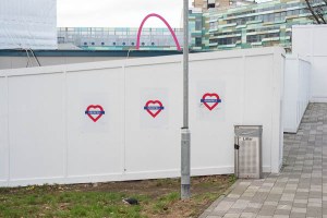
By the end of March, I had amassed a number of photographs of Grenfell tower. In addition to those I’d taken from Wood Lane on my way to and from work, I had made four walks around the surrounding areas of west London.
This process repeated my journey around Kirkwall taking pictures from the four points of the compass forming part of my square mile exercise at the start of this module. Just as St Magnus Cathedral stands out from the Kirkwall skyline, Grenfell Tower is ever present – appearing above the roofline of terraced streets or through gaps in the buildings as you move in a wide circle around it.
My first shoot in January took me close to the tower itself. The second ranged up over the hill from Holland Park and down through the two conservation areas named in the planning documents towards the tower. From a bus, I had seen that there was a point on Holland Park Avenue where you got very clear views of the tower; I went back and took a small number of views. Finally, I went for a walk up to the north and back down under the A40 to get some pictures from that viewpoint.
Having gathered my words and pictures, I started pulling in the set of references that (I hope) give context to this small body of work made in the streets around Grenfell Tower.
Joel Meyerowitz World Trade Center Archive (and David Campany’s thoughts on late photography) seemed a good place to start. Although Meyerowitz took his photographs as an insider (a New Yorker, he felt a powerful need to be involved in some way in the ongoing narrative of 9/11) I already knew that what I was doing should not aspire to being a ‘mirror’. I can only act as an outsider looking in at the Grenfell fire. It is not my tragedy and this work cannot reasonably be about me.
I needed something to give me a different formal approach. Martha Rosler was suggested by my earlier reading of the extended examination of Dorothea Lange’s Migrant Mother in Liz Wells’ Photography – A Critical Introduction where it is one of the critical texts discussed by Wells and her co-author, Derrick Price. I had been struck by her juxtaposition of text with flat, uninflected photographs of the fronts of buildings in the Bowery seemed to offer a way to combine words and pictures in a way that managed to be critical of the social position that they were derived from; her description of both strands as ‘inadequate systems’ also neatly captured my sense of powerlessness when confronted by the awfulness of the fire.
I had already decided not to use any of my location photographs that included ‘found’ text.
-

- fig.1
-

- fig.2
-
- fig.3
(fig.1 shows a sign that appeared one morning along my route to work; suspecting it would not be there long, I took a picture; sure enough, it had been removed by lunchtime)
I am not trying to appropriate other people’s words nor to make myself appear closer to the experience of the fire than I am. I am not trying to awaken the conscience of any audience these pictures may have; you are free to draw your own conclusions from them. Of course, I hope your conclusion will be close to my own, but there is – I think – scope for variation.
To achieve this I have appropriated Rosler’s presentation – double-width panels with photographed text on one side and documentary-style photographs on the other – wholesale. Where she worked in black and white (The bowery in two inadequate descriptive systems is a pre-Egglestone, pre-Shore, pre-non-commercial-use-of-colour work) I have chosen colour. It is the way we see the world now, and black and white can seem simply to be an appeal to judge pictures as art, or against photographs taken during the heroic age of photo journalism between the 1930s and the mid-seventies. I have not tried to aestheticise the street views; they are plain pictures which are not aiming for any profound emotional response. Unlike Meyerowitz, I am not reaching for the sublime.
I manufactured the record cards with text which make up six of the thirteen assignment pictures in photoshop – they are not records or sentences, they are pictures of words presented in a way which I hope signifies. They should be read as such.
The brief for this assignment asks for an open narrative (one which does not overly direct the viewer along a specific track to a pre-ordained closure); I have tried to leave space for viewers to work with the words and the pictures, deriving their own meaning as they pass through the sequence of untitled pictures. If the pictures of text are viewed as captions, I hope they act as relays, setting off flurries of association rather than as anchors, keeping the pictures in place as simple illustrations of fact.
The planning permission sentences all concern the surface appearance of the tower, after cladding has been applied. They seem only to be concerned with the needs of people who do not live in the tower. The refurbishment’s effects will not simply be benign; they shall be positively beneficial. The pictures give the lie to this. In the gulf between words and pictures, between intention and result, I think there exists sufficient space for reflection, for the viewer to draw their own conclusions.
If I wished, I could give my assignment the emotive title, The Road to Hell…
But I shall not. I believe my intentions are good, but there is no sense in tempting fate.

Proposed Installation Layout. With apologies to Martha Rosler.
Reference:
- The Royal Borough of Kensington and Chelsea, Planning and Building Control CasePP/12/04097 (Accessed Online – 26/5/18)
- Hattenstone S (text), Healey A (video), Sinibaldi C (photographs): Living with the tower – life in the shadow of Grenfell Guardian (18/11/17) , London (Accessed Online – 26/5/18)
- ed. Wells, L (2009) Photography: A Critical Introduction. 4th Edition, Routledge, London.
- Younge G: The powerful will only see tragedy when it suits them Guardian (11/5/18), London (Accessed Online – 03/06/18)
Other works referred to in passing here are referenced fully in the earlier posts which deal with them in more depth.

You have definitely made the right decision presenting the work in colour , I like the presentation very much too . A very thought provoking series .
I also like the presentation. Mostly I like the emotional detachment. I think many of us feel very angry about this tragic and needless loss of life, and more so at the political communities lack of willingness to find solutions for the survivors.
Your presentation is a breathing space – it keeps the focus going (and it should be kept in focus), but provides a little refuge from the mental/emotional intensity.