The tutor’s report for the assignment is Here.
All Related Posts for the assignment can be found either Here or by using the link nested beneath the heading Identity and Place in the blog’s top navigation.
File versions of the six A4 prints contained in the physical submission can be found on the assessment G: Drive.
Assignment 1 – Revised for Assessment
-

- fig.1
-

- fig.2
-

- fig.3
-

- fig.4
-
- fig.5
-

- fig.6
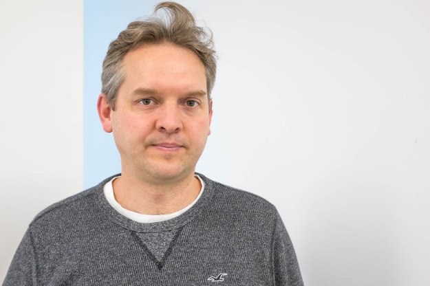
The original set of photographs consisted of pictures taken at a training centre in east London of the people attending a re-certification course for the programme management methodology, MSP. I was also there for the course and it seemed a good moment to get pictures of people I had just met outside of their normal environment. They would not be wearing their professional armour and might let their guard down a bit.
When I arrived at the venue, I realised that there were marvelously vacuous, motivational statements printed in big letters on the walls. I used some of them as backgrounds for this initial set of pictures and hoped that the whole thing would hang together nicely while commenting on the whole professional certification racket. My tutor’s response seemed to indicate that this hadn’t really come across and that rather than ‘unguarded’ most of the pictures’ subjects came across simply as uncomfortable being photographed. Some were also smiling; it would appear that this is not generally viewed as a good thing if one wishes to be serious about portraiture.
Then, a few months later, I attended another professional certification course which took place at another training centre about a hundred yards away from the first. Again I took pictures of my course-mates during breaks.
In the time between the two courses, I think I had reached a better understanding of how to settle people and take good, non-awkward pictures of them. Four of the pictures in this revised set were taken at that second course. The two from earlier have been re-edited to make them all fit together as a coherent set; the one included in my original set – fig.4 – has been cropped to remove the text on the wall with a corresponding increase in the impact of the subject.
