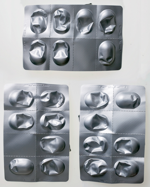
So, I came home from the hospital with a bloodied pad of gauze and a box containing three strips of seven big, antibiotic pills to take over the next week (three daily, after meals). I took the first the next morning, after breakfast.
I had already made the connection between TS Eliot and measuring out a week of my life not in teaspoons but in pills. I realised that I needed to take a picture of both sides of a strip of pills, before I had broken the foil. I also realised that if I wanted to capture a full week of pill-taking before during and after, I would need to make a composite image. And to do that, I’d need to do more than one picture, if they were to be put together in any interesting composition as otherwise rotating them would create the wrong set of shadows and highlights for the picture to work.
I quickly took the 3 pictures to give me a week (three strips of seven pills, rotated to give a believable set of shadows and highlights when you put them together. I made my second poetry post and stuck the composite up on flickr too for good measure,
I liked the way the composite managed to both look real, while at the same time having something not quite right about it. I thought of catalogue pictures and typographies like Karl Blossfeldt’s pictures of flowers or Walker Evans’ pictures of tools for Fortune. I felt I was on to something.
And then I carried on taking pictures of the strips as I worked my way through them and I carried on thinking about time and how you could represent it…

For one of the strips, each time I popped a pill from its bubble on the strip, I nipped up my attic workroom and shot 6 pictures of the packaging: one of the front with the writing, one of the back with the bubbles; then the same two pictures but with the strip rotated through 180 degrees; then the same two pictures rotated a further 90 degrees. The idea was to get the highlights and shadows right to allow a composite, matching the first “week” and giving a different take on the idea of time passing while I took the medicine.
So then, by the end of the week, I had a complete kit of pictures that would allow me to build up whatever units of time I wished: this week; next week; last week; a day; a working week; the weekend, etc. I made up a second composite for “last week” – three strips with the pills obviously popped from their plastic casing.

emptied pill packaging – composite
I was on my way. And I realised that I could probably do an entire assignment from this, but that seemed too easy; I wanted to do other things that alluded to units of time.
So – what could they be? At Leyton Baths when my son was down from Glasgow, he asked me how long it took to go down the (rather good) flume there. I went up and counted how long it took from launching myself at the top to splashdown.
 I used my normal method of counting seconds: “One elephant, two elephant, three elephant…” and got up to Eight Elephant as my feet threw up a plume of spray at the bottom of the run.
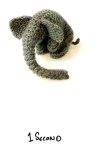
At some point I had moved from my mother’s One-Thousand, Two-Thousand, Three-Thousand to using elephants. An elephant was a unit of time, I realised. And back at the house I had a variety of elephants to play with.
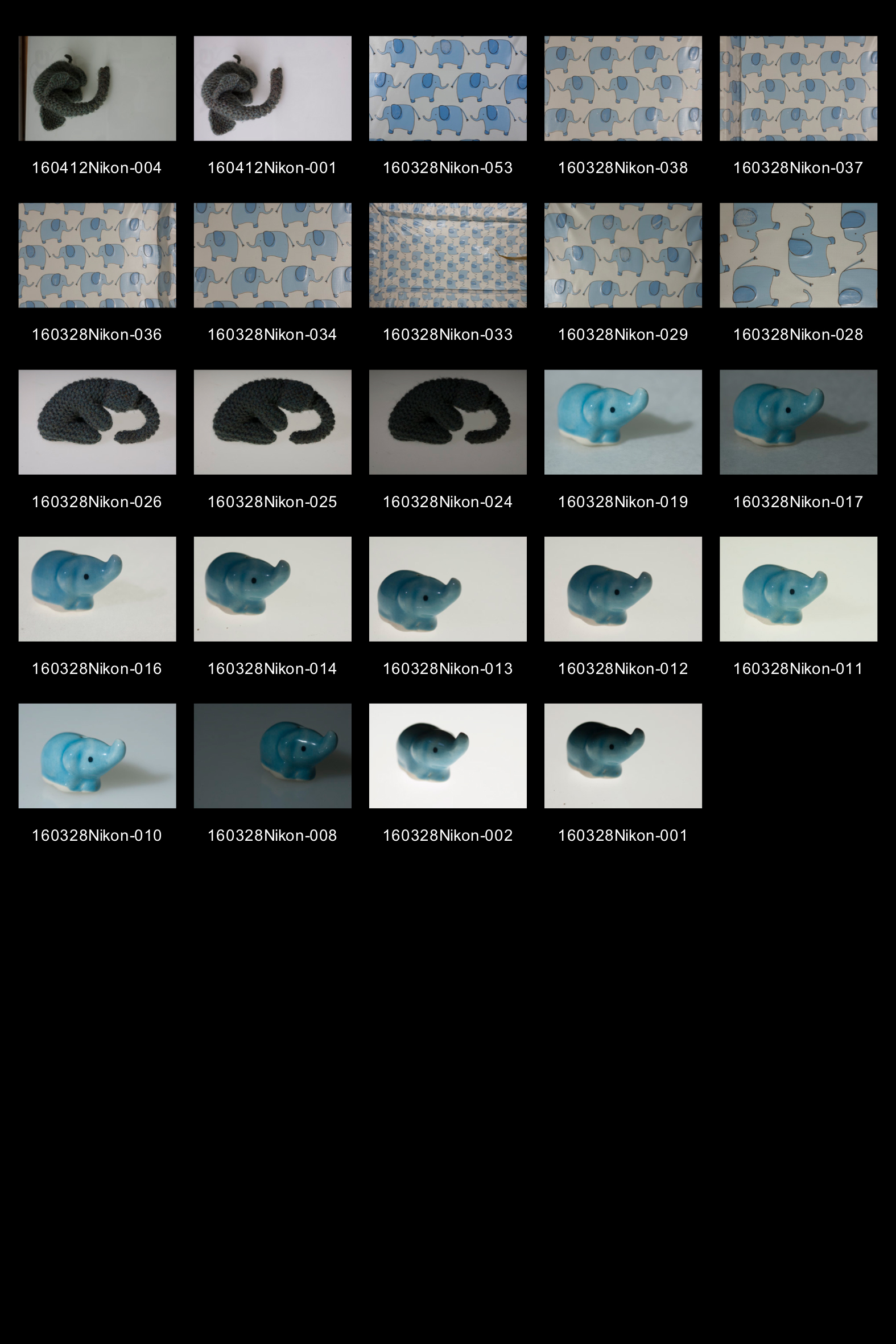
There was a china incense holder given to me by a Thai friend. There was the elephant print on my daughter’s John Lewis changing mat. She’d also been given a knitted elephant (as had my son) by my niece. There was scope here.
I took a number of photos of the ceramic incense holder. Like the photos of the antibiotic strips, I placed them on my light box and then tried to get a balanced lighting effect using softened flash off to the left of the camera fired through an umbrella. For the single elephant pictures I used a manual focus 105mm Micro-Nikkor on my elderly Nikon D50, stopped down to f32 to try and get some depth of field into the pictures; a handheld reflector was used to bounce some of the light back from the right side of the frame, again to give more sculptural depth to the elephant. Balancing the stobe against the lightbox to get some shadow to the right of the elephant also seemed to be preferable to no shadow at all.
I then did a shot of Mary’s knitted elephant flat against the lightbox, but with enough raking fill to give it both texture and depth. The idea was to use it as the seed for a sixty elephants picture to represent a minute, but somehow it didn’t work. I moved onto the changing mat and realised that – beside the fact that it was shockingly hard to get a flatly lit picture with no kicking highlights of it – it gave a much better starting point for a minute of sixty elephants.
The assignment calls for a “tightly edited” set of pictures. While it was possible to get a picture of 60 elephants in a frame, they wouldn’t fit into either a 3:2 or 5:4 frame (160328Nikon-033). To do that would require further compositing using a small group of elephants.
After trying and rejecting building a frame to resemble the original mat by including the raised border on both sides (160328Nikon-036-37), I settled on using the central group of four elephants from 160328Nikon-053 as they seemed flatly lit and made up a usefully repeatable pattern. I isolated the cream background and removed it to avoid the difficulties in matching subtly different grey points that I had experienced when making the two “week” pictures; the textured nature of the plastic surface would only make this harder. So instead, I shot a piece of plain background cut from the inside of the mat and used it beneath the repeated layers of elephants.
I now had a portrait ratio picture of 60 elephants (10 rows of 6) that would match the two pictures of the pills packaging once they had been cropped to a 5:4 ratio. I tried to crop a portrait ratio picture out of my single elephant pictures but couldn’t quite manage it. I quickly reshot a picture of the knitted elephant (again on the light box, with the 105mm lens stopped down as far as it would go. I tried a less flat composition this time, instead shooting the elephant in three quarter face and it worked nicely (160412Nikon-001 & 004), I thought. Having 4 pictures (1 second, 60 seconds, a week and a week that was passed) I quickly went through my options for another four pictures in loose pairs.
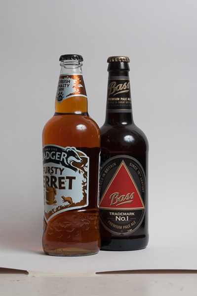
Rejecting buying a packet of Benson & Hedges (twenty = a day and one = a ten minute screen break when I still smoked) as I didn’t want to buy my first packet of fags for 10.5 years, I settled on the change in the recommended maximum alcohol intake back in January when it was reduced from 4 units of alcohol (2 pints) to 2 units (a single pint).  This seemed to point up some of the artificiality in the way we construct time nicely, so I got a couple of bottles of nice beer and took their portraits (one on its own and then the two together as a couple), using a 55mm manual micro nikkor this time and a flat white card backdrop curved into an L-shape against the wall. Lighting was again from a flash diffused through an umbrella but this time with more effort being made to block reflections in the glass than to bounce back light to fill in the shadows, I haven’t included contacts here as the main process simpy consited of getting the balance of the light right and excluding the reflections. No compositing was involved in the making of this pair of pictures composed from the off to work as 4:5 portrait ratio prints.
Finally, I had to choose between ideas for representations of longer periods of time, some of them of unfixed duration: a month of Sundays (4 copies of the Observer, most likely); an eternity (the time taken for a watched pot to boil); and a lifetime.
For a lifetime, I rejected taking a picture of the dates on a random gravestone in the cemetery, as this would move away from the constructed nature of the pictures (unless i was to buy a gravestone, or try and make a model one). It has been noted elsewhere, that a lot of famous people seem to have died so far this year; I have read quite a few obituaries in the paper, all of which conclude with the dates of birth and death of their subject. I took a random obituary from the Guardian (chosen as much for its colour registration strip next to the dates summary as for any other reason) and I had my “lifetime”.
To highlight the relevant area of the subject, I limited the depth of field, using the 105mm lens again and highlighted the section of the text using an undiffused flash masked with a cardboard gobo while lighting the whole are of the frame with a lower intensity diffused light. I could have done this in photoshop, but it seemed more useful as an exercise to do it in camera.
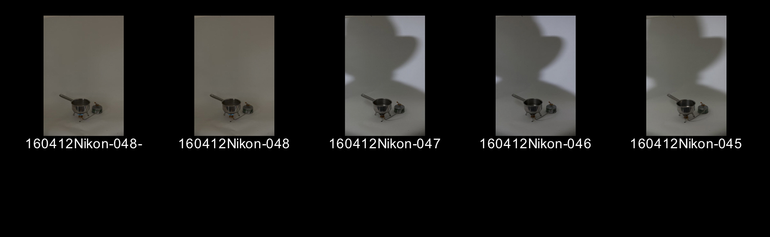
Then for my final picture, I rejected the “week of Sundays” idea (at least in part because I’d have to wait another fortnight or so to build up my month’s worth of papers, but mainly because it would be too like “lifetime” to be a proper development of the idea) and instead tried to work out a way to picture a watched pot (which of course would never boil). There is not enough space in the kitchen of my house to do this on the hob, and anyway, doing a final set-up picture would complete the series nicely. I bought a gas stove from a camping shop (it would come in handy later to have in the car for tea-making on trips into the country, I rationalised) and set it up at the end of the long axis of the attic, in front of a white paper backdrop. I already knew that a small (ie undiffused), distant light source produced contrasty light, and so also led to well-defined shadows. I placed a bare strobe, flat on to the stove and pan at the far end of the attic. So it would not cast a shadow itself, I set up the camera on a sturdy tripod above the strobe, where it would be able to see the setup over the shadow casting object. Again, I was using the 105mm lens.

Picture 8. The Setup.
Now to find what would cast the best shadow on the flat surface with the gas stove and the backdrop as it curved up behind it. The long neck of my display head made it useless as a template to cast a realistic “watching” shadow, so reluctantly I made my appearance on the photographic stage and sat myself mid way between the camera and the stove; I triggered the camera with a remote and by trial and error altered my position til the shadow was big enough and postiioned in the right place in the frame. I decided a hat would be both a nod towards Dyer’s Ongoing Moment (and therefore Walker Evans again) and also make the shape of the shadow more interesting.
finally, to provide some illumination to the area in shadow, i set up a diffused flash to bounce off the ceiling onto my “stage”. It took only about three goes then to get a finished raw image, although the amount of experimentation that had gone into this had led to many more exposures. As they didn’t work, I didn’t download them onto my laptop. Perhaps I should have, for the record…
 The only thing left was to make two exposures to capture the flame of the burner which didn’t show up at all in the 1/400th second exposures that I had been making with the flash. It would be possible to do a long, stopped down exposure that would carry on long after the flash had – err – flashed, but it seemed easier to make another composite here. It worked easily. And I was done with the shooting.
All that remained was to crop the frames to size and to get the pictures printed. I decided to have the prints made on 12 by 8 paper, using the wide border at the bottom to add a written caption, anchoring the “meaning” of the picture while at the same time highlighting its subjective nature. A more objectively descriptive title would be typed out on a sticky label and stuck to the back of the print. Hopefully, the gap between the two titles allows space for something closer to a relay to take place where the spectators find a space for themselves somewhere inbetween.
For the prints, I then went through the rather tortuous process of getting small, cheap prints made on the machines at Boots on the way to work, adjusting in the evening and then making another set of prints. It only (!) took three iterations this time, and I think that I’m finally getting a feel for the difference between on-screen and printed, but I’ve still a fair way to go. Then it was off to online lab and a day’s wait for the prints to fall throught the letterbox…