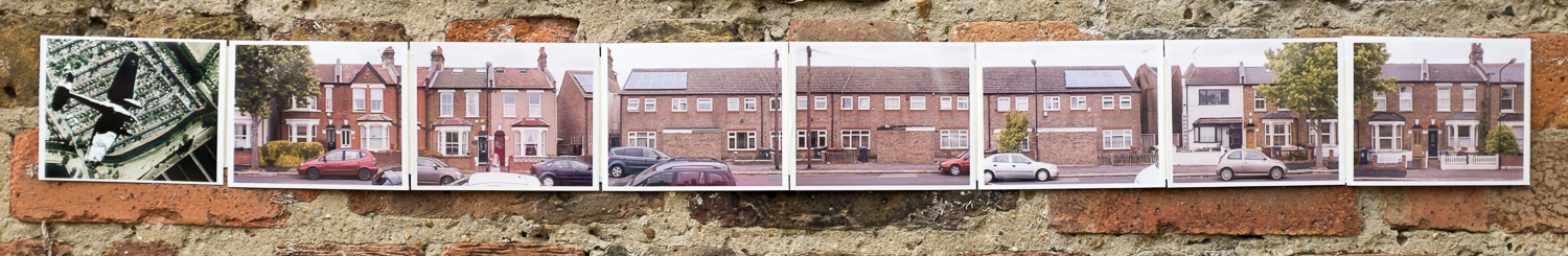
When I was 10, I was given a Kodak Instamatic loaded with black and white film. It had a slider for different weather conditions and a little square hole to look through. The shutter release was a flat, stainless-steel plate. Continue reading
Assignment # 5 – Tutor’s Comments
“Conceptually this assignment was a success. You have experimented with an interesting idea and have created a critically interesting body of work looking at this place.”
Another set of positive comments (Tutor’s Report – Assignment 5) came back from my tutor, a couple of weeks after I had submitted the physical book dummy and a link to my recent posts for the assignment. I was glad to see that David had thought the work was successful and the description of it as a body of work (rather than a bunch of photographs) showed that I had hit the spot I was aiming at here.
It would have been nice to get a bit more explicit praise, but moving onto things that can be improved makes sense in the context of a course that I am following and which itself forms a part of larger scheme of development.
“Rather boringly I’m afraid I have concentrated most of this feedback on a few technical issues that do need to be ironed out as soon as possible to allow your outcome to match your critical thinking. Hopefully this will put you in a strong position both conceptually and technically for the next module.”
Onto the specifics. First: “There is an overall red colour cast in all of the street pictures.” This is followed by a detailed description of how to correct while editing the images.
I find this useful and annoying in equal measure! Useful, because my use of Lightroom is very much self taught in a very hit and miss way. One of the things I’ve noted as a possible side-project during the level 1 courses is to work a bit on my workflow and how I work with images after they have been created initially and a particular area of focus would be how I deal with colour. The techniques outlined here are instantly applicable and can be incorporated into my expanding repertoire of standard actions while preparing pictures for inclusion on the blog or for individual assignments. It’s annoying however, because I actually applied the basic Lightroom “Cloudy” white balance setting to all the street images as they seemed a bit cold. The easy way to achieve much the same result as via David’s method would be simply to revert the pictures to “As Shot”. How embarrassing!
Chromatic Aberation reared it’s ugly fringe again too. All the street shots were taken with the same rather old 24mm f2.8 Nikkor prime. Leaving aside the fact that I should have spotted this myself (and corrected it in Lightroom), Level 1 of the BA lays the most emphasis on the straightforwardly technical aspects of photography, and I should definitely review my basic kit and replace the worse bits of it with something better as I work through the next two courses before moving onto level 2. Generally, my set of lenses is good, but old and second hand, chosen as much for price as for performance; There have been issues with some of the other lenses I’ve used with my D50 during TAoP and this may be the next place for me to focus my attention after replacing my DSLR body with something that is less ten years old…
The other area for focussed criticism was the presentation of the assignment: “I was pleased to see you include a dummy for the book. This demonstrates well your thinking concerning potential presentation of the work. I realise this is level one and as such this is unlikely to have a huge bearing on marks but you might consider producing a slightly more polished version for assessment.”
I’ll also redo the Assignment 5 book dummy following the method detailed in the feedback: I’ll print the pictures as a strip and then fold them into shape rather than connecting individual prints. The scoring board and tools are sitting in my Amazon basket, ready for me to click submit. I have worked out where to get it printed and just need to make up the composited file for printing.
I will also take some time to look at how pictures can be displayed online, both in WordPress and more generally. I have a basic knowledge of web design and it shouldn’t be beyond me to play about with the Javascript & the CSS styles around them. I’ve noted a couple of times during the course that photographers’ websites can often be shocking to navigate or even just as a platform for pictures; it would be good to turn this carping into something positive with regard to my own work!
And that – bar some best wishes for the future and a nice general appreciation of my work over the course – is that.
“I would suggest enrolling on the ‘Context and Narrative’ module next.”
And so I shall. I have enjoyed this course, and feel ready to move on. I’m booked in for the November Assessment Event. I’ll spend the next couple of weeks tidying my learning log – turning unfinished drafts into published posts; writing up missing exercises; making sure the metadata is consistent across posts; doing a final proof-read for typos, spelling and just simple stupidity – and making a final selection of assignment pictures to send as prints. It would be good if the assessment report would be able to feed into the next course sooner than November, but that can’t be helped. I shall assume that it won’t differ radically from what David has been saying over the last year.
light # 12 – contrast and shadow fill
Set up a simple still-life shot. You will not need to move the light around so the background can be whatever you want. Leave room for access at the sides of the set, and make sure that neither side is close to a wall. Shoot from the same level as the object, with the camera on a tripod. Fix the light at about two to three feet to one side of the object and at its level, so that it is aimed at right angles to the camera’s view. Take the first photograph without a diffuser in front of the lamp, and the second with the diffuser.
Follow these with a series of five exposures. The light and camera remain unchanged. Take the white card and place it three feet/one metre away from the object, on the opposite side from the light and facing it. Take a photograph. Then move the white card twice as close to the object, and take another photograph.Tear off a piece of the aluminium foil sufficient to cover the area of the white card and place it against the card, with the dull side facing the object. Make an exposure. For the next shot turn the foil round so that the shiny side is facing out. For the last shot crumple the foil in your hand and then smooth it out again. Place it once more against the card, with the shiny side facing out. Compare the results and arrange them in order of contrast, from the one with the biggest difference between the lit and shaded parts, to the least. You can see now why the expression ‘shadow fill’ is used. In a simple lighting arrangement like this, the lamp is set up first and then, if necessary, the shadows are filled in with a reflector.
– AoP Coursebook
light # 11 – direction of light
Keep the camera in a fixed position (on a tripod) aimed horizontally at the subject. If you are using an object (rather than someone’s face) place it on a small level surface so that there is room to move the light all around it. Place a plain background some distance behind. Start with the light, fitted with its diffuser, at the same level as the subject and camera. Between shots, move it around the subject, so that you photograph this lit from the front (with the light next to the camera), from the side, from behind and to one side, and from directly behind. With the light directly behind, aimed forwards to the subject and camera, the effect you will have is that of a silhouette, provided that the area of the light’s diffuser is greater than that of the subject. Then raise the light so that it points down towards the subject at an angle of about 45 degrees. Again, move the light right around the subject between shots. Finally, suspend the light overhead, pointing down, and take three pictures: directly overhead, from slightly in front, and from slightly behind. Lay out all the photographs together.
Study the differences in order to become familiar with the effect of moving the light. You should find that certain qualities of the subject are revealed better by some lighting directions.
– AoP Coursebook
light # 7 – cloudy weather and rain
“For the first part of this exercise you will photograph the same view in sunlight and under cloud. You can do this at different times or on different days, but the easiest time is on a day when individual clouds are drifting across the sun. If it is windy, so much the better, as the light will change more rapidly. Choose two or three different subjects, such as a building, a person, and a street scene. Note the difference in exposures. Keep the white balance set to sunlight/daylight.”
– AoP Coursebook
light # 6 – variety with low sun
“This is an exercise to demonstrate some of the advantages of shooting when the sun is low. Obviously, there is no sudden moment in the day when the sunlight switches between low and high but, as a guide, the sun is low within about two hours of sunrise and sunset, except in winter when it stays low for much of the day. In summer, this may not be a convenient time to go out shooting, but the results from getting up really early can be very rewarding. You can choose any subjects for this project, but they must be in sunlight.”
– AoP Coursebook
So, while he was down for the bit between Christmas and Hogmanay, I dragged James out for a walk down by the River Lea. When we were heading back home over the derelict golf course the light had dipped far enough to try out this exercise. The instruction was:
Take as many pictures as possible, but aim to produce four as a final result. If in doubt, bracket your exposures. If you can, complete all these pictures on one occasion. There is a tremendous variety of lighting, and you can capture this variety by changing your view point.
You can’t just assume with a 12 year old, but James was willing to pose and to turn this way and that so, here are the results: Continue reading
light # 5 – light through the day
“You will need a sunny day for this exercise, or else sun at different times on differentdays. You are going to photograph one scene from dawn to dusk. The number of pictures you take will depend on the time of year, but get at least one per hour, and more at the end of the day when the light is changing faster. Find a landscape location with a fairly definite subject that will catch the sunlight even when the sun is close to the horizon. It needs to offer a good, clear view that is lit throughout the day – containing an isolated building, perhaps, but convenient to reach, as you will need to keep going back to exactly the same spot. Try and keep the composition exactly the same for all the photographs; either remember which parts of the scene touch obvious points in the viewfinder (such as the corners or any markings on the screen) or draw a little sketch. Keep a note of the exposure for each photograph”
– AOP Coursebook.
I took these pictures over the course of three days, way back in November. I’d set my tripod up, leaning into the velux window in the attic, looking out from my work-room (it’s where I’m sitting typing now) to the northeast. The view was open to the south so the light would pass over the view revealing detail and creating shifting shadows for the whole of the period of daylight. Continue reading
A quick note about what’s going on here….
I have finished working through the exercises from The Art of Photography, but have not managed to write all of them up into post-able combinations of pictures and prose. Similarly there are exhibitions I have been to and books I have read that have generated drafts which still need some work. I’m not going to start Context and Narrative for a couple of weeks (it’s always good to have a breather; I don’t think I could do two courses simultaneously either). And lastly, I need to do some basic neatening to get everything ready to be submitted in September for the November Assessment Event.
So, the next few posts here will mostly consist of exercises and reviews, well out of sequence (either in course terms or in terms of when I did something.
I need to work out how to display (and navigate) the material in a better sequence than the simple chronological by posting date one that wordpress defaults to, and I suspect it has to do with Pages. Let’s see…
Assignment 5 – Personal Review
Course Outcomes
On successful completion of the course you’ll be able to:
- use the principles of composition when planning and taking photographs using suitable cameras, lenses and other equipment
- demonstrate skills in the control of qualities of light, and colour, and demonstrate creative outcomes using these skills
- demonstrate a basic knowledge of the principles of graphic design in photography through a single photograph or a series
- reflect on your learning experience.
AoP Coursebook
I think, in the terms of the outcomes stated above, I have successfully completed this course.
In the section on assessment in the Coursebook, these outcomes are then broken down into 4 areas, each corresponding to one of the Course Outcomes, above, and then further subdivided. Where I have already covered something in some depth in the posts dealing with how I came to produce my submission for Assignment 5 – 75 Years After – I have only given a brief summary here.
Demonstration of Technical and Visual Skills
- Materials: The physical manifestation of 75 Years After is made up from the cheapest prints I could have made – 6 x 4, colour, gloss, no borders – by Snappy Snaps with the exception of the composite Heinkel/Google Earth picture which was an even cheaper 6 x 4 colour, gloss, no borders print made on a machine in Boots. I had already used the print module in Lightroom to add enough blank space around the prints to make the 5:4 ratio pictures fit on 3:2 paper. The individual prints were connected using masking tape after they had been trimmed down to give an even amount of white around the picture. For the book dummy I have produced and submitted, this works fine I think.
I have wondered how I could go about getting long strips made with some provision for folding them into concertinas and have come to the conclusion that you’d need to some sort of mass edition with five copies being made on one large sheet of paper. This would therefore presumably have to be inkjet printing (or else unaffordable) changing everything about the way it all would look. If I do go for applying the same process to another two or three streets and putting on a show at the next Walthamstow Art Trail, I may follow this up and, at the same, time get larger prints (á la the Steffi Klenz original) made for the actual display. - Techniques: I have gone into great detail earlier about how the pictures were made and processed. I think I have felt in control of the process and am happy with everything apart from my inability to get it right sooner while taking fewer pictures. I am still overshooting dreadfully and need to curb this as the resulting overhead in editing terms is one of the main reasons why my progress through this course has been slower than I would have liked. I realise I should include a contact sheet of the final pictures, before any post production had occurred. I will do as part of my response to my tutor’s notes on the assignment.
- Observational Skills: I have been aware of the bombsites that punctuate large sections of Walthamstow for a long time, and I continue to spot new ones. I am – I think – capable of seeing starting points for further investigation in the world around me.
- Visual Awareness: I find it hard to separate this from the previous heading. Possibly this is because this was a piece of work which was planned rather than pulled together on the fly with me reacting to input from my senses.
- Design and Compositional Skills: As stated in the previous post, I think the pictures work both as individual photographs and together in sequence.
Quality of Outcome
- Content: I think the subject matter is suited to the i; the treatment may not work in terms of a magazine photo-story, but as a narrative it holds together.
- Application of Knowledge: I believe that I have applied many of the things the course has been concentrating on – composition and awareness of light in particular – in this piece of work. There is nothing that sticks out as shoddy or ill-judged.
- Presentation of Work in a Coherent Manner: As well as the finished narrative, I hope the narrative of how I got there that is found in the posts on this blog makes sense and leads the reader through the development of my submission from the original idea to the finished “book”.
- Discernment: I don’t think that what I am doing in this assignment is “obvious” to all as a subject. In this sense, I think I am displaying “discernment” while at the same time not really feeling comfortable with it as an ascribable quality.
- Conceptualisation of Thoughts & Communication of Ideas: comments left on the published posts here on my blog and also feedback I’ve received from people who have looked at my pictures both as work in progress and as a finished narrative suggest that I’m doing alright at this. People have definitely “got” what I’m trying to do in this assignment and have been interested enough to spend time thinking and talking to me about it. At some level at least, what I am doing is managing to communicate with others.
Demonstration of Creativity
- Imagination: In this assignment, I have taken something that is there and made something from it, rather than plucking something from nothing or putting together disparate elements to create some new synthesis.
- Experimentation: I have however pared back the elements that make up a narrative, leaving I think something fairly minimal that still tells a story (or two).
- Invention: Physically, I have made a concertina/book which – while not original – does show an ability to combine things into something new.
- Development of a Personal Voice: This is where I think this course has truly paid off. Before the course, I think that while I was comfortable taking pictures on trips to new places either abroad in the UK, I was less able to come up with things that make up my basic surroundings. I have many pictures from Moldova or Kiev or Brazil; my pictures of London (where I have now lived for nearly 17 years) or of Glasgow (a total of nearly 13 years) have never really felt comfortable somehow, particularly in contrast with pictures I have taken in Orkney (20 years; see Assignment 2). Now I think I am finding ways to photograph and present things that are familiar to my; things that make up my day-to-day surroundings. Now I feel that I am beginning to make visual sense of London in a way that I always have been able to when I’m in Orkney.
Context
- Reflection: I think I have managed to combine viewing exhibitions, reading and the coursework to date into a coherent body of work. I think I have managed to document that process here, on this blog.
- Research: I am pleased with the way I have taken something I have noticed (a possible bombsite) and fleshed it out into something with a when and a how and a what attached to it. I find it slightly worrying that until the point when I found the Borough Council record of the bombing, that it had never crossed my mind to think of people being killed. I think I had somehow placed everyone neatly in shelters, safely away from the destroyed houses…
- Critical thinking (learning log): I think I have been able to think critically about both my work and others’ throughout the course. During parts 3 and 4 however I found great difficulty in turning this thinking into critical writing (or indeed into writing of any sort). During part 5, I think I have done better, producing nearly nine thousand words (over 10,000 when you take this into the equation) of quite decent writing, backed up with good pictures from the exercises. I think a good part of my problem here is in striking a balance between keeping a record of personal thoughts and of at the same time creating a published document. There are many posts stuck at draft stage. I will attempt to take as many of them as possible into a state where I am happy to make them public, before this blog must be submitted in September, while at the same time not letting this tendency to revise and fret over posting get in the way of the next course, Context and Meaning…
Throughout The Art of Photography I have found these personal reviews consistently difficult to do. iI think I can analyse what I’m doing and how well I do it; putting it into words is somehow much harder. Hopefully, I will get better at it as course follows course…
assignment 5 – narrative
In this final assignment imagine that you are about to illustrate a story for a magazine. You have a cover to illustrate, and several pages inside (create between 6 and 12 images – you can choose). Even though there may be no text, you should write captions (of any length) to explain and link each picture.
The cover picture will need some of the techniques of illustration that you have been experimenting with. The picture essay will be more of a narrative. This means that, as you will be using several photographs to illustrate the main body of the story, you will have the opportunity to spread the load of the story telling among them. Different images can deal with different aspects of the subject, or you might choose to insert a linked series of photographs that show something happening in sequence. Remember that some of these photographs will be seen together on the same pair of pages. You can use this to set one image off against another; sometimes the juxtaposition of two appropriate images can be telling.
AoP Coursebook
First, before the shouts of “RTQ, Chirgwin! RT bloody Q!” begin, I should say that it was a conscious decision, discussed with my tutor, to move away from a straight illustrated story for this assignment.
Quite reasonably, he pointed out that it was better to take risks, and not worry about assessment marks now, rather than in a few years’ time when hopefully I’ll be making a start to level 3 of the BA and the marks will count for more than a simple pass or fail. The idea of following a path suggested by Steffi Klenz’s body of work Nummianus seemed to give me scope to tell the story while paring the clues about what was happening back to a minimum.
At any rate, I am quite pleased with the results and think that it works as a narrative. It could even work in a magazine as a series of double page spreads, but I’m not sure which magazine would run it.
75 Years After
The hard copy of this assignment (nine 128mm x 102mm Digital C-Type Prints joined with masking tape into an extendable concertina, seen above stuck to the bomb shelter at the bottom of my garden) is the bit I’m most excited about; I still need to do some work on the online presentation of the sequence – the slideshow below is not quite satisfactory, but I haven’t been able to work out how to get the pictures to flow sideways, like the long opening shot of Goddard’s Weekend (1967). No doubt there’s a widget, or I could write some javascript, or something, but for now, I’ll leave it – like far too many photographers’ sites I have viewed recently – as another slightly flawed online presentation of photographs!
I have tried the print version of the sequence out on a number of people now and they all have “got it” which is gratifying. It has been interesting listening to the variety of comments it has aroused – ranging from thoughts of how present bomb-sites were when people now in their 50s were growing up to the way you don’t notice the signs of bomb damage all around you, and more abstract comments of how nice it is to be presented with something physical rather than something on a screen. I think it would be interesting to make larger prints for display (like the Nummianus installation views) and to maybe try another few roads as well. This would lead to something that could go on as part of the annual Walthamstow Art Trail, possibly.
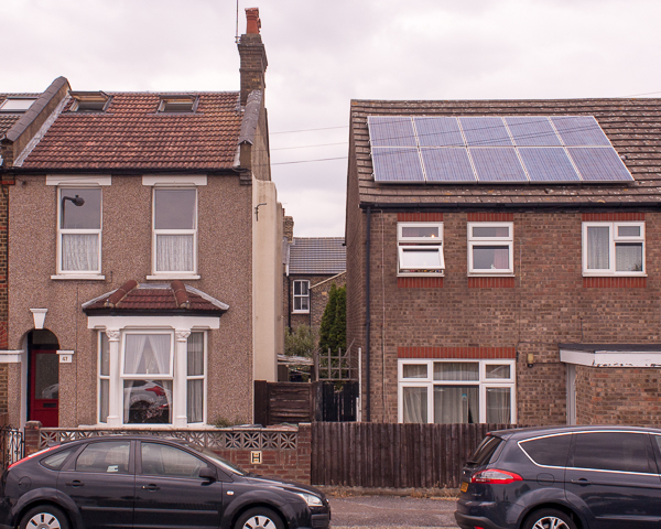
Also, the more I have looked at them, the more I have become aware that there is also a second, softer narrative to be found in the pictures: each individual instance of the two types of house pictured would have started off pretty much identical (there are variations in the Victorian Terrace, but even so, the variations repeat as you go down the street) but now they all are different – doors have been changed, and windows; some of the attics have been converted and had windows let into the roof tiles; 65 has had monstrous things done to it; there are solar panels and there is pebbledash. Individual people have made their mark on the street and that is as significant as the bomb that fell 75 years ago. As well as being a story about death and injury, it becomes a story about life going on and progress and rising house prices and so on and so on. The sequence can also serve as a typography of houses in the street.
Notes on the Pictures:
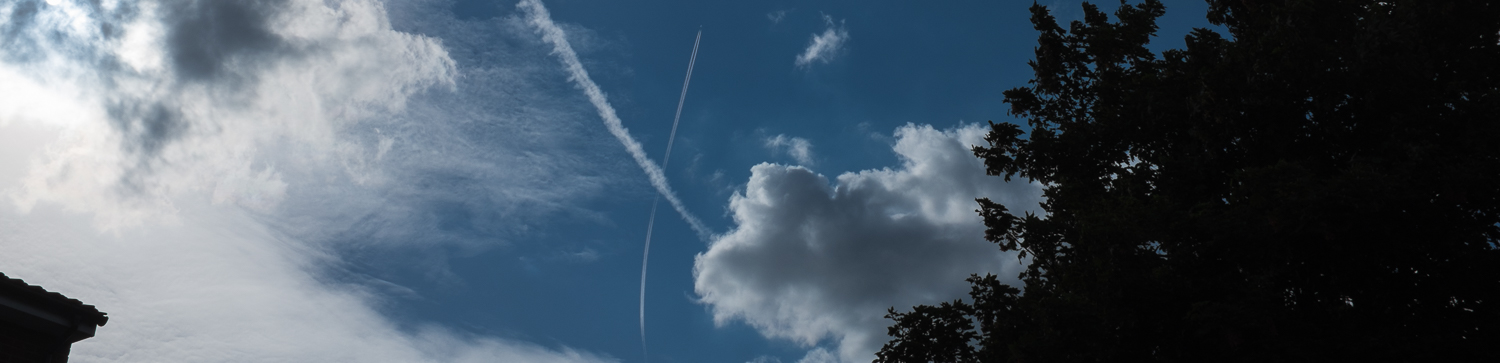
fig. 1 – A contrail dividing the blue ground of the sky into a 2/3:1/3 composition. Attached to the right-hand side of the string of prints, to wrap back round and seal the “book” when it is fully folded up. When the string of prints is unfolded, the back of this print is visible, which is why it is folded under and not visible in the header to this post. The typed label was made with a manual typewriter and stuck to the print; it contains enough information to allow the viewer to make sense of the whole. “1 H.E.” refers to the single high explosive bomb that fell on Elmfield Road; the numbering of the houses (47-61) suggests a mistake by whoever recorded the damage for the Borough Council as close inspection of the remaining numbers show that number 47 – if damaged – was left in a repairable state while number 63 is missing.
fig. 2-9 – A sequence taken around 17.00 on Sunday 14th June with me 6 foot up a step ladder using a Nikon D50 with a Nikkor 1:2.8 24mm manual focus lens. ISO 200, 1/200″, f8 (underexposed by about a stop to prevent the highlights in the sky blowing out). Contrast was reduced in Lightroom by pulling back the highlights (a lot) and upping the shadows (a bit) and then upping the exposure by one stop. White and black points were also adjusted. The frame was then cropped to 5:4 as this seemed to give the best section of the street per picture, although possibly something even squarer would have been better for the Victorian Terraces as more sky would have been included and the TV aerials wouldn’t have been cut off, but it wouldn’t have worked as well for the wider, lower post-war houses in the gap. I have tried – and generally succeeded I think – to make each of these pictures a pleasant composition of horizontals, verticals and quadrilateral shapes as well as working in concert with one another. The slight chaos at the junctions between 3 and 4 and 7 and 8 is intended to accentuate the change from original to bombed and back again without being too heavy handed about it.
fig. 10 – a composite made from 2 acquired images: the google earth view of Elmfield Road and the famous picture of a Heinkel 111 bomber over the Isle of Dogs, taken by an anonymous Luftwaffe photographer on the 7th of September 1940. Isolating the aircraft was a relatively straightforward selection in Photoshop Elements, it was then pasted onto the google earth picture and rotated so the direction of the sun matched. I slightly reduced the saturation of the background shot and added a small amount of gaussian blur to match the bomber. The intention was not to make a convincing fake, but rather to link the ‘then’ with the ‘now’ in the picture and in the sequence as a whole. If I was going to make larger prints of the pictures for exhibition in frames, I would probably definitely need to seek out higher resolution source images, and be more scrupulous about the edges of the bomber. Online or in the smaller prints I had made for presentation, I think it holds up. Just. There is also the question of whether its inclusion is just a bit unsubtle, really; I suspect the narrative would be apparent without it, but have left it in for now.
Finally, I took this picture showing clearly the gap between the original and the post war houses, but decided that it both disrupted the flow of the pictures in the sequence and was not necessary to understand what was going on in the narrative. I include it here though as I quite like the view through to the parallel street behind.


