Part 1 – Primary & Secondary Colours
“Produce one photograph for each combination of primary and secondary colours, adjusting the distance, focal length or framing when you shoot so that you compose the picture to the proportions listed […] — or at least close to them” – TAoP Coursebook
-

- red-green; 50-50
-

- blue – orange; 66-33
-
- violet-yellow; 80-20
The ratios were suggested by Goethe and seem to be based upon the relative brightness of the colours, with only a small amount of yellow (the brightest colour, losing saturation with under-exposure) needed to balance dark violet while red and green are about equal in the way they react to under- or over-exposure. In light of this (no pun intended) the exposure of the blue-orange picture needed to be increased carefully to allow the orange not to fade into brown, while leaving the – admittedly pale – blue dark enough not to bleach out into near grey…
Part 2 – Appealing Colour Combinations
“Produce three or four images which feature colour combinations that appeal to you. They can be combinations of two colours or more. The objective here is to demonstrate that there is no single ‘correctness’ to complementary colours. But you should be aware of any imbalance in the combination and study its effect” – TAoP Coursebook
-

- Green-Blue-Red – Leyton
-

- Blue-Green & Red Highlights – Glasgow
-

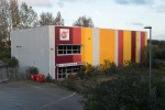
- Red/Orange-Yellow-Blue – Central London
-
- Magenta-Yellow-Red -Leyton (again)
-

- Blue-Yellow – Central London
-

- Yellow-Magenta – Leyton
I think all of these are obviously “colour” and – to varying degrees – show up the differences between naturally occurring (and relatively muted) and artificial (and strongly saturated) colours. This is emphasised in the pictures where there is a neutral (greyish) base to the picture; the first two seem quite balanced, while the other 4 – all of which have strong elements of yellow, either from man-made dyes or from artificial light fighting with the blue of outdoors – have either dull light blue or concrete to set off the stronger colours that are at the heart of the picture.
I have rarely liked selective desaturation (where a colour – usually red – remains after all else is desaturated in whatever editing program the photographer is using) in still images, but here nothing is totally unsaturated, and the combination existed in front of the camera. The pictures where this contrast between neutral and colour is strong are the more urban ones; there could well be something to exploit in this in accordance with the location of my photographs (the Orkney shots from assignment 2 have a uniformly muted palette; assignment 3 – shot before I wrote this – is more urban and features more defined, “coloured” colours…
