For this exercise you are going to find scenes or parts of scenes that are each dominated by a single one of the primary and secondary colours. To produce images that match the six colours closely, you may find that you have to make a number of attempts. Don’t feel frustrated at the difficulty of making an exact match with each example – you will be refining your own ability to judge these colours.
AoP Coursebook
The open-endedness of this exercise – exemplified by the phrase “you may find that you have to make a number of attempts” – led me to wildly overshoot for this part of the course. The exercises here and the one on colour combinations merged into one long set of shoots that also began to overlap with getting the assignment done; one moment I’d see something RED and bracket it, the next I’d see something YELLOW set against VIOLET and bracket it too, then I’d see a contrasting colour highlight and take a candidate picture for the assignment. The next day I’d go to reshoot the bits that hadn’t come out as expected and then be distracted by something else.
Eventually, I realised I just had to stop and get the assignment finished as a priority. Now, at the end of the course, I’ve returned to try to make some sense of the stuff I got lost in nearly a year ago. Here are the most exemplary versions of each of the six colours. The way the colours behave as they are move from over to underexposure is described in a hugely subjective way in the text that goes alongside them.
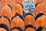
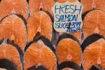
1: Red
-

- Red fig. 1: +1/3 EV
-

- Red fig.2: +-0 EV
-

- Red fig.3: -1/3 EV
-

- Red fig.4: -2/3 EV
The lighter it gets (or rather the closer it gets to being over-exposed) the closer red moves towards being orange. It also gains massively in terms of intensity by being underexposed, when it quickly starts to glow in the gathering shadows of the rest of the frame.
2: Orange
-

- Orange fig. 1: +1/3 EV
-
- Orange fig. 2: +-0 EV
-
- Orange Fig. 3: -1/3 EV
Orange seems to become grubby when underexposed; slight overexposure makes it stand out true.
3: Yellow
-
- Yellow fig. 1: +1/3 EV
-

- Yellow fig. 2: +-0 EV
-
- Yellow fig. 3. -1/3 EV
Over-exposed, yellow quickly becomes wishy-washy. Like red, it stands out from darkness, gaining in intensity as it is progressively underexposed, but like orange, it quickly subsides into being merely a variant of brown.
4: Green
-

- Green Fig.1: +1/3 EV
-
- Green Fig.2: +-0 EV
-

- Green Fig.3: -1/3 EV
Green stays green, but loses it’s tendency to yellowiness, becoming darker and bluer as it is exposed for less time.
5: Blue
-

- Blue Fig.1: +2/3 EV
-
- Blue Fig.2: +-0 EV
-
- Blue Fig.3: -2/3 EV
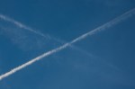
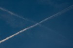
As noted in the previous exercise (Control the Strength of a Colour), blue seems to be at its bluest when the exposure is set for an average meter reading and then quickly drops off towards something more violet-tinged. The pictures here were taken around the time the stuff around the Scottish Independence Referendum was increasingly taking hold of large parts of my psyche, despite my not having a vote; the saltire-in-the-sky effect does not necessarily indicate how I would have cast my vote, had I had one…
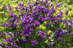
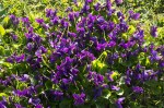
6: Violet
-
- Violet Fig.1: +2/3 EV
-
- Violet Fig.2: +-0 EV
-

- Violet Fig.3: -2/3 EV
A bit too magenta when over-exposed, but works as purple in either of the other pictures.
But of course, I did feel humungously frustrated by this exercise. This was where I think I lost focus quite seriously, as I tried to get the colours to behave as expected. This frustration is reflected in the fact that this is only being posted now, after I have completed the rest of the course and am putting my learning log in order for the November Assessment Event, and I still don’t feel that I managed to nail it.
Instead, it turned into a mass of overshooting, keeping on trying to get the result I wanted and never quite managing to reach a point where I could stop and write this post. I also began to feel that the compensatory stuff in the way my camera created jpegs for me to preview the raw files I was making was not really allowing the differences between exposures to be that visible while I was working . This did not help!
Looking back at what I did manage to do, while I do think that I could do better now, I don’t think all of the exercise pictures for this section of the course were failures. However, I may keep on at this work during Context and Narrative, running it as a side project, trying to find my definitive primary and secondary colours, while working out how different exposures affect them.
Definitely this exercise should mean that I will try to keep my log moving, writing up posts and publishing them not as necessarily as finished articles but as something closer to a log, keeping some record of where I am at a given moment in time, rather than trying to perfect each entry before something goes up.

Pingback: Assignment 3; Colour – Notes for the Assessors | Simon Chirgwin's Learning Log