
Regent Street; September 2015
“Find a street that particularly interests you – it may be local or further afield. Shoot 30 colour images and 30 black and white images in a street photography style. In your learning log, comment on the differences between the two formats. What difference does colour make? Which set do you prefer and why?” – C&N Coursebook
I’m never that sure about “Street Photography”: as a genre it seems to span so wide a variety of photographers and their ways of working as to be meaningless as a description; I don’t really know what the pictures are “for”; and I don’t enjoy taking “street” pictures, finding the whole thing grimly stressful. And this is before I even start thinking about the number of different ways the practice of street photography is codified by the policemen of both photography and of the internet. Is street black and white or colour? Can you crop the images? Should you involve the objects before your lens in the picture-making or just hit and run? Must there be people? Does inside count as “street” if it is a public inside?
I’ll expand on this for bit, before going on to work through the practical part of this exercise.
Firstly, even trying to contain Diane Arbus, Lee Friedlander and Gary Winogrand (the photographers contained within the New Documents exhibition at MoMA in 1967) within the same classification is quite hard – they all worked in black and white, but Arbus was using a medium format camera and working with the people in her photographs, while Friedlander and Winogrand used Leicas, Winogrand grabbed candidly at people moving around him in the street and Friedlander doesn’t seem that interested in people at all but is all about finding coincidences in light and geometry – to then work work back through Robert Frank and Helen Levitt and (of course, he’s photographic Beethoven, he’s everywhere) Walker Evans to Henri Cartier-Bresson and to work forward again to Paul Graham or someone else working now (Philip-Lorca Dicorcia?) through Joel Meyerowitz and William Eggleston (maybe) seems almost impossible. And that’s before you move out of work (mostly) made in America.
So – Martin Parr? Is the seaside the British street? Tony Ray-Jones? Does the photograph taken of me and my sister in Aberdeen in 1971 as we walked down Union Street and sold to us by the photographer in his studio that afternoon as a print count? How about Graham’s early work made in the UK in the 1980s? Is the A1 our Route 66? Or is Oxford Circus our Time Square? Are the Americans wrestling with the myth of America while we look ironically at class? Are we simply sneering in the name of irony? Does it have to include social comment and have a documentary intent or is it just about the point of view of the individual photographer as they pound the mean streets of the place they happen to find themselves?
And what is it all for in the end? The second time I went to the Fine Art Society Cartier-Bresson show, a colleague came along too; while we stood in front of my favourite picture there and discussed whether it was really worth 13.5 thousand pounds (before import tax at 5%) she asked whether, having bought it, I’d hang it on my living room wall? I had to admit that I wouldn’t; but I would hang in in the hall, preferably where someone could come across the 3 Spanish women frozen in Valencia in 1933 as they turned a corner on the stairs and be transfixed by them as if they were the young HCB, himself. I have wondered whether I’d hang an Arbus at all, or whether they (because you’d want the box of 10 prints from 1971) would live tucked away in a drawer and be taken out once in a while and looked at with a shudder. I suppose I could live with a geometrical arrangement of shapes spotted by Friedlander on my wall, but I wouldn’t want him reflected back from a car’s wing mirror…
Street pictures seem much happier in books than on walls (unless those walls are in a gallery) or in a magazine maybe, like Walker Evans’ series for Fortune magazine. Even if you’ve taken taken the picture yourself, you probably don’t want the people in them – strangers – staring out at you all the time back home.
Indeed, it often seems that it is the taking, of them – capturing a moment, a coming together of people and things in space and time – that matters at least as much as the later processing of them. Would Winogrand have ever got round to developing the thousands of rolls of film that were found in his studio after his death? Will you – or I for that matter – ever look a second time at most of the images that build up like digital silt on the hard-drive of our computers or our mobile phones? The taking is often an act in itself; the images require no afterlife beyond a cursory glance as they are downloaded.
And then there’s me. I’m left eyed so the whole “using a Leica [or other, less expensive rangefinder] you can look through the viewfinder with your right eye, while searching for the next picture with your left” thing – as expressed by Joel Meyerowitz in the 3rd Part of Badger’s TV series, The Genius of Photography (BBC, 2009) among others – doesn’t work for me. I miss far more pictures than I take at the decisive moment, usually capturing another indecisive moment instead, although of course, like everything, the more I do it, the better my hit rate gets. And I’m much shyer and internal than my projected self suggests to people who don’t know me well; I don’t relish confrontation. So why should I put myself out there in the middle of a pavement trying to take photos of people who probably don’t want their picture taken and who may aggressively complain if I ignore this? I need to psyche myself up, take deep breaths, select a poker face from my wardrobe of faces before stepping out of the door. Street takes it out of me, emotionally, even if no one tries to break my camera. Or my face.
However, putting all this to one side – for the exercise – I nipped out from work at lunchtime on the 8th September and then again on the 11th, each time giving myself an hour to take pictures around Oxford Circus in London.
I had written myself a William Ryker-ish set of directives:
- People smoking outside shops
- People looking lost as they exit the tube station
- People Taking Photographs
- Chuggers?
- Portals
…but quickly found out that the most common factor on the days I was out was “People looking at the Screens of their Devices” or simply talking on their phone. I quickly added this to my list.
On the 8th I had a digital camera – a Fujifilm X100s, with a fixed 35mm lens, set to f5.6 and 1/125th sec and focused at the hyperfocal distance to get over the slowness of autofocus – and took slightly more shots than you would get on a roll of film. This was the colour shoot, carried out on a day when the light was relatively un-contrasty so the sky (if caught in the frame) was less likely to blow out as I exposed for people in the shade of the tall buildings in the street.

8th September 2015 – Virtual Contact Sheet; Street – Colour
As ever, the experience was terrifying. I moved around the crossroads trying to channel the weird balletic grace displayed by Joel Meyorowicz in the Genius of Photography, but I suspect that sort of thing requires lots and lots of practice. instead, I think I stuck out like a sore thumb, obvious to the people I was photographing. As a result, the thing that strikes me about these is firstly how many people are staring into the lens, ranged across a spectrum that stretches from puzzled (33) through to downright hostile (18 or 36). 36 – left – was the last photo I took, walking past and then pivoting to take a picture back at the three young men and finally accelerating around the corner; I was pursued by all three while the man on the left ran – quite aggressively – through a fascinating set of protests against what I had done ranging from the falsely legalistic to the bizarre. All of the strands of attack seemed to express different facets of the way many people seem to not be quite comfortable with the idea of photography at some very fundamental level that shows that we aren’t that very different from the mythical primitives for whom the act of photographing them equates to the theft of their souls.
Eventually I lost them by darting round another corner and into a door before they were able to see where I’d gone (or they got bored) and so I managed not to delete the picture (which I liked too much to delete it unless there was no other way to get out of the situation) but didn’t feel too happy with myself nonetheless. Certainly, I was much less confrontational when taking the second, black and white set of photos a few days later on the 11th.
I have a block somewhere about taking black and white pictures with a digital camera, so I loaded up my Voigtlander Bessa-R rangefinder with Kodak B&W 400cn (i’m not so purist that I won’t use C41 process B&W) and screwed on the 35mm f2.5 color skopar pancake lens and got a general meter reading of 1/250th at f8 and headed back down to Oxford Circus. The weather was a brighter, with more contrasty light, but overexposed skies aren’t so much of a problem either with film or black and white. After I’d had the film developed and the negatives scanned, I again made up a virtual contact sheet:

11th September 2015 – Virtual Contact Sheet; Street – Black and White
I was going for shape and pattern more than I was for freezing chaos (or to put it a different way, trying to be more Cartier-Bresson and less Winogrand; trying to be less in people’s faces). Also with a directly coupled focus system in a rangefinder camera, it was much easier to change and check focus quickly and without any noticeable shutter lag whatsoever in the Bessa, considerably easier to time shots. As a result, I was much less likely to snatch at pictures and found I was able to slow down, increasing the likelihood of connecting with a subject (see #260 in the contact sheet) and of finding a location where something could be caught as various people moved by in front of my camera (#238 to #240, say).
I also found the people in the picture much less likely to react with hostility (the man with the Lewis’s bags in #236 was the only person who seemed to object to photography); this could have been down to my being less in your face than I had been two days earlier, not wanting to repeat the confrontation after the final colour shot, it could have been because the camera with it’s totally black body was less noticeable, it could have been down to my being less uptight or it could have been something else entirely that I’m unaware of. Whatever it is, I think that when you get some form of eye contact that pierces the lens and the back of the photographer’s skull and then carries on through to the viewer of the resulting photograph, it affects both the way you read the picture and what you end up thinking about the person who took the picture.
But, to get back to the point, what differences are there between the two shoots that can be put down to colour, or its absence?
The colour contact sheet contains more pictures that stand out, even when you can’t tell quite what it is that stands out. The black and white contact sheet contains more geometry and considered composition. The black and white set maybe contains “better photographs” but I think I prefer the effect of the colour pictures. Hmmm.
The Shirley Baker exhibition at the Photographer’s gallery had a handful of colour pictures taken during a few weeks in 1965 among many more black and whites taken over a much wider period of time; the black and white pictures were simply in “the past”, the slides seemed to connect to now (for more on this see the post on the exhibition); black and white connotes history while colour is still current.
Compare these two shots of people standing talking on their phones:
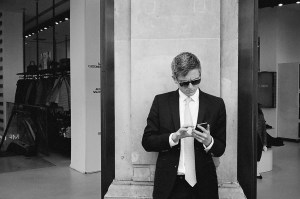

The black and white picture is a collection of tones; the blue behind the man in the colour picture sets off the 3 orange letters on the man’s t-shirt and gives it a whole extra layer. I’m sure that it isn’t just the more modern/casual clothing of the man in the colour picture contrasting with the suited retro-vibe of the man in the black and white that makes it feel more “now”. And that’s before you get into the way the fractured colour and layers of the right hand side of the colour picture is just more interesting than the more formal composition of the black and white.
 The abrupt orange highlight, contrasting with the more muted blues and greys of the rest of the picture create as sense of balance in this picture from the colour set, adding to the compositional strength of the contrast between the man and the dummy one with arm raised, the other with left arm akimbo and arranged on a diagonal. In black and white, his face would recede into the gray of the portland stone. Everything would be a bit less “alive”.
Newspapers almost universally publish colour photographs now; black and white no longer connotes “truth”, rather it connotes the past or at the very least a self conscious stab at a particular aesthetic that has little to do with capturing a moment as “now”. Certainly, I can’t see why people go out with digital cameras, take pictures and then desaturate the colour without any particular reason other than to make them look more “documentary”. There are times when you’ve messed up the white balance or the exposure and black and white may salvage an otherwise excellent picture, but generally I think I’ll stick to film for black and white.
I mean, I like these black and white group shots as moments captured in time:
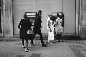
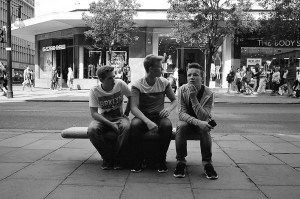
(and indeed the crowd gathering unnoticed around a fallen pedestrian in front of the Body Shop on the other side of the road in the picture of the three teenagers on a bench is really interesting, if i’d only noticed it at the time taken the half-step to the right to make the sign say “The Body”, and reframed accordingly) but there is something much more tellingly “now” in the colour groups of people trying to work out where they are after emerging from the tube:


…and I don’t think they’d be improved by removing the colour from them.
It could of course be that I’m closer, less afraid before the three blokes decided to make something of it, and therefore more likely to be “good enough” in Robert Capa terms, but nevertheless the colour seems to make them much more “alive” and more likely to give an idea of what it was like to be there, near Oxford Circus, sometime in September 2015.

Some really good ones there.
Pingback: the photograph as document: assignment 1 – from idea to pictures | Simon Chirgwin's Learning Log
Pingback: Jeff Wall at the Marian Goodman Gallery | Simon Chirgwin's Learning Log
Pingback: Assignment #3 – Dear Diary… | Simon Chirgwin's Learning Log
Pingback: exercise 2.2 – the unaware | Simon Chirgwin's Learning Log