“Use digital software such as Photoshop to create a composite image which visually appears to be a documentary photograph but which could never actually be. To make a composite image you need to consider your idea and make the required amount of images to join together. Upload the images and decide which image you’ll use as your main image and background. Use the magic wand to select sections of image from the others you wish to move into your background image. Copy via layer and drag into the background. Do this repeatedly until you have all the pieces of your puzzle in place. In order to make it more convincing, use the erase tool on each layer to keep the edges soft and to create a better illusion. Be aware of perspective and light and shadows for the most effective results.”
– C&N Coursebook
London – No Sé
I was first confronted (and given the sheer scale of the print, confronted is definitely the word) by Andreas Gursky’s picture Sao Paulo – Sé (2002) at the Barbican Exhibition, Constructing Worlds (reviewed here as part of my log for TAoP). I immediately liked it and the other Gursky, the 1992 constructed image – Paris Montparnasse – on show at the exhibition.
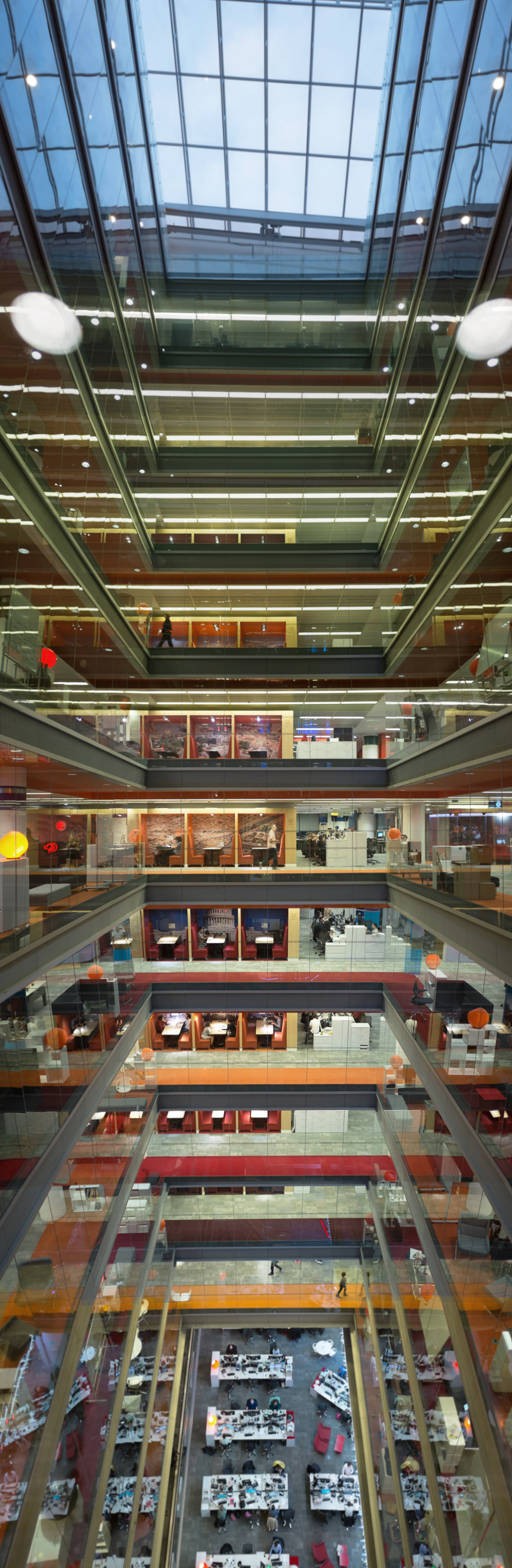
London – No Sé; Simon Chirgwin, 2015
Apart from wondering if I had been to Se station on one of the trips I’ve made to Sao Paulo for work, I was struck by how a similar treatment could be applied to the atria at my workplace, New Broadcasting House in London.
I didn’t get around to doing anything about this thought until I needed to create a constructed image for the course, when after considering and rejecting a couple of constructed scenarios involving people – me, in magician’s outfit levitating my partner, Fiona; my partner, Fiona in magician’s outfit levitating me; me juggling something, possibly three copies of my head; etc – I remembered Se and NBH.
There are two atria (one in the east and one in the west of the building) spanning the area from the lower ground floor newsroom to the roof; nine floors are visible. The drop and the view upwards are visible from all four sides from all floors through floor-to-ceiling glass. Some people find this quite upsetting; I rather like it and saw the picture as an opportunity to capture the space’s vertiginous nature. I also saw it as a chance to add the extra space needed to allow everyone who works there to have a permanent place to sit, getting rid of the need to ‘hot desk’. Four extra floors would do it, I reckon…
I experimented with pictures from all 4 sides of the atrium. The enclosed space is deeper north-south than it is east-west. While it would be nice to have had a wider image, the deeper view looking from the either north or south seemed more suitable as some sense of three sides could be achieved without using a particularly wide lens which would have introduced far too much edge-distortion to make joining multiple images together anything other than a total pain.
I then had to decide between the two remaining views. Looking south, you have a view of the lift shafts; looking north from between the two pairs of lifts, you can see ad-hoc meeting spaces (with foreign city themed backgrounds) and also deeper into the building’s office space where people sit and work. Looking north was the more interesting view. So looking north it was.
I shot the “down” views from the seventh floor, looking straight across from the fifth floor and looking up from the third floor to extend the vertical span of the space as much as possible (ie the middle of the picture is from the middle of the building, the view up is from near the bottom and the the view down from near the top). All the pictures were taken just before I headed home in the evening, as by this time it was dusk and the contrast between inside and outside was at it’s minimum.
I used a 35mm lens and pressed the camera up against the glass wall by the lifts, having noted a join in the roofing at the middle of the window that I would be able to line up with on other floors. To get a straight ahead shot, the lens was flat against the glass, then either tilted up or down to get further coverage of the vertical space. When taking these I needed to be as close to the glass as possible to cut down reflections from behind me. I tried to keep the edit points (usually the bottom of the band of metal that seals off the inter-floor space and separates the panes of glass) near the third lines to further reduce distortion at this point.
The picture was then assembled in Photoshop Elements from a stack of 8 pictures, using hard lines as a separator between pictures (so the central – uppermost -layer is cut back to an X-shape with above and below then masked by it, which are in turn cut back to mask the next layer out from the centre. Some lens distortion needed correcting using the Photoshop filter for this in order to get the lines marking the edges of individual panes of glass to line up and not bend too much towards the edges of the image. Likewise, as degree of tilt needed to be factored in to keep verticals as close to vertical as possible and also to keep the perspective on the beams as close to true as possible.
It almost works here – this is version 2 – and you cannot see most of the joins, but there is a slight helical twist to the picture which I could not quite correct out.
So, a second reshoot might be in order. For it, I’d use a tripod and take a tape measure with me, keeping my position and my relationship to the glass as close to constantly flat as possible (the straight on pictures were easy, as the lens just needed to be pressed to the glass, but the tilts were far harder to keep square); then I’d need to rig some sort of light tent around the camera to cut out reflections.
I then played a bit more with “reality”. I took a 5th floor, straight ahead shot of the second atrium (which is a mirror of this one, with the meeting spaces off to the right, rather than the left) and cut out the middle of the picture. I then flipped it horizontally and dropped it in, then cut out any notices pinned to the walls and reflipped them, so that the writing (readable at full resolution) wouldn’t give the game away.
Finally, I cut out some of the people walking across the various floor (with their reflections) in some alternative shots of the various floors and dropped them into the composite. Only one of the striding figures actually was there in front of the background.
I could do a lot more, but I think what is there now, is sufficient for the exercise! I think i will have another go though, both to correct the twist and also to do a few more drop ins. A large print would be nice too. Once I’ve got round to doing this, I’ll post the results.
And finally, I know “Sé” is Cathedral in Portuguese and that “No Sé” is Spanish (for I don’t know), but I think that it fits nicely with the spirit both of the exercise and of the whole surrealist, “this is not a pipe-iness” of stuff like this…
References:
- Constructing Worlds – Exhibition: Barbican, London; 25/09/2014 – 11/01/2015)
- New Broadcasting House – BBC Online; about the building.
Links checked 15/11/2015

This is fab, Simon. I really like it.
Pingback: Assignment 4: “A picture is worth a thousand words” – Choices and Preparation | Simon Chirgwin's Learning Log