Orcadianicity Simon Chirgwin 2017
Three things feed into this image:
- Firstly, there is the poem itself (Like a Beacon, by Grace Nichols) which I first encountered as a Poem on the Underground on my way to work a little over a year ago
- Then there is Roland Barthes’ 1961 essay, Rhetoric of the Image which deals with the way an advertising photograph for Italian food products intentionally creates its meaning for a specific target audience.
- And finally, there is me. Like Nichols I grew up on an island and now live in London; like Nichols, I haunt art galleries; and like Nichols, I sometimes long for a taste of foods that i grew up eating…
This third thing is what pierced me, drawing me to the poem. This is one of things i am trying to say with this picture. I think I am attempting to transfer a Barthesian punctum – or the literary equivalent of one – from one medium – a poem – to another – a photograph.
Of course, I am not a poet. I am a white European man, not a West Indian woman. My mother did not give me whisky with my tea and haggis is not particularly Orcadian. But I do like to eat it and clapshot is definitely Orcadian (and tasty too, if you add plenty of butter and pepper).
1: Constructing a Meaning.
In Rhetoric of the Image (1964), Barthes identified three forms of meaning found in photographs:
- Linguistic, text, broken down further into anchors (using words – titles, captions, the full text of an illustrated article – to limit the ideas available to the viewer) and relay (opening up possibilities for further, non-literal ideas to be evoked).
- Denotative – the stuff of the picture which seems to stand as a sign for what it is (an apple, an orange, the view, Uncle Frank etc).
- Connotative – The more general meanings assigned to “things” (and pictures of things) by the culture where they exist. All these cultural meanings may not be accessible by everyone and some may be very personal indeed, which is where the punctum comes in.

the original 1960s advertisement
All three forms are present in the Panzani advertisement which is examined in depth in Barthes’ essay.
Text anchors: “Pates, Sauce, Parmesan”; there is relay: “A L’Italienne De Lux” and the word Panzani itself, with its Italianate “-zani” ending.
This anchoring text reinforces the denotative signs in the image: packs of spaghetti, tomatoes and onions, the cheese. And the relay towards what Barthes styles “italianicity” is similarly reinforced by the ideas associated with “pasta,” “parmesan” and “tomatoes”; the palette – red, white and green – is likewise “Italian”. And so on.
Then to this initial connotative area of meaning, Barthes adds three others: culinary preparation, still life and plenty.
My picture needs to work in the same areas – textual anchors (and an evocative relay) the correct denoted objects, and a raft of cultural associations. Then to Barthes’ four connotative signs, I would be adding a fifth: anyone who occupies the same place as I do within the discourses of “education” and “art”, would spot references to “Rhetoric of the Image” and the genre of “The still life”.
2: Constructing a Photograph
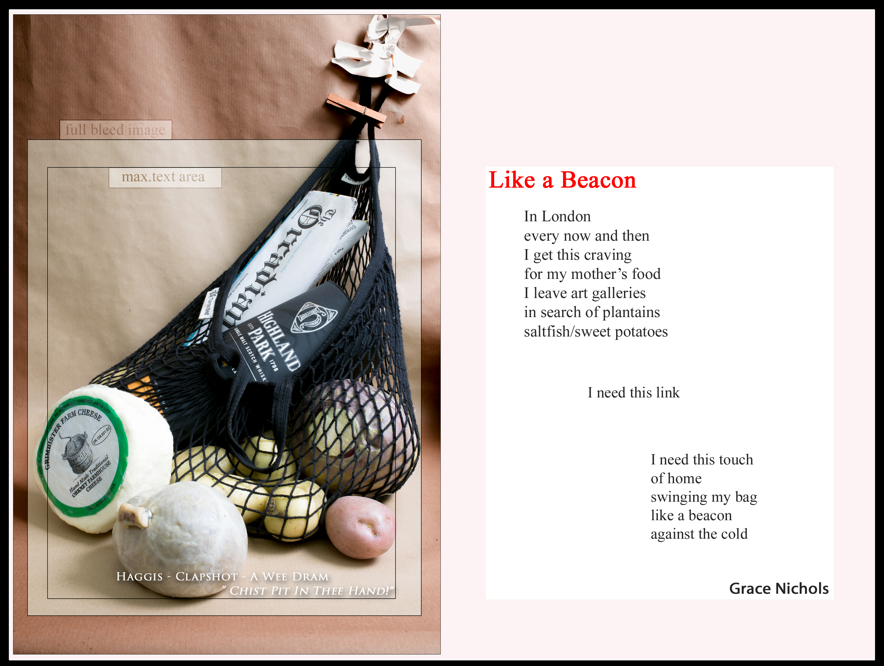
I put together a set of props: a string shopping bag and the food itself. Potatoes and a neep, which mashed together make clapshot; a proper haggis, not one with plastic casing. These are all round-ish, and so is a farmhouse cheese to stand in for the parmesan. I needed something rectangular to open out the bag and replace the spaghetti.
I got my sister (who still lives in Orkney) to send down a copy of the local paper and tried to get bundle of razor clams (“spoots” in Orkney dialect), but my local fishmonger didn’t have any the week I took the picture, so I used a bottle of Highland Park (the distillery visible from my childhood bedroom window) in its squared-off presentation box as a second rectangular element. With the haggis and clapshot – it gave a wintery, Burns’ night feel to the connotative package I was assembling.
For a backdrop, I went for brown paper, as this would harmonise with the browns, yellows and beiges of the foodstuffs. It also made a link in my head with the colour of faded, wind-beaten grass after an Orkney winter.
The lighting of Panzani’s ad is contrasty enough to give an idea of roundness through highlights and soft shadow, but is not harsh. I tacked up my brown paper and positioned a softbox, angled at 45 degrees, above the camera; I added a strobe to the left to add highlights and create shadows.
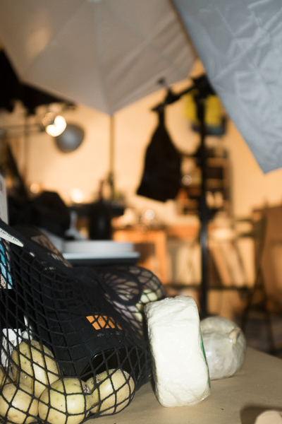

I set the camera on its tripod and started constructing the composition and tweaking the lighting. After a couple of hours, i had a picture that mirrored the original advertisement and which also included elements of its construction in case the finished work would need them.
This contact sheet shows the process:

Three of Barthes’ meanings (“culinary preparation” – the string bag and raw ingredients, “plenty” – the bulgy bag, resembling a cornucopia, described by wikipedia as “a symbol of nourishment or abundance […] a large horn-shaped container overflowing with produce…” and “still life” – an arrangement of inanimate objects, related closely to a simple advertising “pack shot”) are covered by the raw picture; the idea of “Orcadianicity” substituting for the original’s “Italianicity” takes more work to establish.
This is where text can play its part in establishing a narrower idea of what it is you’re looking at. Various things act as anchors: the paper’s masthead (“The ORCADIAN”); the label on the cheese (“Orkney Farmhouse Cheese”) and – on a cultural level – Highland Park is the better known of Orkney’s two malts.
This leaves only the question of how (beyond the obvious-to-anyone-in-the-know mirroring) to link to the original pasta advertisement and Barthes and also to Nichols’ poem.
3: Taking it further – beyond a still life
The Panzani Ad includes two levels of text – that contained ‘inside’ the still life and the superimposed advertising copy (discussed above). I added first my superimposed anchoring line – Haggis -Clapshot – A Wee Dram and then a more connotative invocation to Chist Pit in Thee Hand (a phrase as laden with Orkney-style couthiness as Sit Thee Doon Buddo burnt into the surface of a traditional wooden stool).
At this point, having I hope evoked both “Orcadianicity” and an advertisement, I imagined a place for the ad I had constructed to be displayed: the Guardian’s Weekend colour supplement. Looking online I found out the dimensions for a full page advert and worked out the ratios for a full-bleed picture (going to the edges of the page) and also the are within this allowed for text. Rather than crop the picture to remove the tape tacking the bag to the paper backdrop I ruled the guidelines onto the full frame image and labeled them.
Poems on the Underground occupy the same physical space as advertising, above the windows and over the heads of the passengers. And earlier, looking at Eugene Smith’s Country Doctor series as it appeared when published in Life, I had noted how the famous sequence of pictures appeared juxtaposed with advertising copy. It was a simple step to extend my picture into a double spread and to add the poem as a final piece of context for the image. After all, a beacon is a signal to others, a message…

What a great idea, a self-portrait, an advertising illustration and a theoretical reference all in one.
Thank you Emma! I do think it makes a good fist of wrapping up pretty much all the other parts of the course!
Fabulous Simon , it says so much about who you are & where you came from . Well done !
Thanks Judy, it also hides quite a lot too!
A success on every level I think. Good to see the contact sheet as well – the black background highlights the content of each thumbnail. I think it’s a great project – being a (semi?) self-portrait as well as encapsulating your learning throughout the Module.
Wishing you success in eventual assessment.
Pingback: Assignment 5 – Reflection | Simon Chirgwin's Learning Log
Pingback: research point – barthes’ ‘the rhetoric of the image’ | Simon Chirgwin's Learning Log