In a minute there is time
For decisions and revisions which a minute will reverse.For I have known them all already, known them all:
Have known the evenings, mornings, afternoons,
I have measured out my life with coffee spoons;
I know the voices dying with a dying fall
Beneath the music from a farther room.From T.S. Eliot: The Love Song of J. Alfred Prufrock
Category Archives: Context & Narrative
Some quick thoughts on Frank Auerbach at Tate Britain

Frank Auerbach – Tate Britain, 9th October 2015 – 13 March 2016
- The first thing that struck me was the sheer physicality of the paintings (they’re not in frames so much as contained within glass fronted boxes). You don’t get this from the Catalogue (Fiona went a few weeks ago and brought back the book; I was rather unimpressed by the reproductions and was then surprised by how much I liked them in the gallery) or indeed online.
- There is something sculptural about about the depth of the paint in the early (1950s + 60s) works. The later paintings are less obviously built up over time, but still show more evidence of having been painted than they do of being paintings of something.
- They are also both in concept and appearance a bit like a picked and picked again and again scab! The word scarification comes to mind.
- Also the worked over drawings include patches of paper collaged on over lower – presumably damaged or at least un-erasable – generations of the charcoal chalk and paper work. The result was a sort of patchwork effect that made me think of Hockney’s 80’s print collages. Possibly a usable effect later in the course…
- Following on from the above comment, I think that if I were to leave only one picture of myself for posterity to gawp at, I’d rather it was not an Auerbach. If I were to leave behind two though, I’d be honoured…
- Like the Monet pictures of Rouen Cathedral in the Musee de Orsay in Paris, the pictures have meaning and content at a distance and then dissolve into painting as you step closer. You can see (and see in my previous comment) how upsetting this can be to people who want simple likenesses of people and things…
- In the leaflet that you’re given as you go in, each of the rooms (organised by decade, with the paintings chosen by the artist and then a final, career-spanning one put together by Catherine Lampert) has a short essay on one of the paintings by a critic, a sitter or another artist. These are all fine descriptions – Lucien Freud on how the size of the picture relates to the size of the idea it contains is very good indeed- and I shall return to them when I start on the fourth part of C&N
- Similarly a line from the piece on Building Site, Earls Court, Winter 1953 – “I actually posed a still life in the front, of a saw and a pair of pinchers and a hammer, and thought I would create some sort of connection between painting from life and painting drawings” – points towards an idea for inclusion into the constructed work for Assignment 5: combining some sort of studio shot with a location background. Hmmm
- And, finally, there seems to be some connection between the later, strongly coloured pictures and the Saul Leiter work that’s on at the Photographers’ Gallery at the moment. In my head at least…
And as ever, I’ll now link to the Review in The Guardian (Tim Adams, 11/10/15)
Narrative #2 – Poem
“Choose a poem that resonates with you then interpret it through photographs. Don’t attempt to describe the poem but instead give a sense of the feeling of the poem and the essence it exudes.”
Later this year, we hope to move house. One of the things we need to do to turn this into a reality is to pack things away. I have way too many books, so they need to be boxed up and made ready bit by bit. As a result most of my poetry books – all of them. actually – are now in boxes in the the attic. This is quite good as it forces me to find some new poetry to look at, for this… Continue reading
Narrative # 1 – Country Doctor and The Dad Project
“The town of Kremmling Colorado, 115 miles west of Denver, contains 1,000 people. The surrounding area of some 400 square miles, filled with ranches which extend high into the Rocky Mountains, contains 1,000 more. These 2,000 souls are constantly falling ill, recovering or dying, having children, being kicked by horses and cutting themselves on broken bottles. A single country doctor, known in the profession as a “g.p.”, or general practitioner, takes care of them all. His name is Ernest Guy Ceriani.”
– Opening of Country Doctor, Life, 20/09/1948, pp 115-126
“Three months after my Dad died, I found myself hanging photos on a gallery wall that revealed the story of our relationship and of his death. We had recorded it together through photography and film during his last six months, and it became ‘The Dad Project’. He was 65, I was 29, and two years have passed since.”
– Opening of .pdf version of The Dad Project, online, Briony Campbell, November 2011
In itself, the attribution to these two quotes identifies a number of significant differences between the two series’ of photographs considered here. Country Doctor exists in a single form contained in one edition of Life; The Dad Project has had many versions – a book, exhibitions, articles in the press (and a Guardian film) and the currently available online version that I will base the bulk of my comments in this post upon. Country Doctor – although the pictures are available with some outtakes on both the Life and Magnum sites – is a singular thing; The Dad Project is multiple. Country Doctor is a 3rd person narrative; The Dad Project is first person. Continue reading
Assignment 1: Photograph as Document – Reflection
1: Demonstration of Visual Skills
I don’t think these are the best pictures I have submitted for an OCA assignment and feel that the overall presentation is more of a sketch than it is a finished piece of work. I think it works, but more as a pointer towards what it could be than as the thing itself. Continue reading
Some thoughts on the display of assignments (and pictures generally) online and off it
What follows is what I jotted down in my physical log at about one in the morning when I couldn’t get back top sleep because of toothache.
I had been thinking about the online presentation of Assignment 1, and was looking through John Berger and Jean Mohr’s Another Way of Telling. I began to muse on the differences between different forms of presentation for photographs. I then started to wonder how this related to their meaning, particularly when that meaning relies on the relationship between the individual pictures and their layout. Continue reading
Assignment 1: Photograph as Document – The Pictures

Half-Way Along Walthamstow High Street
Swamped or Enhanced?
In Walthamstow, the high street runs west to east (or east to west) for a bit over a mile. While there is a seventies mall and some larger shops, most of the shops are housed in square units. While some of these smaller shops have been open for years, there is a fairly high turnover of businesses. The shops tend to reflect the patterns people moving into and out of the borough as well as the economic fortune of different sorts of trade. Woolworths closed and a Lidl opened in the aftermath of the crash and there aren’t any record shops anymore. However there will probably always be a call for cheap jeans, pots and pans, regardless of who is selling them.
Jeff Wall at the Marian Goodman Gallery

Unlike the large scale works of other photographers like Andreas Gursky and Philip-Lorca diCorcia, I am not aware of having seen any of Jeff Wall’s enormous pictures before, apart from as reproductions in books. So the first thing that struck me about the six pictures – one triptych and five singles – exhibited in the large upstairs space at the Marian Goodman Gallery was their sheer size! Continue reading
the photograph as document: assignment 1 – from idea to pictures
“This assignment is designed to give your tutor a feel for your work […] Create at least two sets of photographs telling different versions of the same story. The aim of the assignment is to help you explore the convincing nature of documentary, even though what the viewer thinks they see may not in fact be true. Try to make both sets equally convincing so that it’s impossible to tell which version of the images is ‘true’. Choose a theme and aim for 5–7 images for each set, depending on your idea.” – C&A Coursebook
As the first assignment of each of the level 1 courses is intended as a benchmarking exercise, allowing your tutor to make an assessment of where you are at this (that) moment, it makes sense for it to follow on directly from the work I did for Assignment 5 of The Art of Photography where we constructed a narrative. My response to this tried to give enough information for a viewer to work out what had happened to a terraced row of houses in Walthamstow one December night in 1940, when a single bomb destroyed a chunk of the terrace. That space is now filled in with post-war housing that is quite different from the Victorian terraces on either side.
The pictures were heavily informed by Steffi Klenz’s Nummianus. For it, I took a series of pictures of the street-facing elevations, each showing two doors-worth of houses. These were then combined into a long concertina-folded strip that opened out to show the affected section of street.
At the time, I thought that it did more than simply show that there was bomb damage in Elmfield Road. There was a second narrative, showing how different owners had modified their houses, resulting in a small typography of variations in how identical houses had been personalised (mainly since the 1980s). There was also the seeds of an idea of how pictures taken in different streets could be combined to provide a fictional street of my own designing.
The Background:
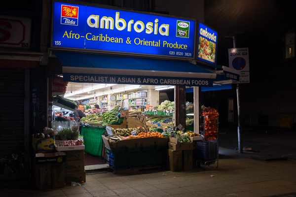
I was working on this final assignment during the UK election and its immediate aftermath. There was a lot in the air about immigration from (Eastern) Europe, of being “swamped” and of the character of parts of England being changed. Usually for the worse in the eyes of those trying to make political capital from it.
I live in Walthamstow and the rhetoric around race and migration and being swamped didn’t latch with my day to day experience. Continue reading
The Photograph as Document #5 – Constructed Images
“Use digital software such as Photoshop to create a composite image which visually appears to be a documentary photograph but which could never actually be. To make a composite image you need to consider your idea and make the required amount of images to join together. Upload the images and decide which image you’ll use as your main image and background. Use the magic wand to select sections of image from the others you wish to move into your background image. Copy via layer and drag into the background. Do this repeatedly until you have all the pieces of your puzzle in place. In order to make it more convincing, use the erase tool on each layer to keep the edges soft and to create a better illusion. Be aware of perspective and light and shadows for the most effective results.”
– C&N Coursebook
London – No Sé
I was first confronted (and given the sheer scale of the print, confronted is definitely the word) by Andreas Gursky’s picture Sao Paulo – Sé (2002) at the Barbican Exhibition, Constructing Worlds (reviewed here as part of my log for TAoP). I immediately liked it and the other Gursky, the 1992 constructed image – Paris Montparnasse – on show at the exhibition. Continue reading


