“Choose any subject that you can move around and take 8 photos based on the 4 themes of the assignment. ” – AoP Coursebook
The themes for assignment four were Shape – the 2D aspects of the subject – Form – the 3 dimensional aspects of the subject, adding depth to the outline – Texture – bringing out details of the surface – and Colour – which I took to relate both to the colour of the subject and also to the colour of the light falling on the subject.
So, the first task was to choose a subject that gave enough scope for all four of these to be shown, without too much repetition between pictures. I also wanted to use a variety of different sorts of light for this, using daylight and artificial light and also specifically photographic lighting to gain the effects required.

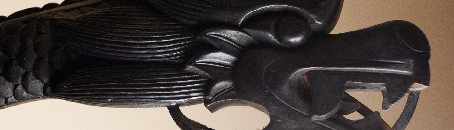
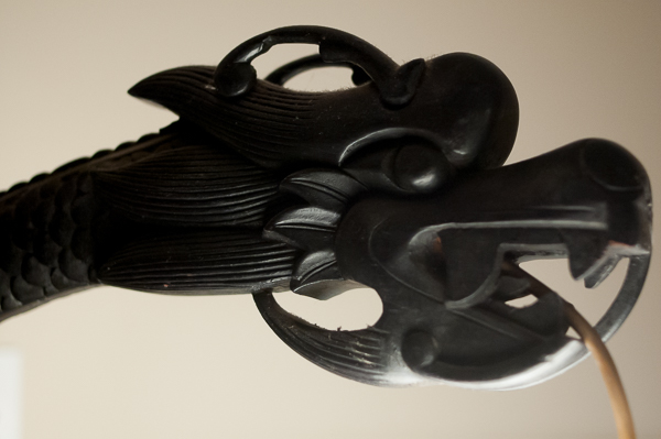
the dragon lamp
I started looking at lights that were already present in the house with the idea of the subject lighting itself in some of the pictures, settling on either an anglepoise-type lamp which offered a lot of nice, variable geometry or a 1920s wooden standard lamp in the form of an oriental dragon which would produce more diffused light through its paper lantern lightshade.

anglepoise lamp
Shape and Form would be fairly easy to get, with the anglepoise offering a wider variety of silhouettes and the chinese standard lamp offering more interesting possibilities to cast shadows bringing out its form. There was plenty of texture in the carving of the standard lamp while the anglepoise had a rough cast iron base and silvered springs which would make fine closeups. But both were black: colour would be a bit of a problem although one picture contrasting the orangey light of the lamp itself with white, photographic light would be achieveable as would trying to give some idea of depth by using two lights coloured with gels to give contrasting (red in the foreground and blue further back) highlights.
I had already discovered the amount of space needed to light a subject during the photographic lighting exercises that led up to the assignment; the attic where I have my workroom probably wouldn’t be large enough to do wider shots of the standard lamp while clearing the living room of the clutter left by me, my partner and our 2 year-old would present problems.
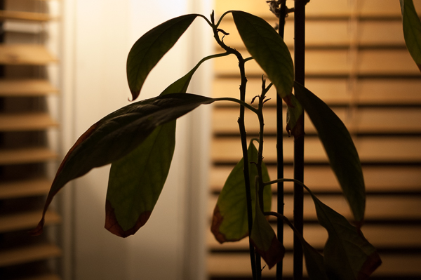
 I put the idea on hold, while I tried to think of other more easily isolatable subjects, coming up with a typography of old Russian cameras – again, good shapes and nice textures but not a lot of colour – a battered old pair of shoes and an avocado plant, grown from a stone and now showing some nice structure for both the form and shape pictures, good textures on the leaves and trunk/stem and also a variety of colour in the leaves which contrasted nicely with the soil in the pot and the pot itself.
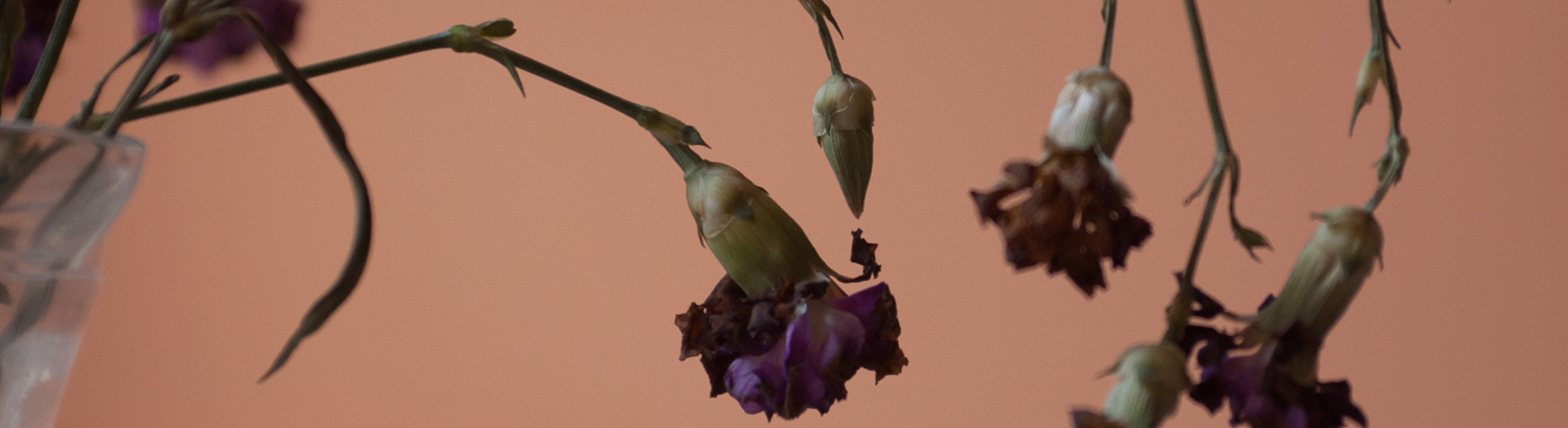
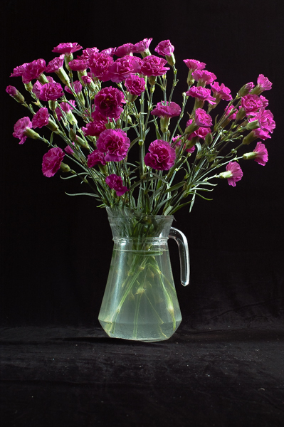
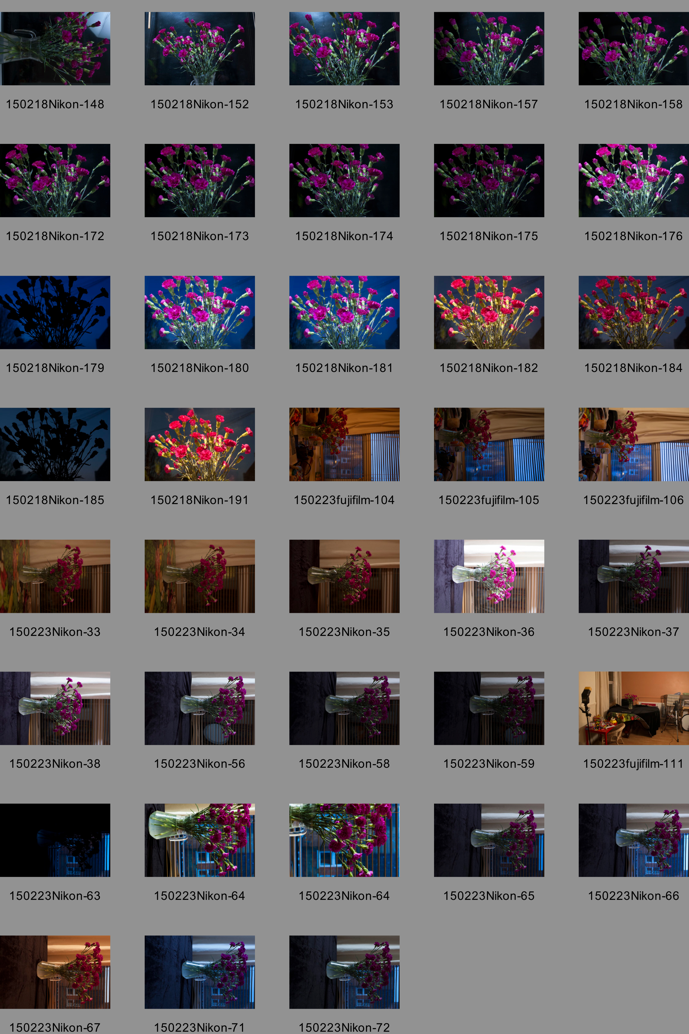
At this point however, the deadline for the assignment was looming and I just needed to knuckle down and shoot something; it was Valentine’s day and my partner gave me a bunch of carnations. As they fell into some sort of arrangement in a glass jug, I realised I had found my subject and also that the short lifespan of cut flowers would force me to work reasonably quickly. I cleared enought space in the living room to make a start and began making the pictures.
I will confine detailed notes and contact sheets to 4 of the 8 submitted pictures…

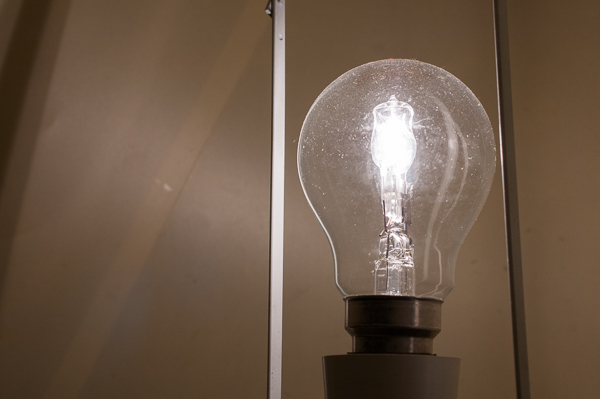
Keep a good head and always carry a lightbulb..

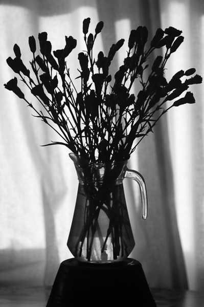
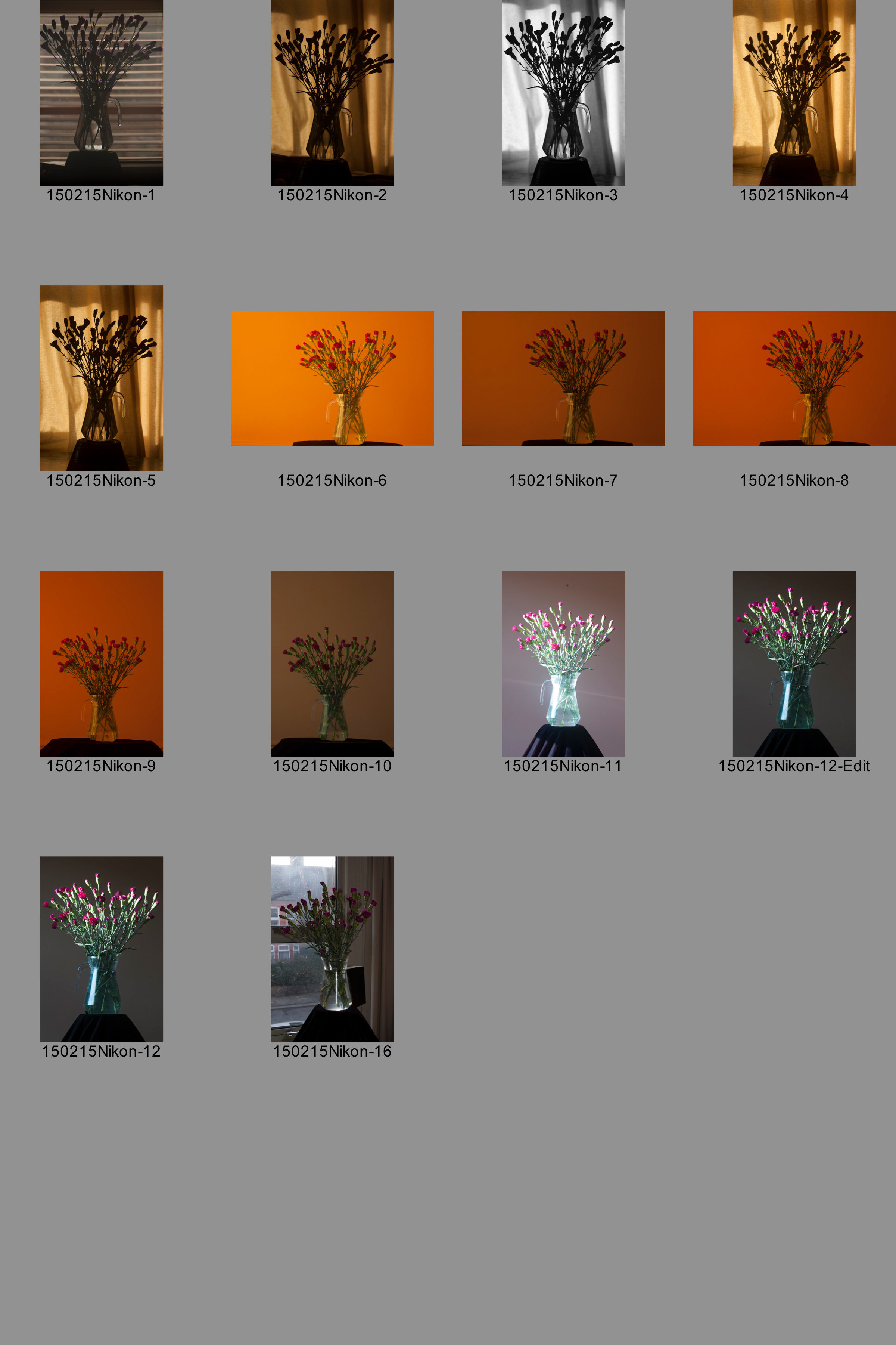
Contact 1 – Shape 1 & Form 1
For the first shoot – trying to get a natural light Shape and Form – I put the jug of flowers on a table in front of a window and then raised it on an upturned earthernware plantpot so that the base of the jug was inside the area of the window. I took an initial shot using a venetian blind to control the intensity of the light somewhat, but did not like the effect (shot 1 on the contact sheet); instead closing the curtains gave a much softer diffused light while the folds of the cloth gave some variety to the background without being as disruptive as the hard horizontals of the blind.Liking the overall effect (shot 2) I took three further shots made with the same exposure, but varying the aperture to give an increasing depth of field to try and catch the outline of the whole bunch of flowers in focus. (check exif).
I then shifted the camera 90 degrees so the light was coming from the side of the frame rather than directly towards the lens. I experimented with trying a landscape formatted picture, but felt that – without something interesting on the background (shadows, perhaps) – the flowers suited a more vertical treatment. The low evening light was quite strongly warm, particularly when filtered by the oatmeal curtains. I tried different white balances, but overall did not like the resulting muted colour and lack of contrast (10 on the contact sheet). I drew the curtains to get more contrasty, undiffused light. I had draped a wider support (a cable drum) with black velvet to cut down on internal reflections but as the sun sank outside this did not raise the jug high enough for it to remain evenly lit, so I went back to using the upturned plant pot, but this time draped with the cloth. The effect was better, but the light hiting the water-filled jug reflected a sharp shaft of light on the wall behind the flowers (shot 11). To stop this, I taped my notebook to the back of the jug (shown in shot 16) and took the final shot. Annoyingly, you can just see the notebook to the left of the jug’s bottom (12) but – with the light vanishing for the afternoon and tea needing to be served on the table – was able to clone it out later (12-edit, the submitted image).

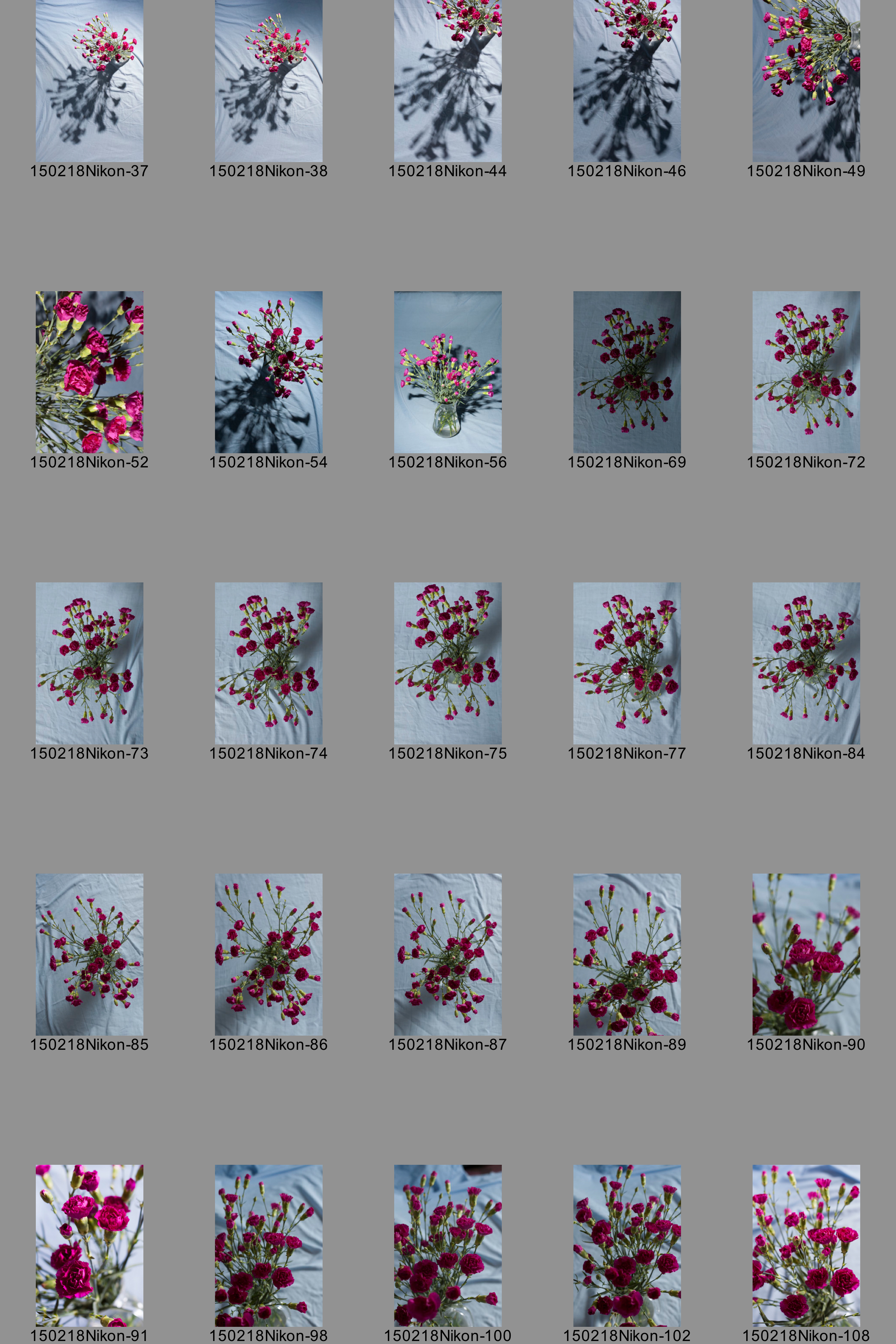
Contact 2: Form 2 becomes Colour 1
I thought it would be fairly easy to get a flash-lit form picture using a plain background (a pale blue sheet)and a relatively strong undiffused strobe set to give a wide beam of light to cast nice sharp shadowws. Shooting down into the vase I thought I would effectively get a front and side elevation combined in one picture to give a stong idea of the 3D shape of the subject. I was wrong…
Firstly, getting the sheet anyway near flat enough to not cast distracting shadows proved almost impossible. And the strong contrasty light was focussed by the lens-like effect of the water in the glass jug, drawing more attention to the background than the flowers. Moving closer (44 and 46) gave a better effect than the wider shots I started off with, but it never quite worked for me at the time. In retrospect, I quite like some of them now, but still think I’d have needed to do more work to get them just so: rearranging the flowers to hide the hot spot; maybe raising the whole set up up and taping the sheet to a wall so I could work along the horizontal axis, rather than looking down on the jug of flowers while gravity pulled the ruckles out of the sheet. I almost got to this set up by draping the sheet over the front of the couch (56) but lacked the height I’d have had with the flowers on the table and so couldn’t really get the strobe low enough to send a shadow out straight to the side. It would also have allowed me to set the camera on a tripod and work on small improvements to lighting without worrying about framing and where I wanted the shadow to fall.
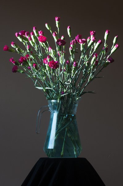
But instead, I gave up on the hard shadow 3D effect and instead added a shoot-through umbrella to the lighting setup, diffusing the light and losing a lot of the shadow; I also started working closer (69 onwards) losing the sense of 3 dimensions as I moved in but gradually becoming aware that the magenta of the flowers was nicely set off by the pale blue of the sheet, while the green of the stems stood out on the other side of the blue. Rather than a form picture, I was making a colour one. Picture 90 (the number of pictures shows the other downside to not using a tripod – rather than being able to sort the framing and then concentrate on the lighting effect, I was constantly reframing as well) is the one that I plumped for in the end; it also works at giving an idea of depth, thanks to the shallow focus and isn’t bad in terms of the texture of the flowers either, but the colour I think is closest to the effect of the carnations in reality…

Contact 3 – Colour 2.0.1 & 2.0.2
All along, I had wanted to combine tungsten light with daylight, limiting the background to blues while the subject was rendered naturally by adjusting the camera’s white balance setting to compensate for the orangey light of a filtered strobe. Dawn looking west would maximise the contrast, I hoped.
My first go – 148-191 – placed the flowers in the livingroom bay window, relatively close to the pane and with the light high up to the left of frame in an attempt to avoid reflections of the light in the glass. I once again tried a landscape format composition (it left less vertical space for reflections to form and also was going to result in a nicer silhouette of the buildings across the street); I then blocked spill onto the background using a piece of black-wrap as a barn door on the window side of the strobe. I got the aperture part of the exposure correct; locked everything off and went to be. In the morning, I’d find out how long an exposure would be required to get a suitable blue outside and then take the picture.
Then in the morning, I realised that there were still reflections in the double glazed glass and also that getting the focus right in near darkness, was very hard indeed. I managed to crack the focus thing (a torch shone on the bit I wanted sharp allowed the autofocus to work much better) but couldn’t lose the reflections. I moved on to using much the same position as I had used for 1 and 3 with the jug in front of a different window (104-106) and adjourned til the evening. I then ran through the same process as the previous attempt this time realising that the problem with the view directly accros the street was that the houses opposite and their white window frames distracted from the actual subject and its colour while the brickwork didn’t end up blue enought for the effect I was looking for. I did however notice that he window shot from an oblique angle, into the corner gave plenty of blue, without either reflections or distracting detail (Contact Sheet 4, 33-42.

Contact 4 – Colour 2.1
So, that night, before going to bed, I went through all the same steps again – although this time, I created a rolled tube of blackwrap to concentrate the orange coloured light form the strobe on the flowers, casting a shadow on the wall behind – only to find that the morning was not clear and birght, like the previous two days, but was instead really rather overcast (54-57) and so there was much less light from the window, resulting in a much longer exposure being required. I shot anyway, and rather like the effect, even though, after necessary slight adjustment of the WB form the cameras tungsten preset in Lightroom the blue is much less pronounced than I’d been hoping for.
I didn’t do a lot of editing on the pictures gathered, limiting myself mainly to cropping, with a little bit of getting the overall exposure closer to filling the space from black up to white. Some colour adjustments (beyond converting some of the final pictures to black and white) have also been made, if necessary, but this has been kept to a minimum…