Category Archives: The Art Of Photography

My Learning Log for the Level 4 Open College of the Arts’ course, Photography 1 – The Art of Photography

Assignment 5 – Ideas & Initial Research

barcelona teleferique - 13/04/2014

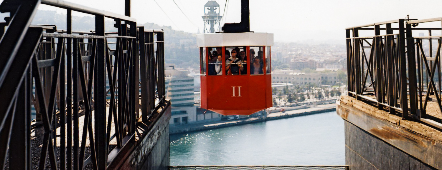
barcelona teleferique – 13/04/2014

For this last assignment, I arranged a phone tutorial at the end of April to go through the ideas I had for narratives In preparation I sent him a quick summary of the 4 ideas I wanted to examine: they covered a reasonable spectrum of stories and possible treatments ranging from total control through to recording an event.

Idea 1: Alice – Birth to 2 year-old in Clothes

My daughter is newly two, and we still have not got round to passing on the clothes she no longer fits.

I quite fancy the idea of doing something that shows what she would have worn typically (with increases in size) at 3 months intervals.

There would be body suits, sleep suits, shoes, trousers, coats etc etc to document into some sort of typology. Also, plenty of colour, opportunities for framing to get some idea of growth over 3 otherwise identical tops say etc etc

Idea 2:  Crosswords

Taking 3 of the different sorts of clues (anagrams, read throughs and conventional codes for example) and illustrating them with one day’s crossword as it is solved and filled in.

Opportunity for a nice wide cover shot; opportunities for time to be indicated in various ways like changing light through the window, the crossword being filled in, coffee rings on the paper etc etc as a lazy day off is spent doing the puzzle.

Idea 3: Why is Elmfield Road in Walthamstow an incomplete terrace?

Because there’s a small range of 50’s houses in the middle; because a bomb was dropped sometime in late 1940/early 1941…

A mixture of constructed shots:

  • a silhouetted bomber over Walthamstow at night say;
  • details of the bomb damage maps held in the Waltham Forest Archive

And more documentary stuff:

  • the Heinkel bomber at Duxford
  • Elmfield Road (good for this as it’s one-sided allowing you to get far enough back for a wide shot)
  • Possible other missing-tooth bombsites in the area

Idea 4 – A trip over the Thames in the Cable Car from Canning Town to the 02

  • Queuing
  • Getting In
  • The people you share the gondola with
  • The view.
  • Exterior shots of the ride (near/far)

Stuff like that – giving a simple journey narrative thing, probably taking two journeys to get all the pictures.

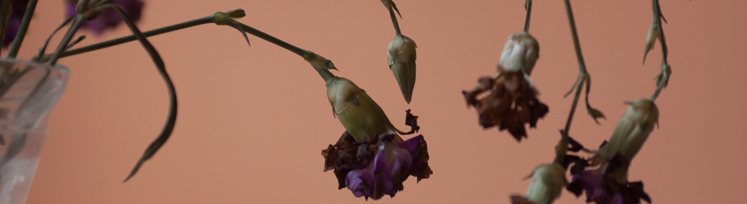
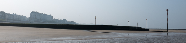
Also maybe include some pictures of the Olympic Teleferique in Barcelona, that I took a week ago (and got the idea for this from) but which don’t add up to a full narrative.

The tutorial passed over ideas one and two to concentrate on either the bombed terrace or the cable car. The crossword idea is technical and safe, consisting of a series of constructed shots; Alice’s clothes could look like a series of catalogue shots and again would equal a good commercial photographic commission rather than something to stretch myself (although I’d still like to do this as a personal project – I think it could be a lot more interesting than the outline above suggests).

David made the point that this stage in the Photography BA  is a good one to take risks with as the only pressure to get marks is the need to get 40% or over, allowing you to move onto the next module. Working on from this he pushed the second two ideas in a more experimental direction than I had been considering up to that point.

For the cable car idea, I had been thinking along simple “journey as narrative” ideas, done with a mixture of of 1st person POV stuff, taking in waiting to get on, crossing the Thames and then getting out at the other side and 3rd person shots of the cable car, the gondolas and the wires overhead. They would not have been radically different from the Barcelona pictures, but would be more comprehensive than those I’d managed to take over the course of a single one way journey with only one, 12-exposure roll of film in a 50 year old folding camera after the last battery died in my digital (one of which is the header for this post). Instead, David suggested a series of pictures taken from a static point of view looking out from the moving gondola. An interesting idea, but not one that jumped out immediately as the one to do.

But then, for the filled in blitz-gap in the middle of a row of terraced houses, David’s idea clicked instantly! He suggested doing something along the lines of Steffi Klenz’s Nummianus, a piece I was familiar with from Fox and Caruana’s Behind the Image, where three of the pictures are used across pages 12 & 13 to illustrate the idea of choosing a title to add meaning to a body of work. While following this approach would move away from the magazine article part of the assignment, arranging pictures in a printable sequence would still be possible (I think I will produce a postcard-sized concertina-type book which would be capable of being displayed as a free-standing sequence on a shelf or of being fully opened out and pinned to a wall.

Excited, I moved onto more detailed research and planning…

References:

Behind the Image – Anna Fox and Natasha Caruana (AVA publishing SA, 2012)

Nummianus – http://www.steffiklenz.co.uk/work/nummianus/?lang=en (link accessed 17/06/2015)

Assignment # 4 – Tutor’s Comments

gorizon-pano

“You wisely used a transparent jug here for the flowers and that has given you a much greater variety in framing options than an opaque vase would have. Indeed, a couple of your photographs are reminiscent of Lee Friedlander’s ‘Stems’, and this is no bad thing…”

Again, David was generally positive about the work I had produced for assignment 4 and was glad I had stuck in, despite having found it remarkably hard to get started (or settled on a subject even). Generally he felt:

“All of your photographs were successful –each revealed the aspect you were exploring well. As such there isn’t really much for me to add on that side of things. Your use of lighting accurately brings out the physical properties defined within the assignment.”

There were minor technical issues with a couple of the pictures. The first of the form images was harshly lit, with highlights that were beginning to burn out, something I was aware of while I was editing the pictures, but was unable to do anything beyond correcting the fault as far as was possible in Lightroom, as the next opportunity to have the living-room and the living-room table to myself at a time when it would be fully lit from the window would not be for a couple of weeks, by which time the flowers would have been dead. That said, I did take some pictures after everything had faded, to act as the header for this post; possibly I should include one of them in the set submitted for assessment at the end of the course in place of the picture submitted here. I’ll think about that. The second technical issue was that some of the pictures were over-saturated and that the particular pink of the flowers would be hard to reproduce in prints. Before I started AoP, I had only very rarely printed shots that originated on a digital camera, and I’m still learning lots about how to take things from a .raw to a file that can be handed over to someone who’ll make a digital-C print from it, let alone work out what needs to be done to get a good inkjet print made. David had told me I didn’t need to send prints with this assignment as he was happy that the files and the prints submitted for assignments two and three matched up. However, I think I’ll have a play with the files from this assignment and get them printed up sooner rather than later, as this will allow me to have another run at them if necessary before they are submitted for assessment in the autumn. This probably is a good place to have a look at soft proofing in Lightroom, although my ignorance still extends to the point where I’m not sure if this is only applicable to inkjet stuff… Where I had done much less well though was in writing up the exercises for his section as part of my learning log. I had managed to get almost all of the photographs taken (and I have now filled in the gaps) but failed dismally in getting a final edit of each set of images sorted and then writing it all up. The problems with my workflow first became truly obvious during part three of the course: I have found it hard to confine my shooting to a manageable number of shots and also found overlaps between things that could be used for an exercise or the assignments or for both meaning I have built up pots of suitable images, without necessarily defining where they would appear over the course of each part. I have only managed to avoid this really during assignment two – when I only had one day to take the pictures and no opportunity to go back and further refine them and fill in gaps; even so, I managed to take nearly 350 pictures in that one day – so this is something that I really need to work on in part 5, alongside making sense of the missing posts from parts 3 and 4, and probably will now need to focus on during the course that follows this. While I have managed to reduce dramatically the number of options I have created for the exercise in part 5, I still need to convert that focus during shooting into completed blog posts in my learning log. Watch this space… Then finally, there is a pointer from David to focus more on conceptual self-evaluation, positioning my pictures withing the context of my understanding of both what I am trying to do and where it fits into the wider world of contemporary photography. And this is where Lee Friedlander and Stems comes in…

Assignment 4 – further reading; stems, weeds and studies

In the tutor’s  feedback for assignment 4, I was pointed in the direction of Lee Friedlander’s Stems and also to a wider list of other photographers’ work dealing with the flowers and the way you can light them, in a variety of ways. I was aware of some them already, others were completely new to me.

Two modern Americans, with contrasting approaches to flower pictures:

Friedlander’s Stems: I’ve known about Friedlander for a while now and have the catalogue from the 2008 MOMA retrospective. While the catalogue contains a number of the Stems pictures, I hadn’t consciously spent time looking at them, paying more attention to the exterior shots earlier on in the book (and Friedlanders chronology). However the similarities between 2 and 5 in my set and the pictures here, suggest that – at some level at least – they had penetrated my consciousness.

They don’t deal with the flower heads, but instead play with the transparency of glass vases, the distortion created by water and the structure and shape of a bunch of stems and leaves. They take something commonly regarded as an aesthetic cliche (flowers) and then ignore the obvious to find further ideas of beauty in the bits that most people pass over. This oblique view of the subject is further emphasised by being in black and white, removing colour from the equation as well. It’s not for nothing that the Russian for “flowers” is the same as the word for “colours” and its absence turns the subject into something else entirely.

Robert Mapplethorpe’s Flowers Portfolio (1978 – 1989): In contrast these seem very classical in their concentration on individual named types of bloom, either in black and white or colour. They are crisp enough to be  scientific illustrations, and  – unlike Friedlander’s pictures – are titled according to the flower name. I really like the contrast between the flatness of the backgrounds and the heightened form of the foregrounded flower heads. Orchids, 1989 (one of the coloured pictures) could almost be a watercolour; Poppy, 1988 captures beautifully the hairy texture of the flowers’ stems, the red of the petals again seems exact. Lovely!

3 photographers producing images that could be described as typographic:

Charles Jones (c. 1900 and rediscovered in 1981): Peas, Carrots, Sprouts, Roses, Marrows, more Roses, more Peas, Strawberries; all set out like illustrations in a seed catalogue. All slightly rougher and less perfect than the fruit and veg you get in a supermarket. The text with the pictures linked above describes them as “portraits” and, like with portraits, there are things that give them away as products of a particular time; for example, the variations of grey that depict the red of the strawberries or the green of the pea pods seem slightly “off” in a way that presumably comes from the non-panchromatic way the chemistry of Jones’ plates reproduced colours as greys.

Karl Blossfeld’s Urformen der Kunst (1928): ‘Urformen’ translates from German as ‘Archetypes’ and these pictures seem very much an attempt to set down the underlying structure of the plants photographed by Blossfeld in a way that relates them directly to elements of design used by humans for either aesthetic or engineering purposes. There is no drama in the uncontrasty lighting here; no strong shadows and no dazzling highlights.

My favourite of the three linked above is Laserpitium Siler, (Laserwort, Part of a Fruit Umbel) with the starry umbels illuminated with their supports darker and in soft focus behind, reminding me of the yellow stars painted on the mid blue ceilings of the tombs in the valley of the kings.

Garry Fabian Miller: I looked at his pictures of Honesty Seed Pods and Bramble Crosses. If I hadn’t read the text, I wouldn’t have picked up on the religious subtext that surrounds these images (although ‘Crosses’ in the title of pictures made at Easter, should have alerted me, I think) leaving me to think about the way they work with repetition of form and variations of colour within depictions of the same thing. Unlike the pictures by Jones and Blossfeld, I don’t see anything that places them in time but – given that they were all made within the last 10 years – the time-specific signifiers probably haven’t started to become obvious yet…

All three sets of pictures looked at here take the plants and flowers pictured out of any sort of historical context, presenting them instead as exemplars of their type, showing details of structure in a scientific, detached way. It is possible to date the pictures however and to place them within the development of photography from technical characteristics of the prints such as the way colours are reproduced (or converted to greys); Jones’ pictures of vegetables or flowers could probably be placed within the context of the cultivation of different types by market gardeners too – they’re not as much a give away of a subjects location within time as clothes on photographs of people would be, but to my relatively ignorant eye, his carrots and marrow don’t look like their 21st century equivalent…

3 photographers whose pictures of flowers seem more concerned with the conditions where the flowers grow than with the flowers per se:

Chris Shaw – Weeds of Wallasey (2007-2012): Purposefully rough pictures printed in a messy high contrast style (“creating an aesthetic of bad printing” is the way Shaw puts it  in the video made by Tate Britain to tie in with a show that paired him with Daido Morayama). Centred, foreground objects are overlit by explosions of flash; the edge beyond  the exposed area of the film is left in; there are stains and imperfections everywhere; and there are also hand-written humorous titles (I particularly like “The Haywain” where you struggle to link the view of a bus stop with one pane of glass shattered into a drift of ice, in front of a box bridge receding into a fog that is either real or a flaw in the exposure of the print with the picture by Constable, but somehow still end up accepting them both as encapsulations of a certain type of ‘England’). Shaw has written that “Weeds are us” which I take to mean that we are the things that spring up between the cracks in the post-industrial world. As someone with two grandfathers who made a living from ships and the Mersey and who grew up in a house called Bidston, I feel a connection with this series, even if my father managed to think his way out of that particular ghetto.

I’d already linked his pictures with Morayama, before I saw the Tate video by the way; I’m not sure why I feel the need to type that, but for some reason (and I suspect my smartarse motives here) I do…

David Axelbank’s  Still Life:  harsh, high contrast single flash, outdoors at night, giving extremely vivid, coloured flowers against an inky black background. They’re not unlike Terry Richardson’s fashion stuff in their harshness, or possibly even surveillance pictures; I found myself thinking of the Japanese bloke who took pictures of people having sex in parks in Tokyo or Weegee taking photographs of couples on the beach at Coney Island or snogging in the pictures. Some of them (the ones of round puffy blue flowers, say) could be taken deep underwater or of tiny things viewed through a microscope; they are photos taken somewhere we don’t belong (night) and of things that we don’t normally see.

Julian Anderson, Cinder Path (2009): 6 centrally placed flowers lit within a square frame with a sense of the much darker surroundings not enclosed within the depth of field. Another set that dares to be ugly, eschewing conventional ideas of “prettiness”.

Where the typography pictures aspire to some sort of perfect reproduction of their subject, these images all revel in their imperfections; smudges greyness, text from outside the boundaries of the frame. The making of the pictures and the photographer making them is as important here as the subjects; the flowers provide a pretext for photography, standing in for something larger, odder, more significant perhaps.

If the typographies have more in common with the Mapplethorpe pictures, these all share something with the tensions between order and chaos between the conventional and the individual in Friedlanders’ Stems. It’s also, I think significant that the type of plant is not of significance here; rather the place or the time when they were taken seems to be of greater significance. We have moved from depiction to an interpretable meaning here…

So, how do I relate these to the pictures I made for assignment 4? Some relate directly – Stems match up with Fig, 2 and Fig. 5; I can see a link between Axelrod’s flowers at night and the last of my pictures where everything is made strange by the mixed light from dawn outside and the interior tungsten filtered flash; the second texture picture (Fig. 6) fits in with both the typographies and with Mapplethorpe’s pictures. All of mine could be pushed further I think, but that wasn’t what I was asked to do; I was trying to play with lighting.

References (all accessed 06-vi-15):

narrative and illustration # 4 – rain

“Imagine a magazine cover on one subject: rain. You have the entire cover space to work in, and you should produce a single, strong, attractive photograph that leaves no one in doubt about the subject. This is first an exercise in imagination, not always easy, and second an exercise in producing a photograph to a specification.”

AoP-5.4-1

This is what I settled on – the view from upstairs on a bus, as a woman with an umbrella crosses the road in front of us. As it is a magazine cover, it needs to be in portrait format; I cropped down to match the roughly 4:5 dimensions of the Guardian Weekend. There is plenty of space for text to be superimposed upon the image.  It works as a compendium of many of the ideas I examined while working on this exercise, during the couple of properly rainy days we’ve had recently. Continue reading

narrative and illustration # 2 – evidence of action

“Produce one photograph in which it can be seen that something has happened. As a suggestion, include in the photograph something that has been either broken, or emptied”  – AoP Coursebook

Digging Dug

Not a set up shot, but rather then end of an afternoon’s digging out the borders when the sunlight had sunk to the point where it no longer lit the brick air-raid shelter, but was still pointing up the uneven, freshly dug earth. It’s fairly obvious what has happened and the angles of lines running through the frame and the division of the space work nicely, I think, but it would be better if the pile of dug up grass and other weeds was more obviously different from the raggedy lawn which only got cut the next weekend.

colour # 3 – colour relationships

 Part 1 – Primary & Secondary Colours

“Produce one photograph for each combination of primary and secondary colours, adjusting the distance, focal length or framing when you shoot so that you compose the picture to the proportions listed […] — or at least close to them” – TAoP Coursebook

Continue reading

A quick note – Margate, Trish Morrissey + A Sotherby’s Freak-Out*

Margate, looking South West, 13:00, 17th March 2015

Margate, Kent; looking South West, 13:00, 17th March 2015

It was my birthday yesterday, and to celebrate it, we drove down to Margate, because I’d never been there and because it’s on a corner. The weather was warm with the first hints of spring, so we sat outside and ate fish and chips for lunch and then had a beer at the pub on the pier. There was a slight mist which diffused the light spilling across the beach from the south west and caused everything to gradually dissolve into the distance. You could see where Turner (a onetime resident of the town) got it from…

Continue reading

assignment 4 – light

“For this assignment you will draw together the different lighting techniques you have been studying and apply them to one object. The idea is to use your new knowledge of lighting to bring out particular physical properties of the same object. It is also a test of your observation. Choose any subject that you can move around and take 8 photos based on the 4 themes of the assignment. At the core of this assignment you should aim to show the following qualities (Shape, Form, Texture & Colour) of your subject, one at a time, by means of the lighting.” – AoP Coursebook 

This slideshow requires JavaScript.

 All pictures were taken using a Nikon D50 with the ISO set to 200.


1: Shape – This quality has to do with the outline of an object – its edges. These are likely to stand out more clearly if they contrast with the background, and if there is minimum detail visible in the object.

Fig 1 - Shape - Available Light

Fig 1 – Shape – Available Light

– Late afternoon sunlight from behind, diffused by curtains; no fill. Long focal length (112mm/168mm 35mm equivalent) to flatten image somewhat, with camera approximately 4 metres from subject and the flowers 1.5 metres from the background; wide aperture was used to help separate subject from background by reducing the depth of field. Colour original very yellow due to low angle of sun and the oatmeal material of the curtains  – when it was converted to B&W, I increased red/orange/yellow in the mix while reducing blue/green in order to lighten background while further darkening the silhouetted jug of carnations.


Fig 2: Shape - Photographic Light

Fig 2: Shape – Photographic Light

ii – Bright Field Lighting (Hunter, Biver, Fuqua – Light, Science and Magic – Chapter 7) using a light box, fairly close to the rear of the subject; no fill. I used the zoom lens to keep edges of the light box at the edges of theframe in order to achieve the black outline of the jug and it’s handle through the creation of internal reflections. The image was then cropped so the subject filled the frame. With the camera positioned close to the lens’ minimum focus distance, sufficient depth of field to keep the whole bunch of flowers sharp was achieved with a small aperture (f16) and a relatively long exposure of 1/15″ to correctly expose using the relatively weak artificial light source. I did not convert this to B&W as I rather like the almost pen-and-ink-on-parchment feel of it, and the slight hint of magenta flowers coming through.


2: Form – This is another way of describing the volume of an object – how 3 dimensional it looks. The modelling effect of the light and the way you deal with the shadows is all important. Try to show as much depth as possible in the subject.

Fig 3: Form - Available Light

Fig 3: Form – Available Light

iii – Late afternoon sunlight (about 40 minutes after fig 1) through window on the left of the frame. This contrasty low angled side light was softened slightly by sticking a sheet of grease-proof paper onto the window, but no attempt was made to reflect light back from the right to soften the shadows, emphasizing the 3-dimensional nature of the subject. The low sunlight did not directly strike the background, resulting in it being underexposed and so, I hope, further separating the lit subject from the background, again adding emphasis to its form. Depth of focus was boosted by setting the aperture to f9 and by using a shorter focal length than the more flattened picture in Figure 1. This picture was one of ones taken earlier during the exercise, so the flowers are less open, leading to them having less form to define.

Fig 4: Form - Photographic Light

Fig 4: Form – Photographic Light

vi – The subject was placed on a strip of black velvet which was then taped to the wall about a metre behind the jug and flowers. The key light was a Nikon SB-27 Speedlight firing through a white umbrella above and to right of the subject; a silver reflector was then positioned to the left to create the shape-defining band of reflection in the glass jug and also to stop the unlit side of the subject vanishing into the black of the background. Again,  the aperture of the lens (a 35mm prime) was shut down to f11 to keep as much of the subject in focus as possible, but this time, due to the brief duration of the strong light from the flash, the shutter speed was able to be a fast 1/400″ rather than the 1/15″ used in fig. 3.


3: Texture – This is a quality of the surface detail. Fine detail, such as that on sandstone or skin, stands out best with a pattern of small, hard shadows, so you will have to consider both the diffusion (or lack of it) and the angle of the light. Of course, a shiny surface like chrome, although it is thought of as being smooth, also has a texture of a kind.

Fig 5: Texture - available light

Fig 5: Texture – available light

v – Undiffused late afternoon sun shining through the jug,  creating reflection on the surface of bubbles in the water which had collected on the inside of the jug the flowers were standing in. The lens used was a Micro Nikkor 55mm 1:3.5 prime macro lens shut down to f16 with an exposure of 1/8″. The picture has been rotated 90 degrees from landscape to portrait to match the others in the assignment.

Fig 6: Texture - Improvised Light

Fig 6: Texture – Improvised Light

vi – Improvised using a Mini Maglite pen torch with the beam focussed on the carnation to the left of frame and a kitchen foil reflector to the right to reduce contrast in image. 55mm micro nikkor 1:3.5, f16, 2″. The length of exposure – intended to compensate for the low light output of the maglite and the small aperture used to create enough depth of field for the picture to be about the texture – inadvertently smoothed out the effect of my hand trembling as I held the foil reflector in position giving a more softened edge to the reflected fill.


4: Colour – Choose a kind of lighting and exposure setting that shows the subject’s colour (or colours) as strongly as possible. In addition, you could photograph your subject in any other interesting, unusual or attractive lighting.

Fig 7: Colour - Photographic Light

Fig 7: Colour – Photographic Light

vii – Nikon Speedlight through umbrella to rear and above subject.  Lens was a Nikor AF-D 35mm 1:2 at f4; exposure of 1/500″ to restrict the light to that provided by the strobe. The pale blue of a background (a bed-sheet) was chosen to sit in the spectrum between the magenta of the flowerheads and the green of the stems; the magenta was further highlighted by slightly underexposing the image as covered in part 3 of the course. White balance was set to Flash in the camera and did not require any correction later.

Fig 8: Colour - mixed light

Fig 8: Colour – mixed light

viii – Mixed light from a Nikon Speedlight with a cheap, “gold” (nearly tungsten, but not quite) Flash Bounce Diffuser restricted by long black-wrap snoot to only illuminate the flower heads acting as the key; fill provided by very early morning daylight on a cloudy day through west facing window in shot to left of camera.  Lens was a Nikor AF-D 35mm 1:2 at f6.3 with an exposure of 1/3″ to allow the blue fill to burn in after the initial brief punch of coloured light from the flash. The camera’s white balance set to tungsten, but adjusted slightly in Lightroom to give a less blue cast to the entire picture as the original effect was overly lurid, resembling 1930’s technicolour a bit more than I wished.