Produce 10-15 photographs, all of a similar subject…
Flotta – Friday 1st August 2014
This slideshow requires JavaScript.
…between them they will show the following effects:
1: single point dominating the compostion

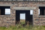
1: A Single Point
I thought long and hard about using one of the shots of the wind turbine, with its nacelle as the point, but in the end decided that a: the square view through the window and the doorway of this small brick hut (a sentry hut?) was “pointy” enough and b: that this was a much stronger photo than any of the turbine pictures. I particularly like the way moving your eyes over its surface generates a strong sense of refocussing (as discussed in part 4 of Shore’s The Nature of Photographs) and the way the various horizontal and vertical lines in the picture reinforce the idea of the frame. The point possibly becomes a punctum, leaving us with a picture about pictures hung on (or here, in) a wall, with the almost central positioning of the point achieving a sense of uneasy stillness which works nicely with the flatness of the view.
2: two points

2: Two Points
Two water tower supports, out towards Stangar Head. I think these qualify as points because of the way the crumbling concrete contrasts with the softness of the land and the lack of any obvious focal point out towards the horizon. This is probably a bit soft, when viewed at print size, a warning not to use a heavy 35-70mm zoom handheld with a shutter speed of 1/80th sec. The framing of this is key: I spent a reasonable amount of time with the camera, judging how close to the edge the two structures needed to be to achieve some sense of balance; I then carried on this process cropping a bit more off the the sides and bottom of the image in Lightroom. I hope your eyes travel along the horizon from the larger tower to the smaller one, and then back again…
a combination of vertical and horizontal lines

3: Vertical and Horizontal Lines
A natural triptych which – like 1 – creates a very strong sense of planes. Taken inside a searchlight emplacement (the light would have split into 3 strong beams as it passed through the vertical slits) I used the camera’s flash throttled back to minimum intensity to get some sense of texture on the inside wall helped by the black staining, which is presumably carbon deposited by the arc-ing rods that made the beam of the searchlight. It was hard getting the colour temperature right here, something that wasn’t made easier by the chromatic aberration visible down the verticals of the slits, that I only noticed when I got the second version of the print back. I’ve corrected it on the file uploaded here, and will get a new print made when I get the prints made for assignment 3.
several points in a deliberate shape

4: Several Points in a Deliberate Shape
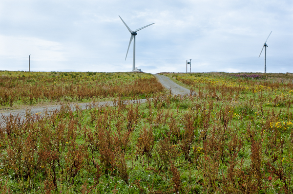
Two triangles combine to make a quadrilateral tilted away from the viewer like a ceiling over the ludicrously busy field. Your eye either moves round the edge of the shape, or zigzags up from the pole on the right, to the windmill, down to the power post and back up to the other smaller windmill. The slight a-symmetry of the distances off to the left and right edges of the shape make it more interesting than if I had moved off to the left, when I would have lost the way that the field above the road and the sky area locks jigsaw-like into the foreground bit of field with its run-to-seed docks and yellow flowers.
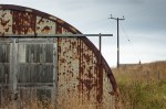
distinct, even if irregular, shapes
-
-
5: Distinct Shapes – Quadrilaterals
-

-
6: Distinct Shapes -Semi-Circle and Oblongs
-
-
7: Distinct Shapes – Quadrant, Quadrilaterals and a Perfect Right-Angled Triangle
I took advantage of the 10-15 picture scope for this assignment to add all three of these – a building of unknown purpose at Stangar head, the inside of the buried nissen hut that acted as the magazine for Buchanan Battery and a recycled nissen hut spotted on my way back to catch the ferry. I think compositionally the three work as a sequence, with the centrally placed doors of 5 and 6 creating a similarity with the curve of the nissen hut in 7 echoing the corrugated ribs in the roof of 6.
5 and 6 are fine (and I like the green object in 6 – a Heineken can? – in the lit part of the spill of earth into the hut, wishing the coke bottle in deep shadow over to the left was equally lit) but I’m particularly happy with 7 where planes merge into one another making shapes out of things that would have simply seemed unrelated if I hadn’t moved left and right, back and fore til they lined up and worked as a 2D arrangement…
curves

8: Curves
Here, I think the viewer’s eyes starts at the top left of the frame and follows the zig and the zag of the road down to the bottom right; the fence post directs the eye up to the cottage and then you track up the gentler curve of the horizon back to the top left. And then you do it again. It would be slightly better if i’d taken half a step to my left, lining up the ruined cottage’s chimney with the fencing stab, I think, but I can live with it as it is. Definitely among my favourites out of the pictures in the assignment.
diagonals

9: Diagonals
I spotted the playpark as I walked through the village and realised it was perfect for doing something that collapsed the many planes formed by the various bits of equipment into something much flatter. It was then huge fun to move left and right, step back and take a half step forward again, squat down, stand up, lean and lean back before taking each of the 3 pictures I took here. This is the one that creates the nicest chaos of diagonals, I think.
The only bit that I feel unhappy with is the very top where I can’t quite work out where the exact point to cut off the confluence of the near poles should be. As a result, it’s an ‘almost’ rather than a ‘definitely’. Getting it right would involve going back though, and I won’t be able to do that until next year now.
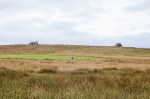
at least two kinds of implied triangle
-

-
10: Implied Triangles
-
-
11: Implied Triangles
-

-
12: Implied Triangles
Another group of 3 to take advantage of the 10-15 limit, as 10 manages to get the asked-for two with the obvious vanishing point of the road tailing off towards the horizon, and the inverted triangle formed by the two cottages on either side of the road and the inverted Stop! Children sign painted on the road. 11 was included as the first thing I thought when I noticed the two cottages and the bloke in a red caghoul, fixing a fence was “triangle!” – it proved a lot harder to get the red of the caghoul light enough and red enough (and the landscape light enough for it to show up strongly) than I thought it would. 12 is there because i like the way that the bank opening up to the concrete shelter on the right seems to lack any sense of depth, while pointing the way to a vanishing point somewhere off to the left. Also, it rhymes beautifully with the triangle formed by the washing lines in…
rhythm

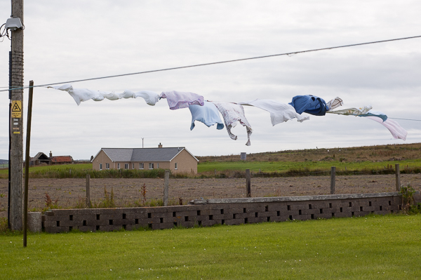
13: Rhythm
…this one! Here I took several other shots, trying to get a fully left to right waveform from the clothes on the line; this was the one that worked best. Also, the way the gaps in the breezeblock wall and the fencing stabs below the washing move left to right in some sort of counterpoint helps the rhythmic feel here. the way the washing pole seems to bend into the picture helps too.
pattern

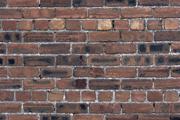
14: Pattern
As I said elsewhere, brick isn’t really a particularly Orcadian building material and is only really found in the wartime buildings that dot the landscape. I wish I’d been able to find a more imaginative pattern somewhere, but I didn’t, so here’s a section of the wall of the Fleet Communications Centre. After 70 odd years, at least the pointing is holding up…
Lastly, I confess that I have deviated from the order these are given in the Assignment Brief, as the images seem to flow better this way: eg the final implied triangle matches the way the washing lines fill the upper half of rhythm; the first four pictures go obviously one, two, three, four; diagonals goes quite naturally to the first implied triangle, and not just because they’re the only ones in portrait format.
At any rate, if I were to hang the prints on a wall, this is the order I would like you to walk past them.