Category Archives: Assignments

Towards Assignment 4 – David Campany and Late Photography

Again, I am coming back to things I have looked at during earlier courses, here with the work I did around the Tate Modern exhibition Conflict-Time-Photography (Nov 2014 – Mar 2015) which fed into my final assignment for The Art of Photography. However, I think my understanding of Campany’s essay has moved on considerably since then.

(At this point I should say Campany writes well and persuasively, choosing his words carefully  and using them to powerful rhetorical effect. You can tell that – at the time of writing in 2003 – he was not a particular fan of late photography…)

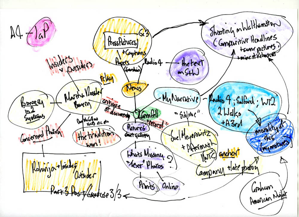
What was Campany on about? To start with, I’ll  break his examination of the problems with late photography down into three sections:

1: The TV documentary about Meyorowitz.

Reflections on Ground Zero (Channel 4, 2003) discusses Meyorowitz’s photos which will go on to appear in Aftermath (Phaidon) and be shown online and as part of exhibitions around the world. Campany’s essay starts by highlighting the contrast between television’s ‘state of the art news production’ and Meyerowitz’s ’60 year-old, Deardorff plate camera,’  between events happening live, globally and on TV with the slow ritual nature of large format photography, and between the complexity of the geopolitical situation and the simplicity of both the technology used by Meyerowitz and the message it appeared to be producing..

In the Channel 4 documentary, photographs were being positioned as superior to the television programme in which they were presented, despite containing ‘video images at least as informative as the photographs.’ I have had a look at the video that prompted Campany’s article (it is there, of course, on You Tube) and there is a possible argument to be made, qualifying Campany’s statements about television’s ability to make images ‘at least as informative and descriptive as the photographs’ and so act as a better medium of record than still photography. But of course, the ability of video to capture what someone is saying, rather than simply (?) presenting a static, mute portrait of an individual, opens up all sorts of possibilities for the construction of meaning.

The sanctioned status of the images taken by Meyerowitz (he was granted access to the ground zero site by the city authorities) will determine how they are viewed (and may mean that  they continue to stand out over time). They exemplify stills photography having ‘inherited a major role as undertaker, summariser or accountant [turning] up late, [wandering] through the places where things have happened.’

2: Photographs and Memory; Photographs and Stillness.

Campany describes this as being an approach that was becoming (in 2003) ‘a commonplace use of the medium’ – depicting the aftermath of events – ‘traces of traces, fragments, empty buildings empty streets, damage… static, sombre and straight,’ it is ‘cold not hot,’ ‘it forgoes the presentation of events in progress and cedes them to other media’ Pictures of events have, since the 1970s, been provided by television rather than by the Nikon-toting press cameraman; even the stills used in the press have often been taken from video footage.

And even the concept of ‘stillness’ is different from the way the Victorians perceived images in the days before cinema, Campany argues. Then, all pictures were ‘still’; now ‘still’ (like colour) is a choice and as such has its own meaning, one that is closely linked in the popular imagination to memory, the moment and the significant detail.

The habit of tracking and panning over still images (so prevalent it even was given its own name – the Ken Burns effect  – in iPhoto) is repeated in the original television footage of the documentary; it is very difficult to get a television camera pointed at an object or scene to maintain a static frame for any length of time, whereas with stills in a book or framed on a wall, or in a pile on a table in front of you, you can spend as much time looking as you wish, at whichever part you choose. This is, I think, significant. Confronted by a static image (be it a painting or a photograph) television’s preferred position is to act as a stand-in for the viewer, attempting to simulate the way we (the viewer) might look at a picture, reading it in sections as we move from detail to detail.

3: The late photograph and contemporary art.

While acknowledging and disparaging the existence of ‘ruin porn’ – photographs of crumbling grandeur in Detroit or any number of abandoned asylums, anyone? – in passing, Campany finds interest in work by other photographers working with the ‘traces of traces’. Sophie Ristelheuber’s pictures of the abandoned Iraqi defences from the first Gulf War or Paul Seawright’s series Sectarian Murders (or possibly his photographs taken in Afghanistan, after the campaign to dislodge the Taliban as part of the response to the attack on the twin towers – his picture Valley directly quotes Roger Fenton’s Valley of the Shadow of Death, from his pictures of the Crimean War which are also referenced in Campany’s essay). Generally he can find both ‘a certain modernist reflection on the indexicality of the medium [of photography]’ and also reflection on the idea of photographs as evidence and documentary truth.

The best of these pictures are all authored by someone who has chosen and shaped what it is that they depict. Despite Meyerowitz’s claims that his pictures are the result of his being ‘there as a witness…without trying to put some formal idea of how to photograph it [the destruction]’  the pictures still display evidence of his accumulated ‘photographic skills, honed over several decades.’ The pictures become aesthetic objects and as such – and Campany invokes Allan Sekula here – run the risk of  being decontextualised ‘in order to make it enigmatic or melancholic or merely beautiful.’ In this way, what may appear to be a vehicle for mourning can at the same time ‘foster an indifference and political withdrawal that masquerades as concern.’

Rather than offering mute (unmediatied) witness to the events of the age, the late photograph can ‘leave us in permanent limbo, obliterating even the need [Campany’s emphasis] for analysis and bolstering a kind of liberal melancholy that shuns political explanation like a vampire shuns garlic.’


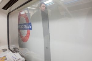
I will discuss Meyerowitz’s Ground Zero photographs in more detail in the post that follows this, but  – while I acknowledge their imperfection as a memory of the destruction of the twin towers itself –   I must say that it is much easier to track them down in a complete, high quality form (I simply ordered a copy of the book from Amazon) than it is to find the transmission details (or a high resolution copy of the full video) of the Channel 4 documentary. Possibly this means simply that time has moved on again and network television is no longer the primary way we experience (and remember) major events.

The internet has become our repository for the images (still or moving) that we use to make our memories of public (and increasingly of private) events. Instead of the official channels of information (newspapers; television; wedding photographs taken by a ‘proper’ wedding photographer) we use search engines to piece together our own chosen version of the events from fragments stored in a server farm somewhere ‘on the web’ . We may still pick and choose which links we follow according to what we think about the trustworthiness of the information to be found there (I’ll go for the Guardian or the BBC over Fox or the Daily Mail for news) but the idea of a single, official, authoritative source for images about major events like the one created by the city of New York and Meyerowitz seems to be a thing of the past.


Reference:

  • Campany, D (2003) Safety in numbness: some remarks on the problems of ‘Late Photography’ accessed on Campany’s site (http://davidcampany.com/safety-in-numbness/) 01-v-18
  • Channel 4 News, London (2001) Reflections of ground zero; accessed (in 3 parts) on You Tube: https://www.youtube.com/playlist?list=PL0E496C00306D0177 01/5/18

assignment 4 – words and pictures

I probably woke up at about 7 am on the morning of June 14th 2017; certainly I was listening to the radio (Today on Radio 4) by 8. Gradually, I became aware that something was going on with a fire in a tower block in west London. I remember this.

I remember an interview with someone who had got out of the tower but remained at the scene. He described how residents had been told that if there was a fire, they should remain in their flats as their doors would keep a fire outside for the hour it would take fire fighters to get to them. The man being interviewed had ignored this advice and – as a result – had not been trapped inside. He described people who had stayed and waited shouting out of their windows. Today moved on to other things – Brexit, sport – but kept coming back to live reports and interviews from the fire. After the programme finished at 9, the fire remained the main item in the hourly news bulletins. It was obvious that something very bad had happened – was still happening – in west London.

On the fourteenth of June I didn’t go into my new workplace – on Monday 12th I had started a new job (for the same employer) and moved buildings from central London to Wood Lane further west along the central line – because I was catching a train up to Manchester to attend a conference for all the people associated with my new department. I carried on listening to the radio and did working-at-home-type work and then got the tube to Euston and headed north. It was only when I got back to London that I realised how close to the scene of the fire my new workplace was, but once I’d spotted it on the other side of the tube line to the East of Wood Lane and so, there, in front of me as I left work each day, it was impossible to ignore.

A week after the fire, I took this:

 
At the time, I wasn’t precisely sure why I took it  – I remember thinking that it looks just the same as it does in pictures so, really, what’s the point? – but somehow it seemed a necessary thing to do. Time passed.

And then, another day – a Monday in November – when I was working at home again. Start the Week was on, on Radio 4.  Darren McGarvey (aka Loki) – described as a ‘writer, rapper and hip-hop recording-artist’ – caught my attention as he spoke about his first journey to the West End of Glasgow, emerging from the subway at Hillhead and thinking ‘this is how people dress when they’re not afraid to be stabbed’. I could also have been one of those unafraid people, and I listened on, thinking it would be useful for the insider/outsider stuff I was thinking about for part 3. McGarvey was interesting and – like almost everyone on programmes like this he had a book out. I  looked the book up on Amazon and saw it had a ‘read inside’ tab; I clicked on the tab and almost immediately came across this quote in the introduction:

The materials proposed will provide the building with a fresh appearance that will not be harmful to the area or views around it. Due to its height the tower is visible from the adjacent Avondale Conservation Area to the south and the Ladbroke Conservation Area to the east, The changes to the existing tower will improve its appearance especially when viewed from the surrounding area. Therefore views into and out of the conservation areas will be improved by the proposals.

Planning Application, 2014, for the refurbishment of Grenfell Tower, London

Instantly I associated this with my view as I left work in the evening. Almost instantly. I realised that this provided something that I could hang the Words and Pictures assignment on: the gulf between this single stated aim of cladding Grenfell and the actual outcome was immense. I found the two conservation areas on a map and worked out (height tables to work out where the tower would definitely be visible over intervening buildings; a ruler to find likely direct lines of sight) where you would have a view from the surrounding areas. In January I made the first of four walks around the area of the tower; in March I made a second, walking from Ladbroke Grove down towards the tower through Avondale. And then finally, I did brief detours to the north of the tower and to the south in Holland park.

I had the pictures I needed and the words to go with them. It had not been hard to work out what to shoot (and the points where you could see the tower were not that plentiful) and I had a few ideas how to combine them with text, but it never does any harm to contextualise a bit. I decided to look again at two bodies of work (and some of the critical work around them) that could help shape my final presentation of the project: Joel Meyerowitz’s photographs of the clear up of Ground Zero in New York and the earlier (and much more interestingly radical) series of pictures of the Bowery taken by Martha Rosler in the seventies.

Taking the pictures had been easy; working out why I had taken them and what their impact might mean morally and politically might be harder to achieve.  I tried to consolidate all the strands that might feed into the assignment into a mind map (at the top of this post) and set to work re-reading David Campany’s 2003 essay on Late Photography…


Reference:

  • Start the Week (BBC Radio 4: 13/11/17) Anger and Deprivationhttps://www.bbc.co.uk/programmes/b09drjb7 (accessed 7/5/18)
  • McGarvey, D (2017) Poverty Safari: Understanding the Anger of Britain’s Underclass;  Edinburgh, Luath Press Ltd

assignment 3 – inspiration and research – Paul Graham

I have written about Paul Graham before, during the big post that lies at the heart of my experience of Context and Narrative; I had taken some photographs in his late style and thought that trying to apply this to catching stories on the escalators of the Moscow Metro would be an interesting thing to try. This – alongside the pictures of Walker Evans and Lukáš Kuzma – fed into my work for the “unaware” project in part two of this course, especially the pictures I took during a trip last summer to Kiev.

Wishing to find out more about Graham’s recent work, I had also bought the book collecting his three latest series (The Whiteness of the Whale) and  found an interview with him about the related exhibition of these pictures in 2016 at Pier 24 in San Francisco in 2016. Continue reading

Assignment 3 – A Mirror


The Pictures:

This slideshow requires JavaScript.

(The gallery/slideshow feature does not appear to have a way to disable auto-start. I will continue to look for a way to let you start the show playing once you’re ready, but suspect I need to upgrade my wordpress account.)

Statement:

I was born on a small Scottish island, living there until I was eighteen, Despite – or maybe because of – this, I have always felt that, by nature, I am a creature of the city. I enjoy the bustle, the sense that things are forever changing and evolving around me, that nothing is ever static. But also, I enjoy the anonymity offered to me by my unmarked presence in a crowd of which I am only a small part.

In his book, The Language of Cities, Deyan Sudjik explores this tension between being alone and yet – at the same time – of being part of something much greater than just your experience of it. He sets out the ways by which those who belong to a city differ from those how simply visit. And of the many ways that people can acquire a sense of belonging in that most rootless of modern places, one of the most potent is to be found in the way people navigate their way through the the complexities of its public transport system.

Based on the most recent available statistics (collected in 2016) more than 225,000 people enter or exit Oxford Circus Station daily, making it the fourth busiest station on the London Underground. Eight times a week I pass through Oxford Circus station on my way to or from work.  Normally, I join the further mass of people who change from one line to another without actually leaving the station.

We  find ways to idnetify where we need to stand in order to be in front of a door when the next train finishes sliding into the station and we make sure we will be in the right carriage to leave our final stop by the shortest route. We have glyphs and other markers; marks on the wall and scuffed spots on the platform.  We recognise other people doing the same and identify with them; we may even begin to spot the same faces recurring, day by day, over time.

But as we make our daily commute, we shut our eyes or find other ways of vanishing into ourselves, into our phones, our newspapers or our books. We do not make eye contact with one another; nor do we stare. We distance ourselves, becoming alone again amongst the thronging people around us.  But at the same time, sharing transport helps makes us part of a functioning community, not getting in one another’s’ way, standing on the right and walking on the left and letting people get off the train before boarding ourselves. We share our journeys with each other even if we only rarely acknowledge this..

Normally when I am taking pictures,  I feel that I am putting distance – a pane of glass perhaps –  between myself and the event or thing or person that I am photographing. Taking the pictures for this project has worked differently, opening me up to my surroundings, making me more aware of the people who surround me as I travel to work. I am able to see myself reflected back at me as they do the same things that I do. 

They say there are a million stories in the naked city; mine is just one of them and parts of it are very like the many other people’s stories, too…


A more traditional, prints-on-a-wall presentation of the pictures is shown in this post.


Reference:

  • Sudjic, Deyan (2017) The Language of Cities. London, Penguin

Assignment 3a – A Mirror (alternative presentation)

Statement:

I was born on a small Scottish island, living there until I was eighteen, Despite – or maybe because of – this, I have always felt that, by nature, I am a creature of the city. I enjoy the bustle, the sense that things are forever changing and evolving around me, that nothing is ever static. But also, I enjoy the anonymity offered to me by my unmarked presence in a crowd of which I am only a small part.

In his book, The Language of Cities, Deyan Sudjik explores this tension between being alone and yet – at the same time – of being part of something much greater than just your experience of it. He sets out the ways by which those who belong to a city differ from those how simply visit. And of the many ways that people can acquire a sense of belonging in that most rootless of modern places, one of the most potent is to be found in the way people navigate their way through the the complexities of its public transport system.

Based on the most recent available statistics (collected in 2016) more than 225,000 people enter or exit Oxford Circus Station daily, making it the fourth busiest station on the London Underground. Eight times a week I pass through Oxford Circus station on my way to or from work.  Normally, I join the further mass of people who change from one line to another without actually leaving the station.

We  find ways to idnetify where we need to stand in order to be in front of a door when the next train finishes sliding into the station and we make sure we will be in the right carriage to leave our final stop by the shortest route. We have glyphs and other markers; marks on the wall and scuffed spots on the platform.  We recognise other people doing the same and identify with them; we may even begin to spot the same faces recurring, day by day, over time.

But as we make our daily commute, we shut our eyes or find other ways of vanishing into ourselves, into our phones, our newspapers or our books. We do not make eye contact with one another; nor do we stare. We distance ourselves, becoming alone again amongst the thronging people around us.  But at the same time, sharing transport helps makes us part of a functioning community, not getting in one another’s’ way, standing on the right and walking on the left and letting people get off the train before boarding ourselves. We share our journeys with each other even if we only rarely acknowledge this..

Normally when I am taking pictures,  I feel that I am putting distance – a pane of glass perhaps –  between myself and the event or thing or person that I am photographing. Taking the pictures for this project has worked differently, opening me up to my surroundings, making me more aware of the people who surround me as I travel to work. I am able to see myself reflected back at me as they do the same things that I do. 

They say there are a million stories in the naked city; mine is just one of them and parts of it are very like the many other people’s stories, too…

The Pictures

***
***
***
***
***
***
***

This post shows the possible layout for an installation of the photographs. The three asterisks indicate individual groups of pictures with the following block of pictures appearing further along a wall or working clockwise round a room.

There is a separate post here, displaying the pictures as a slideshow and with no variation in picture size, that probably works better as an online thing, without the need to scroll.


Reference:

  • Sudjic, Deyan (2017) The Language of Cities. London, Penguin

assignment 3 – further editing

While continuing to make the last pictures I needed for the assignment on the underground, I had quite radically changed and simplified the form that my submission for this assignment would take.  A post describing the process that led to this can be found here
Here is a quick run through: Click on the gallery thumbnails if you want to view them larger.

Prologue

Orientation

Waiting for the train

Arrival

Disembarkation

Embarkation

The lady in the red coat gets on board

Departure

Now it was time to go back to the questions posed by the coursebook (on p.71)

• What order should the images be shown in?
• Are there too many repetitive images?
• Do you need to let go of earlier images because the project has changed?
• Are you too close to some of your favourite pictures and they don’t fit the sequence?
• Do you need to re-shoot any for technical reasons?
• Are there any gaps that need to be filled?

It still needed work, but it was getting there, I thought. The main problem was the number of (repetitive) images in the sections between the arrival and departure of the train.  I had already got rid of a lot of images as the project had changed to concentrate on the Oxford Circus part of my morning commute; the fact that I really liked some of the dropped sequences (the ‘on the Central Line’ section – in the previous post –  works nicely for all sorts of reasons, I think, but it did not fit into the revised timebox), but I don’t think that held me back from putting them to one side.

Order was straightforward. If I was going to build up a sense of the experience of passing through Oxford Circus Station, changing from the Victoria Line to the Central Line, it needed to combine the various passes I had made through the station in a chronological order.

The people waiting (my proxies or in terms of this module, mirrors) needed to build up, a train needed to come; people needed to spill out and the waiting people get on board; the train needed to leave with them on it. Ideally there would be some sense of this being a repetitive cycle as the next lot of passengers began the wait for the next train.

In order to get this across, I needed to create an idea of a place where the action would occur. The final exercise for this part of the course had worked through the idea of different sorts of gaze. The first type of look I had looked at was the one that came out of consciousness of the photographer’s (my) presence. This tied in both with Stephen Shore’s idea of taking ‘a screenshot of my field of vision’ (discussed in this post) and the ideas around producing a subjective representation of an individual’s experience of – primarily urban – life examined in Christopher Butler’s Modernism – a very short introduction. Modernism may be quite old hat (and there is nothing particularly cutting edge about American Surfaces any more either), but this gives a way of establishing me as a participant in the everyday drama that was unfolding in my series of pictures.

The Critical Bin

All the pictures for the central section of my sequences had been taken using a fixed focal length fixed lens from the same viewpoint – to one side of the bin that I used to locate where the correct doors of the correct carriage of the central line train I would take west would  be to allow me to both get on and get off again, by the way out when I got to my destination. (You can see it reflected in the dark windows of the stationary trains in some of the pictures, if you look hard enough.) Standing there, I had tried to keep the camera pointed straight ahead giving me a rectangular stage where the action could unfold.

In order to stop this single frame being both repetitive and flat, I needed the action to move through it on different parallel planes. The trains and people moving along the platform established some of this; I used the direction the people were  the people I was focusing on were looking and the sense of their actual movement to help articulate the transition between the individual pictures:

At this point, I also went back to the digital pictures and adjusted the crop of the pictures so to accentuate this sense of movement over the groups of selected pictures.  I also realised that the sequence would hang together better if individuals – the woman in the red coat or the tall man with a beard and a rucksack, for example –  could be followed from sequence to sequence.

The winnowing process could now be carried out again on the sections of the narrative that remained after I had abandoned the initial  idea of spreading the assignment over my entire journey. I had made another another batch of 6×4  prints made from pictures I had taken during the time I was working through the various edits to try and fill gaps (people getting onto the trains were tricky to isolate and I wanted a better train-leaving-the-station picture) and to add in further pictures of people who were recurring throughout the series:

Once this process was complete and I had made a final selection, I needed to work out how to display them. Again, both Short and Hurn and Jay had highlighted how different presentations – a photo story in a a Sunday supplement; an exhibition at a gallery; part of a book – all called for different numbers of images and for them to be sequenced in different ways.

I decided to put together two sequences which will form part of this log: a slideshow which should approximate the main presentation of the images at assessment, when A4 prints will be viewed one after the other as they are moved from one side of a clamshell box to the other; and a layout that could be used to display the prints framed, on the walls of an exhibition space.

Here, and for tutorial purposes, I would treat the slideshow as the primary view, with the exhibition layout acting as a variant.

Also, as a footnote almost, I have varied the size of some of the images within the exhibition view, playing around with the html to use a table to order and size the pictures on the page that will be displayed in your browser. I realise that this sort of thing – like having people smile in portraits – can be frowned upon, but I was very impressed by the variety of sizes of print displayed at Jurgen Tillmans’ retrospective at the Tate last year. The variations in size of the pictures broke things up, forcing the viewer  to move in closer for one picture and then to step back for the next, making it impossible to simply move along the walls, going from picture to picture to picture with them all blurring in one simple sequence. Viewing the pictures became much more active in the process, adding a lot to the experience of viewing the huge number of pictures shown.

Also, to return to the influence of Paul Graham on the development of this piece of work,  the way the pictures are printed and arranged across the pages of his recent collection of  work made in  America, The Whiteness of the Whale (2015)  led me to think about how differing the size of the individual images relative to one another might affect the way they are perceived. In  A Shimmer of Possibility (2005-2007)  irregular sizes within groups of pictures (where a cutaway to a parked station wagon is much larger than the main sequence of a man mowing a grass verge during a rain shower for example) vary the rhythm of viewing them while in  The Present (2008-2011)  each of a pair of pictures is presented the same size, but the size varies from pair to pair. The effect is very different from the regular steady progression from picture to picture as your turn the pages of Walker Evans’ American Photographs or Robert Frank’s The Americans.

I think that what I have tried here  is only the beginnings of experimenting with online layout beyond what is available in basic WordPress, but it is definitely something I would like to develop further as I move on.


Reference:

  • Butler, C (2010) Modernism – a very short introduction. Oxford, Oxford University Press
  • Graham, P (2015) The Whiteness of the Whale. Mack Books


assignment 3 – initial edit

You can create as many pictures as you like but, in your reflective commentary, explain how you arrived at the final edit. The set should be concise and not include repetitive or unnecessary images. Be attentive to this aspect of production.
Some questions to consider are:
• What order should the images be shown in?
• Are there too many repetitive images?
• Do you need to let go of earlier images because the project has changed?
• Are you too close to some of your favourite pictures and they don’t fit the sequence?
• Do you need to re-shoot any for technical reasons?
• Are there any gaps that need to be filled?
IaP coursebook – p.71

Recap: The Initial Idea – A journey in three parts with two entr’acts

Four times a week,  I travel on the tube from Walthamstow Central (a few minutes from where I live) to White City ( a few minutes from where I work). The journey takes around forty five minutes and is broken into two legs: first I take the Victoria line south to Oxford Circus; then I change to a Central Line train which takes me west to my workplace.

Like anyone who wants to optimise their journey, I have worked out exactly where to stand on the platforms and which carriage to get into in order to shave as many milliseconds off my commute as possible. I am sure I am not alone in this…

The previous post details how I got to the point where I had a lrge enough body of photographs to start off a rough edit. My intention was to end up with between 15 and 20 pictures, split into five sequences: Walthamstow; Victoria Line; Change at Oxford Circus; Central Line; White City.

The travelling sequences (two and four) proved easiest to put together…


Sequence 4 – Central Line; Oxford Circus – White City:

There is an obvious linear order here, and a sense of rhythm and movement provided by red pole cutting each image in two vertically. The pole is of course colour-coded to indicate the Central Line (contrasting with the pale blue of the Victoria Line). And of course, I appear in the second image, distorted in the mirror of the window  – another commuter, but one with a camera – while my newspaper appears at the bottom corner of the third, mirroring that of the woman opposite.

Sequence 2 – Victoria Line; Walthamstow Central – Oxford Circus:

This was another sequence that came together early on. It feels much more crushed and dark, with the movement provided by arrows and diagonals an tilt rather than the repetition of poles.

It would have been easy to go on taking pictures like these, but heeding David Hurn’s warning  not to reshoot the “gimmes” but to get on with the other things you were trying to photograph, I tried to concentrate on the bits that didn’t work yet – the ‘in’ and ‘out’ sequences and the interchange at Oxford Circus.


Sequence 1 – the start of the journey

I had intended to balance the White City/Destination Sequence with an opening group of pictures located at Walthamstow Central Station. It was all a bit literal and ‘sign-y’.

Pictures two and three both could be re-shot (two needs to be taken later in the day, when the sun has moved round to light the flat, north-facing sign; three to remove the woman walking towards the camera) but overall everything starts out well. On the plus side, the first picture managed to contain a lot of red and pale blue which would establish the overall colour palette from the off.

Sequence 5 – White City:

I began trying to arrange the sequences in a less linear fashion. In part this was to try and get around the way the exchange sequence needed to swap direction of travel from left-right to right-left.

Sequence 3 – Change at Oxford Circus

These work as pictures (I particularly like the radiating lines on the ceiling  in fig.1 and fig.3) but lack focus as a description of how I find my way through the station. There are figures who act as my proxy, the signs point the way, and the two escalator pictures continue the change of direction, but it doesn’t work yet as a sequence. I began to wonder how it could be expanded (and how the other sequences could be contracted to compensate).

I had already taken the photographs that included the markers (bubbling paint and a plaque with a stripey red line indicating something or other to people in a different sort of know from the one I occupied) I used to indicate where I should stand to get onto the right carriage of the second, central line train:

Building Block 1 – peeling paint marks the spot!

What I couldn’t do was to find a way to fit in the other marker  – a bin that is pretty much directly behind the dark haired woman in the paint sequence:

I took other pictures in an attempt to fix it, but they didn’t really take off either. I made more prints and stuck them to the wall. I grouped different pictures into different sequences, organising them into chronological order or other ways indicating movement:

Building Block 2 – a Central-Line train passes through the station

For Example, I had already assembled this linear sequence. I had a lot of material to go between image 1 (train leaves the station, revealing the wall-plaque) and image two (woman in a parka in front of a train entering the station.

You don’t really see people’s faces on the tube, at least in part because of the rules we’ve absorbed about not staring… I tried to pick up on some other people waiting:

Building Block 3 – A growing sense of anticipation

And then, trying to get some pictures to indicate arrival at Oxford Circus, I took these:

Building Block 4 – Arriving at Oxford Circus

And it was with this group of three  – with a window acting as a fantastic mirror and with the camera and the train moving from darkness into light – that I got the final thing I needed; I thought of Paul Graham. There was movement and the station sign provides a definite location for what is happening. It would work nicely as an in media res (opening in the midst of an action) beginning. Could I lose the pictures that had been penciled in before these? Possibly I could drop everything I had planned to put earlier and concentrate on this stage of the story, while I was moving through Oxford Circus.

Perhaps it could move away from a prosaic description of my everyday reality and become something more subjective, more poetic even. I moved more pictures about on the wall, bluetacking them into new groupings…

I needed something to break up the arrival and departure of the Central Line Train. I had a lot of pictures taken while a train was in the station.

Pre-Selection short-ish-list – people getting onto and getting off trains

This is some of them; when you have people streaming both from right to left and from left to right, and you have people moving towards you from a train and moving away from you into a train, it’s quite hard to get a decisive moment but they could be narrowed down into further related sequences, and I had pictures that included quite a few of the people who featured in the ‘waiting’ pictures.

2 More Building Blocks: Narrowing Down Alighting and Boarding


And then, to finish it off, follow the woman in the red coat from BB3:

…let the train exit the station:


And close on the beginnings of the build up of people waiting for the next train.

I tried to balance the individual sequences as if they were balanced verses in a poem rather than paragraphs of prose, and ended up with eight sequences of 3, 2, 4, 4, 4, 4, 2, 3  pictures respectively (giving 26 pictures in total). It could still come down a bit, but at this point, I felt I had the good first draft that I had been looking for.

getting there – a work-in-progress installation view (the livingroom, home; 3/3/18 – 12/3/18)


assignment 3; mirrors and windows – ideas

Choose a community that you’re already a part of. It could be your child’s nursery or you regular gym class, but it should be something that takes up a substantial amount of your interest and time.

Create a photographic response to how this group informs who you are as a person. What aspects of this group or community reflect on you? What do you share? How does it function as a mirror reflection of who you are?

–  IaP coursebook – p.71

‘Something that takes up a substantial amount of your interest and time’  fits in neatly to Maria Short (in Context and Narrative) and David Hurn and Peter Jay (in On Being a Photographer) suggesting that you start by making a list of potential Subjects (Short) or Projects (Hurn and Jay)  that interest you. I took the list of traits I’d compiled as part of my response to Exercise 3.2 and came up with three areas for investigation here.

  1. Food and Drink – I’ve been taking photographs in restaurants, of the staff, the food and the place for almost as long as I have been travelling a lot for work. Also, I spend a great deal of time doing most of the cooking for my family. I have a half finished post (still in note form) putting together my thoughts about Masterchef (BBC) and its extremely satisfying story-arc…
  2. Travel – A lot of my archive (I have been looking back at my output a lot for this course, I think I am much more aware of what it is that I take pictures of and how it has changed over time) consists of pictures taken when I have been away from home, often on my own and usually for work, although holidays feature quite strongly too.
  3. Change – I am aware of how a large portion of the interest of photographs can come with the addition of time as the thing pictured changes or vanishes entirely. The area of London where I live is gentrifying rapidly while other things – failing shops, my garden in winter – decay and become shabbier before they in their turn are transformed into something new…

In the generally downbeat feedback for my previous assignment, a glimmerof hope was offered by the comment:

‘Your approach of searching and collecting images on a journey or holiday is important.
That’s something you can take from this, the fact that your perception to visual sights
is heightened when you’re not in a customary environment. But this searching and
collecting needs refinement.’

To it, I would add that I have long been aware of the need to be able to apply the same approach to my everyday life and surroundings. I have recently changed job and this has reduced dramatically my opportunities for travel (outside the UK at least). If I’m going to progress as a photographer, I will have to apply myself nearer to home…


My first idea  (September – early December) had its roots in food and my neighbourhood. Ever since I moved into my flat nine years ago, I have been eating in (and taking food away from) the Turkish restaurant at the bottom of my road. I used to live on Green Lanes in Harringay (which is well known for its large Turkish community and their food)and have had plenty of opportunity to work out what I like. This restaurant – Bodhrum – is a very good one indeed. I get on well with the family who run it and thought I could possibly do a Life-style photo essay on a day at the restaurant, getting behind the scenes and covering the stuff that happened down stairs in the prep kitchen, the food and the grilling of meat and its service in the restaurant itself.

I got as far as asking the owner if I could come in for a few evenings and take pictures, and he was happy for me to do so, but somehow it never quite happened (the pictures above were taken a few years ago, when I was trying out a new camera while waiting for my takeaway to be prepared one Friday). Perhaps my enthusiasm was dampened somewhat by not really wanting to do something a ‘straight’ as my original idea, and possibly i wasn’t feeling up to the amount of interaction with people that would be involved, once you factored in customers (who I do not know) as well as the restaurant staff. I toyed with doing quite formal, lit portraits of all the people who work there to combine with images of the food and of them in action (missing out the customers entirely), but I’d lost momentum somehow.

And also burbling away in the background, I was trying to move house and this began to occupy more and more of my thoughts. So, my second idea (December 2016 – January 2018) began to form.  Having lived in the same place for a while, I know my immediate neighbours quite well and other people who live a bit further away to a varying degree. Perhaps I could do something around this, to form a commemoration of my time here?

If the pictures were captioned somehow with how long people had lived in their flats and where they had come from, some idea of how the community was changing would be able to be established. The longest-resident person was my downstairs neighbour Bill who – incredibly – had been living in his maisonette since 1960, bringing up two children there with his wife, who had died long before I moved in upstairs. We share a garden and I’d taken photographs of him before, but never quite got it right. I was playing around with redscale (reversing the film in the camera, so its red backing acts as a filter to the pictures) when I took this one of him. As is usually the case when I experiment with ‘alternative film processes’, I rather wish I hadn’t; this project would give me the chance to have another go.

Bill downstairs. Moved from Hackney in 1960. Retired.

I began talking to my other neighbours – no one objected in principle, but I failed to get dates in anyone’s diary – and started working out what lighting tests I’d need to make, to allow me to light portraits quickly using portable off-camera flash. Perhaps I could widen it to include the various small shops nearby where I buy the paper, buy milk, buy vegetables, buy meat; perhaps the Bodhrum idea could be incorporated too…

The project and its idea widened, grew more diffuse, and collapsed in on itself; I was going to have to organise and schedule a large number of individual shoots. In the end, I never really got started. The sale of my flat temporarily fell through because of issues with the chain but now it’s back on again (I hope) and while I’d like to follow through on the idea and take the pictures for this, I realised I needed something I could work on without needing to take more time that I don’t really have from my day-to-day life.

I needed a project where I could just start making  pictures.


Back in June, I had changed my job (but not my employer). Apart from the effect this had on my available intellectual energy as I absorbed what I needed to do my new work, the main practical difference was that my daily commute doubled in length. Instead of simply taking the Victoria Line to Oxford Circus, I now changed there and continued to White City on the Central Line. With a day a week spent working at home, I was now spending upwards of six hours a week in the underground system.

My journey to work was taking up a surprisingly  large part of my time – criterion one of the brief had been met (and I also had one of  Hurn and Jay’s key factors in determining the viability of a project – I had regular access to it). It fell into the travel category of my list of subjects while also occupying a place in the unexceptional part of my life (my criterion – work made nearer to home).

For a month or two, it also had taken up a reasonably large part of my conscious thought while I was doing it (criterion two of the brief, and meeting Hurn and Jay’s need for you to know a lot about your subject) as I had expended a considerable amount of thought on working out how to streamline my journey: which carriage should I get into at Walthamstow Central to so as to be in the right place to change at Oxford Circus? did this change if I was travelling in later in the day? – yes! – where should I stand  on the central line platform to be next to the doors that would let me get off next to the stairs out of White City station? I needed to work out how could I spend the least amount of time on my extended journey possible.

And of course, there are other people who do exactly the same thing, every day. Some of them even can be spotted on consecutive days if you get properly in sync. Could I find people to act as my proxy as I recorded my journey? Could people generally be used to motivate the sequence of final pictures internally by the direction they were looking, illustrating my/our journey? That would give you my community – city dwellers, barely acknowledging each other, but using public transport to get to the same place each day.

I worked out (Hurn and Jay again) that I would need around fifteen pictures: 3 at Walthamstow Station – three covering the journey to Oxford Circus – three for changing lines once I’d got there – three for the onward journey to White City – and a final three as I exit the underground at White City. I realised the number would inevitably rise for some of the stages of my journey, but it shouldn’t rise much beyond twenty.

Technically, my options were limited. You cannot use a tripod or artificial lighting on the underground system. I did not want to use an ostentatiously  large camera with an ostentatiously large lens. Possibly I could make a couple of passes with an SLR to catch details like signs and clocks and direction indicators with a longer lens, or wider general views with a very wide one,  once I had worked out which ones I needed to move my narrative, but for now I would use my nicely unobtrusive Fujifilm x100, with its fixed 35mm (equivalent) lens.

The first picture (Victoria Line)

I made a series of test pictures one morning, establishing that – in the steady light of the underground, I could get the right combination of depth of field (f2.8 in the darker tunnels and f4 or even f5.6 on the trains or the brighter parts of white tiled stations) and speed of shutter (1/30th or 1/60th with the option of dropping down to 1/15th if I wanted obvious motion) by working at an ISO of 1250-1600.

So, my technical constraints had been established and the only thing left to do was to just get shooting!

So I did:

This is a selection of the pictures I took during journeys to work between the eighth of February and the first week of March. As I continued to acquire images, I was creating sequences with them and using the next day’s journey to fill in gaps and replace pictures that didn’t quite work, either because of timing, or for technical reasons like poor focus.

Over this time I also made three trips to Boots to get quick 6×4 prints of good, final set  candidate pictures made. By the 3rd of March, I had pretty much all the pictures I felt I needed, bluetacked in sequence order to the plain walls of my living room…


Reference:

  • Short, M (2011) Context and Narrative. Lausanne, AVA Publishing SA
  • Hurn, D and Jay, P (2008) On Being a Photographer, 3rd Edition. Anacortes, Washington; LensWorks Publishing

Assignment 2 – Tutorial + Remake

It was another dispiriting tutorial. I’d been quite happy with the pictures; Robert, my tutor, was not:

“I think what you’re trying to do with regards to the vice versa brief sounds interesting but
is ultimately intractable and over-complicated. […] Your photographs seem to be holiday photos, and so a different project. […]  Actually it isn’t that clear how the concept of vice versa fits with your pictures, but they do seem like candid holiday shots that loosely cover the unaware and the aware categories in Part 2 of the course. […]  They’re very diverse pictures and somewhat ill-fitting as a series.”

I had, in his opinion (and, to be fair, in mine, too), over-thought things without managing to translate enough of the thoughts into something you could see in the pictures…

He did like two of them though (James and Alice in my sister’s kitchen – they’ll be in the assessment set)  but not the other three; he thought  – as with part one – that some of the pictures from the exercises were quite good.

fig.1 –  Alice at her Auntie Laura’s, August 2018

Perhaps  – he thought – I should create a set of varied portraits of James drawn from the mass of unedited pictures of our holiday to replace this set before assessment? Whatever it was that I was trying to say, it did not come across in the pictures. Hmmm…

fig.2 – James at his Auntie Laura’s, August 2017

I think (that word again!) that I was trying to take posed, setup pictures outside and to make un-posed pictures inside. I was also hoping – impressed by the sheer size of the photographs of Charles Snelling’s family album, as shown on Julian Germain’s site, in installation shots of For every minute you are angry you lose sixty seconds of happiness at the Baltic Centre in Gateshead – to do something similar in terms of taking family album shots and, through size ( and context, turning them something, not greater exactly, but different. Of  making the personal, public and giving viewers something to identify with, without their needing to know exactly who the people and places depicted were. What Robert had seen was just my holiday snaps.

There is no denying  that that is what they had started off as; but how could I make them somehow bigger in a way someone else could recognise? How could I transform them into something that other people could identify with, perhaps even into something approaching art?


At this point I went to see two exhibitions that made a big impression on me: Thomas Ruff at the Whitechapel Gallery (with four of his big portraits on display at the NPG by way of a teaser) and the show of Wim Wenders’ polaroids at the Photographer’s Gallery.

In my post about the NPG mini-exhibition (linked above), i included 3 Ruff-inspired portraits of James and intimated that I might include them in a remake of this asignment, at least in part to add more variety to a set of nothing but Jameses. For assessment, I think I’ll use the one of the back of his head, not least because (like surrealists’ photos of people with their eyes shut) this is an impossible viewpoint for anyone to see themselves from in real life, given that (even with mirrors) it is tricky to get anything approaching this clear a view of yourself from behind.

fig.3 – Obverse, James; London; 2018

At the Whitechapel Gallery, at the start of his big retrospective, there were two series’ of appropriated and doctored Installation views from long-taken down exhibitions, one (presumably done specially for the retrospective) at the Whitechapel Gallery itself. Since I would not be able to get James’ Ruff-inspired portraits printed as big as Ruff’s originals (the assessment print will be A4 orpossibly A3) , if I wanted to see what it would look like on a truly grand scale I could do worse than re-working my photograph of the three big portraits at the NPG.

fig.2 – Portraits: J. Gow and S. Chirgwin (with A. Giese); Installation View, The National Portrait Gallery, London, 2017

For good measure I have included one of my base self-portraits for Assignment 3 of Context and Narrative. The most difficult part of this was replicating the reflections in the glass of the pictures, making them feel that they were really there.


Wim Wenders’ pictures at the Photographers’ Gallery were at the opposite end of the scale from Ruff’s – original polaroids, given added dignity by a mask and a frame. You could walk around, listening on headphones to streamed recordings of Wenders reading the relevant section of the text of the book of the pictures. The text turned what could have been mostly seen as insignificant adjuncts to Wenders’ film-making into marvelous chunks of deadpan autobiography. You leant in and peered at the tiny pictures; you smiled and listened to Wenders’ slow delivery of his words. They stopped being a crate of forgotten pictures and became little filmic sequences. Wenders talked about his work having personal relevance for him, but never revealed what was private. This seems to matter too.

fig.1 – Alice, Skaill Beach 2018; Installation View, The Photographers’ Gallery, London, 2018

There’s nothing in between Skaill bay on the west coast of Orkney and America (Newfoundland, actually); looking out, as a kid I wondered if you might just be able to see it if you really, really screwed up your eyes and concentrated…

So, when I saw that one of Wenders’ sequences was titled LOOKING FOR AMERICA, it seemed obvious that that was the one I should appropriate for the three pictures of Alice at Skaill, one of a number of sequences of three related pictures that I had been unable to include in the original assignment set. The woman looking at them was really looking at Gursky at the Hayward.


I think this covers the opposed ideas of ‘street’ and ‘studio’ quite well. You have unposed, candid pictures taken at Laura’s, a carefully lit and posed picture of James and – taking studio to also mean pictures that are consciously put together – two composites, creating an elevated context for my pictures of my children.

I’ll redo my composite pictures before getting them printed – I was working with relatively small jpegs and they won’t enlarge particularly well. Also, since I did a Gursky pastiche for an exercise during part one of C&N, I have been enjoying the process of putting pictures together from different bits and seem to be improving every time I give it a go. I am aware that there are clumsy things that can easily be improved on (the expansion of the mattes from square to rectangular in the Photographers’ Gallery composite for example)  and In another few months (assessment in November, I’m thinking) I should be able to do an even better job, I hope.

But enough for now – I can procrastinate no more! Time to move on to Assignment 3…


assignment 2 – reflection

living-room wall, during the editing process for assignment 2 – walthamstow, september 2017

1: Demonstration of technical and visual skills

This assignment exists in two forms: online in the post that precedes this one and physically as five A4 prints + a printed sheet with the artist’s statement from the post. While most people reading this won’t ever see these prints, I consider them to be the primary endpoint of the assignment with the log version acting more as supporting material.

I am happy with the all five of the final pictures (and indeed there are others that I like as well, but that did not make the final cut). The composition works for me and the relationship between my subjects and the camera seems appropriate for the situation. Colour, contrast and overall balance of lighting likewise seems right. The light from James’ laptop and Alice’s iPad in the two interior pictures is possibly a bit too blue, too bright, but will pass (or be fairly easily rebalanced for assessment).

I have got to the point where I am acceptably comfortable working in Lightroom. I use it both as my main editor and, probably more importantly, as an organisational tool. For more complex retouching and for compositing, I use Photoshop (Elements – I’m a tightwad), but haven’t really had to here. The final piece of the workflow jigsaw has been getting the printing module to output files that come back from Loxley successfully translated into C-type prints (ie as old-fashioned photographic prints, rather than inkjet).

The prints that should now be with my tutor (and let’s wait til he comments, before I make any definitive pronouncements on them, myself) seem to have worked well. In the past, colour has generally worked as exected, but I’ve had issues with the way with the overall lightness of my prints – they tend to be much darker than the images appear on screen. This time both the small prints I make with the machines in Boots (see the header for this post) and the final submission prints seem consistent with what I’m seeing on screen. One of the differences between professional, restaurant food and the food you eat at your (or someone else’s) home is supposed to be that if you have the same meal several times at a restaurant, it will be the same each time; a home cook will not maintain that level of consistency…

I have been musing about the way the size of a print (or the size a picture displays on screen) affects the way that it is read) a lot recently, too. The bigger something is printed, the less likely it is to come across as a vernacular snapshot.  Part of the job of moving the assignment pictures away from being viewed as ‘holiday snaps’ has been achieved simply through printing them on a bigger scale than would easily fit into an album; a comment on one of my earlier posts by my fellow-student Holly Woodward commenting that she wondered how they would look as A3 also set me thinking. For the assessment maybe?

As well as making them seem more considered and worthy of serious consideration, size also of course, exposes technical imperfections like noise and poor focus. The prints seem generally fine technically; I’m less sure about them once they have gone through WordPress’ compression and resizing engines. Another reason for preferring the physical version of the assignment.


2: Quality of outcome

In the posts leading up to this assignment, I have focused a lot on the creation of images that can be read by people who do not know the circumstances of their making. So, how well have do I think I managed this?

The pictures on the ferry north, are sufficiently ‘boaty’ with the tilted horizon and windblown look of the people  combining to provide a simple and clear portrayal of people in a particular space. Also, everyone looks happy enough (with me, with each other, with the general blusteriness) for a general ‘off on holiday mood’ to be conjured up. However, I realise that my personal reactions to the site-specific backgrounds (the inside of Laura’s and Dave’s kitchen;  the beach at the third barrier, with Fiona and the sand castles) will not come across to others. So, do they succeed in signifying enough to work? The answer (obviously to such a rhetorical question) is that I think they do.

The pictures of James and Alice looking at screens clearly come across as people who are not fully present in the environment where they are pictured. Their relationship is with somewhere far away on the other side of their screen. Certainly there are not in the same space as I am, although I am physically present in both of the pictures: my camera bag is one of the two foreground objects in the picture of Alice; more subtly, my unlit knees are just apparent in the bottom corners of the picture of James. Also, they are still among all the busy-ness of the room around them. They are on holiday from being on holiday but there is a lot that can be read off the walls to give a sense of my relatives who are sharing their house with us.

And finally, as Fiona sits on the beach, she definitely exudes a sense of relaxation and away from it all, from all the child-friendly activity like building sand castles, from other people, from the city. She has managed to achieve solitude, and in a nice looking location.

The statement accompanying the pictures (I hope) expands their possible meaning rather than simply explaining it (in Barthes’ terms the paragraphs should act as ‘relays’ rather than ‘anchors’). I wonder whether it should be split into chunks and interspersed with the pictures, rather than presented in a single – separate – ‘thing’. Before I find out what my tutor thinks, I feel that a useful approach to reworking the assignment might be to play around with the sequencing of text and image, but that may all change!


3: Demonstration of creativity

As I worked through the edit for this I was quite surprised at how much overlap there was with parts of the course introduction. There is a distinct (and unplanned) connection back to both my Square Mile Exercise and to the work that is beginning to done with examining/interrogating my (family’s) photographic archive.

I suppose this is inevitable when I have made a lot of use of my family to make pictures in circumstances – on holiday – where people traditionally make the bulk of their pictures and at a location where I have a load of history to work with (Orkney). As such this assignment can be viewed as a snapshot of a larger body of work made within a much greater time frame.

I can see glimmerings of a lot of things that might move all this further on, both here and in later courses. This, I suspect is part of the cumulative ‘developing a voice’ aspect of the courses. Stuff to put away for a bit to let it develop further in the dark recesses of my head.


4: Context:

Through this section of the course, I have experimented with the way I have presented my pictures in the posts on my blog. For TAoP and C&N, I mainly used WordPress’ gallery and slideshow options with the pictures shown medium size (about 300px on the longest edge, or about half the normal WP column width) and centred, which is fine but a bit limiting. Here I used both smaller and larger sides and tried to integrate them into the writing more. I have also begun to play with the HTML markup for the blog a bit rather than just accepting what the WYSIWYG editor gives me.

I have barely scratched the surface of this aspect of presenting my work and my studies, and will probably not take it significantly further during this module. When I move onto level two at the end of IaP, I’ll start a new blog. This would be the time to investigate moving to a premium (and so not free) version of WordPress, which hopefully will allow more tinkering with layout and appearance.

Most people (though not of course the OCA’s assessors) only see my work online; many professional photographers’ sites (including some of the people we are pointed to by the courses) have terrible, clunky websites; it would be good to develop something that can act as a proper installation or even just an adequate representation of work completed.

I think the exercises for this part of the course as presented here on my log still work well though. I am less sure that working on them at the same time as I was taking the pictures that make up the assignment was necessarily the best way to go about this, though. However, while a more sequential – research to exercise to assignment – approach might have been better, the time-bound nature of doing much of the work over the course of a holiday when I had ready access to people who could act of subjects ruled this out.

I have used this method once before – for part three of TAoP where I created a great mass of colour-related pictures and only later sorted out ‘the good ones’ for the assignment and used the others to illustrate the exercise posts. The effect then was to slow my progress down and to allow me to continually look for something ‘better’. Here I was not able to go on adding more and more pictures to the pot and so, I think, that as a working method it worked better here.

Part three will, I hope, be treated to a more linear approach…