Category Archives: Coursework

colour # 3 – colour relationships

 Part 1 – Primary & Secondary Colours

“Produce one photograph for each combination of primary and secondary colours, adjusting the distance, focal length or framing when you shoot so that you compose the picture to the proportions listed […] — or at least close to them” – TAoP Coursebook

Continue reading

colour # 1 – control the strength of a colour

Find a strong, definite colour – a painted door for instance – and choose a viewpoint so that the colour fills the viewfinder frame. Find the average exposure setting […] Then take a sequence of pictures; all composed exactly the same, but differently exposed from bright to dark.

Arrange the […] images together . Apart from the obvious fact that the […] photographs vary from over-exposure to under-exposure, what other difference is there in terms of the colour?

– AOP Coursebook.

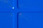
The photos that follow were all taken on a sunny afternoon in my back garden using my D50 with a 35mm 1:2 AF lens on it. They are of a Camden Council recycling tub that I’ve used as a laundry basket ever since I moved north of the river at the turn of the century. There are seven pictures rather than five, because it was only a few weeks ago that – playing with the various menus on my camera – I realised that I could set the increments by which exposure compensation worked at anything other than 1/3 of a stop. Further evidence if it was needed that you can never spend too much time playing with your camera…

All h-s-l values were calculated in Photoshop Elements 6 for Mac and were based on the centre of the embossed cross.

From looking at the the pictures, I can see that the lightness (brightness in Adobe-land) does indeed decrease quite dramatically as the sequence goes on; the saturation likewise increases and the colour temperature (hue) moves up from being closer to cyan to a much more obvious blue and end almost in the region of violet. The truest blues seem to be in the three pictures starting with the one shot at the meter reading and continuing into slight underexposure.

Likewise, doing the same thing with a red storage tub and a yellow council grit container showed similar results, although the red showed a slight drop off in saturation below an average exposure and yellow seemed most saturated either at average or slightly higher.

I’ll have a go with some pictures containing more than one colour, to see if I can emphasise a particular colour by choosing the correct level of under (or over) exposure while reducing the impact of the others.

(Postscript – I have also played with one of the standard exposure pictures and have found that  – providing the highlights or the shadows aren’t clipped – a raw image can be moved up and down the exposure range in Lightroom, creating the same colour effects to my eye as can be created in camera by altering the exposure; another thing to try while editing, I guess …).

in today’s guardian

The Guardian, 14/10/2014 (either Jerome Daly/AP or John Moore/Getty Images - the paper doesn't say)

The Guardian, 14/10/2014 (either Jerome Daly/AP or John Moore/Getty Images – the paper doesn’t say)

When I saw this on the front of today’s G2, against a black background rather than the white here, I thought this was a splendid photograph; 14 hours after I first looked at it, sat on the tube, somewhere between Blackhorse Road and Tottenham Hale, I still do. Continue reading

elements of design # 8 – rhythm and pattern

Produce at least 2 photographs, one should convey rhythm, the other pattern. Remember that that in rhythm there needs to be a sequence in the picture so that the eye will follow a direction and experience an optical beat. For the pattern photograph, be careful with the framing […] so that the eye can imagine it continuing well beyond it. – AoP Coursebook

Continue reading

elements of design # 7 – real and implied triangles

1: Real Triangles –

Find a Subject which is Triangular

A subject which is itself triangular

A subject which is itself triangular

There are loads of triangle in the left half of this – shot upstairs in the Pier Arts Centre in Stromness, but the best two are the one made by the vertical line of the wall and the slope of the roof and the the one made outside the banister. Continue reading

elements of design # 6 – implied lines

There’s nothing to add to what I’ve seen in other people’s logs about the two pictures (the bullfighter and the circling horses) at the start of the exercise (Part 1), so straight on to three examples of my own (Part 2):

Continue reading

elements of design # 3 – horizontal and vertical lines

horizontal and verical lines

inukshuk – yesnaby, orkney

Produce 4 examples of horizontal and 4 of vertical lines. Avoid repeating the way in which a line appears. The most successful will be those in which the line is the first thing a viewer would notice.

– AoP Coursebook

Continue reading

elements of design # 2 – multiple points

REPORT ON MANTLEPIECES

As a first test of your powers of observation, try the following:-

Write down in order from left to right, all the objects on your mantlepiece, mentioning what is in the middle.

Then make lists for mantlepieces in other people’s houses, giving in each case a few details about the people concerned, whether they are old, middle-aged or young, whether they are well off or otherwise, What class (roughly) they belong to. Send these lists in.

If possible, also take photographs of mantlepieces. 

Directive to New Observers – Mass Observation c.1937


Reading Picturing Ourselves (p 93, Wells), I remembered the note I made of the Directive to New Observers at the Mass Observation exhibition at the Photographers’ Gallery (Aug-Sep, 2013) at much the same time as I found myself identifying with Humphrey Spender’s description of himself on page 94, as an outsider exploiting others while picturing them. This exercise – create a still life and at the same time create a network of points – seemed a good way to combine that identification with an attempt to start characterising who the me who takes photographs is. Also, the amount of stuff from holidays, work trips etc etc that had silted up on the mantlepiece needed dusting and thinning out. I decided to clear everything off and start again, building up a still life from some of the things that were there as I went.

Continue reading