3 pictures designed around points
For the first I’m taking the sheep’s face; the second is the ship; the third is the crumpled union-jack bunting… Continue reading
For the first I’m taking the sheep’s face; the second is the ship; the third is the crumpled union-jack bunting… Continue reading

Lines. And points!
Right. Back from holiday in Orkney, with lots of photos taken. Lots of reading done too, and a couple of exhibitions under my belt. Raring to go again in fact. Continue reading
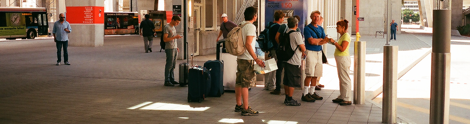
MIA Bus Station, Florida, USA
Again – like swapping the camera blithely through ninety degrees – I think I have been cropping photographs fairly consistently during this part of the course, making a banner header for most of the exercise posts. I definitely like panoramas, on screen at least – I don’t think I often get any thing printed that isn’t fairly close to either square or a standard 3:2 frame…
Generally, any hesitations I have over changing the frame from what was shot, come from reducing my ability to view (either as prints or on screen) large versions of the resulting pictures. The reason can be seen in the Miami Airport Bus Station picture, which was taken from a scan made by Snappy Snaps at the same time as they made me a set of 6″ x 4″ prints.
Looking closely at the original or not that closely at the crops, shows how low the resolution was for this. Also, while I don’t seem to mind isolating a small section of a negative, I am definitely reluctant to alter the aspect ratio. I’m not sure why, but I suspect that it has something to do with liking the regular conformity of a series of pictures, as much as anything. That said, there seems something horribly random about composing a picture through a viewfinder and then changing its shape radically later.
This probably ties in with a reluctance to desaturate digital pictures to make black and white images and the fact that I own one panoramic camera with a swing lens and quite a few medium format cameras that take square pictures. I also suspect that this is something I need to confront and get over.
Anyway, here are a couple of cropped pictures with comments inline with them when viewed as a slideshow:


All Souls’ Church – Regent Street London. June 2014
The idea of extending pictures is one that interests me. This (shot at the same time as I was doing Exercise # 5) is an attempt to get a decent, large, clean view of All Souls’. With a bit more work to neaten up the joins (not really visible here, but definitely present if you look at a larger version) it would be quite a good picture, I think, albeit a narrow one. It was manufactured from 3 portrait shot, meaning the overlaps were quite near the edges. More shots, or possibly more shots in landscape might have meant that the bits that matched were closer to the centre of the frame, with less likelihood of distortion.
I like the idea of creating long, thin (or short, wide) pictures of two parades of shops on the Lea Bridge Road, at the bottom of my street. I would like to make them from a large number of stitched together pictures, taken moving crab-wise along the edge of the opposite pavement. I have had one go already at the first of these (wonderful shops painted yellow, green, orange, pink, red and green etc) but realised as vans came along and parked obscuring the shops, that i needed to choose a quieter time to do this.
Once I have managed to get the series of shots (taken I think with the camera in portrait and with the shots overlapping by at least a third) I expect to need to do some perspective correction and then to spend ages stitching the pictures together manually. It should be worth the effort, even if its just to record what the shops were like at a set moment in time. Even better would be to come back and repeat the exercise in a few years, giving a sense of how the area has changed. Once I’ve got the first sets taken, I’ll post here, and then leave them, and the shops, to mature like a good wine…

landscape & portrait
I’ve been taking pictures in both landscape and portrait throughout this section of the course (and # 4 is entirely portrait) and while I haven’t specifically gone out and done a 20 pictures both ways shoot, I think I’ve thought about which format suits a picture for pretty much each exercise I have done.
Also, looking back through the latest hundred and ten pictures I’ve posted to flickr, I see that about two thirds are landscape, a sixth are portrait and a sixth square.
I think the four to one ratio of landscape to portrait is as much down to the slight clumsiness of using a camera rotated through 90 degrees, rather than any inherent dislike of tall thin pictures, as I seem to remember that any time I’ve used a half-frame 35mm camera (which take two portrait ratio pictures on each frame) the majority have been portrait rather than landscape. A lot of it comes down I think – like an unwillingness to change prime lenses, particularly with screw thread fittings rather than bayonet, or to get out my tripod – to my laziness, something I am trying consciously to overcome over the course of AoP. But then, another thought on this – and I’ve just spent 5 minutes playing with a camera, trying both eyes and rotating the camera each way – that it is possible that the awkwardness of using a camera rotated through 90 degrees may be greater for right-eyed, right-handed people, while I’m left-eyed and left-handed – certainly, the keyboard shortcuts for rotating an image generally are more faffy for doing so the way I generally have to (anti-clockwise, I think) leading me to think that most people twist the camera the other way, which certainly feels much less natural than the way I do. Which is some compensation at least for not being able to do the ‘keeping your left eye open, looking for the next shot while your right eye looks through the viewfinder sited towards the left-hand-side of a Leica’ thing, that Joel Meyorowitz does in The Genius of Photography…
The 1/3 that are square ones – and I should say here while we’re on questions of format, that I rather like square pictures and feel there are loads of things that suit the huge range of symmetries that are available to you – are all medium format, from 6×6 negatives and positives, and simply show that I’ve been playing with a variety of mf cameras recently, rather than that I’m cropping stuff down from rectangles into squares, but anyway, cropping’s a different post entirely…

Hackney Marshes – Sunday 29th of June, Morning
A reshoot, as the first time I didn’t have my tripod with me and really, I should have. I also tried shooting over the Marshes and the Lea towards Clapton, but it the results were less good than these, taken just over the red bridge at the start of the Hackney Marshes football fields looking down towards the orbit and the olympic park.


All pictures taken with a Nikkor AF-D 35mm 1:2 lens on a Nikon D50. ISO 200; f8; 1/640th – 1/1250, depending on how much sky was in the picture.
I’m going to park this one for now, as I’m struggling with the ‘relative weight of things’ v ‘how far they are from the edge of the frame-ness’ of all this. I am fine with ideas like the the golden section or the rule of thirds, but turning it all into little weights on a balance diagrams is something I find really hard (even though I think the pictures I’m looking at are balanced). Rather than get stuck here, I think I’ll come back to this after doing some more reading on Gestalt, Golden Sections and that, if I have time…
But here are some the pictures (all taken around the taking of photos for the other exercises) that I was going to use:


I have particular difficulty with doing this exercise with portrait format images by the way (even though I don’t have a problem with swapping the camera through 90 degrees) – not sure why…
Taken on the way back to work after lunch one day, as I passed Oxford Circus tube and then walked up to the front of All Souls’ Church.

nikon d50; nikkor af-g 70-300mm lens @ 70mm (105mm equiv); ISO 200; f8; 1/320th sec

nikon d50; kaleinar 16mm (24mm equiv) lens; ISO 200; f8; 1/320th sec
Again, while I knew what to expect, I hadn’t actually done this systematically before. And while some of the difference between the two pictures can be put down to the first being taken with the lens pointing fairly close to straight ahead, while the second was pointing seriously up (it would have been nice to have been able to float 20 feet or so up, but levitation wasn’t possible that day and I don’t know anyone who owns a tilt/shift lens) the difference in the sense of space is still quite remarkable! The openness of the second contrasts strongly with the flatness of the first; claustrophobia gives way to a sense of space dominated by the sky behind the church.
Shot during my walk in Glasgow necropolis 3 weeks ago and described in that post. To recap, I was using a Pentax Spotmatic F loaded with Fuji Superia 400 asa. The negatives were scanned at Snappy Snaps on Byres Road and aren’t that high resolution, but are adequate for on-screen use or making 6 x 4 prints. I have not spent too long trying to get the colour balance the same across all 6 prints, as this is not what the exercise was about (said he, by way of excuse).
Here are the pictures:


In all cases (apart from the last which was shot a couple of stops more open, to allow for the teleconverter) the pictures were all taken at f11 to keep everything in focus from the foreground to the far distance.
I don’t think I have ever actually done this before (unless you count the first of the introductory exercises which involved a much smaller difference of focal length) and, although I knew in theory what would happen, it’s good to have that confirmed in practice. The things that leap out at me are both the way that detail in the background becomes ever clearer and the way the perspective flattens as the focal length gets longer. Also, the usefulness of carrying a tripod was hammered home here – it made both composition and eliminating camera shake with old heavy equipment much, much easier. And for the record, I think I like the 85mm shot best…

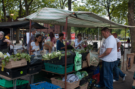
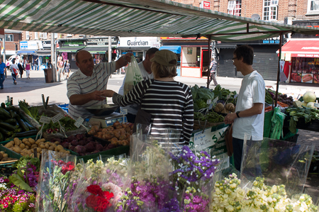
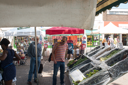
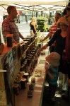
Shot on a Sunday when the Walthamstow farmer’s market was taking place in the open space off the high street, by the library.
It was another bright sunny morning and with me was a Nikon D50 with a Nikkor 24mm 1:2.8 manual focus lens. This gave the equivalent angle of vision to a 35mm lens on a full frame camera – plenty wide enough to get near subject in without having to back off too far in the confined spaces between stalls, but not so wide that there was a lot of distortion around the edges. My intention was to take exposure and focus out of the equation by stopping the lens down to F11 and sliding infinity focus to the point between f8 and f11 on the lens’s depth scale. At ISO 200, this gave a useable shutter speed of 1/125th sec, if I exposed to compromise between the need to not overexpose the areas lit by the sun while still getting detail in the shaded areas under the stalls’ awnings.
Also of course, this is the classic formula since the 30s for street photography – fixed focal length 35mm lens set to the hyperfocal values. forcing you to get close to your subjects. I shot 4 sequences at the market. Below are the combined results of the middle two (which in effect ran into one another) with comments.

1 – approaching the market
A reasonable opening – cropped for the header, above – giving a fair idea of the area covered by the market, but nothing special. The two figures moving in towards the stands are ok, but would be much better if the were slightly to the left of the first row of stalls. To get this better, I could have moved off to my left and waited for another couple of people to enter the shot, but didn’t, feeling it would be better to get in closer, rather than spend time getting a more perfect establishing shot.
2: veg stall #1
Moving straight in towards the central stall nearest me, I took this. There is a nice array of shoppers’ faces to the left and centre, but not enough of the two stall-keepers and the fact the bigger of the two is nearer the camera means there’s always the likelihood of him blocking his smaller partner. Also, there isn’t much sense of what they’re selling. I could have gone a bit to the right, but instead went left.
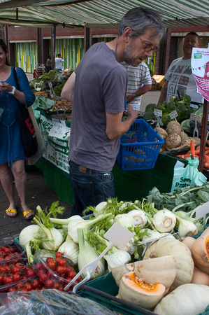
3: veg stall #2
Foregrounded vegetables and almost a nice picture with the shopper making interesting shapes as he reaches for something, while not obscuring the stall-keeper’s expression. And the background is shaded enough to fit the exposure of the people under the awning. So – not bad but, annoyingly, a leaflet pinned to stall’s upright almost does obscure the stall-keeper, and the woman with the blue dress and yellow shoes is neither there nor not there. A bit closer and more angled down from slightly to the left would have cleared the shopkeeper more and removed the woman from the frame. However, it was a fluid moment and didn’t come together like this again.
4: veg stand #3
I skirted round the back of the stand to the other side, getting more of an idea of the produce offered but moving me too far away from the action and interposing the rather annoying and soft flowers in the foreground. The two shoppers and the stall-keepers almost make a nice diamond/square, and the timing of passing over both goods and money almost comes off, but a half step to my left would have been better.
Also, the background (the north side of the High Street) is obviously much, much more strongly lit than the stalls. #3 is definitely better, I think. I took one more shot from the same angle, moving from landscape to portrait (5) but it is no better (though might work cropped square).

6 – phone man #1
I’d been clocked by the people at the stall, and rather than get involved in some form of interaction with them, I turned away to my right and saw this where the man on the phone in the centre and the V-shape of the two angle produce racks caught my eye.

7: phone man #2
I pressed on and took 7…

8: phone man #3
…moved in closer and – having been spotted and being unable to read whether my taking pictures was viewed as good, bad or neutral because of the man’s sunglasses…

9: phone man #4
…I pulled back again. The closer shot with him looking into the lens (8) works best, I think with the awning and the stall forming a rough oval around him.
10: phone man #5
The man finished his call and began to move away; I moved closer again and quite like the abstract planes of the over-exposed background, the array of veg and the flatness of the awning in the top left and centre, framing the three people in the bottom left of the frame. If the aluminium pole wasn’t hiding the bearded man, and the woman wasn’t leaning out of the left of the frame, it might be quite a nice picture. Half a step left?
No! – I had already noticed the jam and chutney stall in the background, and had moved off to the right and gone around the stall to get closer. If the aluminium pole wasn’t hiding the bearded man, and the woman wasn’t leaning out of the left of the frame, it might be quite a nice picture. Half a step left? No! – I had already noticed the jam and chutney stall in the background, and had moved off to the right and gone around the stall to get closer.

11: chutney #1
I took this. It’s got good clean edges and the various planes as you move away from the camera are broken enough by the numerous rectangles formed by awnings, signs and other stuff to let your eye settle on the grounp of people – 2 adults, two children and the stall-keeper – with the interaction between the keeper and the boy on the right centring the group and giving the picture obvious narrative possibility. But other than squares and rectangles, there’s nothing going on in the left half of the picture. I stepped in and round…
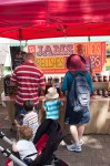


…and someone pushed a pushchair in from the left of the frame. I tried to compensate and 16 almost works, but the hand coming in from the left holding the pushchair distracts from everyone else’s focus on the central area of the frame.

15: chutney #5
I stepped back. Again this works, I think, with the slightly off centre grouping of red or crimson people and objects surrounded by blues and whites is quite pleasing, and would probably become more so with a slight crop to remove some of the seated people to the left and to move the main stall more off centre. I stepped back in closer, and it all fell to pieces somewhat (16).

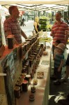


And then – 17-20 – I moved round to the side to try and get something of everyone’s faces; it sort of worked but there was a gulf between the stall-keeper and the shoppers if the picture was portrait (although I quite like the jam-bottles) and when I tried landscape – 21 – it’s a bit better, but not lots better. Tilting down a bit might have helped here.

22: chutney # 12
I went round towards the back of the stall and took this before realising the whole sequence had probably peaked somewhere between 11 and 15. Admitting this, I explained what I was doing to the stall-keeper, took a conventional portrait of the stall-keeper and left….

24: the stall-holder
All in all then, not the best day’s shooting I’ve ever had (If I’d been Garry Winogrand, this would probably have been one of the films that wouldn’t have got developed; and I’m sure Cartier-Bresson had days when only thin boys jumped over unreflective puddles behind the Gare Saint Lazare…). Some of the results – particularly with a couple of slight crops – are ok, I suppose. I don’t think I ever came particularly close to seizing a decisive moment (and the continually changing relationships between numerous people make this harder of course), but possibly with the object of the exercise being to document the moving into position as well as the final “good” composition, that was never going to happen here.
“Good” photography was made harder by the preserve stand’s awning casting a very persistant reddish cast on everything; I’ve included some pictures as shot and some at least partially colour-corrected.
I think it is a good exercise to have done and a better one to have thought about, but the thing I always find nerve-wracking about taking pictures in public places – the spoken or unspoken negotiation that goes on between you and the strangers in your pictures – was made worse by the need to document getting into postion as this removed the ability to get in place and then take one, or two quick shots before moving away. I felt very uncomfortable and – by the time I’d gone to a nearby pub to review what I’d done over a soda and lime – I was quite drained by the experience.
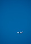
 This is the exercise where you shoot a subject that is relatively small against a fairly flat background. As Walthamstow is under several flight-paths, it seemed a good idea to try shooting aeroplanes against a cloudless blue sky. I did this on the same day as I took the ‘movement’ pictures‘ and made the horrible mistake of forgetting that for short exposures, I didn’t need to have the ISO set at its lowest and least sensitive (which was of course needed to be able to take long exposures in bright sunlight). Ah well!
I had with me my Nikon D50 and on it I had a Nikkor AF-G 70-300mm zoom. The intention was to use the zoom at its longest, giving the equivalent of a 450mm lens on a 35mm camera; this meant that I needed to set the shutter speed to at least 1/500th sec to avoid camera shake, leaving me with little option but to have the lens wide open at f5.6. And this, if you look up the lens’ performance on line, means that your pictures will be soft, as zoomed to the max, it needs to be at about f11 before it’s acceptably sharp. this is before you add in the effect of several thousand feet of hazy air. Of course, I could have upped the ISO to 800 and got f11, but I didn’t. Dolt! Idiot! Anyway…
…here’s the results (each individual photos rather than crops of a single picture), in order of (my) preference:


I think the reasons for my ordering them like that are:
Most of these seem to be based on the sense of narrative given to the the picture, creating a sense of before and after the moment when he picture was taken. The impact is based on how off-balance the picture is, with the “extremely off balance” version (6) and the “equilibrium” versions (4 & 5) working less well that the off-balance-but-not-too-much ones.
Also, even at 1/500th second, it was fairly hard keeping the camera steady enough for focus – 1/1000 would have been better, so I tried tracking several aircraft before I latched onto this one and managed to get more than a couple of pictures with it in the frame where I wanted it before it decreased dramatically in size as it flew off towards Heathrow.
As a last technical note, it’s worth noting that the underside of an aeroplane will be several stops lower (f4 v f16) using “sunny sixteen” exposure calculation making it very hard to get detail on the bottom of the wings, if you can see the fuselage sides and top, particularly if the plane is painted white…
