
To add to your set of examples of horizontal and vertical lines, now take four photographs which use diagonals strongly.
– AoP Coursebook
To add to your set of examples of horizontal and vertical lines, now take four photographs which use diagonals strongly.
– AoP Coursebook

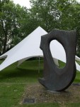
inukshuk – yesnaby, orkney
Produce 4 examples of horizontal and 4 of vertical lines. Avoid repeating the way in which a line appears. The most successful will be those in which the line is the first thing a viewer would notice.
– AoP Coursebook
REPORT ON MANTLEPIECES
As a first test of your powers of observation, try the following:-
Write down in order from left to right, all the objects on your mantlepiece, mentioning what is in the middle.
Then make lists for mantlepieces in other people’s houses, giving in each case a few details about the people concerned, whether they are old, middle-aged or young, whether they are well off or otherwise, What class (roughly) they belong to. Send these lists in.
If possible, also take photographs of mantlepieces.
Directive to New Observers – Mass Observation c.1937
Reading Picturing Ourselves (p 93, Wells), I remembered the note I made of the Directive to New Observers at the Mass Observation exhibition at the Photographers’ Gallery (Aug-Sep, 2013) at much the same time as I found myself identifying with Humphrey Spender’s description of himself on page 94, as an outsider exploiting others while picturing them. This exercise – create a still life and at the same time create a network of points – seemed a good way to combine that identification with an attempt to start characterising who the me who takes photographs is. Also, the amount of stuff from holidays, work trips etc etc that had silted up on the mantlepiece needed dusting and thinning out. I decided to clear everything off and start again, building up a still life from some of the things that were there as I went.
For the first I’m taking the sheep’s face; the second is the ship; the third is the crumpled union-jack bunting… Continue reading

Lines. And points!
Right. Back from holiday in Orkney, with lots of photos taken. Lots of reading done too, and a couple of exhibitions under my belt. Raring to go again in fact. Continue reading
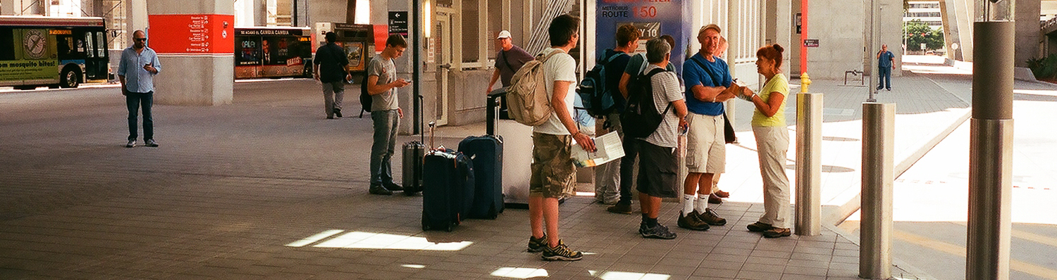
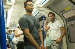
MIA Bus Station, Florida, USA
Again – like swapping the camera blithely through ninety degrees – I think I have been cropping photographs fairly consistently during this part of the course, making a banner header for most of the exercise posts. I definitely like panoramas, on screen at least – I don’t think I often get any thing printed that isn’t fairly close to either square or a standard 3:2 frame…
Generally, any hesitations I have over changing the frame from what was shot, come from reducing my ability to view (either as prints or on screen) large versions of the resulting pictures. The reason can be seen in the Miami Airport Bus Station picture, which was taken from a scan made by Snappy Snaps at the same time as they made me a set of 6″ x 4″ prints.
Looking closely at the original or not that closely at the crops, shows how low the resolution was for this. Also, while I don’t seem to mind isolating a small section of a negative, I am definitely reluctant to alter the aspect ratio. I’m not sure why, but I suspect that it has something to do with liking the regular conformity of a series of pictures, as much as anything. That said, there seems something horribly random about composing a picture through a viewfinder and then changing its shape radically later.
This probably ties in with a reluctance to desaturate digital pictures to make black and white images and the fact that I own one panoramic camera with a swing lens and quite a few medium format cameras that take square pictures. I also suspect that this is something I need to confront and get over.
Anyway, here are a couple of cropped pictures with comments inline with them when viewed as a slideshow:


All Souls’ Church – Regent Street London. June 2014
The idea of extending pictures is one that interests me. This (shot at the same time as I was doing Exercise # 5) is an attempt to get a decent, large, clean view of All Souls’. With a bit more work to neaten up the joins (not really visible here, but definitely present if you look at a larger version) it would be quite a good picture, I think, albeit a narrow one. It was manufactured from 3 portrait shot, meaning the overlaps were quite near the edges. More shots, or possibly more shots in landscape might have meant that the bits that matched were closer to the centre of the frame, with less likelihood of distortion.
I like the idea of creating long, thin (or short, wide) pictures of two parades of shops on the Lea Bridge Road, at the bottom of my street. I would like to make them from a large number of stitched together pictures, taken moving crab-wise along the edge of the opposite pavement. I have had one go already at the first of these (wonderful shops painted yellow, green, orange, pink, red and green etc) but realised as vans came along and parked obscuring the shops, that i needed to choose a quieter time to do this.
Once I have managed to get the series of shots (taken I think with the camera in portrait and with the shots overlapping by at least a third) I expect to need to do some perspective correction and then to spend ages stitching the pictures together manually. It should be worth the effort, even if its just to record what the shops were like at a set moment in time. Even better would be to come back and repeat the exercise in a few years, giving a sense of how the area has changed. Once I’ve got the first sets taken, I’ll post here, and then leave them, and the shops, to mature like a good wine…

landscape & portrait
I’ve been taking pictures in both landscape and portrait throughout this section of the course (and # 4 is entirely portrait) and while I haven’t specifically gone out and done a 20 pictures both ways shoot, I think I’ve thought about which format suits a picture for pretty much each exercise I have done.
Also, looking back through the latest hundred and ten pictures I’ve posted to flickr, I see that about two thirds are landscape, a sixth are portrait and a sixth square.
I think the four to one ratio of landscape to portrait is as much down to the slight clumsiness of using a camera rotated through 90 degrees, rather than any inherent dislike of tall thin pictures, as I seem to remember that any time I’ve used a half-frame 35mm camera (which take two portrait ratio pictures on each frame) the majority have been portrait rather than landscape. A lot of it comes down I think – like an unwillingness to change prime lenses, particularly with screw thread fittings rather than bayonet, or to get out my tripod – to my laziness, something I am trying consciously to overcome over the course of AoP. But then, another thought on this – and I’ve just spent 5 minutes playing with a camera, trying both eyes and rotating the camera each way – that it is possible that the awkwardness of using a camera rotated through 90 degrees may be greater for right-eyed, right-handed people, while I’m left-eyed and left-handed – certainly, the keyboard shortcuts for rotating an image generally are more faffy for doing so the way I generally have to (anti-clockwise, I think) leading me to think that most people twist the camera the other way, which certainly feels much less natural than the way I do. Which is some compensation at least for not being able to do the ‘keeping your left eye open, looking for the next shot while your right eye looks through the viewfinder sited towards the left-hand-side of a Leica’ thing, that Joel Meyorowitz does in The Genius of Photography…
The 1/3 that are square ones – and I should say here while we’re on questions of format, that I rather like square pictures and feel there are loads of things that suit the huge range of symmetries that are available to you – are all medium format, from 6×6 negatives and positives, and simply show that I’ve been playing with a variety of mf cameras recently, rather than that I’m cropping stuff down from rectangles into squares, but anyway, cropping’s a different post entirely…

Hackney Marshes – Sunday 29th of June, Morning
A reshoot, as the first time I didn’t have my tripod with me and really, I should have. I also tried shooting over the Marshes and the Lea towards Clapton, but it the results were less good than these, taken just over the red bridge at the start of the Hackney Marshes football fields looking down towards the orbit and the olympic park.


All pictures taken with a Nikkor AF-D 35mm 1:2 lens on a Nikon D50. ISO 200; f8; 1/640th – 1/1250, depending on how much sky was in the picture.
I’m going to park this one for now, as I’m struggling with the ‘relative weight of things’ v ‘how far they are from the edge of the frame-ness’ of all this. I am fine with ideas like the the golden section or the rule of thirds, but turning it all into little weights on a balance diagrams is something I find really hard (even though I think the pictures I’m looking at are balanced). Rather than get stuck here, I think I’ll come back to this after doing some more reading on Gestalt, Golden Sections and that, if I have time…
But here are some the pictures (all taken around the taking of photos for the other exercises) that I was going to use:


I have particular difficulty with doing this exercise with portrait format images by the way (even though I don’t have a problem with swapping the camera through 90 degrees) – not sure why…
* I realised while writing this that my idea of what discernment actually is was a bit hazy. So I looked it up:
‘As a virtue, a discerning individual is considered to possess wisdom, and be of good judgement; especially so with regard to subject matter often overlooked by others’ – Wikipedia (my emphasis)
